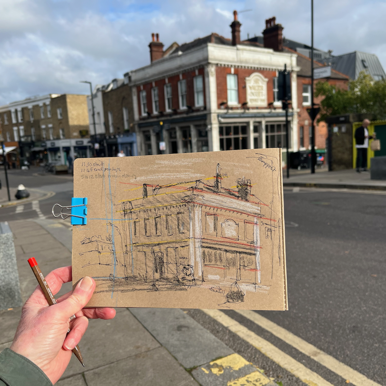
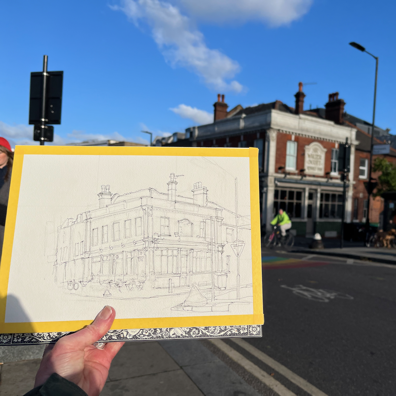
Here is the Market Café, which is at the South end of Broadway Market, near the canal.
Market Café, Broadway Market, Hackney E8, sketched 12 November 2024, 12″ x 9″ [sold]
I’ve sketched the Market Café before, and written about it on this post. This latest sketch was a commission to celebrate a happy event which took place there.
Here are some details from the sketch:
It was a bright and cold day. I did the pen and ink on location.
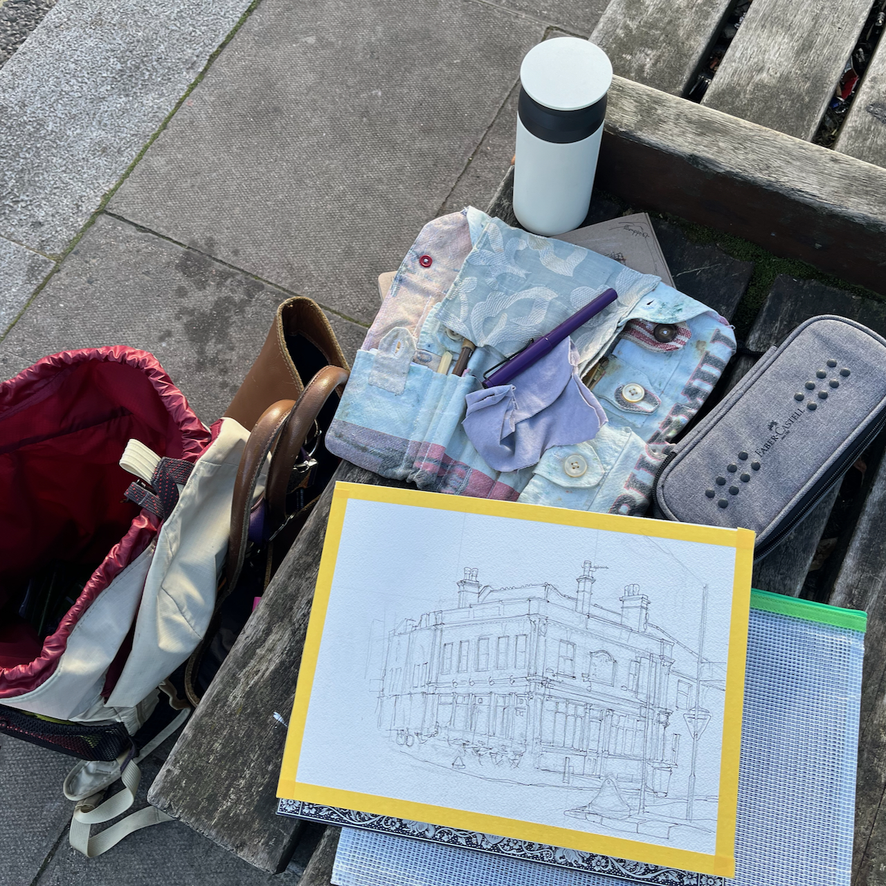
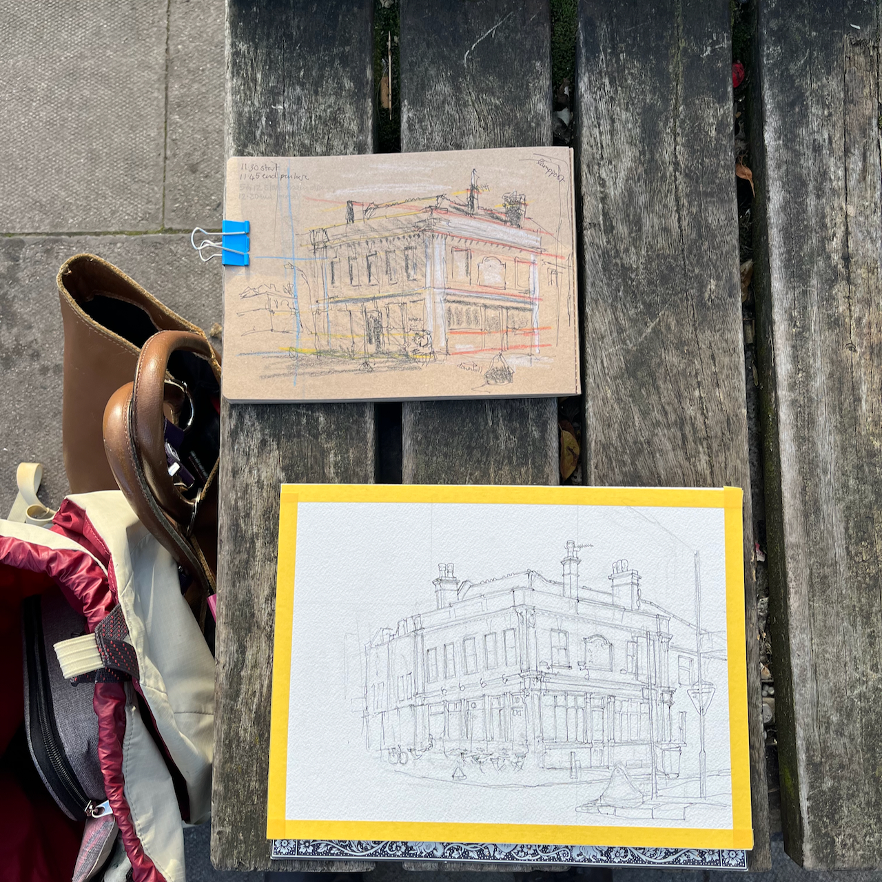
preliminary sketchPacking up.Working on location
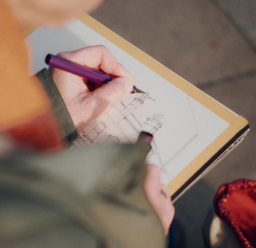
The photographer Nick Hillier came by and took some photographs of me working, which he kindly sent me later.
Sketching on location, image credit: Nick Hillier. Pen is a Lamy Safari.
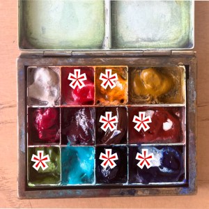
I added the colours at my desk. The colours are:
for the brickwork: Fired Gold Ochre
all the greys and blacks are: Ultramarine Blue plus Burnt Umber
the sky is Phthalo Blue Turquoise
the green tiles are Serpentine Genuine
there’s a bit of Permanent Yellow Deep on some of the highlights and some dots of Transparent Pyrrol Orange
the fine white lines are made by using a rubber resist gum. I use Pebeo drawing gum.
For my current palette see this link. I have 12 colours in my palette. For most pictures I fewer colours. This picture used about 7 colours.
Thank you to my client H for the commission and for allowing me to post this image here.
I’ve sketched around the Broadway Market area before. See this link for a sketch of Climpson Coffee, and here is a sketch done at E5 bakery on the other side of London Fields.
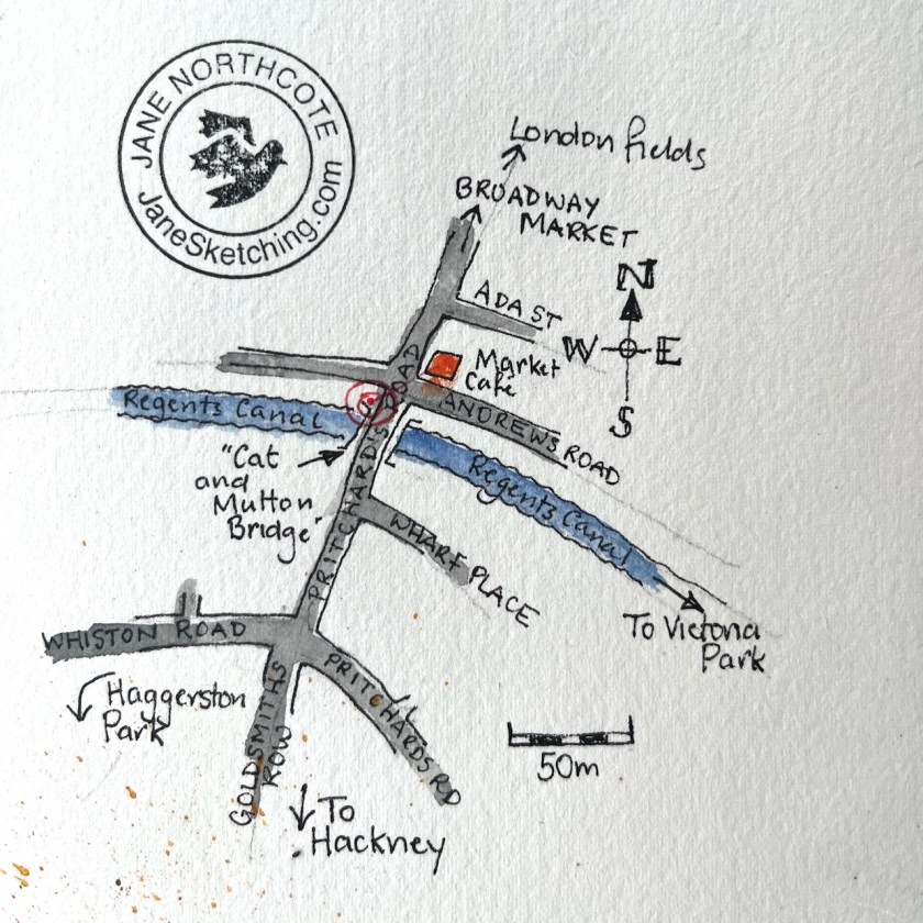
Sketch location
Click a button below to share this post online, email it, or print it:
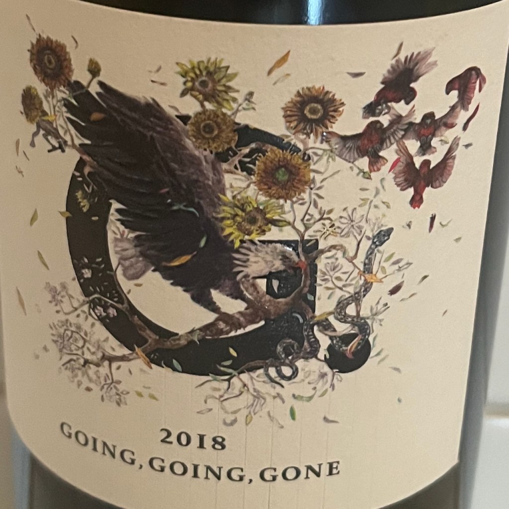
Vanessa from 4G wines saw one of my maps online, and contacted me to ask if I could do a special one for them – for a wine label! I was thrilled at the idea of having my artwork on a wine label, and set to work.
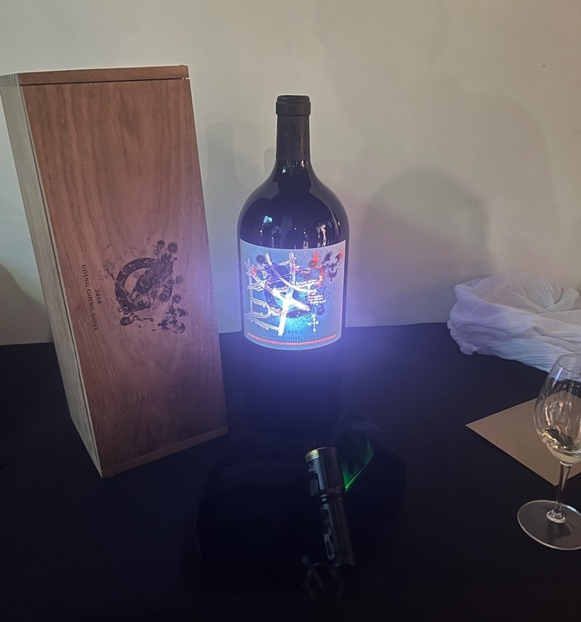
Vanessa was somewhat mysterious about how the map was to be used. I was curious. She invited me to the London launch of their vintage so I could see it in person, when the bottle design was to be unveiled.
The event was at the Banksy gallery on the Charing Cross Road. On display was the 2018 vintage named “Going, going, gone”. The name is a reference to a 2018 event at an auction house. A Banksy painting, “Girl with a Balloon”, apparently started to self-destruct by feeding itself through a shredder embedded in the picture frame. The shredding process started immediately the auctioneer’s hammer came down to mark the sale of the work, hence “Going, going, gone”.
4G make their bottles into intriguing works of art. The label on the bottle is a beautiful design by the artist Sebastian Blinde, showing elements of South African nature.
label design by Sebastian Blinde
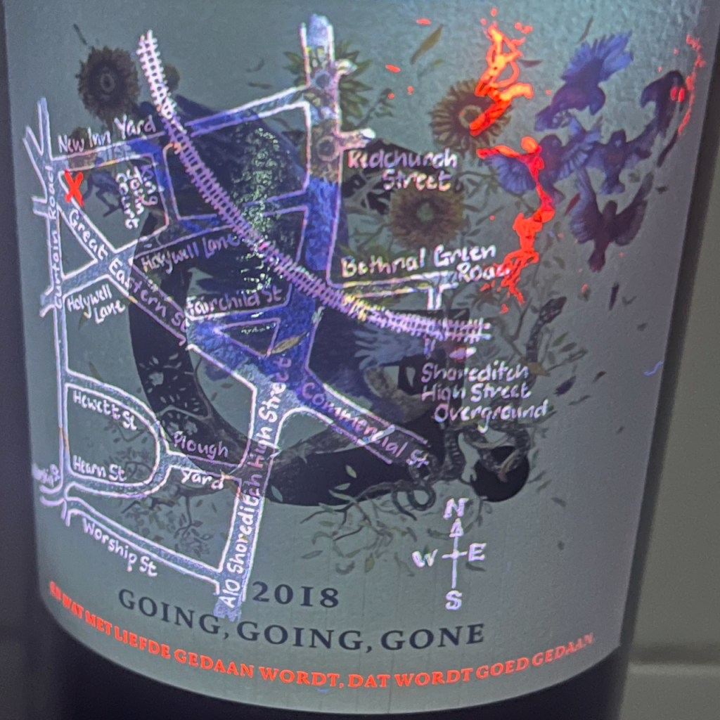
The secret in this vintage is the map – my map! – made visible by shining ultra-violet light onto the label.
Secret map behind the label
It was such fun to see it. There is an X on the map to mark the position of an original Banksy mural “Girl with a Balloon”.
The inscription below the map reads: “EN WAT MET LIEFDE GEDAAN WORDT, DAT WORDT GOED GEDAAN”
This is another subtle artistic reference. It is a quote from a letter of Vincent van Gogh written on 3 April 1878, according to the website of the Vincent Van Gogh Museum in Amsterdam on this page of his letters.
“And what is done with love, is done well.”
An excellent motto, for both wine and art.
Click a button below to share this post online, email it, or print it:
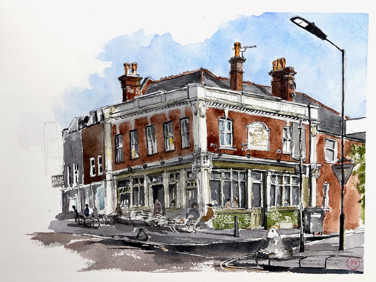
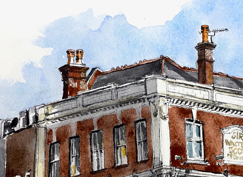
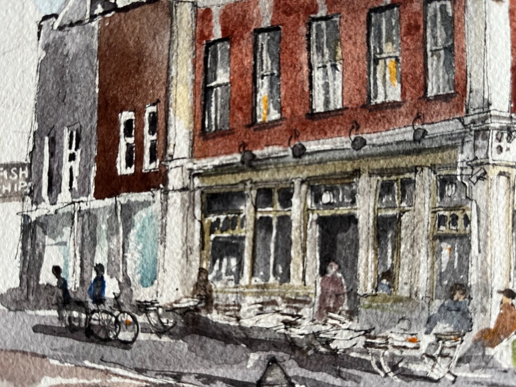
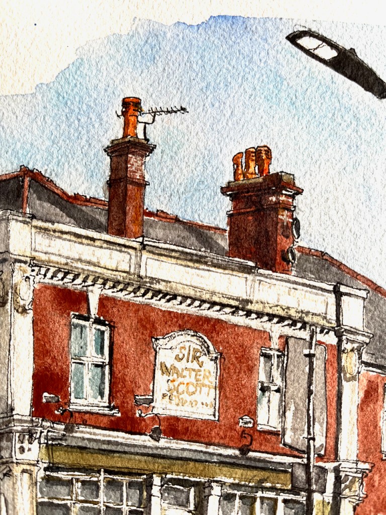
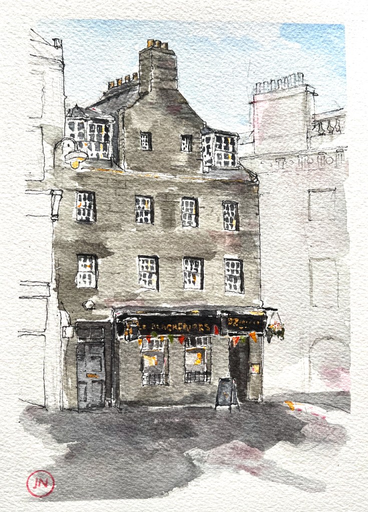
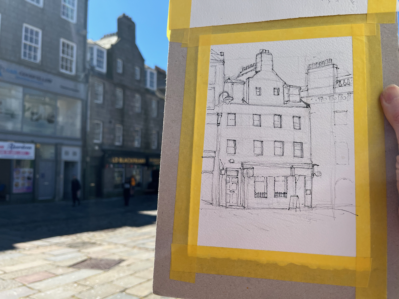
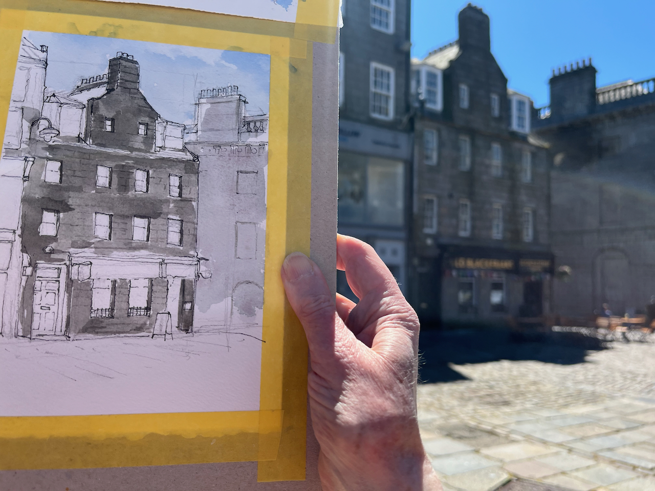
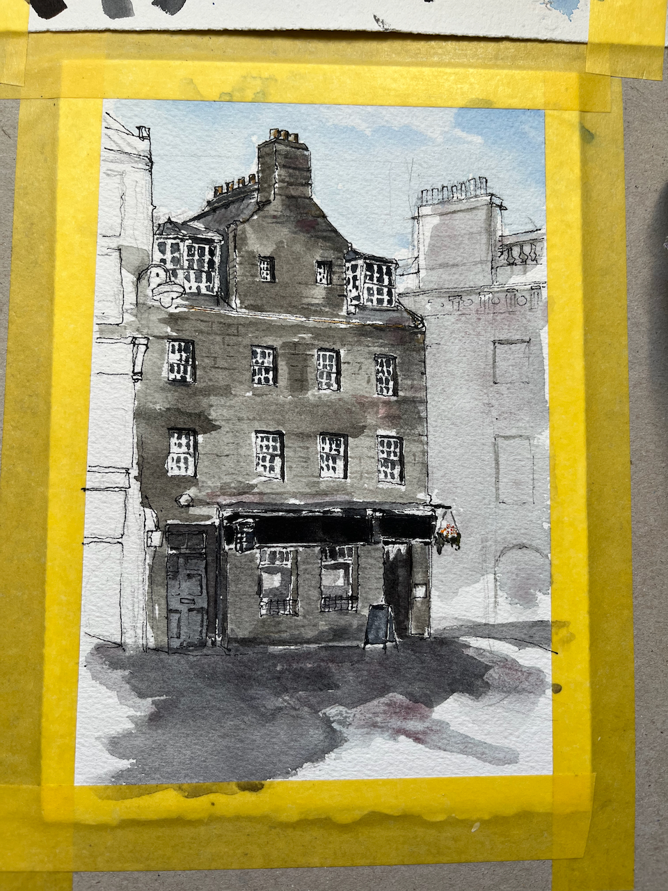
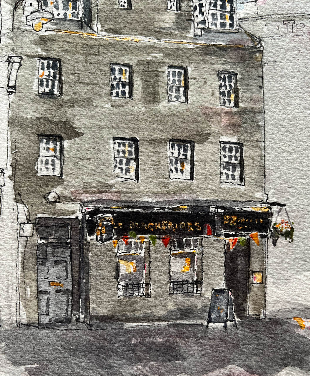
This is the Old Blackfriars, 52 Castle St, Aberdeen.
The Old Blackfriars, Aberdeen AB11 5BB, sketched 24 June 2024, 20cmx14cm (A5), [commission]
I worked on this drawing standing in the large cobbled square called Castlegate. A passer-by walked up to where I was standing, and took an interest in the picture. I’ll call him Campbell. He had much to tell me, a visitor, about the city of his birth. He had been brought up in what he described as the “tenements” on the dock. “Six of us to a room,” he said. He’d trained as a coppersmith, and found work in the engine rooms of ships and submarines, making “boilers, pipes and flanges”.
I was sketching this pub at the request of a client who had happy memories of their time there. Campbell also had happy memories of his lively times at the pub, although his experiences pre-dated those of my client by some decades. It was a pub for folk working the docks Campbell told me, and “they had a hard life”.
Uncharacteristically for British people, we talked politics. The general election was coming up. My new friend had little time for politicians of any stripe. They don’t know what they are doing, he asserted. “It’s like watching a drunk man trying to walk down Union Street”. He indicated the wide straight street across the cobbles, and with an articulate hand gesture demonstrated the erratic movements of the inebriated.
I enjoyed his entertaining stories as I sketched. He went on his way when I was at the pen-and-ink stage. I hope that some of his stories made it into the finished drawing.
Sketching on location in Castlegate, Aberdeen
The main colours are: (DS=Daniel Smith watercolour) – ultramarine blue finest (Schmincke) – burnt umber (DS) – haze pink (Schminke) – in the stones – rose madder permanent (DS) – in the stones For the details: – permanent yellow deep – pyrrole red – mars yellow – acrylic gold paint
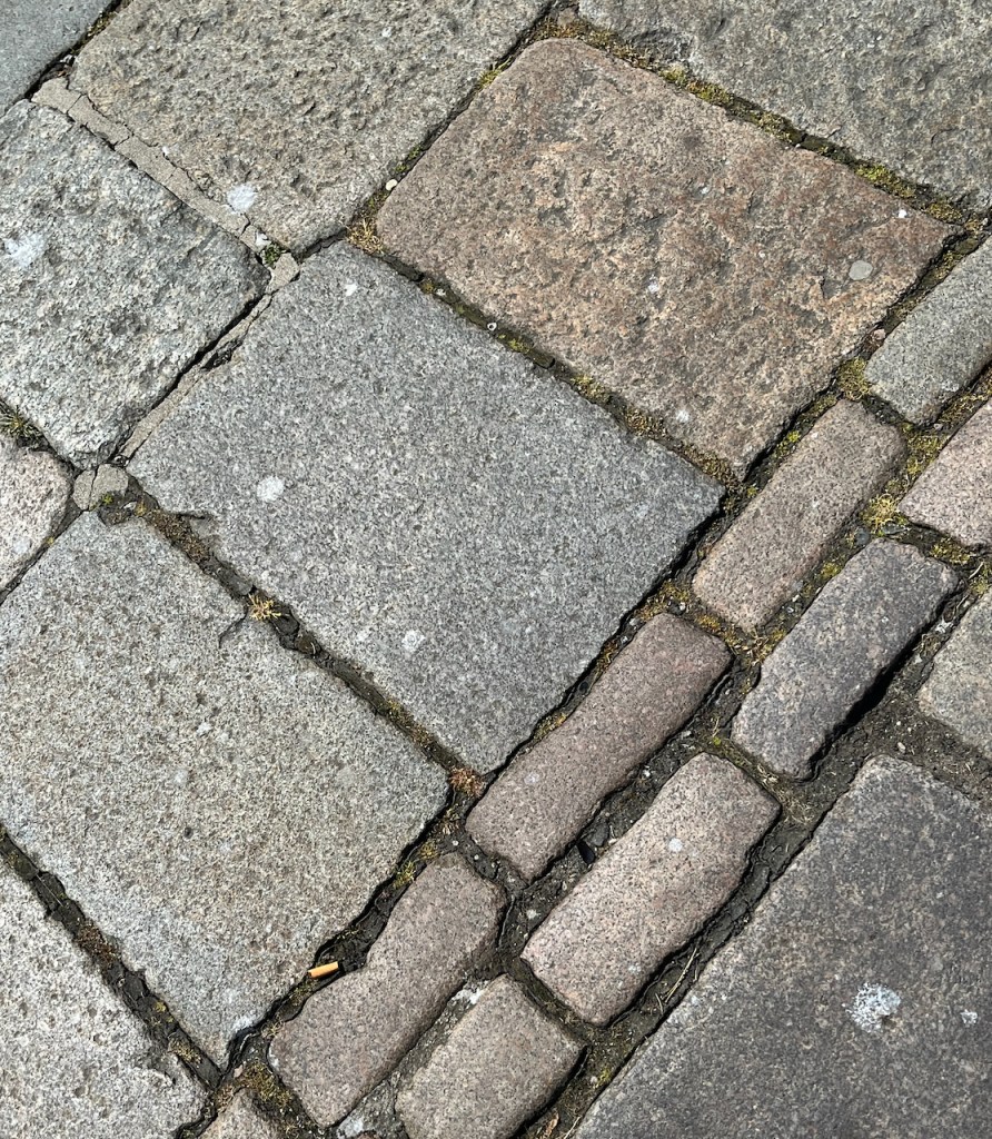
Aberdeen is “The Grey City” for some. But for anyone who doubts that there really is pink in the stone, I include a photo of the cobbles.
Cobbles at my feet
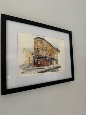
This was a commission. Thank you to my client for inspiring me to draw this historic pub, and for their permission to post the pictures here. They kindly sent me a photo of the picture in its frame:
photo credit: my client G.
Click a button below to share this post online, email it, or print it:
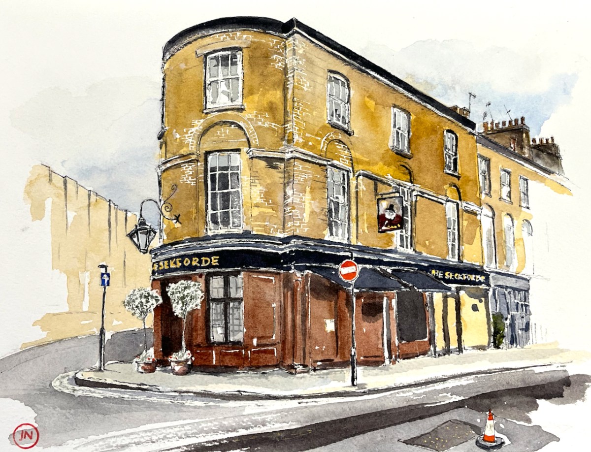
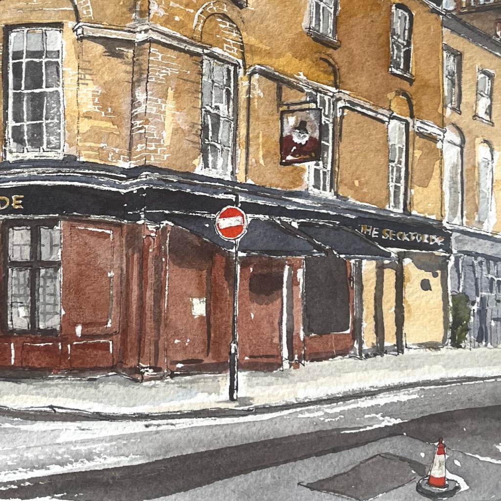
The Sekforde EC1R 0HA, Clerkenwell, sketched March 2024 12″ x 9″ [commission]
This watercolour was specially commissioned to celebrate a happy event.
The colours are:
Mars Yellow
Fired Gold Ochre
Ultramarine Blue
Burnt Umber
plus some Horadam Random Grey, some Daniel Smith Green Serpentine Genuine, and Pyrrol Red for the street sign and road marker.
Gold paint for the lettering.
Admire the bricks! I am very pleased with this effect. It was done by applying a rubber resist, “pebeo drawing gum” to the paper before I did any painting. The paint does not adhere to the rubber resist. When I had done all the colour, I rubbed off the rubber resist and hey presto! bricks.
Thank you to my client for their encouraging words and for inspiring me to make this picture of The Sekforde. Here are some details of the drawing.
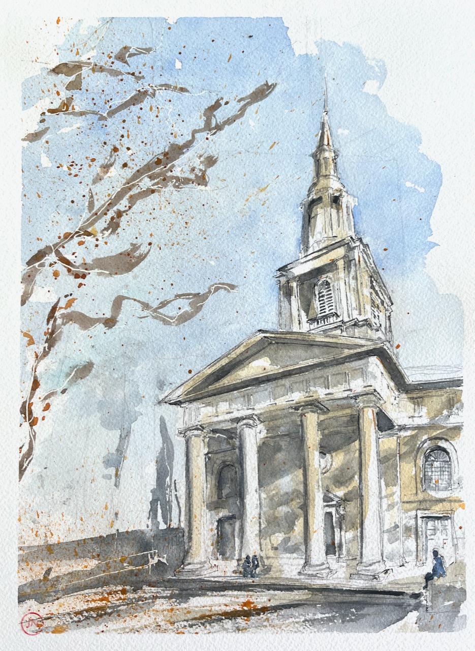
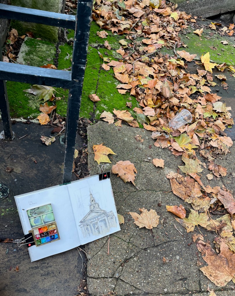
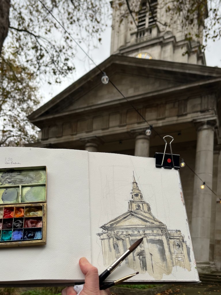
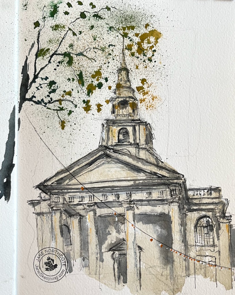
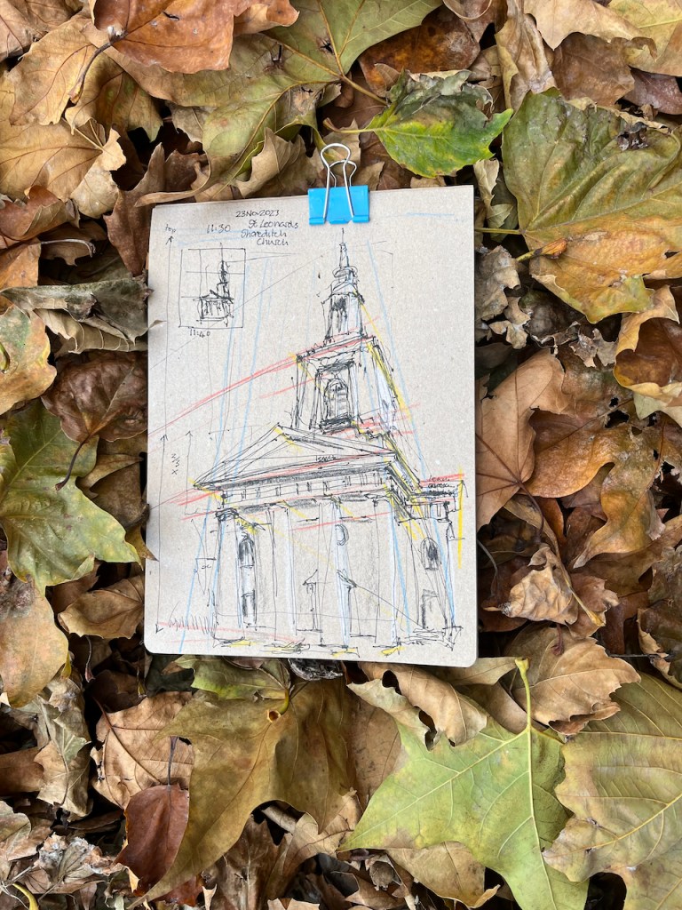
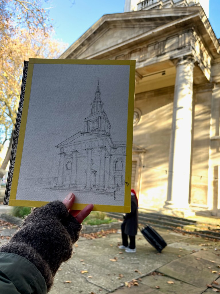
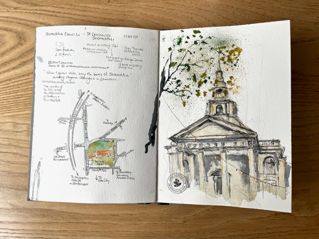
Here is St Leonard Shoreditch, which stands at the intersection of Shoreditch High St and the Hackney Road, postcode E1 6JN.
St Leonard’s, Shoreditch Church sketched 23 November 2023, 12″ x 9″ [sold]
There has been a Christian church here since medieval times. The present building dates from 1741 and was designed by George Dance the Elder (1695-1768). George Dance the Elder was the City of London surveyor at the time, and designed, amongst other buildings, Mansion House at Bank Junction.
The current church is active in the community. On the day I was sketching, a Thursday, they were offering meals to local people. This is the Lighthouse Project, “providing practical help, food parcels and hot meals to local people in need” according to their website. You can see several guests in the picture.
When the church was recently rebuilt at the turn of the millenium, a large amount of money was spent on its community needs and no funds were left to buy paint. Hence it still looks a bit bohemian. We think it’s quite endearing and shows people where our priorities are – with the community rather than how we look.
The current community is highly diverse. The wealth of the City meets the deprivation of Hackney and Tower Hamlets. Our neighbours in Arnold Circus and St Hilda’s Community Centre are highly galvanised community groups acting for societal change.
This church houses the “bells of Shoreditch” from the children’s song “Oranges and Lemons”. If you go inside the church you can see a bell, which is resting on a wooden pallet on the right hand side of the nave.
when I grow rich, say the bells of Shoreditch.
Oranges and lemons, Say the bells of St. Clement’s. (St Clement Danes) You owe me five farthings, Say the bells of St. Martin’s. (St Martin in the Fields) When will you pay me? Say the bells at Old Bailey. (St Sepulchre-without-Newgate) When I grow rich, Say the bells at Shoreditch. (St Leonard Shoreditch) When will that be? Say the bells of Stepney.(St Dunstan’s Stepney) I do not know, Says the great bell at Bow. (St Mary Le Bow) Here comes a candle to light you to bed, And here comes a chopper to chop off your head!
The Society of Cumbernauld Youths in 1784 rang a complete peal of 12000 changes of Treble Bob Royal, taking nine hours and and five minutes, according to a placard in the church porch.
The bells are still rung.
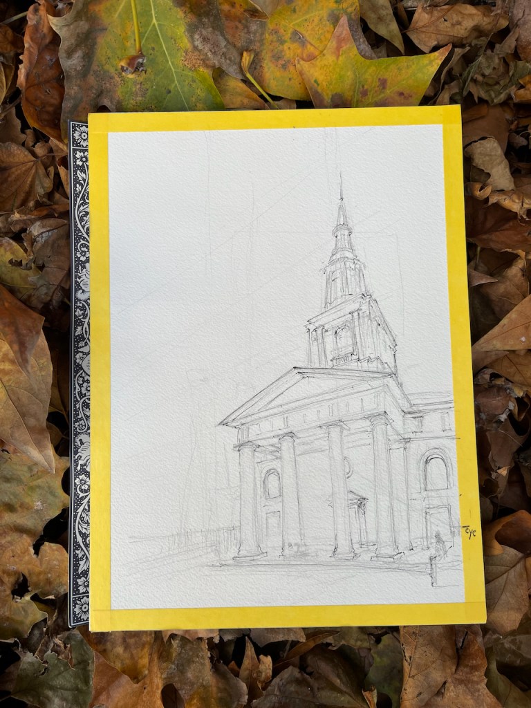
This picture was a commission. My client was keen to have this upward view showing the front of the church. I did some practice sketches to understand the tricky upward perspective.
Thank you to my client for suggesting I draw this inspiring church, and for their permission to publish the photos of the drawing online.
Practise drawing in sketchbookpencil sketchExploring the perspectivenearly finishedPractise drawing in sketchbook 13
Here is a map showing the location:
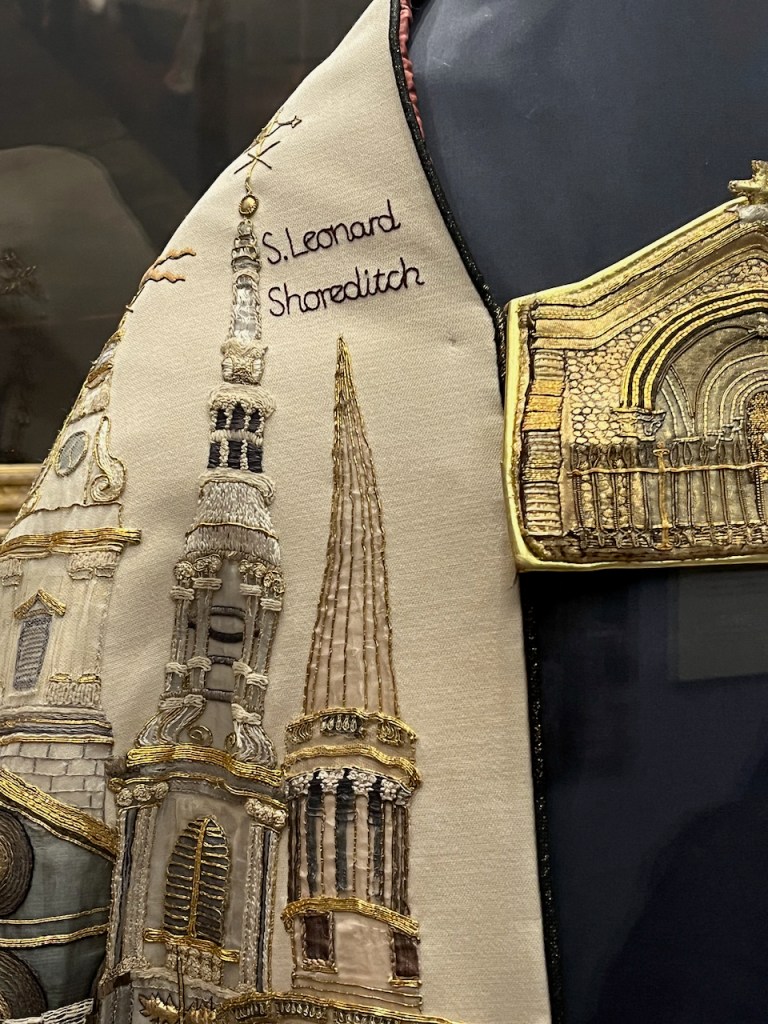
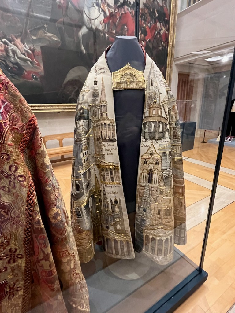
There is a current exhibition in the Guildhall London:
“Treasures of Gold and Silver Wire” curated by Dr. Karen Watts, Emeritus at the Royal Armouries. It celebrates the 400 anniversary of the Worshipful Company of Gold and Silver Wyre Drawers.
St Leonard Shoreditch is the spire to the left of the wordsThe Silver Jubilee Cope on display in the Guildhall 16th December 2023
Having myself had a go at depicting those arches and columns on the spire, I am full of admiration for the embroiderers who managed to create an accurate image in wire thread. Hugely accomplished! The exhibition is on until 31st December 2023- well worth seeing.
Click a button below to share this post online, email it, or print it:
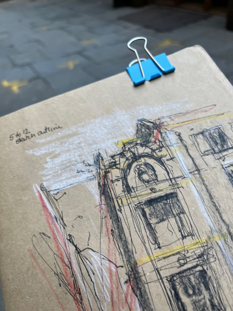
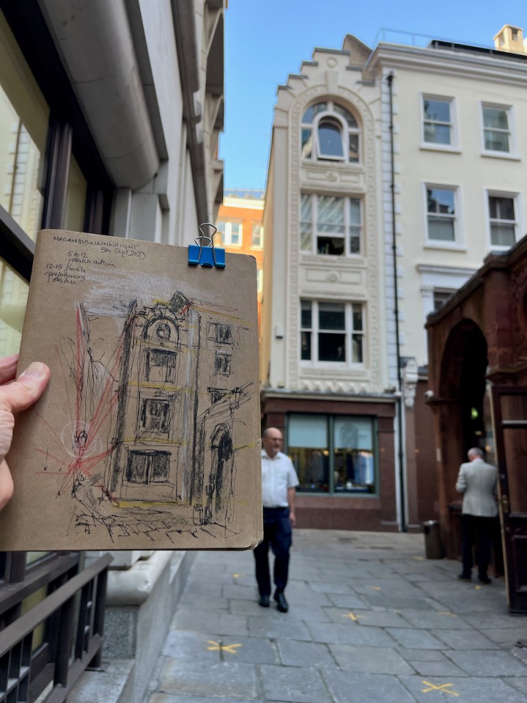
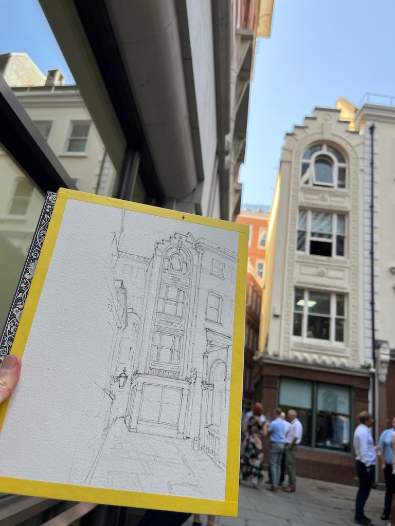
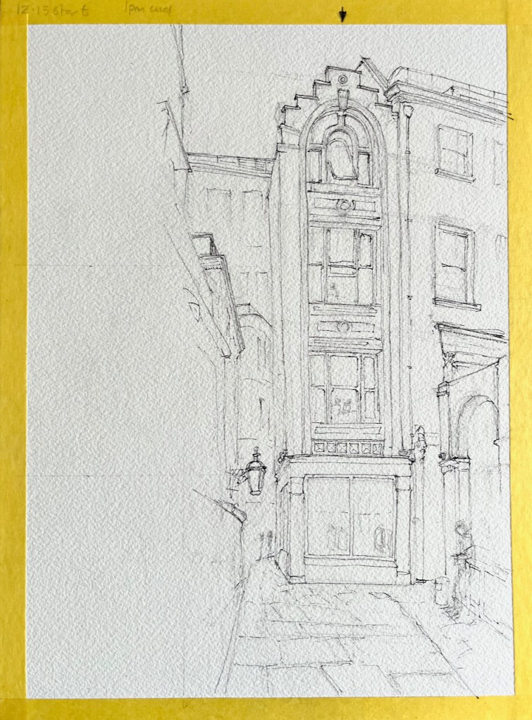
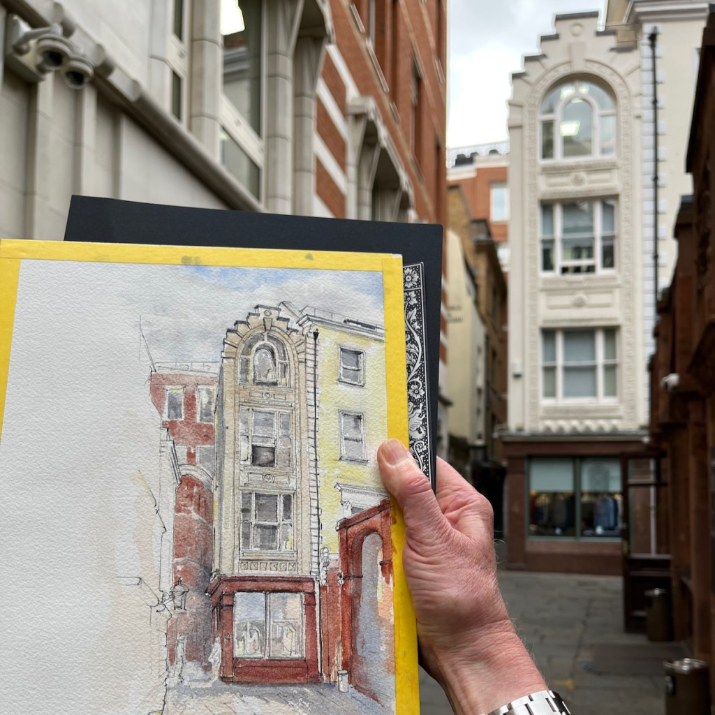
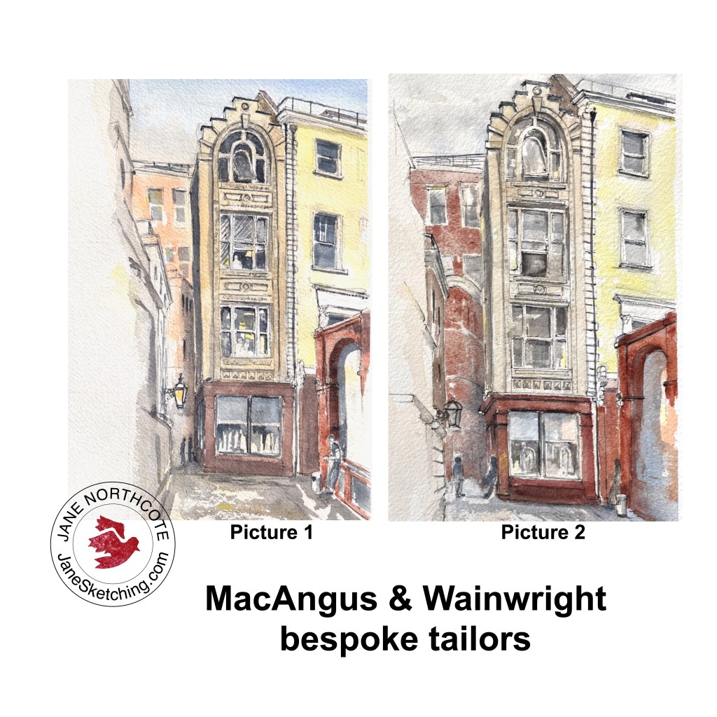
Here is 4 St Michael’s Alley, City of London, EC3, the premises of MacAngus & Wainwright, bespoke tailors. Their business uses all the floors. Above the ground floor showroom are the fitting room, workroom and cutting room.
4 St Michael’s Alley, London EC3, the premises of MacAngus & Wainwright, bespoke tailors.
The shop is just off Cornhill, near Bank in the City of London and right next to the Jamaica Wine House which I sketched previously. You can see a bit of the Jamaica Wine House on the right of my sketch. The prominent lamp is outside the “George and Vulture” pub, which is hidden on the left. I made two pictures of this building, on different days and from slightly different angles. Here is the other one:
4 St Michael’s Alley, London EC3, the premises of MacAngus & Wainwright, bespoke tailors.
Here is work in progress on the drawings.
preliminary sketchpreliminary sketch
A succession of tour guides took their groups into the alley in the centre of my picture. This is Castle Court. These alleys apparently feature in Charles Dickens stories. Since J.K Rowling was inspired by the novels of Charles Dickens, there’s also a Harry Potter angle. I overheard this in fragments of tour guide talks. I don’t know if it’s true.
I started sketching in the late morning. This was the time for tour guides. Later, starting from about 1pm, the courtyard became populated by drinkers at the Jamaica Wine House. They were polite people, helpfully stepping aside and congregating on the other side of the alley, so they did not block my view.
The drawings are on Arches Aquarelle 12″ x 7″ 300gsm cold-pressed watercolour blocks, using Daniel Smith paints. The colours are:
Blues: Ultramarine Blue, Lavender, Cobalt Teal Blue
Yellows: Mars Yellow. The house on the right at the back is mostly Nickel Titanate Yellow. It was quite a hard colour to match.
Browns: The tailors building is a mix of Buff Titanium with Mars Yellow. The Jamaica Wine House and other buildings are Fired Gold Ochre, with a bit of transparent Pyrrol Orange.
All blacks and greys are a mix of Ultramarine Blue and Burnt Umber.
The pen drawing is De Atramentis Document Black ink in a Lamy Safari Fountain pen, fine nib.
Click a button below to share this post online, email it, or print it:
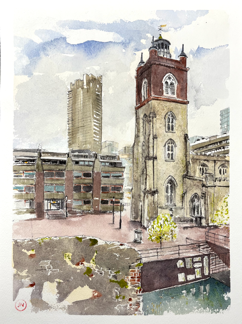
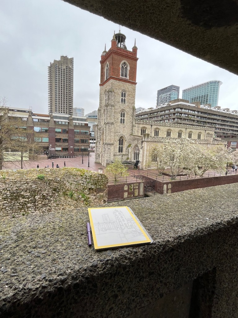
Here is St Giles’ Church, Cripplegate, seen from the public walkway at Wallside. The church is surrounded by the Barbican Estate. Cromwell Tower is in the background. The City of London School for Girls is the lower building, centre and left. Through the gap between the church and the school, you can just glimpse the Barbican Centre.
The magnolia was in bloom!
St Giles from Wallside, Barbican, 1 April 2023 12″ x 9″ [Commission]
I painted this as a commission, for some clients who wanted this particular view. A special request for this commission was that I showed two ducks. These are small, but they are there!
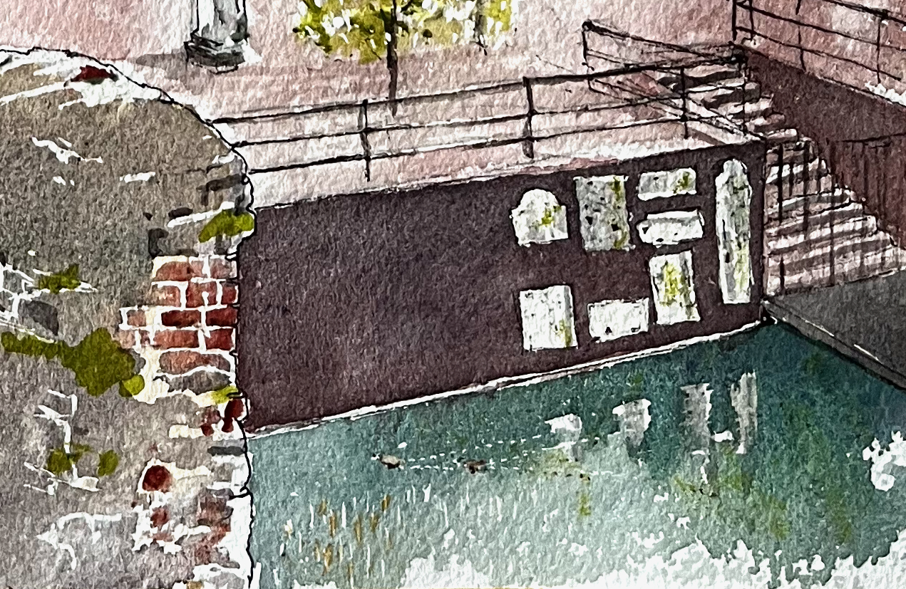
Ducks on the lake.
The white shapes on the lakeside wall are gravestones.
Old London Wall is on the left: part stone, part brick. This is the old Roman wall round the City of London.
Thank you to my clients for this commission and for their permission to post the picture here online. It was a real pleasure to do.
The colours I used are:
For the sky: a pale yellow wash of permanent yellow deep, followed by a grey made from ultramarine blue and burnt umber, with some ultramarine blue for the blue bits.
For the church: the stone is a pale yellow wash of permanent yellow deep, then a dilute buff titanium wash. I put salt on it to get some texture. Then the dark areas are a grey made from ultramarine blue and burnt umber.
The top part of the church, St Giles Terrace and all the reddish/purple brickwork is a combination of perylene maroon, burnt umber, fired gold ochre, and a bit of ultramarine blue for the dark areas.
The lake, which really is that green colour, is ultramarine blue, plus some serpentine genuine which makes it granulate.
All concrete is the same mix of burnt umber and ultramarine blue with some mars yellow.
Old London wall is the pale yellow wash of permanent yellow deep, with a second wash of lunar blue with burnt umber. Lunar blue is highly granulating, which gives a wonderful stone effect. The bricks are fired gold ochre.
All green plants are green gold, and there’s also some green gold on the stonework of the church, to show the lichen.
The weathervane is Liquitex gold ink, applied with a fine brush.
The line drawing is done with a Lamy Safari fountain pen, using De Atramentis Black ink, which is waterproof.
The white parts of the picture, for example the lines between the bricks on Old London Wall, (and the ducks) are done using a resist. This is a rubbery substance, applied before putting on any paint. The resist I use is called Pebeo Drawing Gum. I put it on using a dip pen to get the fine lines. After the paint is dry, I rub it off, and the parts where it was show up white. There are also a few tiny dots of white gouache paint on the magnolia tree.
The paper is Arches Aquarelle 300gsm 12″ x 9″ in a block.
Work in progress. Arches Aquarelle block, Lamy Safari pen. The yellow is masking tape, which I put round to make the picture easier to handle and to give a crisp edge to the work. The people on St Giles Terrace were practising Tai Chi. It was very relaxing to watch them. See the green lichen on the concrete. And the magnolia.
Click a button below to share this post online, email it, or print it:
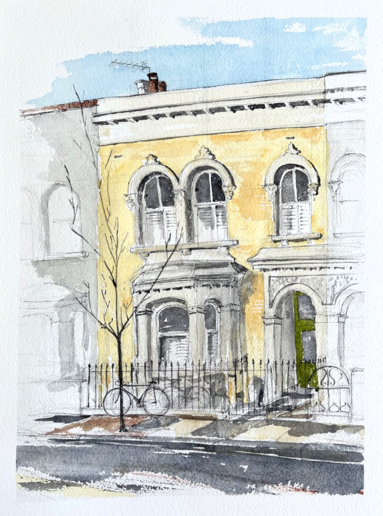
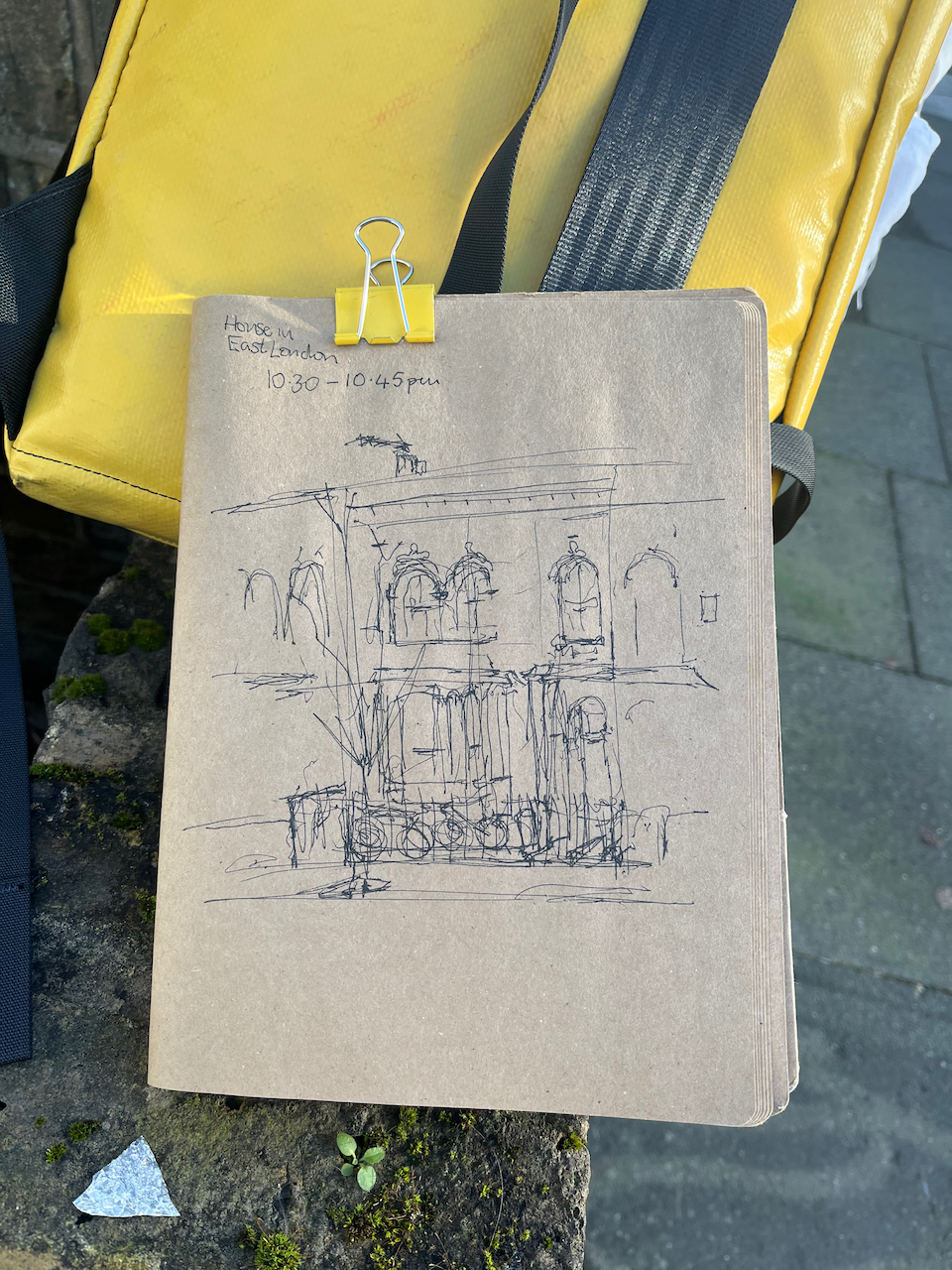
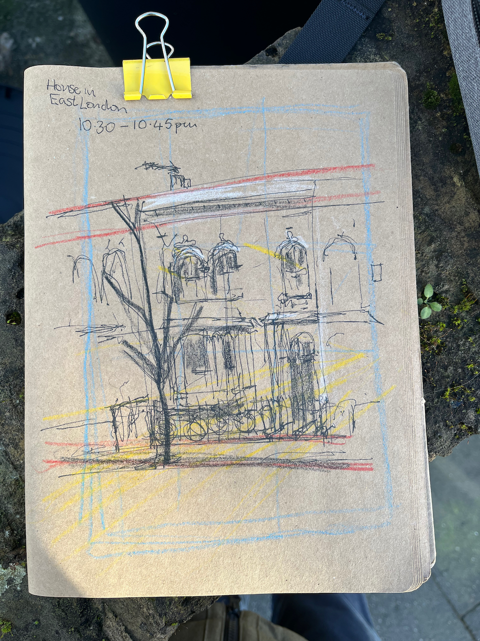
Here is a Victorian terraced house in East London.
A House in East London, 9″ x 12″ 21 January 2023. [commission]
This was a commissioned drawing. Thank you to my client for the commission and for their permission to post the picture here.
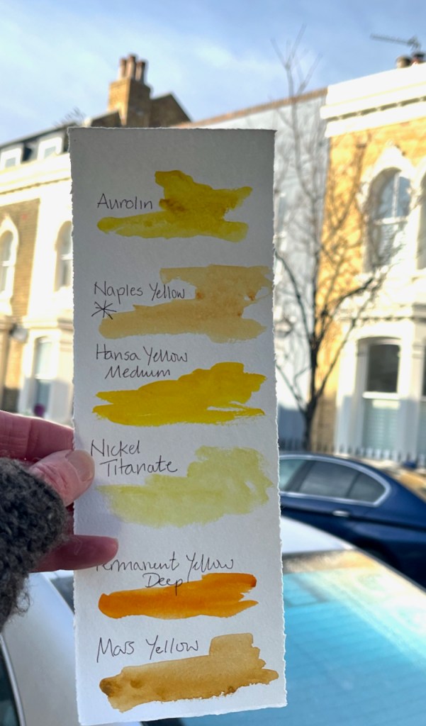
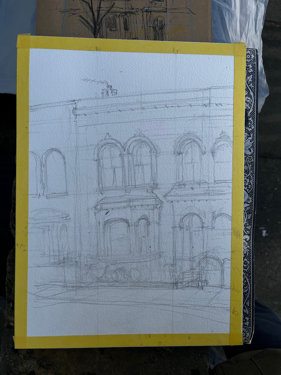
There were two interesting challenges in this drawing. One was the fact that the front of the house was obscured by parked cars. The other was the characteristic colour of the brickwork: a clean and lively yellow. I wanted to draw the fence without the cars, so as to show the whole house. And I wanted to get that yellow right.
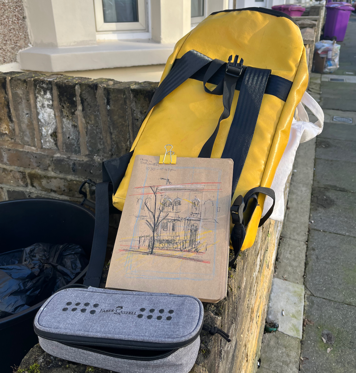
I was stationed on the other side of the road. There were cars parked nose-to-tail on both sides of the road. To draw the part behind the parked cars, I crossed the road and had a look then come back and sketched and then wandered about sketching and trying to get it right, gradually becoming skilled at envisaging the fence behind the car. Fortunately it was a quiet road. The few passers-by took a friendly interest, bemused by an itinerant artist in their street.
To match the colour of the brickwork, I equipped myself with a colour chart of all the yellows I possess. Usually, old London brickwork is Mars Yellow. But in this case I discovered that it was Naples Yellow, a cleaner, paler colour, less orange than Mars Yellow, more orange than Nickel Titanate Yellow. Naples Yellow also has a pleasant chalky texture, which made it perfect for this brickwork .
Finding the yellowColours used
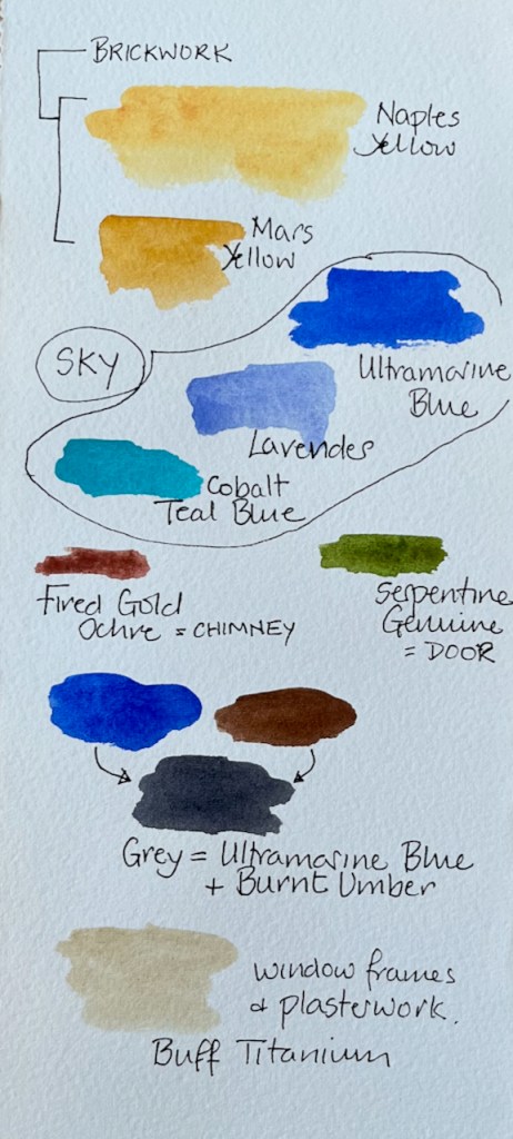
Most of this picture was painted in 3 basic colours: Ultramarine Blue, Naples Yellow and Burnt Umber. Here are the detailed colours, all Daniel Smith:
Sky: Mostly Ultramarine Blue, plus some Lavender and Cobalt Teal Blue
Brickwork: Mostly Naples Yellow plus a bit of Mars Yellow in the darker places
Window surrounds and plasterwork: Buff Titanium (very dilute)
Green door: Serpentine Genuine
Terracotta chimney pots: Fired Gold Ochre
All greys and shadows: a mix of Burnt Umber and Ultramarine Blue.
The paper is Arches Aquarelle 300gsm Cold Pressed in a block. The ink is De Atramentis Document Black, applied with a fountain pen.
I did a preliminary sketch to understand the perspective and the proportions. Here are some images of work in progress. This was January and very cold. I managed to complete the pen and ink on location and then added the colour at my desk in the warm when I returned home.
Preliminary sketchPreliminary SketchDrawing station on the nearby wallPencilPen drawing, before the colour went on.
Click a button below to share this post online, email it, or print it:
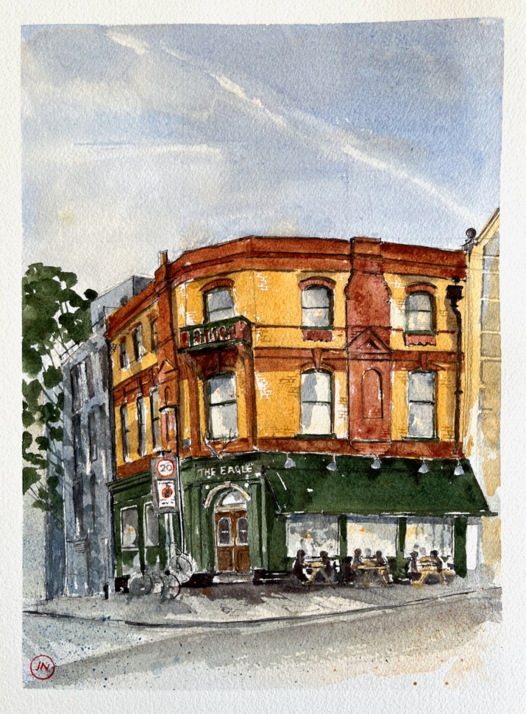
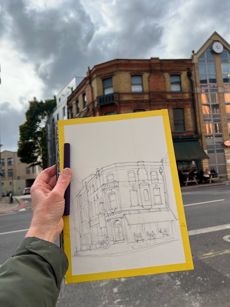
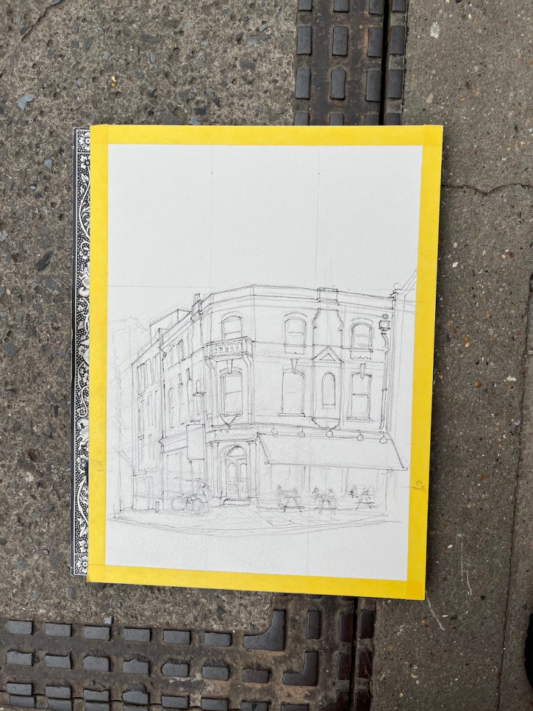
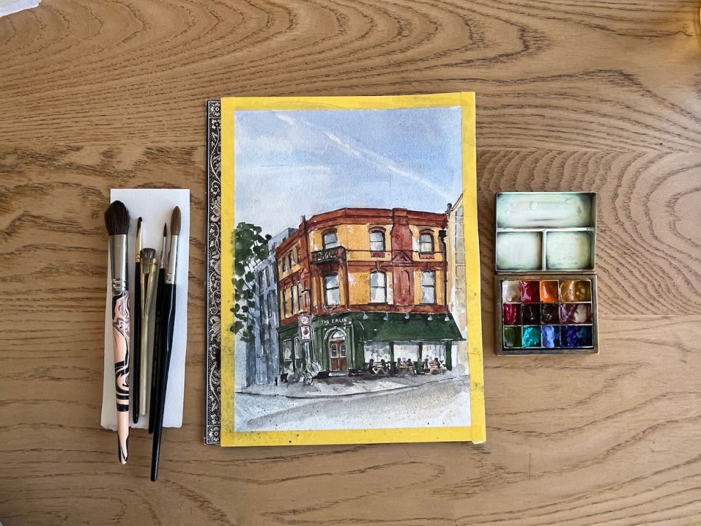
Here is “The Eagle” 159 Farringdon Road, London, EC1.
The Eagle, Farringdon Road, October 2022, 12″ x 9″ [sold]
I painted this as a commission. My client liked the pub and asked for a picture which showed the liveliness of the place. I sketched it from the other side of the Farringdon Road.
There was certainly a lot of activity in the pub. As you see in the picture, people arrived and occupied at the tables in the street, even though this was October, and quite chilly. The lamppost by the door was soon adorned with a collection of bikes.
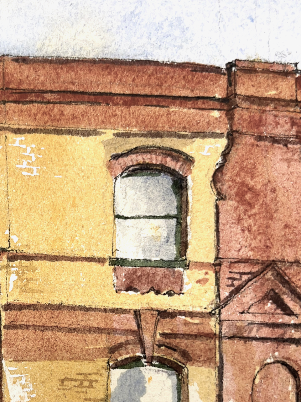
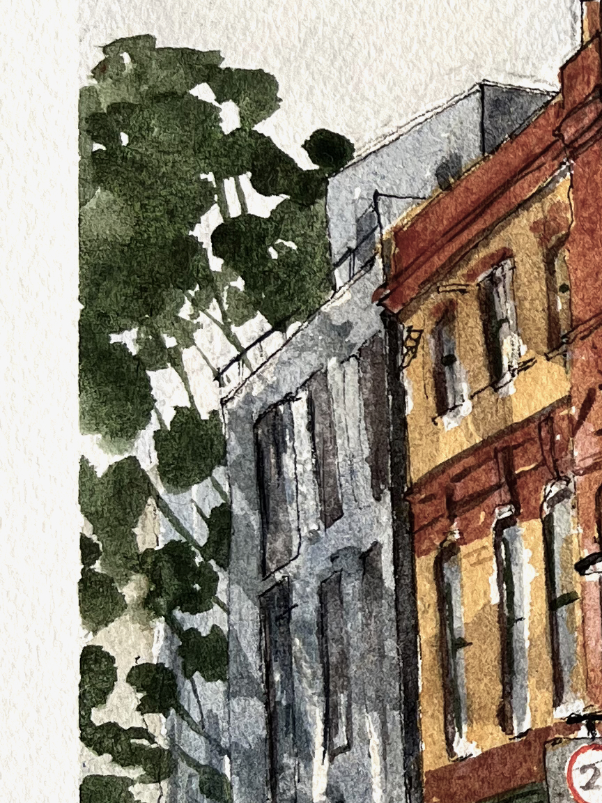
Here are some details from the picture:
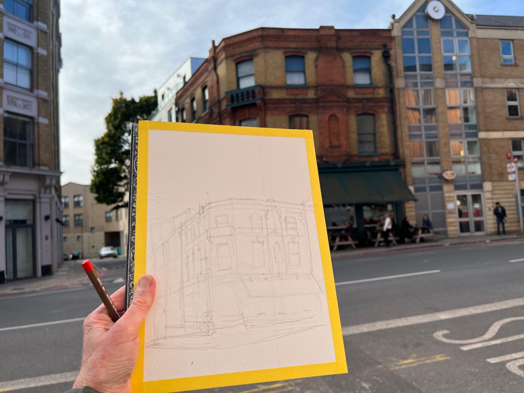
Here is work in progress:
Preliminary sketchPencil underdrawingPen on Arches Watercolour blockPen (Safari Lamy, shown in my hand)Pen complete
I completed the pen drawing on location and added the colour later:
Thank you to my client for this commission, and for allowing me to post the picture here.
I have also sketched The Eagle, 2 Shepherdess Walk. See this post: