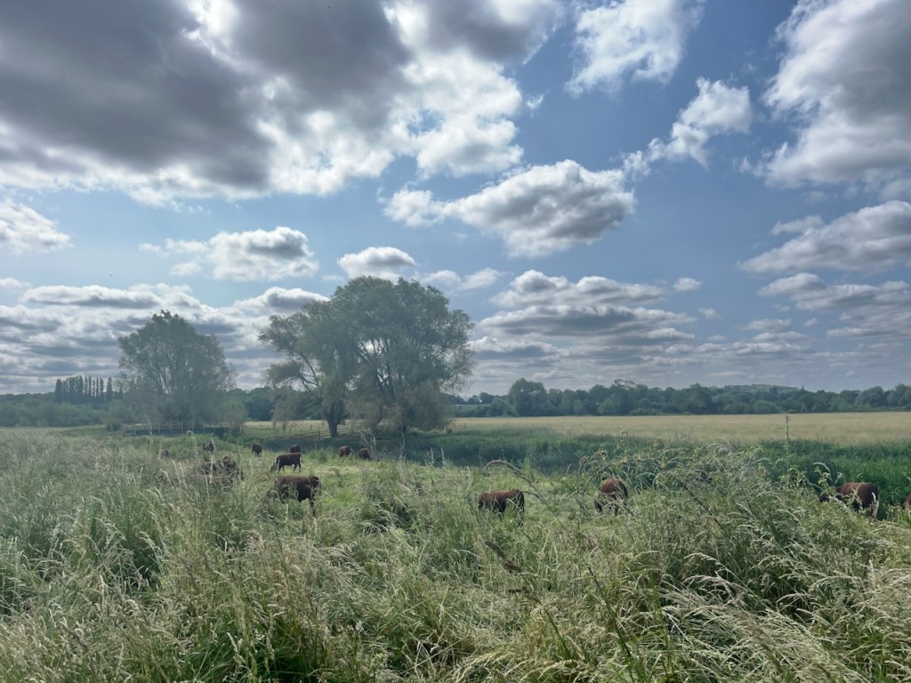
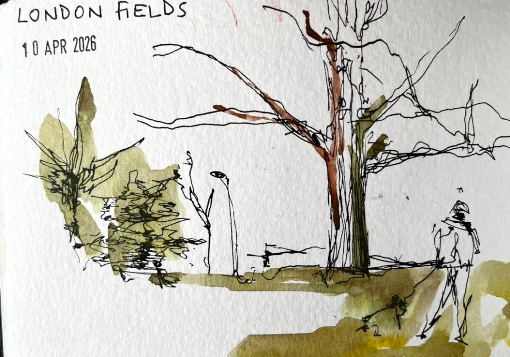
On a sunny day in April, I walked across London Fields. I had a paper bag in my hand containing a cheesy snack from E5 bakery.
I ate my snack on a bench, watching the people walk past on their way to Borough Market.
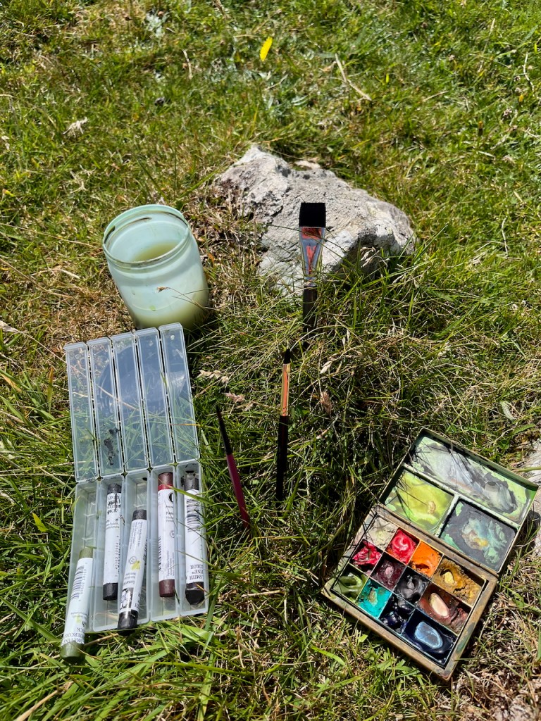
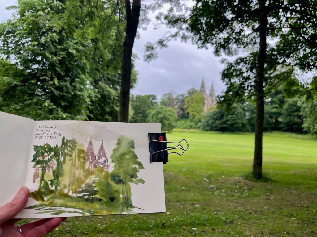
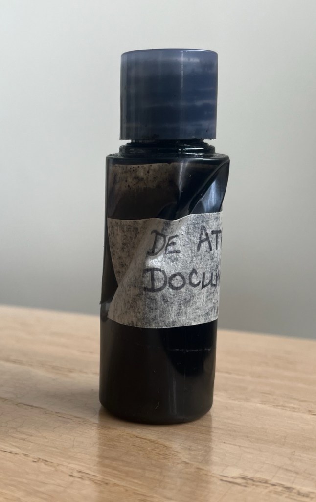
Then I thought I would draw some of the trees, and the people. Already translating the scene in front of me into ink sketches in my mind, I extracted from my bag the bottle of ink I had brought for this purpose. This ink bottle is a repurposed plastic shampoo bottle, small size, from a hotel.
I could not get the top off the ink bottle. The ink had dried. The top was stuck. My hands were not strong enough.
Help was needed. Fortunately, help was going to be readily available in the stream of passers-by. I waited. I discounted the slim woman in the smart white skirt. She would not want to engage with ink. Several older people, though probably interested and willing, would likely have the same issue I had. Then a young man came by. He had the physique of Jack Reacher: a blond man in a tight T-shirt, walking easily and with purpose. I smiled and I said, “You look like a strong guy. Can you get the top off my ink bottle?” I held out the small bottle.
He stopped, and assessed the situation. He had not only the physique of Reacher, but also his attitude: never walk past a damsel in distress. Although I am hardly a damsel. “ I am a strong guy,” he told me with a smile. “You got the right man here!” In his muscular hand, the bottle looked tiny. “It’s ink,” I reminded him, “keep it the right way up.”
“Got it”, he said, and applied himself to the problem.
The top did not move. “Hmmph” he said, and put down his carrier bag. Now he applied his muscular arms and his huge torso into the twisting movement. I had visions of the bottle bursting, ink going everywhere, including into his carrier bag. De Atramentis Document ink is notable for its intense blackness, and archival quality. That means you can’t wash it out.
But within seconds he was handing me back the bottle and picking up his undamaged carrier bag. I thanked him and he went on his way, the action a small blip in his smooth stride across the park.
He had released the top. I undid it cautiously and all was well. No leakage. But this incredibly strong individual had contorted the ink bottle. It now took on the irregular shape of a crumpled can: an art object, perhaps. It sits on my desk, testament to the extraordinary strength of this kind stranger in the park.
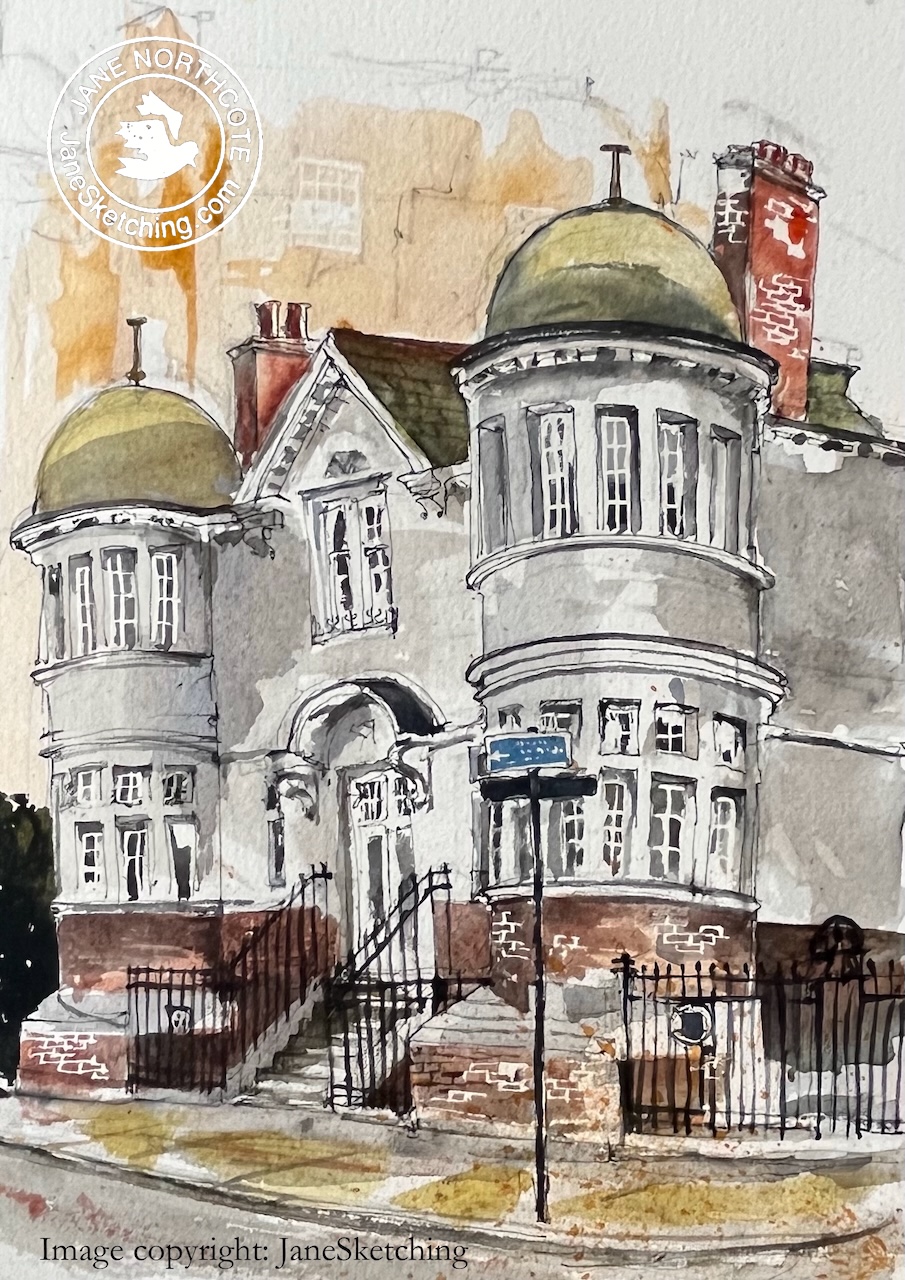
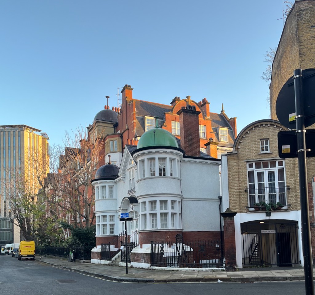
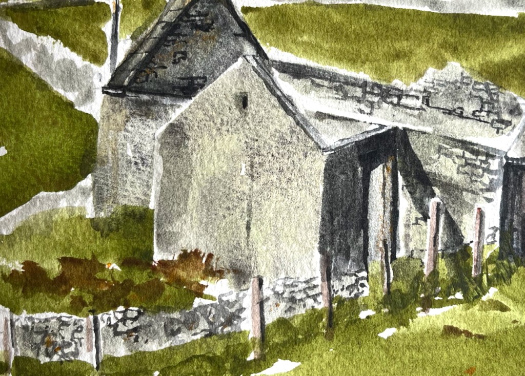
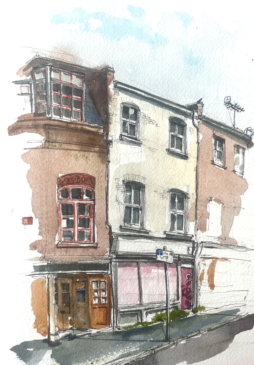
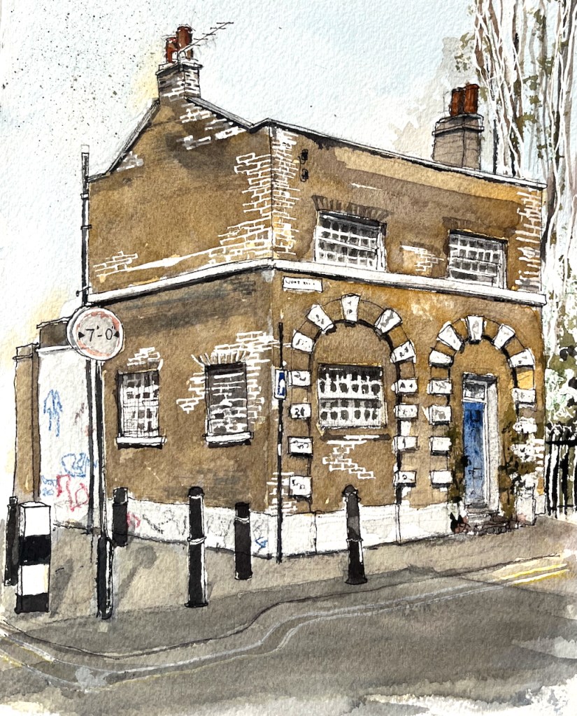
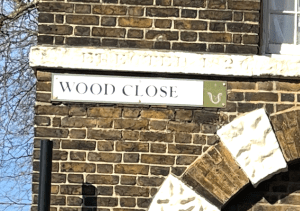
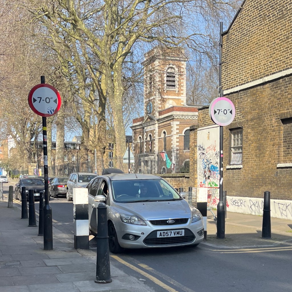
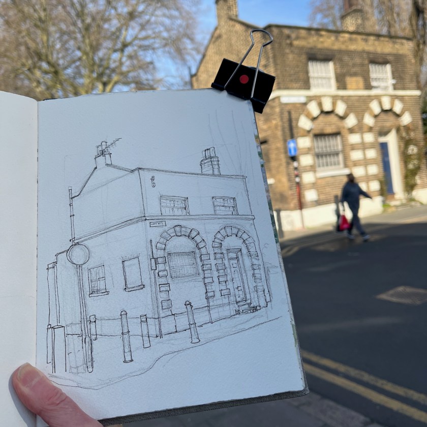
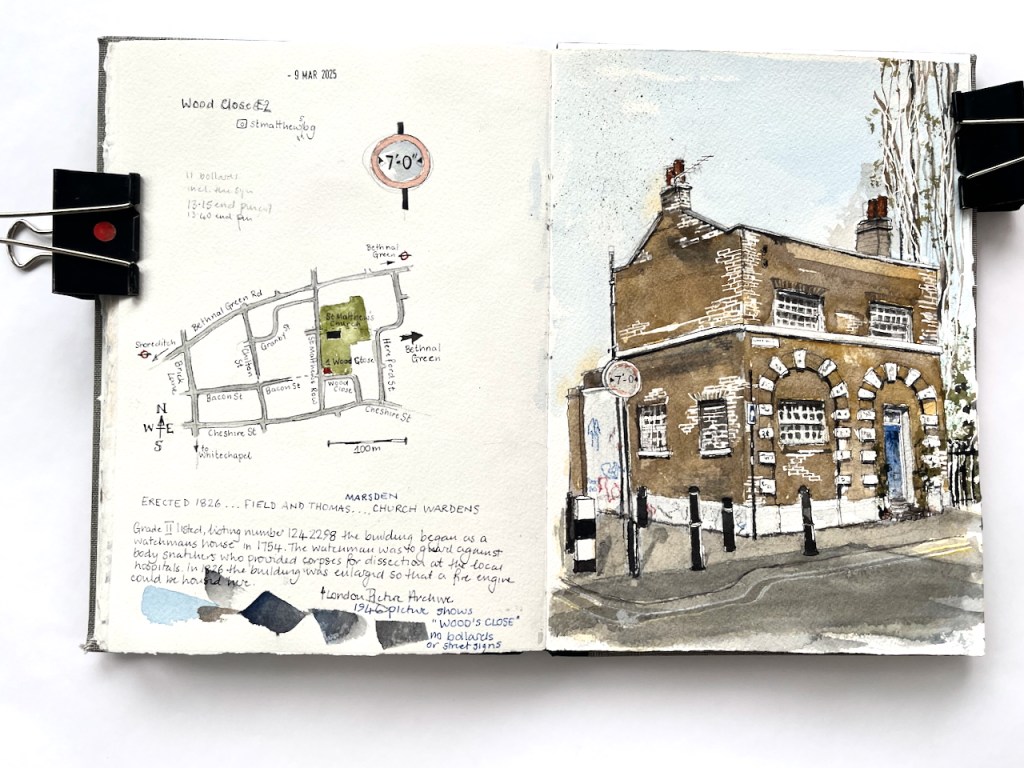
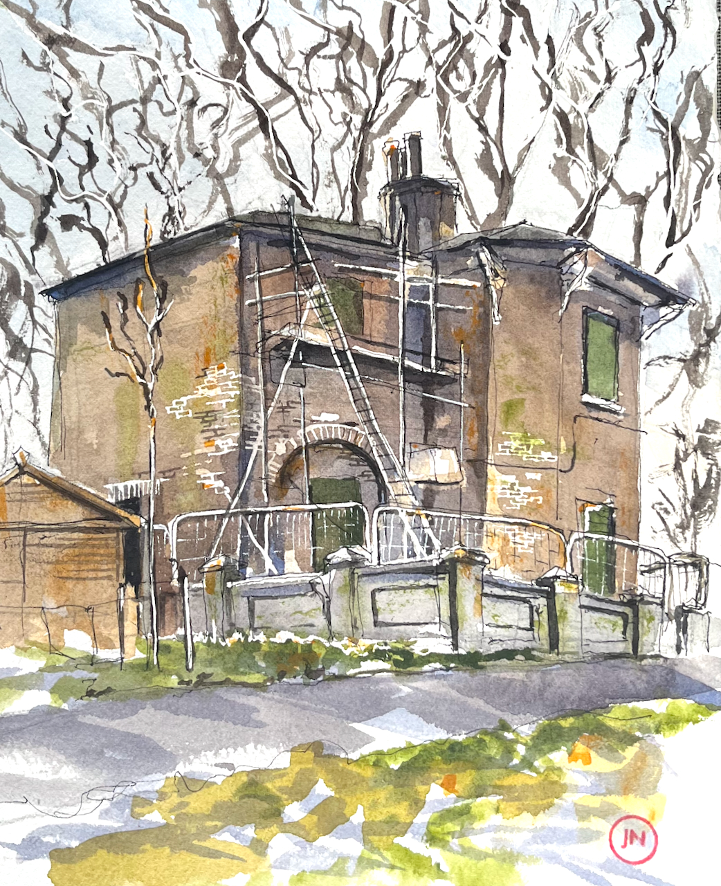
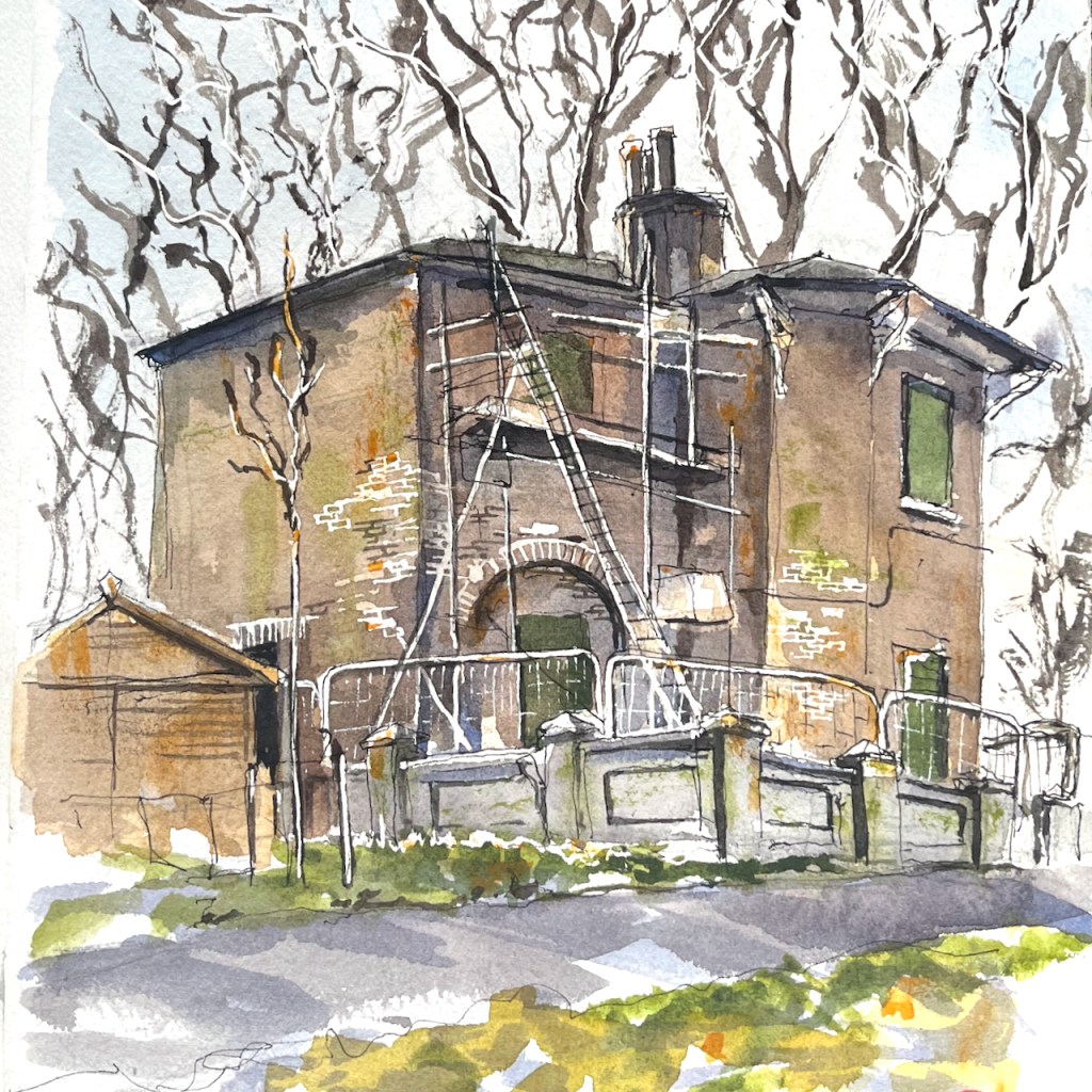
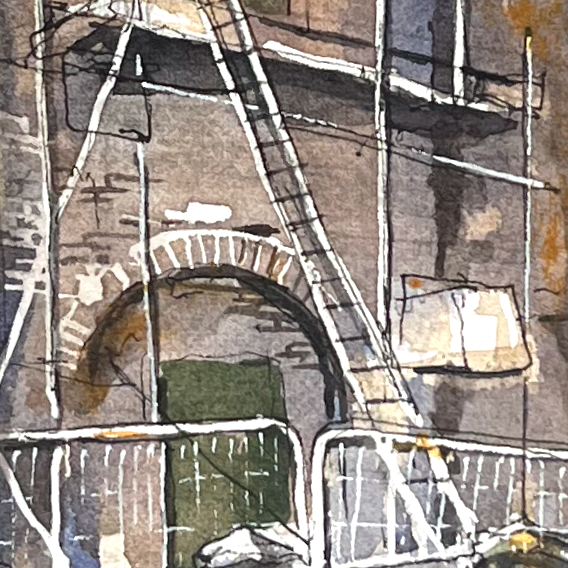
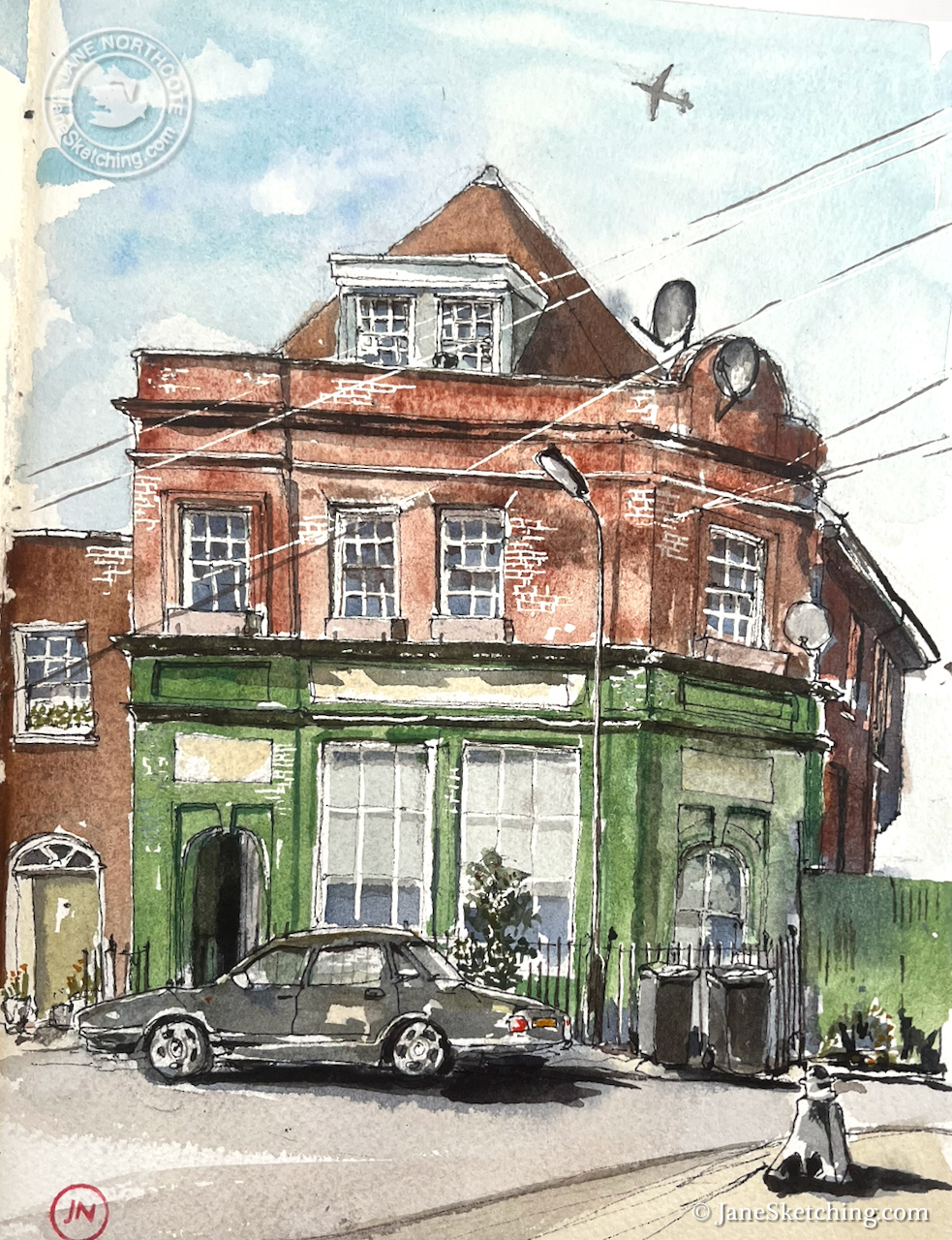
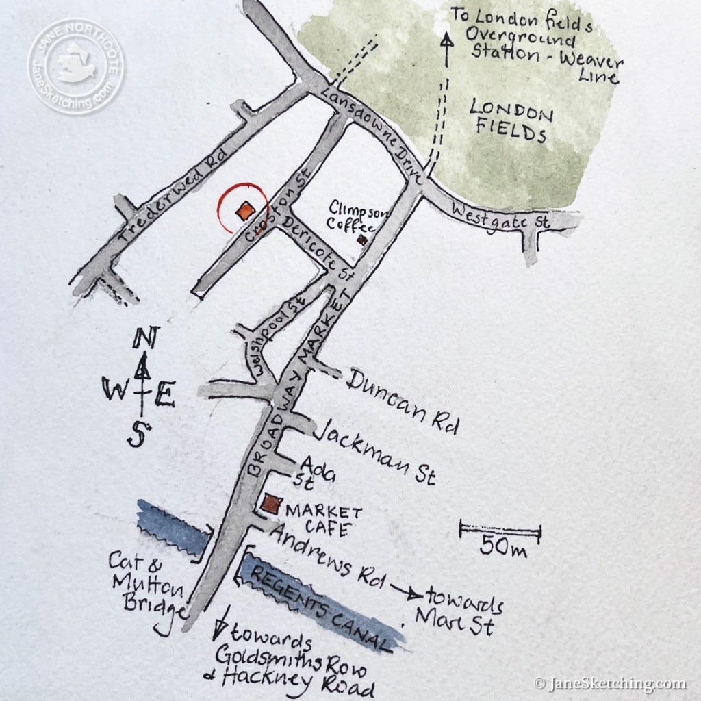
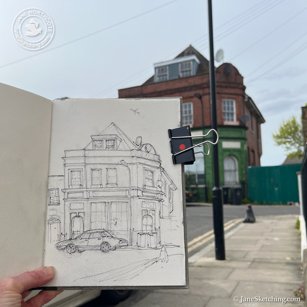
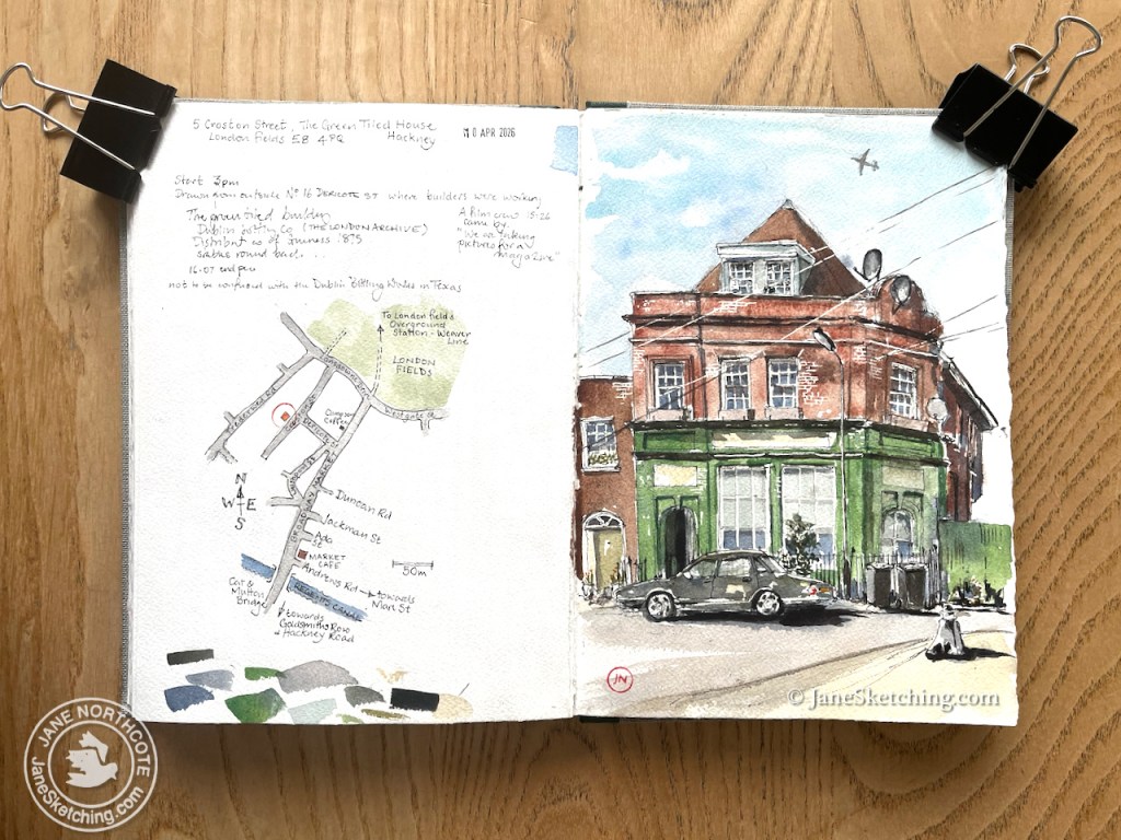
Later, I followed the stream of people towards Broadway Market. I procured coffee from Climpson Coffee and looked for a quiet place to drink it. Round a corner, down a side street, was the perfect place: a silent street, a stone step in the sun, and an interesting house to draw.
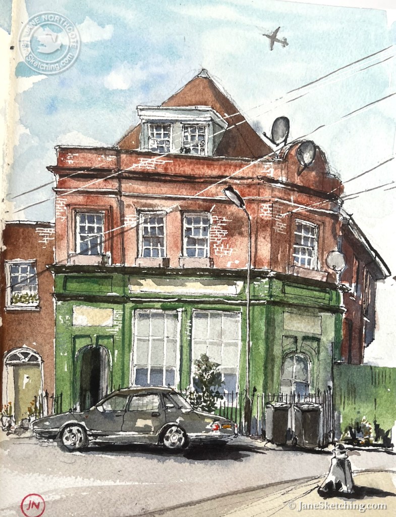
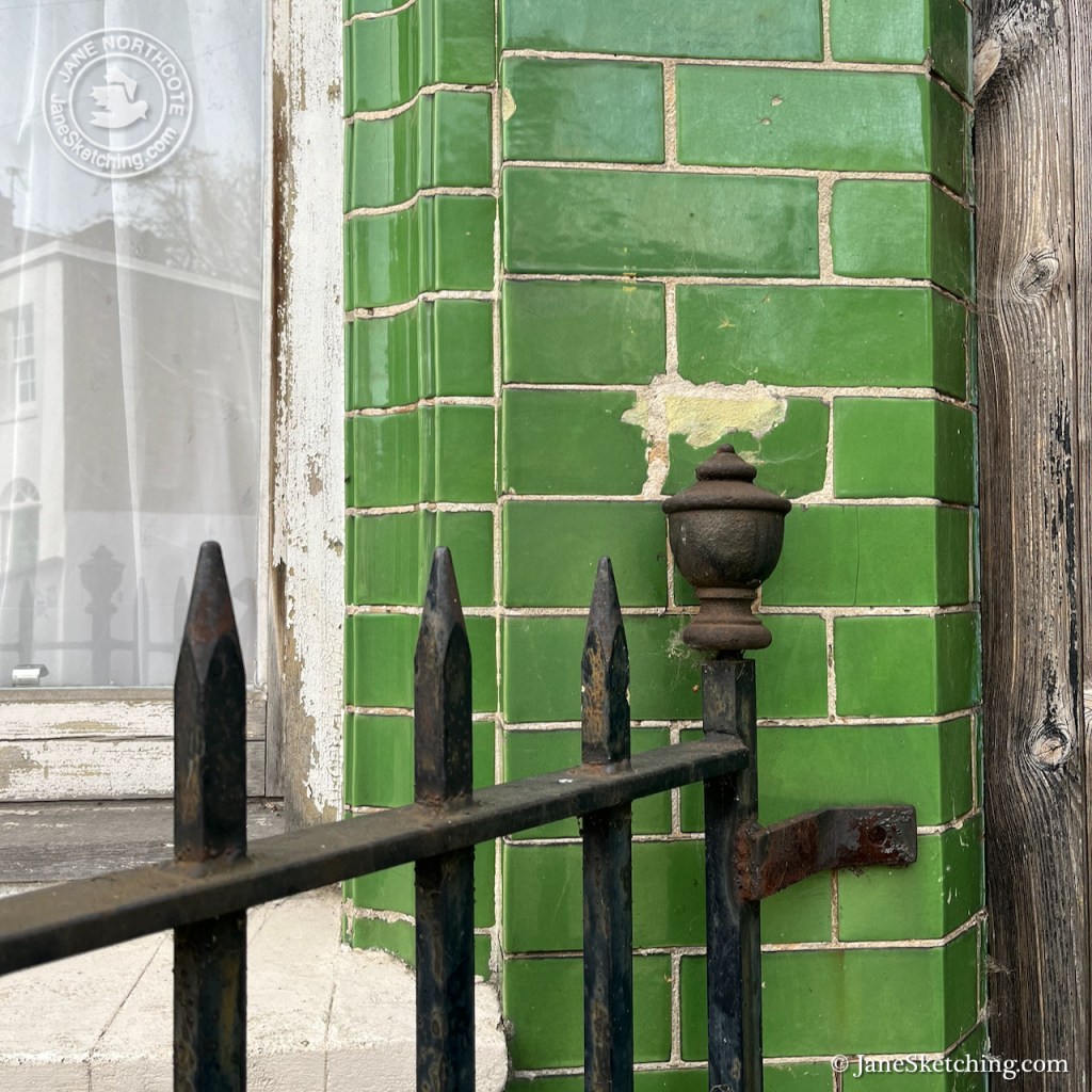
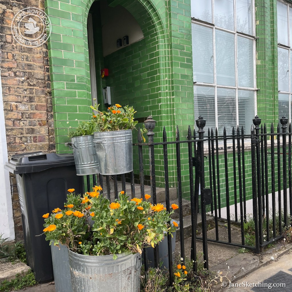
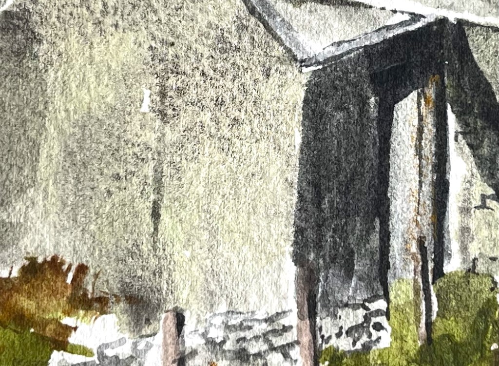
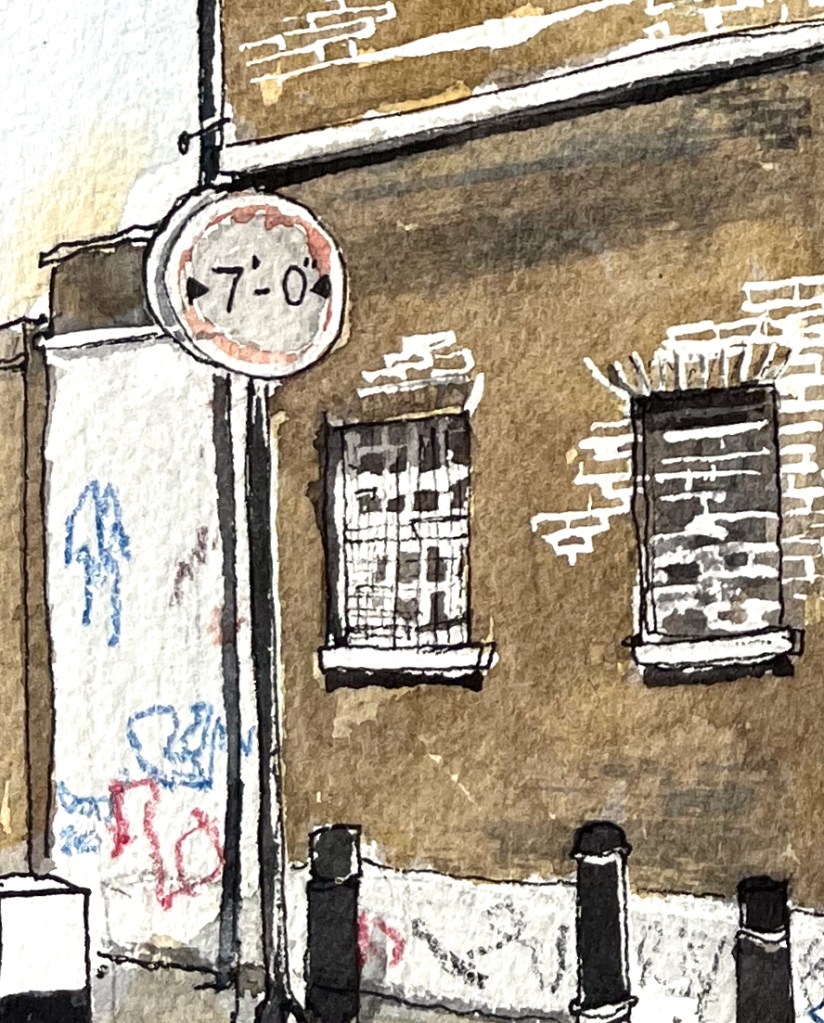
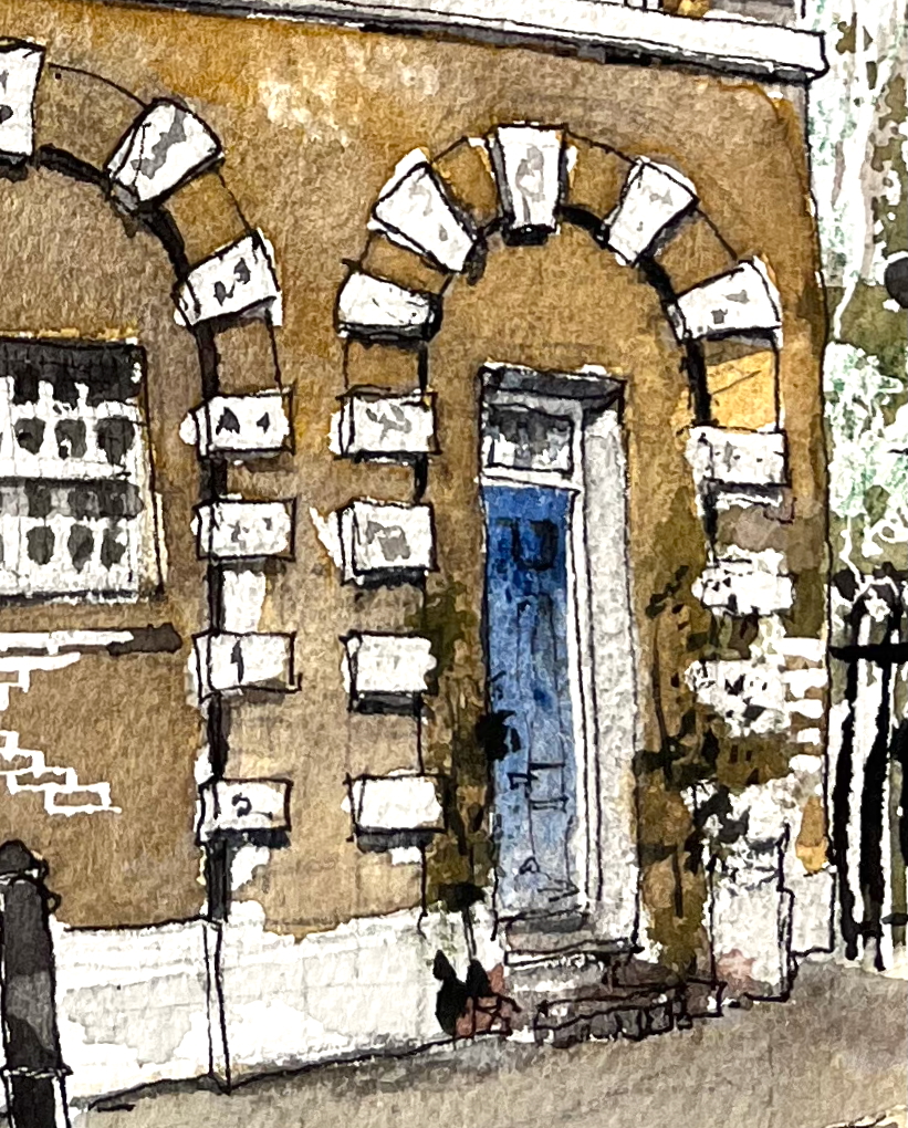
This building had clearly been something. Not a pub: the windows were too low. Pubs of that vintage were built with high windows and stained glass, so children (and others?) could not see the goings-on within1. Also, if it had been a pub, the door would have been on the corner. But the glazed green tiles spoke of a pub. It is apparently residential now. I saw three bell-pushes by the front door and there are three satellite dishes. The bars of the windows were dried up and flaking. That car outside was dented. A mystery.
I was sketching from a doorstep on Dericote Street. It was not so quiet as I had thought. Groups of people walked past. I received many encouraging comments on the picture, including from children. One passer-by asked me if I knew what the building was. I said I didn’t and asked if he knew. He didn’t know either.
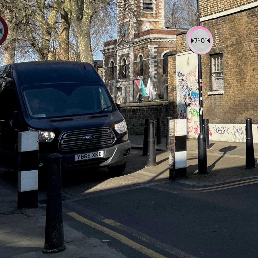
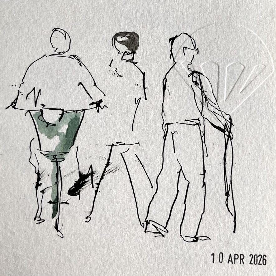
Then the house behind me, which I had thought was boarded up and empty, turned out to contain building workers, who emerged from the front door into the sunlight and all around me. I apologised for sitting on their doorstep and made to leave, but they waved away my apologies, and examined my picture with interest. They spoke a language I did not recognise. I could not decipher exactly what they were saying, but they seemed to be comparing my work with another artist they knew. A fellow building worker drove up in his van, totally blocking my view. As politely as I could, I asked him if he would please consider parking elsewhere. This suggestion was reviewed in rapid conversation with his colleagues from indoors. He leapt back into the van, put it in gear, and moved up the street.
Then the photo shoot arrived. At first I saw a man standing in the middle of the road, shifting sideways, oddly. He was staring, not at me, but round about, in a peculiarly intense manner. He went away, and I thought no more about him. London is full of people moving oddly, myself included. Five minutes later, a whole group arrived, equipped with heavy cameras and silver umbrellas. They were all young and all beautiful. The man who had been moving oddly was amongst them. They took up a position exactly in my field of view. One of the beautiful people noticed me immediately and came across to assure me that “we will only be five minutes”. I said it was a great location, which it was. He agreed, and told me they were making pictures for a magazine.
I watched while one of the beautiful men leaned meaningfully on the railing and everyone else watched and commented.
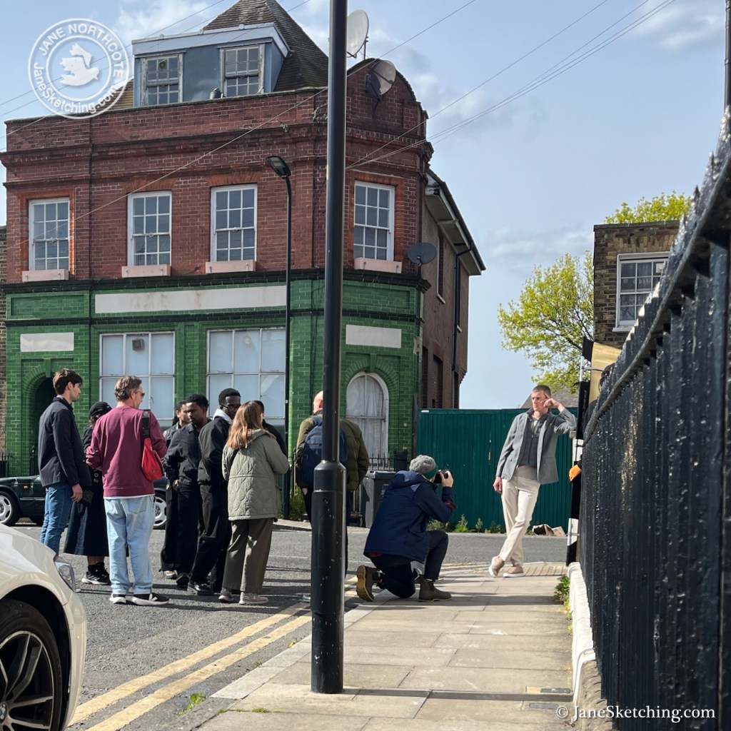
Then, after five minutes as promised, they moved off around the corner and out of sight.
I finished the pen drawing. It was getting cold.
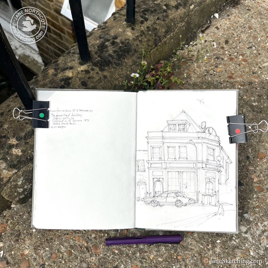
As I was packing up, the man who had approached me earlier, asking about the building, came back, walking briskly. He was flourishing his mobile phone. “It’s called ‘The Green Tiled Building’“, he told me triumphantly. Reading from his phone he continued “It was ‘The Dublin Bottling Company’, distributors of Guinness, 1875. There were stables round the back.” I wrote it all down. Having dispensed this information, he rushed off again before I could thank him. I looked around to say goodbye to the construction workers but they had gone, and the house behind me was silent.
Back at home, I finished the picture, and researched the Dublin Bottling Company2.
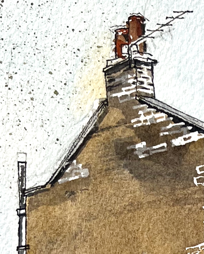
A building is shown at this position in the OS Map of 1891-5, with the same layout and plan as later maps of 5 Croston Street. At that time, Croston Street was called “Hamburg Street” and Dericote Street was “Breman Street”. A building whose roof is remarkably similar to the existing one is shown on the “RAF Aerial Map of London 1945-48”.
My researches took me to the London Archive, where I was able to trace some of the story of this building, via Planning Applications. In the marvellous “Archive Study Room” I spread out plans and saw architects’ drawings showing younger versions of the building I had sketched.3
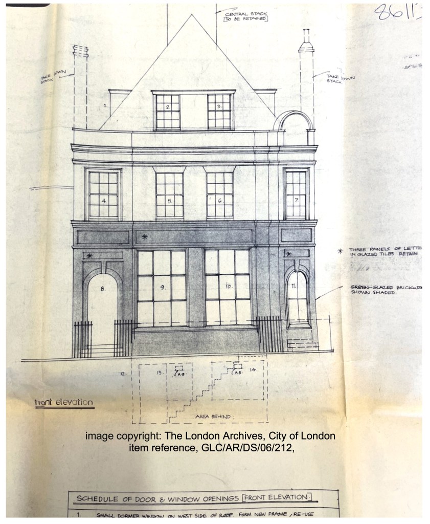
Image copyright: The London Archives, City of London, Reference: GLC/AR/DS/06/212. Reproduced under licence.
The “Dublin Bottling Company” owned the site by 1951. I know this because there was a building application dated 1951, for the proposed installation of a cold water tank, with the owner cited as the Dublin Bottling Company Ltd. By this time the address was 5 Croston Street. A plan of this date shows storage areas for Guinness, cider and “Bass” inside the building, and a big yard with sheds, accessed by a side road to the right of the building.
The Dublin Bottling Company continued to enhance its facilities. In October 1960 they paid a T Whyman and Sons £75 to “form a door through the existing brick wall from open yard store space to storage department and supply and fix rolling shutter.” Mr Wyman must have done a good job because in February the next year, for a fee of £375, he is erecting glazed partitions in the office and removing a “wrot iron gate” to fix another roller shutter.
However in 1964 they started to encounter problems. They applied to install a new steam boiler.
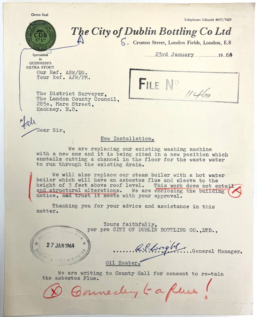
Image copyright: Guinness Archive
The proposed flue for this boiler was “asbestos cement”. The Superintending Architect at the London County Council did his homework. He told them: “It has been ascertained from the makers of the boiler (Berings, Ltd.) that the flue throat temperature is 550°-7000 F. which is 200°F. above the permitted maximum for asbestos cement.” 4
He demanded a cast iron flue. “Please re-submit your application”. I could find no such resubmitted application in the parcel of documents at the London Archive.
By 1975 they found themselves struggling to continue, as the area had been zoned for residential use, and they were not residential. They applied for:
“continued use as a depot for storage purposes and the retention of a storage shed”
However the council was reluctant.
“the building hereby permitted shall be removed at the expiration of the period ending 31st December 1976”
There were to be no vehicle repairs. They had to maintain an 8 foot fence all around the perimeter of this industrial activity.
“The proposal does not accord with the Initial Development Plan for Greater London in which the area is zoned for residential use”
commented the planning officer.
So then some change of ownership must have occurred, because in April 1978 someone, probably the Greater London Council (GLC), was submitting plans to redevelop the property into three residential flats. See the architects drawing above. This was approved on 3rd August 19785. But no redevelopment happened. There was a further application in 1983, now with a builder involved, Atristor Ltd. The planning officer at the time, like me today, wanted to find out who owned the site. In the “owner” field they wrote in red “GLC?” with a note “please try and ascertain”.
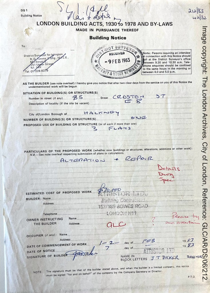
Image copyright: The London Archives, City of London, Reference: GLC/AR/DS/06/212. Reproduced under licence.
It seems that the owner was indeed the GLC, however, because in another bundle there were beautiful architectural drawings for the three flats, marked “GLC ILEA, DEPARTMENT OF ARCHITECTURE AND CIVIC DESIGN, County Hall SE1 7PB, Architect Sir Roger Walters KBE FRIBA FIStructE”.
Do we still have a “Department of Architecture and Civic Design”?
On 9th February 1983 Atristor Ltd notified the District Surveyor they were going to start work in two days. However something went wrong, because on 15th September 1983 the GLC was again submitting plans, this time for replacement of a “fire damaged roof”. They proposed to use steel beams to hold up the tiled roof. This time the work was to be done by the GLC Department of Architecture and design, Engineering Division.
At this point, the archive record stops.
I can only assume that the work to replace the fire-damaged roof went ahead, and that the conversion into flats was completed. Because here is the building, with a roof, and with three flats inside.
It’s a wonderful location, and an intriguing building. I’d love to hear from anyone who knows more about it.
- Victorian pubs have high windows and stained glass to obscure the inside from the view of children and passers-by: I can’t find a reference for this. I have always assumed it is so. If anyone can confirm – please let me know. ↩︎
- This is not the “Dublin Bottling Company” of Texas which makes drinks including “Dr. Pepper” ↩︎
- All the quotations, documents and plans I have reproduced come from London Archive document packs with this reference: GLC/AR/DS/06/212, see this link – https://search.lma.gov.uk/scripts/mwimain.dll/144/LMA_OPAC/web_detail?SESSIONSEARCH&exp=refd%20GLC/AR/DS/06/212 The documents are not online, but are available for perusal at the London Archive Study Room. The London Archive kindly gave me permission to photograph the documents and publish them here. The letter from the Dublin Bottling Company appears by kind permission of the Guinness Archive (email from Sarah Mai Kavanagh, 20 My 2026) ↩︎
- Letter in the London Archive pack GLC/AR/DS/06/212, dated 20 April 1964 from Hubert Bennet, Superintending Architect London County Council, to the Dublin Bottling Company, copied to the Hackney District Surveyor. Mr Hubert writes, “I would confirm my assistant’s telephone conversation with Mr. Wright on 19 March 1964, when the above matter was discussed and the installation of a cast iron flue pipe complying with By-law 10.05 agreed.I would be pleased to receive a reply confirming the installation of the cast iron flue pipe and the cancelling of the application at your earliest opportunity.” ↩︎
- Approved AR/BR/GB115259 3 August 1978 ↩︎