

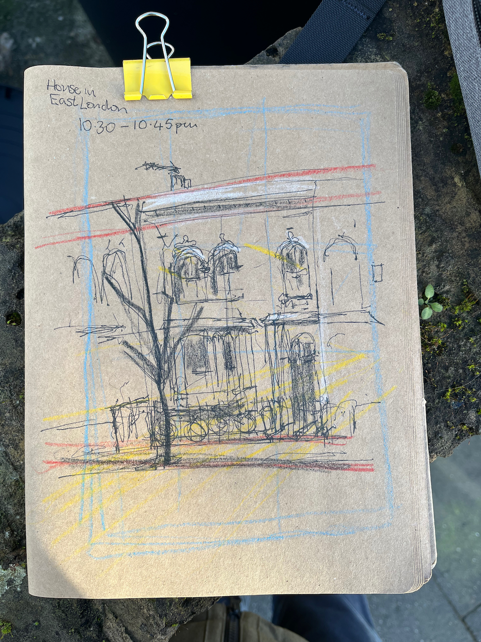
Here is a Victorian terraced house in East London.
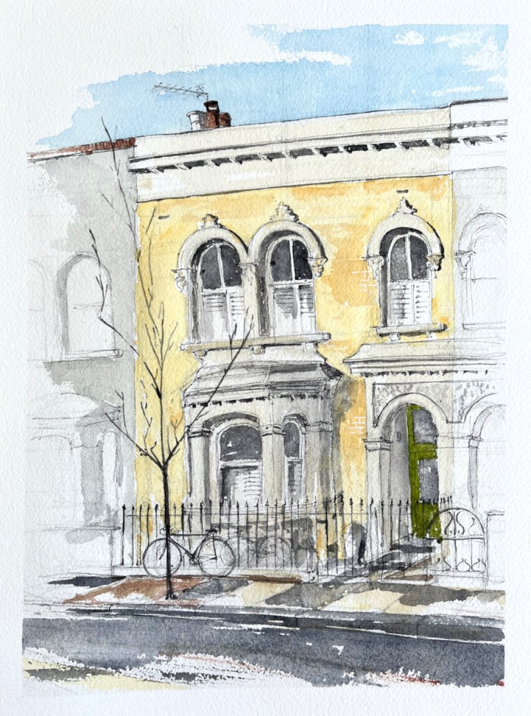
This was a commissioned drawing. Thank you to my client for the commission and for their permission to post the picture here.
There were two interesting challenges in this drawing. One was the fact that the front of the house was obscured by parked cars. The other was the characteristic colour of the brickwork: a clean and lively yellow. I wanted to draw the fence without the cars, so as to show the whole house. And I wanted to get that yellow right.
I was stationed on the other side of the road. There were cars parked nose-to-tail on both sides of the road. To draw the part behind the parked cars, I crossed the road and had a look then come back and sketched and then wandered about sketching and trying to get it right, gradually becoming skilled at envisaging the fence behind the car. Fortunately it was a quiet road. The few passers-by took a friendly interest, bemused by an itinerant artist in their street.
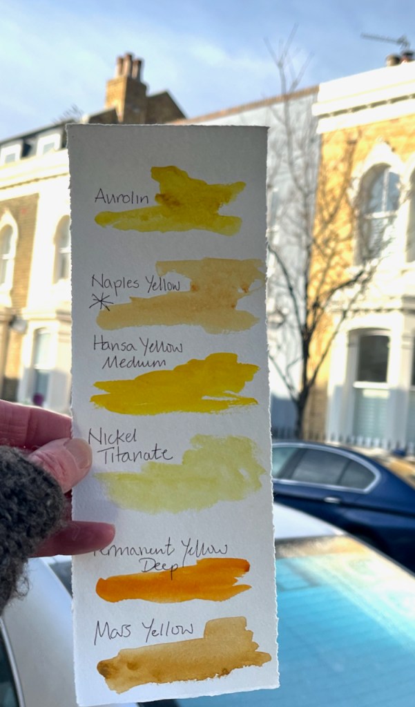
To match the colour of the brickwork, I equipped myself with a colour chart of all the yellows I possess. Usually, old London brickwork is Mars Yellow. But in this case I discovered that it was Naples Yellow, a cleaner, paler colour, less orange than Mars Yellow, more orange than Nickel Titanate Yellow. Naples Yellow also has a pleasant chalky texture, which made it perfect for this brickwork .
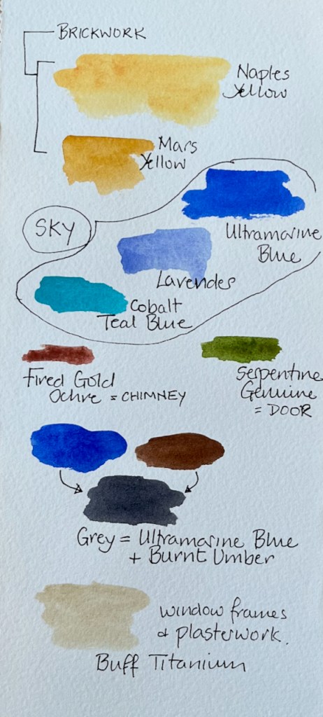
Most of this picture was painted in 3 basic colours: Ultramarine Blue, Naples Yellow and Burnt Umber. Here are the detailed colours, all Daniel Smith:
- Sky: Mostly Ultramarine Blue, plus some Lavender and Cobalt Teal Blue
- Brickwork: Mostly Naples Yellow plus a bit of Mars Yellow in the darker places
- Window surrounds and plasterwork: Buff Titanium (very dilute)
- Green door: Serpentine Genuine
- Terracotta chimney pots: Fired Gold Ochre
- All greys and shadows: a mix of Burnt Umber and Ultramarine Blue.
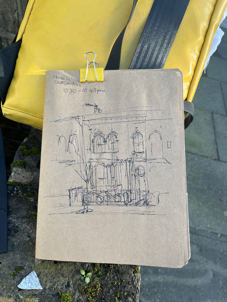
The paper is Arches Aquarelle 300gsm Cold Pressed in a block. The ink is De Atramentis Document Black, applied with a fountain pen.
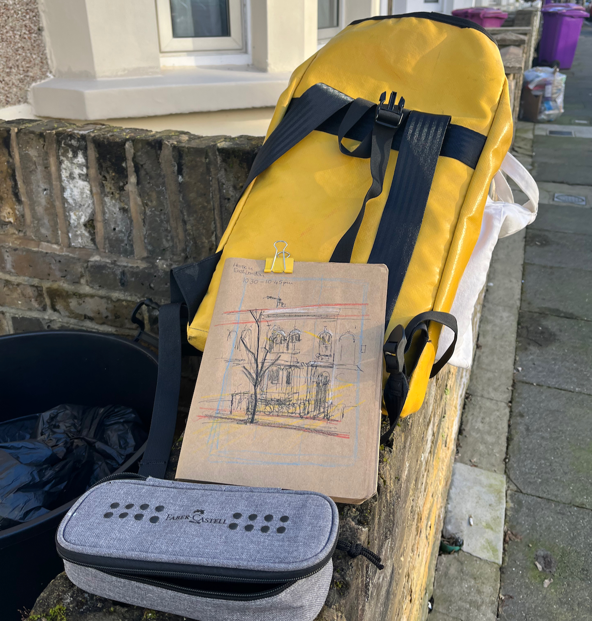
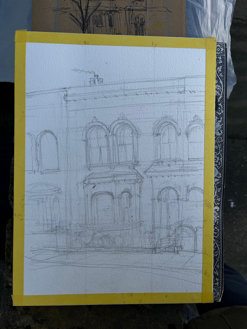
I did a preliminary sketch to understand the perspective and the proportions. Here are some images of work in progress. This was January and very cold. I managed to complete the pen and ink on location and then added the colour at my desk in the warm when I returned home.


Reblogged this on penwithlit and commented:
Thanks for the technical details relating to the colours. Does the currently low angle sun have an effect on the colour/tone perceived?
LikeLiked by 1 person
Yes I think so. Especially when the evening sun is on reddish brickwork, it brings out the oranges and browns.
I drew this house in the morning, so the light wasn’t as red as it has been in recent evenings.
The house had been restored and pebbledash had been removed from the brickwork. So I think we are seeing the original colour of the Victorian bricks, rather than the darker colour of bricks which have been exposed to London air for over 100 years. That’s my explanation why these bricks were this lovely colour, paler and clearer than I have have seen before when painting London brickwork.
Thanks for the reblog.
LikeLiked by 1 person
This is really full of character- I love it!!
LikeLiked by 1 person
Thank you Sue! It is a lovely house, and much loved, I think. Every house in that road was different.
LikeLike
My nephew has recently moved into a similar house in Leytonstone. I would love to commission a water-colour of his house, but will will need to wait till he gets it as he wants it !!
LikeLiked by 1 person
I’d be glad to do it. Please get in touch when you’d like me to have a go.
LikeLike
I will certainly do that!😺
LikeLiked by 1 person