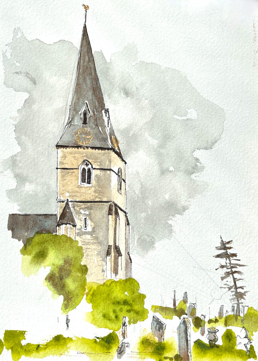
Christ Church Esher stands on the top of a hill, near the intersection of roads that marks Esher town centre.
Christ Church, Church Street, Esher, Surrey, KT10 8 QS. Sketched 28 May 2024, in Sketchbook 14
The church has a “splayed foot” spire.
SPLAYED-FOOT: variation of the broach form, found in England principally in the south-east, in which the four cardinal faces are splayed out near their bases, to cover the corners, while oblique (or intermediate) faces taper away to a point.
BROACH: starting from a square base, then carried into an octagonal section by means of triangular faces.
– Pevsner’s Architectural Glossary, page 116, under “SPIRE”
This simple and elegant geometry turned out to be rather tricky to draw. I worked hard to get the shape of the spire correct.
Sketching the spire of Christ Church
The church was built in 1853-1854 to the design of Benjamin Ferrey (1810-1880) according to its Historic England listing entry. Ferrey studied under A.W.N. Pugin1, and like Pugin, designed in the style known as “Gothic Revival”. Christ Church was built because the growing congregation could no longer be housed in the smaller St George’s, a little way down the hill.
I sketched the church on location and added the colour later. The colours are:
Mars Yellow
Green Gold
Phthalo Blue Turquoise
I used just three colours, all Daniel Smith. I used gold paint for the clock. The clock is on the roof of the spire, which is remarkable. Usually the clock is on the tower, below the spire. So I wanted to put it in and show its unusual location.
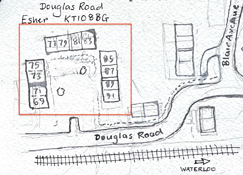
Here is a sketch map of the area.
See this post for my sketch of St George’s, this post for the Tin Tabernacle in West End Esher, and this post for sketches of the council housing in Lower Green.
1A.W.N. Pugin designed, amongst other things, the inside of the Houses of Parliament: https://heritagecollections.parliament.uk/stories/the-architects-barry-pugin-and-scott/. The Houses of Parliament are a classic example of Gothic Revival Style. The Houses of Parliament were designed by a team consisting of Charles Barry, A.W.N. Pugin and later Giles Gilbert Scott.
Click a button below to share this post online, email it, or print it:
Esher is an area of Greater London, half an hour’s train ride from Waterloo. It is a place of diverse architecture: magnificent Arts-and-Crafts villas, modernist mansions, and a row of “stockbroker Tudor” houses.
Stockbroker Tudor houses, Esher.
On the other side of the railway tracks, in the low ground near the industrial estate and the waterworks, there is a council estate. This is “Lower Green”. It was built towards the end of the 1940s. This was an era of visionary town planning and utopian ideals, eloquently described in the book “Municipal Dreams” by John Boughton, Chapter 3. On page 66 Boughton quotes the town planner Patrick Abercrombie who sought a plan for Plymouth
“which allows for a higher standard of living well within our grasp, with its call for space and beauty rather than for mere economy”
J. Paton Watson and P. Abercrombie “A Plan for Plymouth” 1943.
The new towns were built around this time, including Stevenage, Crawley, Hemel Hempstead, Harlow, Welwyn Garden City, and Hatfield. Lower Green has many characteristics of those new towns: two storey “cottage style” houses with a front garden and a back garden, arranged behind wide verges, with trees and plenty of green space. The houses were designed by the architect George Blair Imrie (1885–1952), for Esher Urban District Council.
Round symbol on the houses: E for Esher, “UDC” = Urban District Council. Esher is now under “Elmbridge Borough Council”. See the interesting texture of the bricks.
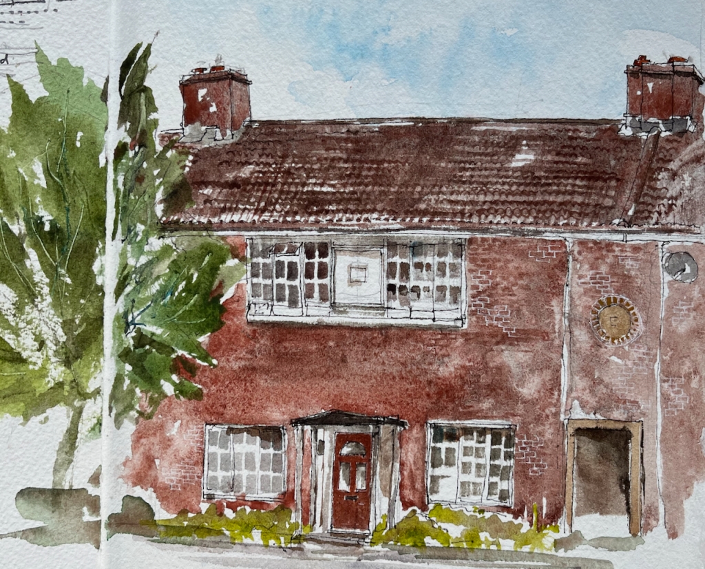
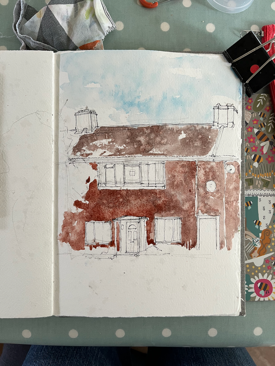
My watercolours show houses on Douglas Road, Lower Green. Here, the land was acquired by the council in 1949. It was a compulsory purchase under the 1936 Housing Act. The vendor was the farmer, Sydney Edward Parkes. I have this detailed information thanks to an owner and resident of one of the houses, who kindly showed me their title deeds.
Here is the basic design of the houses.
A house in Douglas Road, Lower Green, Esher, KT10. Watercolour and ink, Sketchbook 14
The geometry is perfect: the side edges of the upper windows are aligned with the centres of the lower windows. The upper edges of the lower windows, the door lintel and the passage are all in a neat line.
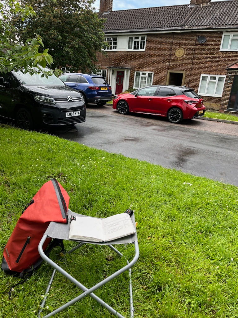
What you can’t see in my painting is that this house stands behind a wide verge and trees, which separate it from the road.
Painting location for the picture above.
There is a passage through the terrace of houses, on the right in my picture. This passage takes you through to “the back” where you can store your bicycle, and your dustbins.
Another feature of the estate is the arrangement of houses round a square.
Here is a painting of some of the houses round the corner of a square: numbers 69 to 77 (odd numbers) Douglas Road:
69-77 (odd numbers) Douglas Road, Esher. Watercolour and ink, in Sketchbook 14Painting of odd numbers 69-77 Douglas Road Esher, seen across the huge green public space.
There are three such squares, all large green spaces. It’s one of the “patterns” in this estate, to use the concept described by Christopher Alexander, in the 1977 book “A Pattern Language”.
“A Pattern Language” by Christopher Alexander and others (1977), page 304, Pattern number 60 “Accessible Green”
I didn’t see anyone using the green space. But this was a Tuesday afternoon, in term time, and it was raining. Perhaps they were enjoying looking out across it from their windows. If they were, they were probably wondering what the strange woman was doing, sitting there on a metal camping stool under the tree, staring at their house.
This estate was originally intended as rental accommodation. It was owned by Esher Urban District Council and residents paid rent to the council. Nowadays, some of these former council houses are in private freehold ownership, having been sold under the “right to buy” scheme. There are also a lot more cars. The estate was built at a time when most people did not not own cars. The houses do not have garages.
The architect, George Blair Imrie, designed many houses in the area. His wikipedia page lists the large houses he designed for the wealthy. His work on the council housing estate of Lower Green is also remarkable, and not mentioned. So I am glad of the opportunity to draw attention to it here.
I drew these pictures between rainstorms, finally completing them under a borrowed umbrella.
Rain on the watercoloursRain on the page: the Arches paper holds up well and doesn’t crinkleInteresting colour effects due to a fine rain showerSketchbook 14, page spreadSketchbook 14, page spread
Blair Imrie’s work, including his work on Lower Green, is mentioned the 100th newsletter of the The Esher Residents Association, January 2020. See pages 4 and 5:
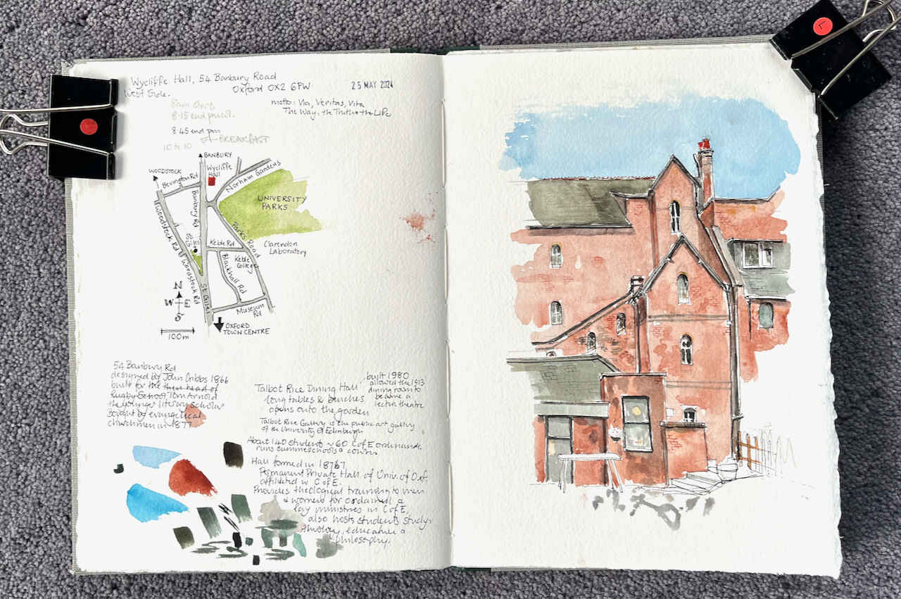
Wycliffe Hall is a “permanent private hall” in the University of Oxford. A permanent private hall is like a college, in that it provides accommodation and tuition for its students. The difference is that a college is governed by its Master and Fellows, whereas the Hall is governed, at least in part, by the Church of England. It is an Anglican theological college, offering courses in philosophy and theology, and preparing people for ordination into the Church of England. John Wycliffe was a 14th century Bible translator, scholar and churchman.
I stayed there as a bed-and-breakfast guest, and sketched this picture from a bench beneath the branches of the plane tree in the gardens. Breakfast is served in the Talbot Rice Dining Room, shown on the bottom left of the picture. I was waiting for it to open.
Wycliffe Hall, West side, 09:40. In Sketchbook 14, 25 May 2024.
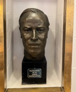
Sculpture portrait of Mervyn Gurney Talbot-Rice, in the dining room at Wycliffe Hall (Photo: Feb 2025)
When they say “friend of Wycliffe”, they must mean a friend of the the Hall, as John Wycliffe died 600 years ago. The Talbot Rice art gallery in Edinburgh is named after David Talbot Rice, one of Mervyn’s sons.
The breakfast room opened, and I took my place at one of the long tables. Behind me, three, or possibly four, men were already engaged in a serious conversation about Middle Eastern politics. Judging by the various accents, at least one of them was American. They took different points of view, and argued from personal experience, with courtesy. At another table, a group of young men and women were working out complicated logistics to do with rowing. Who was to be cox? Who was rowing? When? Where? Another man engaged the member of staff in a lively conversation on management techniques prevalent in a particular football team and how this may or may not affect their chances.
Between them all, I finished my porridge and headed back out to the plane tree to continue my picture.
I’ve sketched at Wycliffe Hall before. Click the image below to go to the post.
Wycliffe Hall Chapel
*The link to the Bulletin is here. Or if that doesn’t work, the pdf is below. The history of Wycliffe Hall starts on page 19.
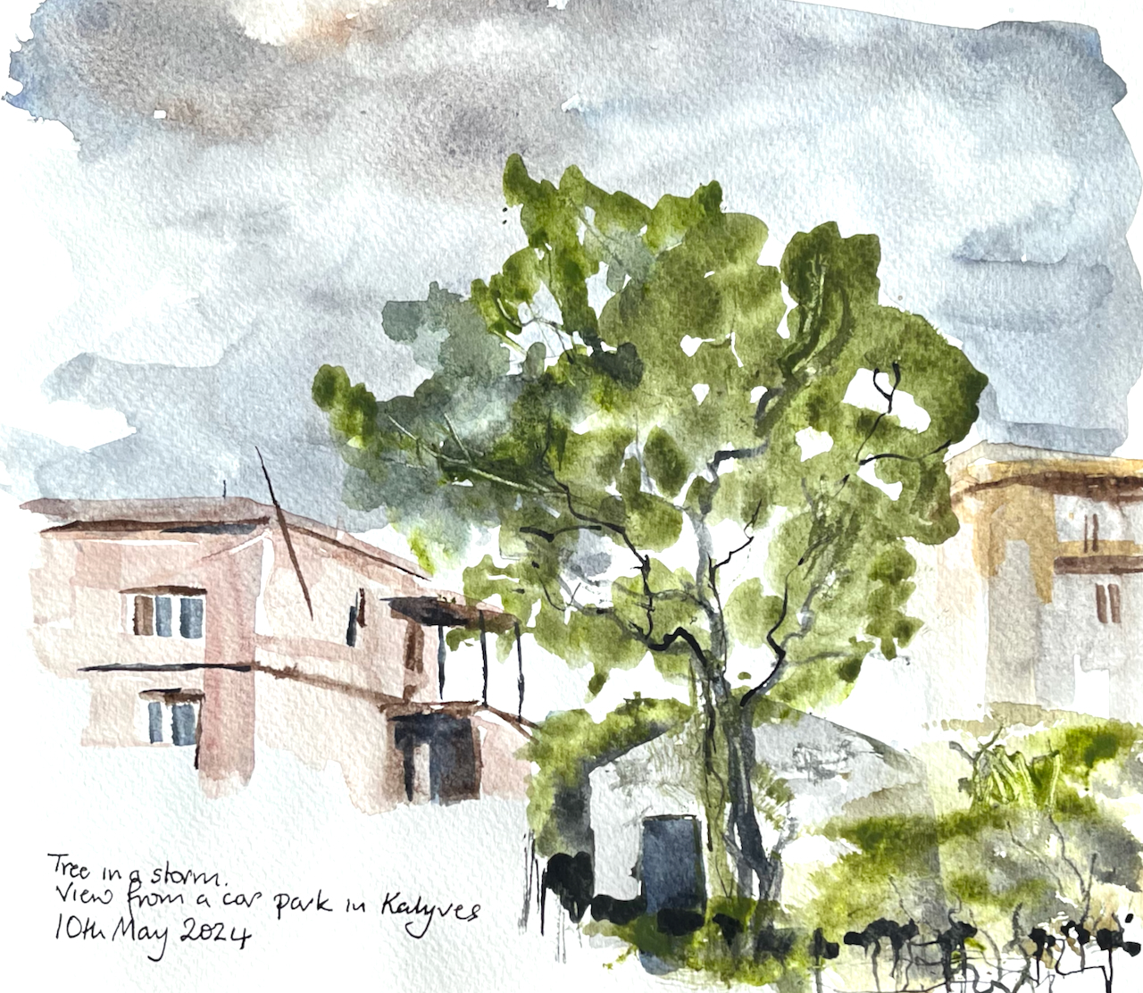
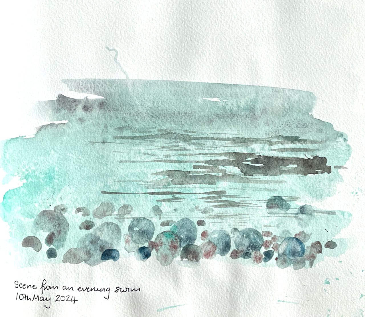
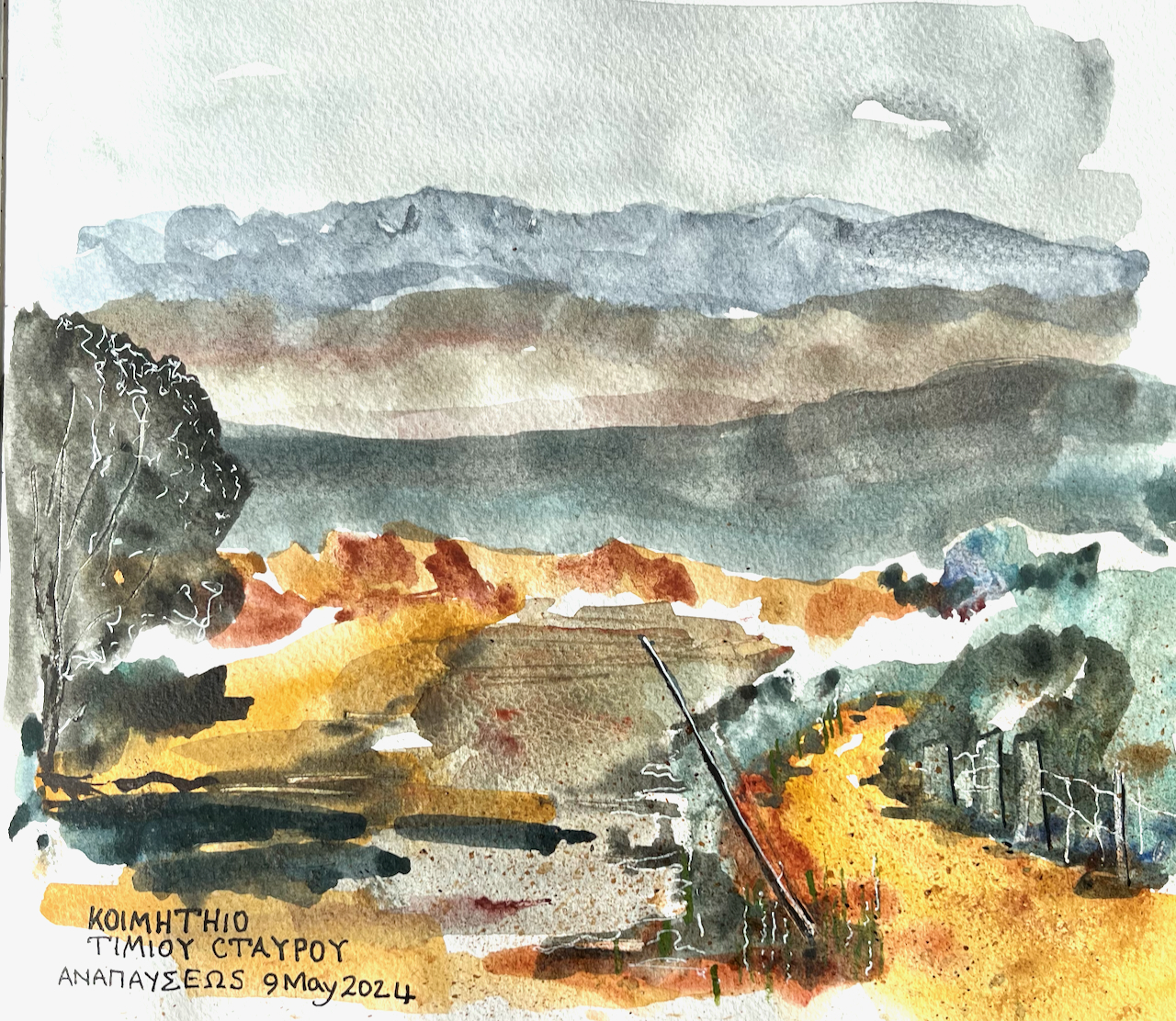
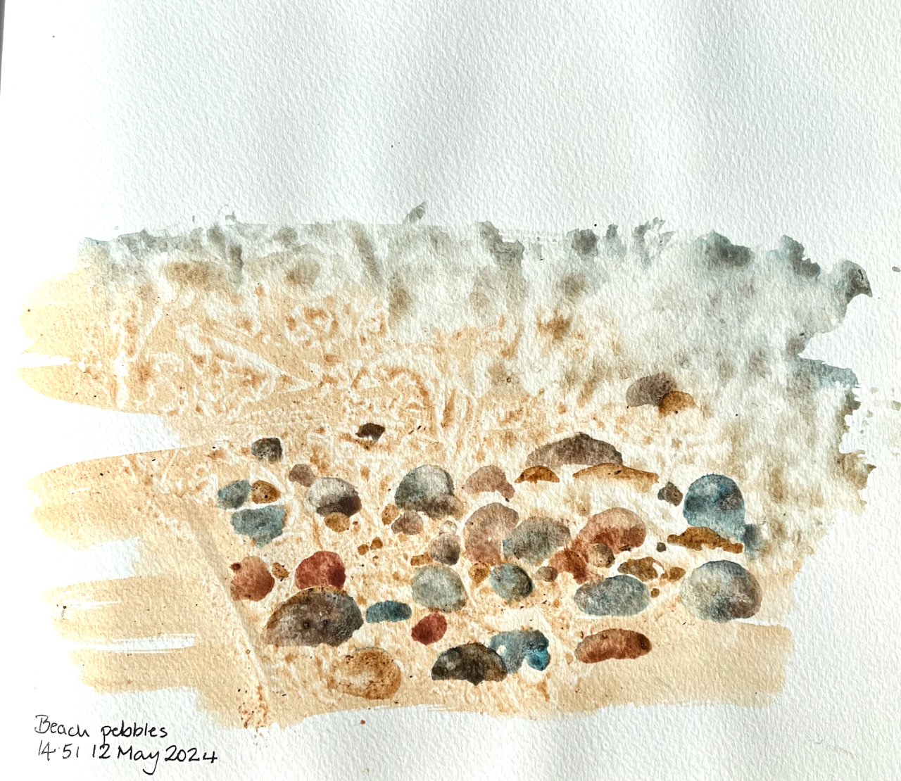
Here are a selection of sketches made in Crete. The sketchbook is Jackson’s Art Supplies’ own brand, 160gsm watercolour paper, cotton blend, about 8″ x 9″.
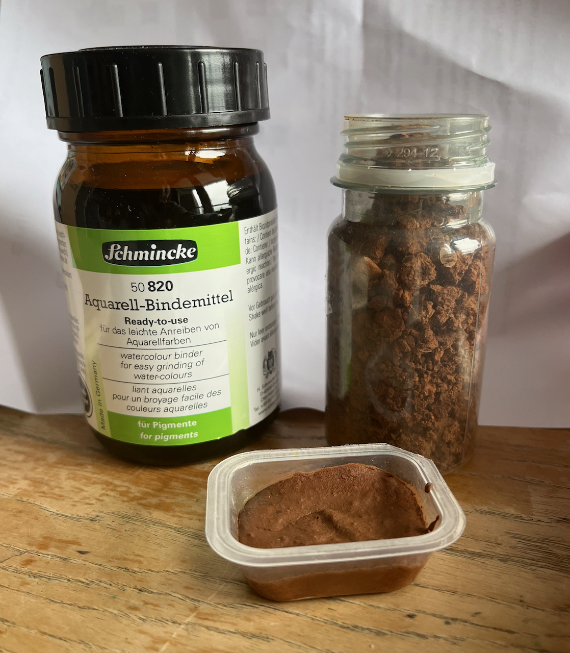
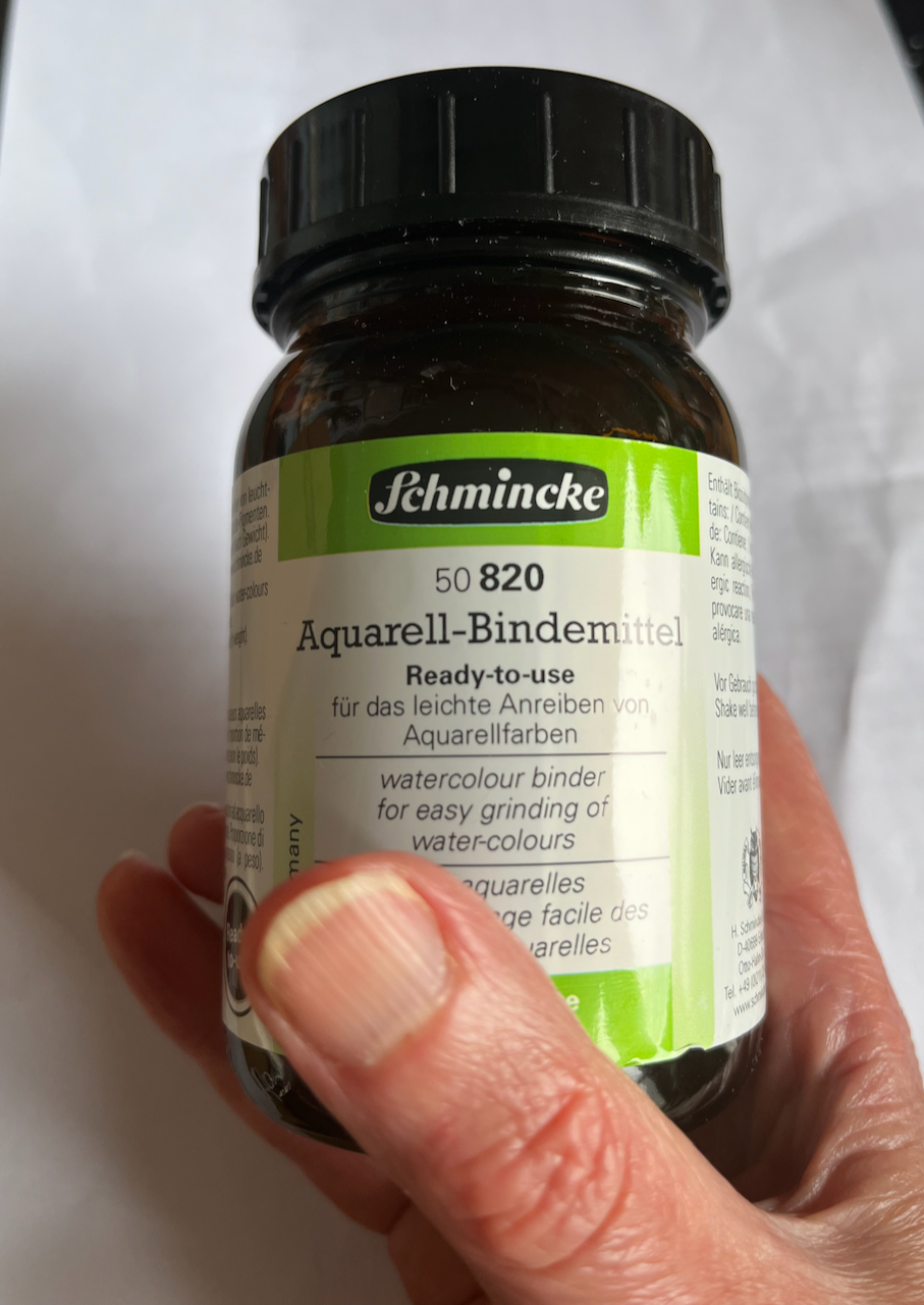
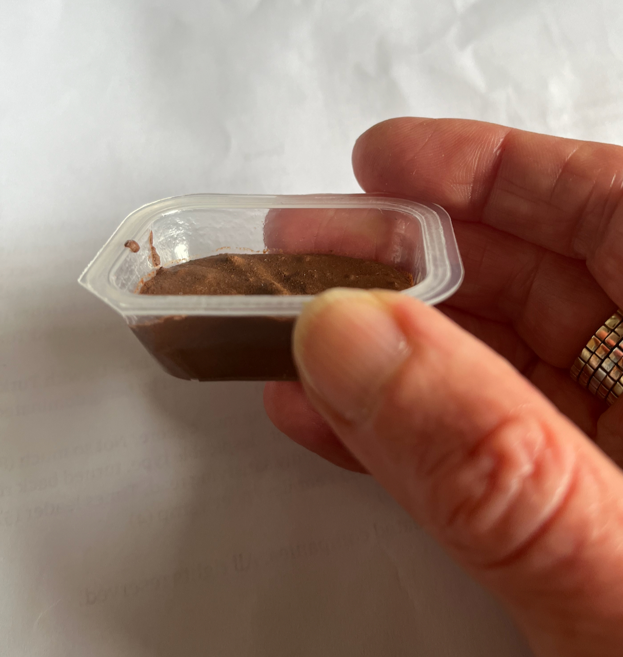
I used some of the local earth as pigment, to make a watercolour, using Schmincke watercolour binder.
Binder + earth = watercolourBinderWatercolour
I ground the earth using a stone, breaking it up to make a powder like talcum powder. It still had bits in, but I managed to separate it by shaking, and scooped most of the bits off the top with a teaspoon. Then add an equal quantity, by volume, of the binder, and scoop into a suitable receptacle. It can be used immediately: it has the consistency of paint from a tube. Or. leave it to dry, then it’s like a watercolour pan. The “suitable receptacle” here is an empty butter portion container.
Home-made watercolour pan.
The watercolour works amazing well. It is a rich red-brown colour. Ideal for painting the surrounding scenery.
Painting with home-made watercolour
You can see it, for example, in this picture:
Here is a flick through the sketchbook:
Crete sketchbook flick-through
Click a button below to share this post online, email it, or print it:
Sometimes I go out and find a view for my sketch. Sometimes the view is determined simply by where I find myself. Here is one of those occasions.
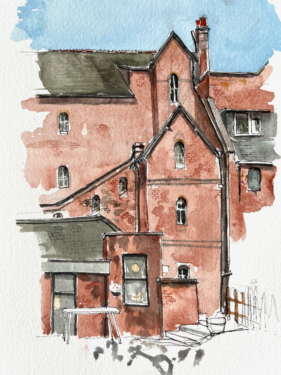
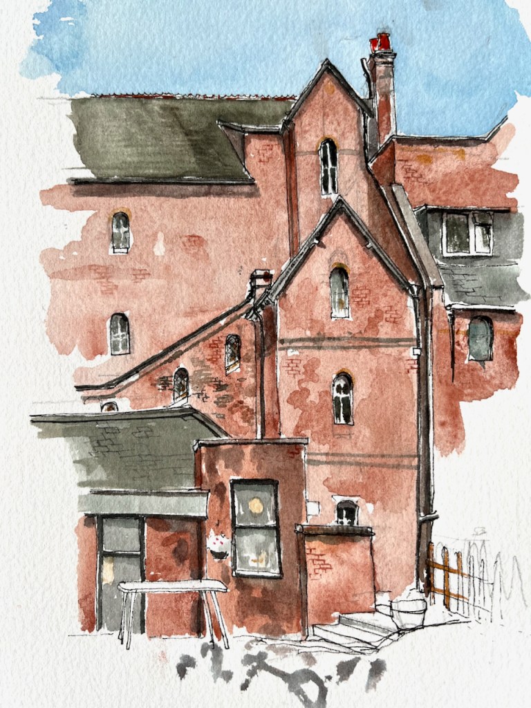
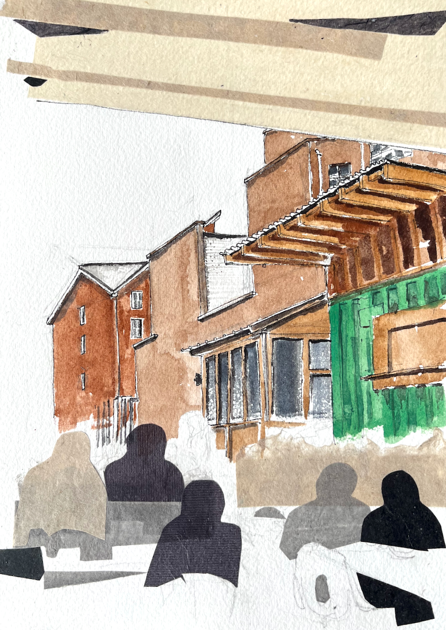
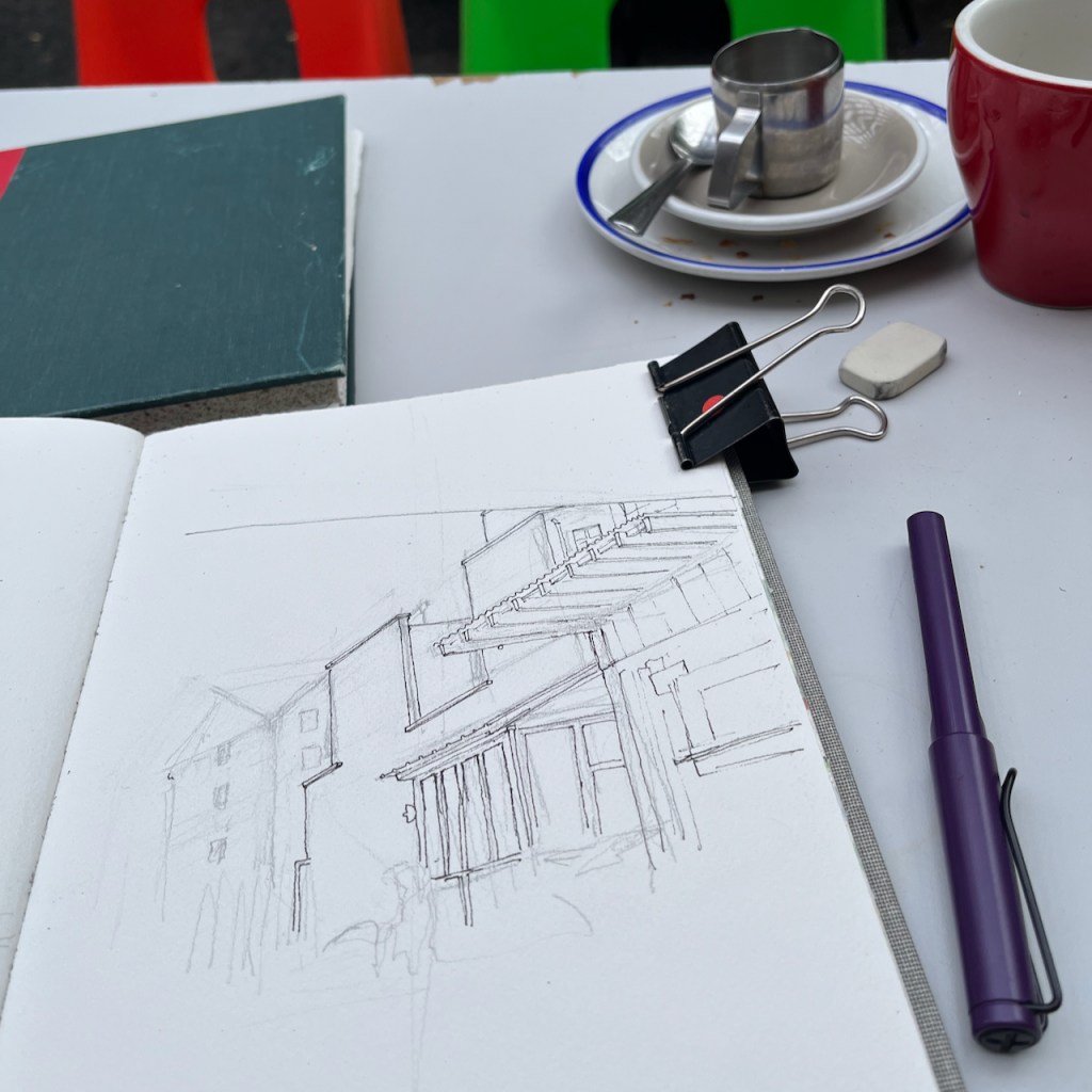
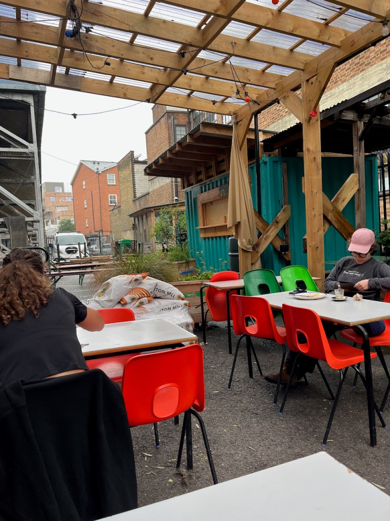
I had breakfast in the seating area at the back of E5 Bakehouse. At 09:15 I was the only person out there. I looked at the view. The various roofs made interesting angles. The cyclist who delivers their bread arrived and loaded up his formidable cargo bike. Customers arrived, and came outdoors. The tables filled up, each new arrival nodding a greeting to those of us already there. People made room for each other. It was quiet, no background music, perfect. I went back to the counter and bought another Gilchester bun. Time to do a sketch.
Sketching at E5 BakehouseThe view from my table
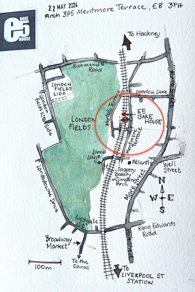
E5 Bakehouse is not in E5 but in E8, right next to London Fields Overground Station, on the line out of Liverpool Street. Their website says
“The name E5 is a nod to our former local postcode and our intention to remain rooted in our community.”
They produce wonderful bread and pastries. My fellow customers were enjoying substantial breakfasts of eggs and all sorts of greens, or a kind of piled up yogurt and fruit dish. My favourite is the Gilchester bun: the archetypal currant bun – “Made using Gilchester’s organic flour , these are so simple and so tasty you can eat them on their own, or toasted even just with butter is all you need!”
A colleague of mine once told me that the way he judged a hotel was to ask for a glass of orange juice. The orange juice told him all he needed to know, he asserted. Was it fresh pressed, or out of a bottle? Was it served in a glass or a paper cup? Did they provide a spoon to stir up the bits?
For me, a currant bun is the test of a bakery. Those at E5 set the standard for currant buns the world over. The currants are numerous, the bread is soft and all the sweetness is from the currants. They are just superb. So that’s why I needed another one.
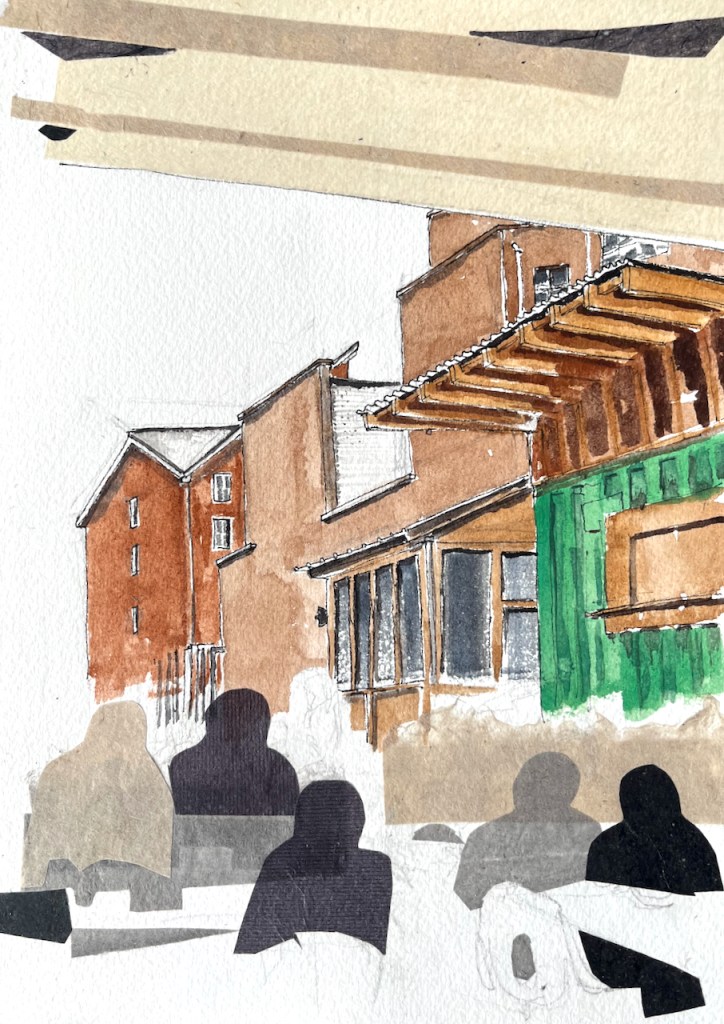
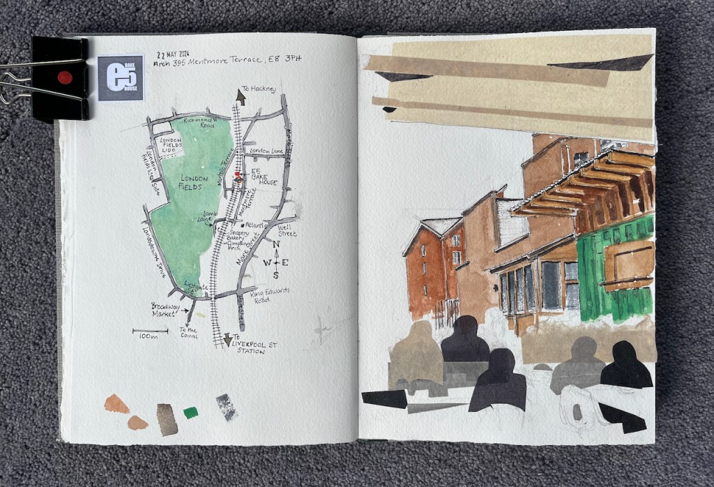
Here’s the finished picture. I added the collage at my desk at home.
Breakfast at E5 Bakehouse, watercolour and collage, 10″ x 7″ in sketchbook 14.Page spread: sketchbook 14
Click a button below to share this post online, email it, or print it:
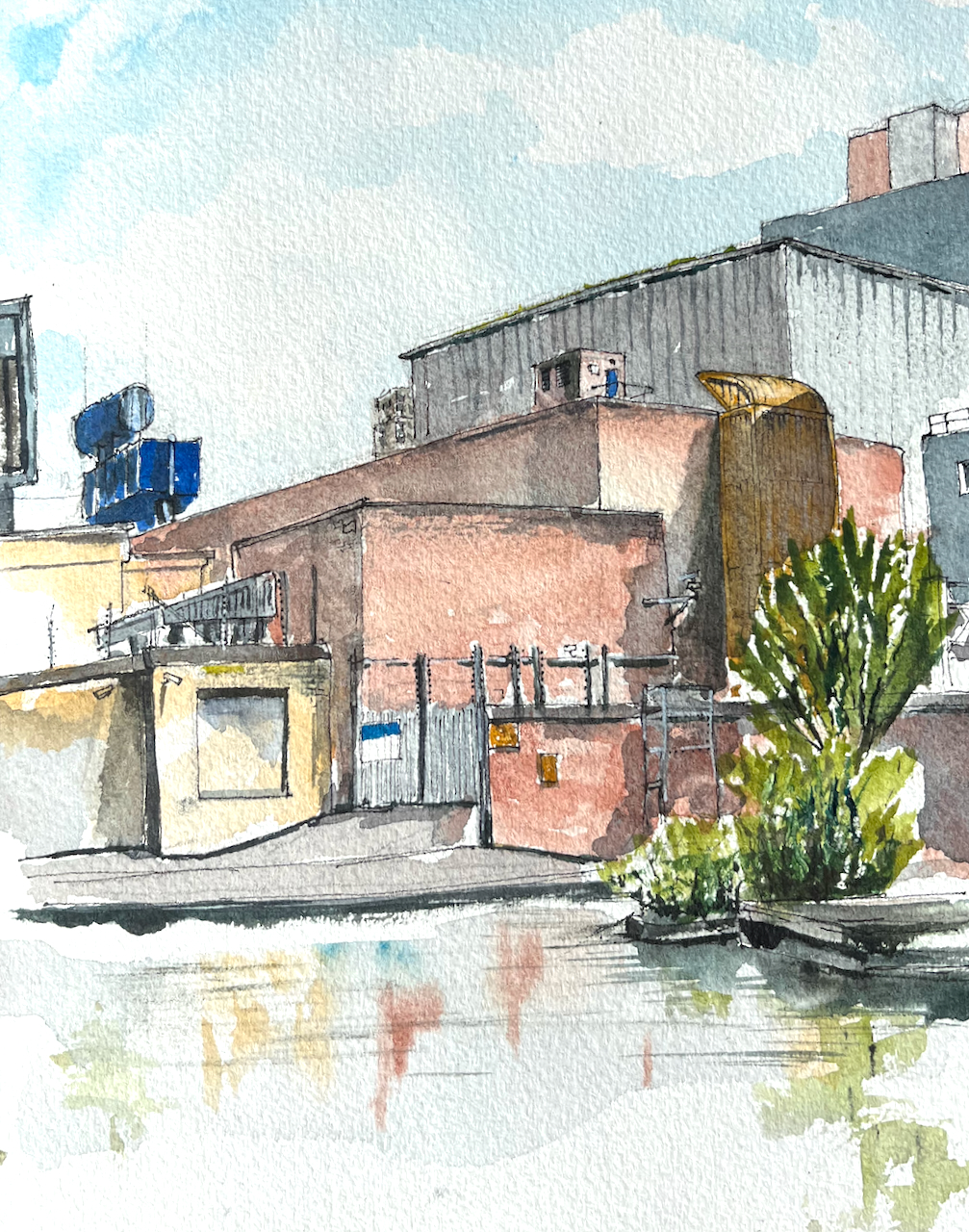
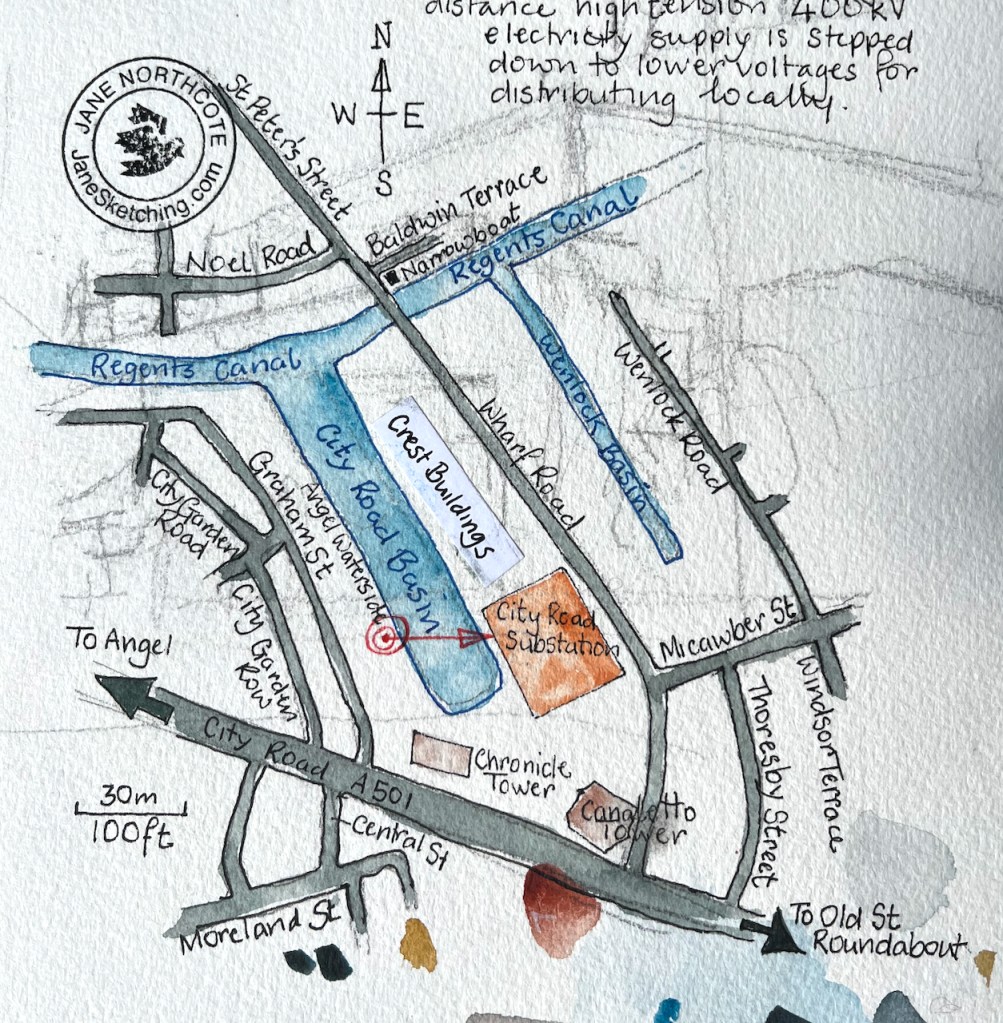
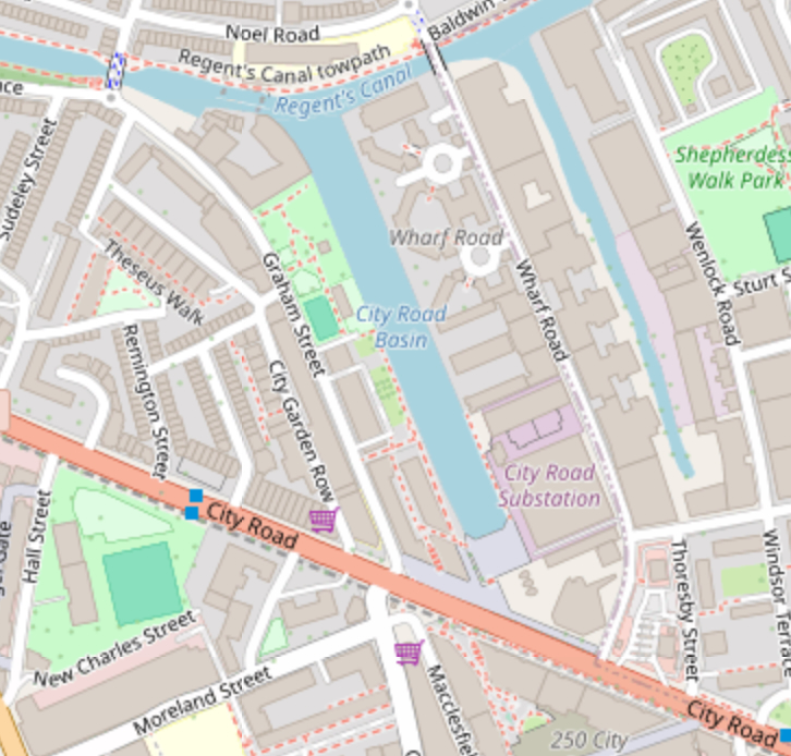
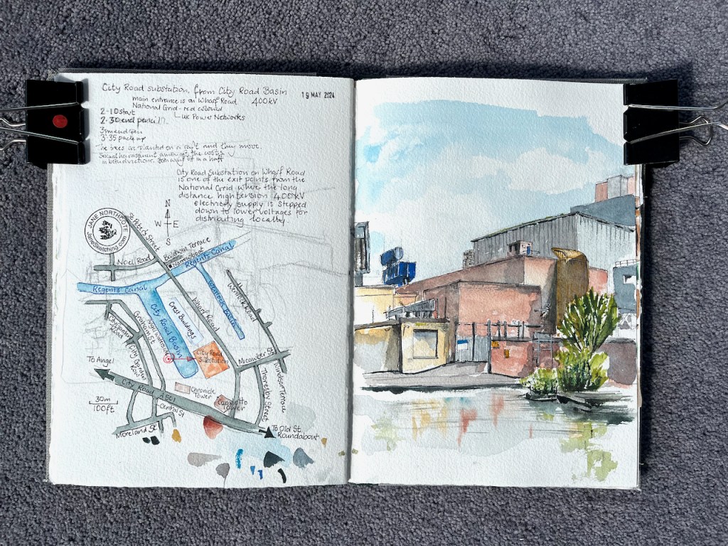
Here is a view of the City Road 400kV Substation, sketched from the other side of City Basin.
City Road 400kV Substation from “Angel Waterside” City Basin, 19th May 2024 in sketchbook 14
This is a monumentally large building, a last remaining representative of heavy industry, in an area now mainly residential. All around are the new tower blocks containing luxury apartments, made of shapes and designs aiming for visual appeal. Chronicle Tower and Canaletto Tower are just off the picture to the right. The sub-station is robustly functional. I enjoyed its forthright no-nonsense appearance.
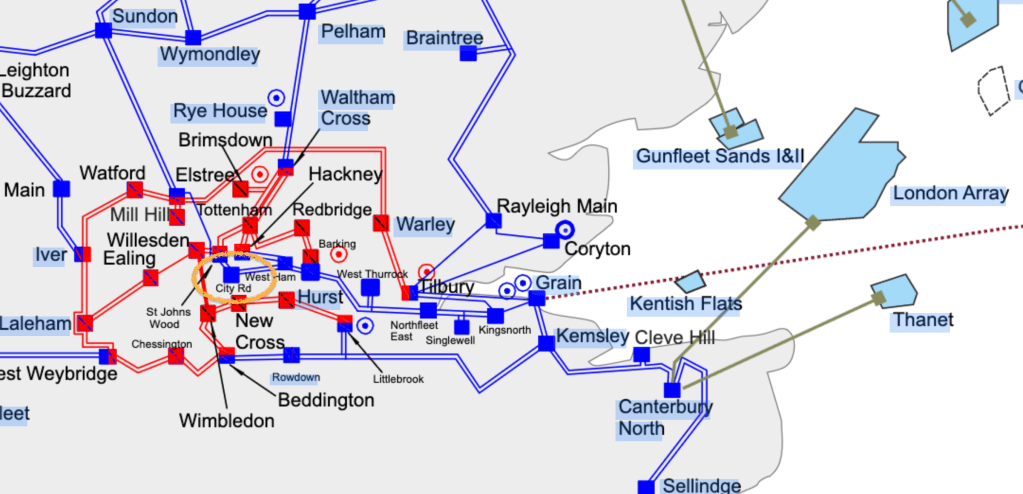
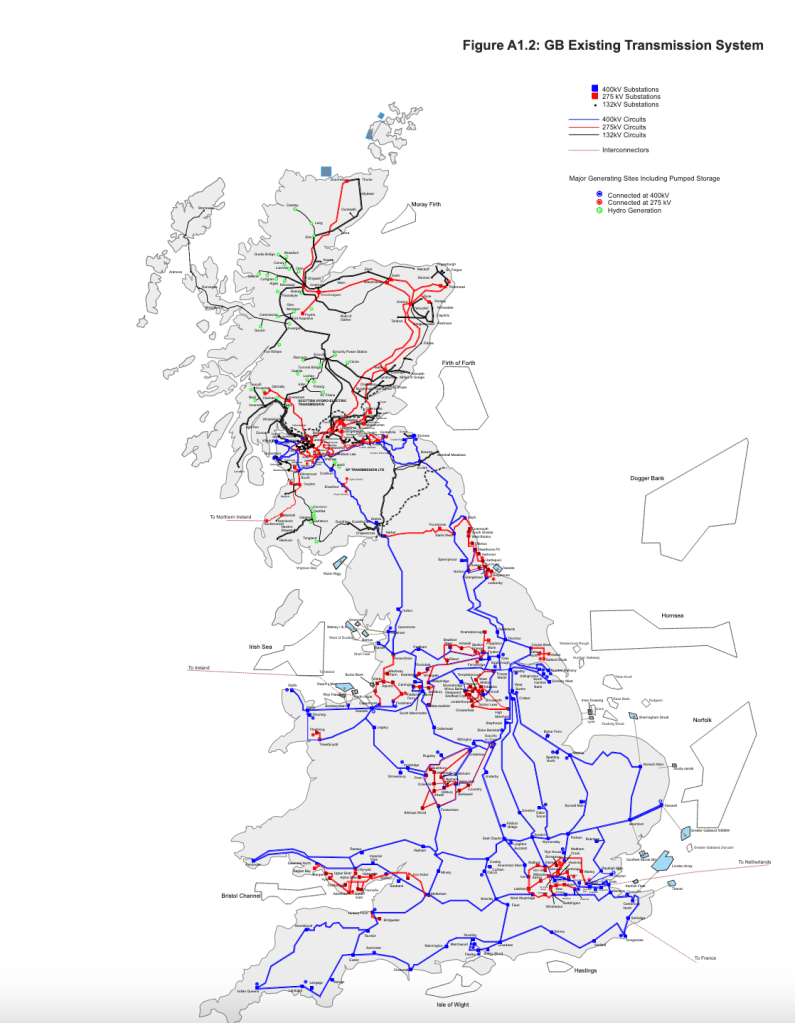
It’s built like a fortress, as well it should be. It is part of the UK power distribution system, connecting us in London to, amongst other power sources, the off-shore windfarms in the North Sea, an interconnector off across to Europe, and power stations on the Isle of Grain.
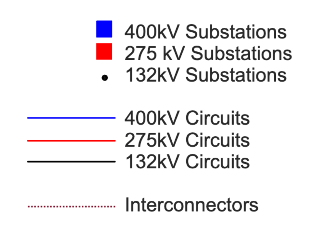
These diagrams come from a National Grid document on this link. The document is “Electricity Ten Year Statement 2012, Appendix A1”. It’s over 12 years old so there may be different connections now.
Despite the uncompromising appearance of the substation, the edge of its higher roof was softened with a subtle fringe of grass. I don’t know if this was a deliberate attempt at a “green roof” or if the grass planted itself there of its own volition.
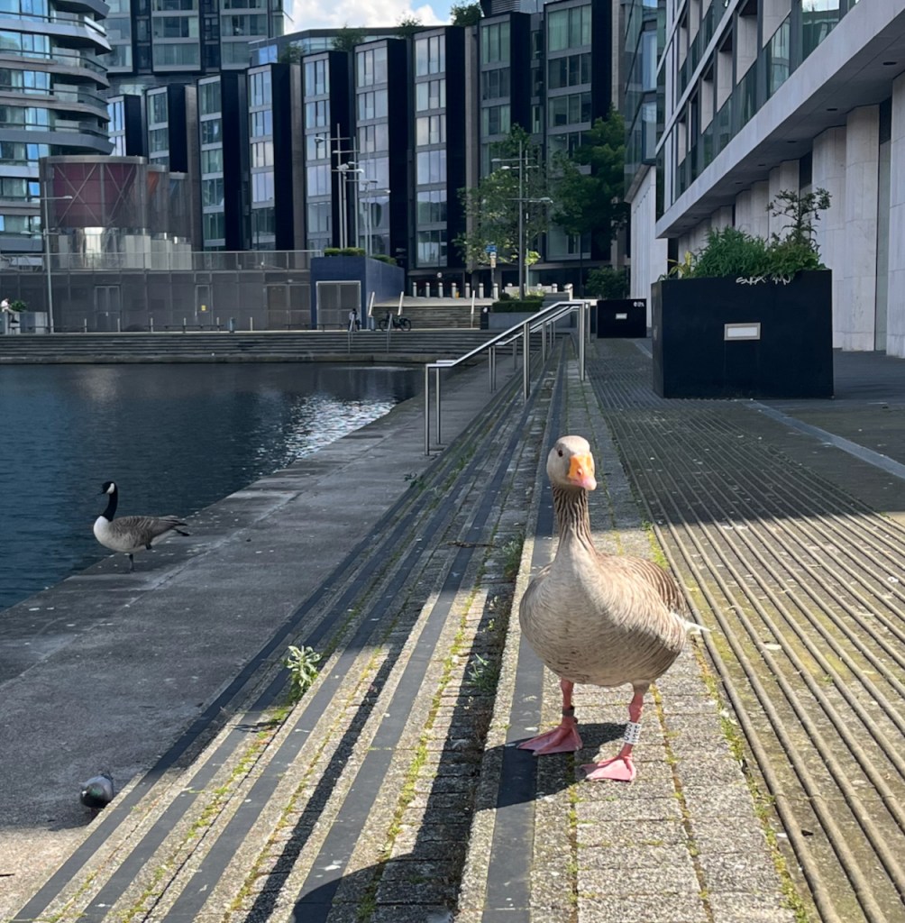
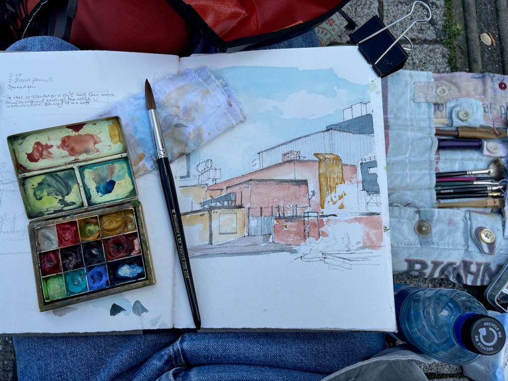
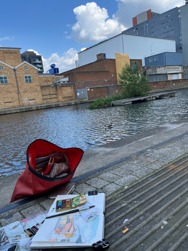
I made this sketch sitting by the water observed by geese. It took me a little while to establish that the tree in the picture was on a raft, and therefore it moved. One does not expect trees to shift around from place to place. I would put it in the sketch, and look up again, and find I had mysteriously got it wrong, again. The geese, obviously, always knew it was a raft, and cackled.
The colours here are:
Phthalo Turquoise Blue for the sky (with some Ultramarine Blue)
Fired Gold Ochre for the bricks
Mars Yellow, with Fired Gold Ochre, for the paler brickwork
Ultramarine Blue for the cylindrical construction on the roof (middle left)
Serpentine Genuine for the tree
All greys and blacks are combinations of the above, plus Burnt Umber.
Colours are all Daniel Smith. The paper is Arches Aquarelle 300gsm in a sketchbook by Wyvern Bindery.
Click a button below to share this post online, email it, or print it:
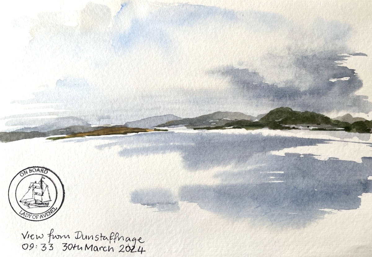
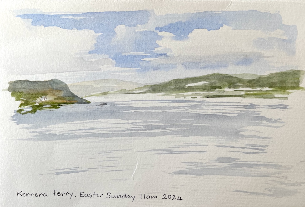
Here’s a view from the ship”Lady of Avenel”. She which was at the Dunstaffnage Marina, Oban, at the time. This is a quick sketch done on thin “Amatruda” watercolour paper, sent as a postcard. It is the view looking north, towards Fort William. See the rain clouds coming!
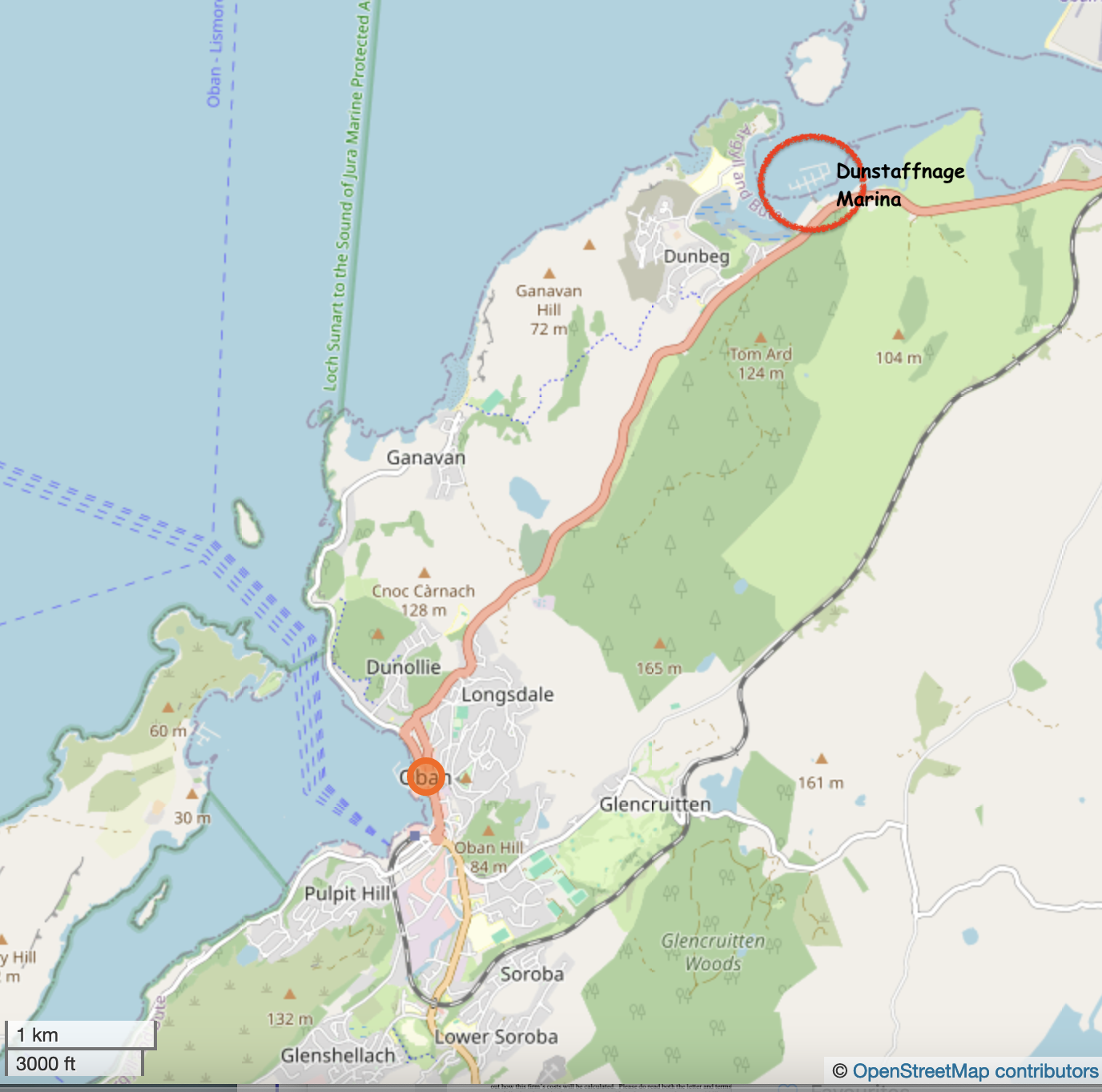
Oban is on the West Coast of ScotlanLady of Avenel was at Dunstaffnage Marina
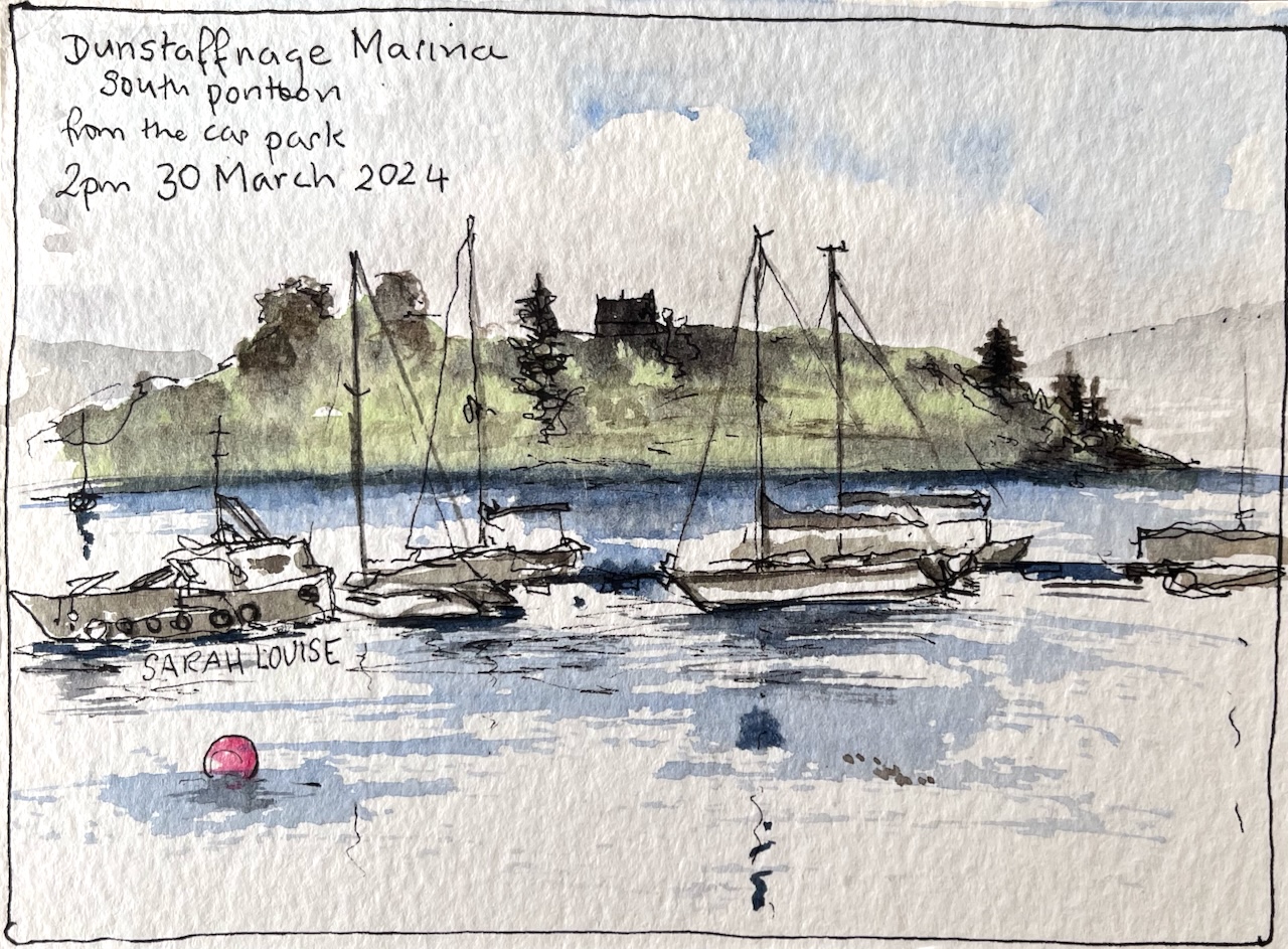
Here’s a quick sketch of the marina.
Quick sketch on a 6″ x 4″ postcard
Later I visited the lovely island of Kerrera.
A5 Amatruda watercolour paper.
These landscapes are so inspiring! I’ll be leading a “Sketch and Sail” adventure on the Lady of Avenel in October 2024, together with Alice Angus. We’ll start and finish in Oban. Would you like to join us? Have a look at this page and get in touch!
Click a button below to share this post online, email it, or print it:
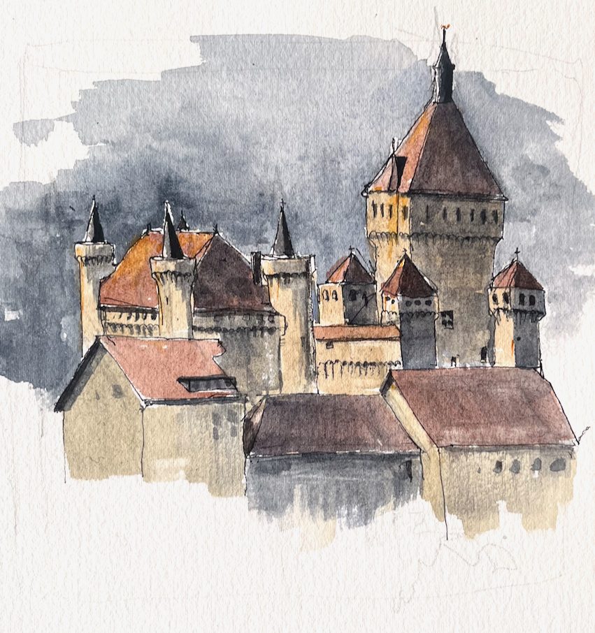
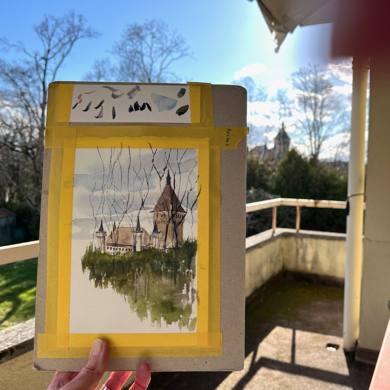
Fine rain started as I sketched the Château de Vufflens. At first I thought I could keep sketching. But then rain arrived in large-size drops, some containing ice. I took refuge under an archway. There was a view of the castle from there, but a different view. Also, standing there, I was, very possibly, in someone’s garden. I am not sure about Swiss laws on trespass. All I was sure of was that there would be laws. I assembled suitable French phrases in my head, to be ready to explain and apologise. And I restarted the sketch from this new angle. Then the rain stopped.
I inspected the sky suspiciously. I watched the cloud movements. Clouds just appear here, over the mountains, as from a volcano. They don’t proceed in an orderly succession as they do over the Atlantic. However all seemed more lightweight and friendly than it did earlier. I exited from the archway, and resumed my place on the public roadway. There are probably laws about sketching on the public roadway too.
But no-one even walked past. Not a car. Not a person. Not a dog. So that was alright. I finished the sketch. And then the rain started again.
Château de Vufflens in the morning, 24 March 2024 11:15 in Sketchbook 14
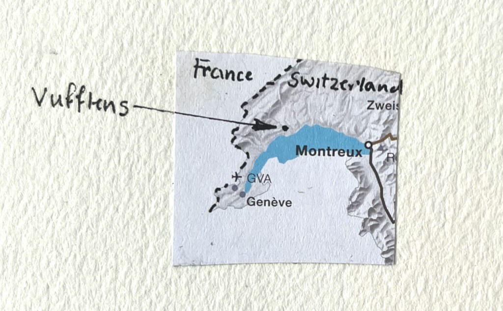
This castle is privately owned. It is on a rock in the valley, surrounded by high walls. Houses cluster at the bases of the walls. if you know the work of Mervyn Peake, think “Gormenghast”.
It was originally constructed in the middle ages, 1420-1430, for Henri de Colombier, an adviser to Duke Amadeus VIII of Savoy, I was told. It looks well maintained, and vast.
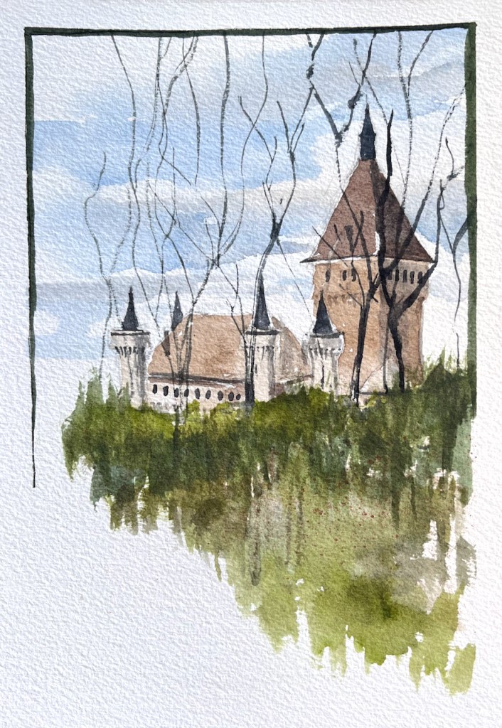
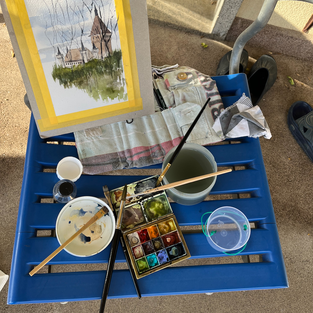
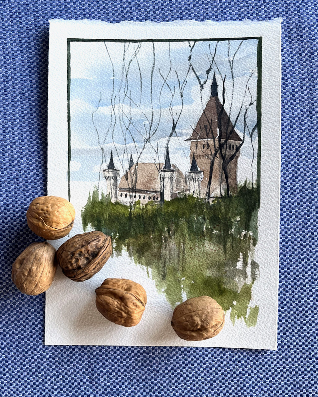
Later that day I made another attempt at drawing the castle, from a different angle. From this new viewpoint I could be under cover, but there were trees. I put the trees in.
Château de Vufflens in the afternoon. 24th March 2024, 4pm. 6″ x 8″ on Arches Aquarelle card
The walnuts came from the trees.
Click a button below to share this post online, email it, or print it:
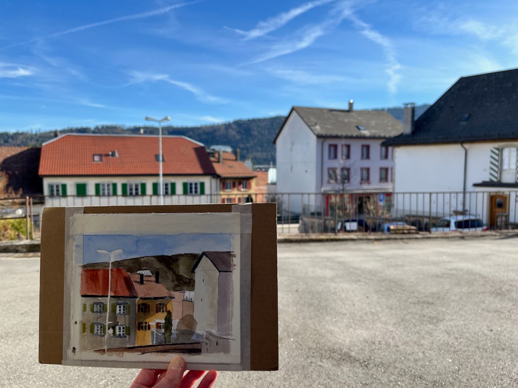
In the afternoon I sat down on the stone steps and sketched the houses that were in front of me.
Sainte-Croix houses, 8″ x 6″ postcard on Arches Aquarelle 300gsm paper. March 2024
I was struck by how the afternoon sun cast shadows on that glass screen, centre left, and illuminated the little greenhouse-type roof on the house in the centre. These are solid Swiss houses, with heavy tiled roofs and properly operational shutters. Some of the metalwork, such as the guttering and the surroundings of the chimney stacks, is in actual copper. Even the downpipes are copper.
One tree was a fir tree and was opaque. The other tree was twigs, and was transparent.
Although it was spring, this is at 1200m, and it was cold. The deciduous trees are still bare. The hill is the background is Mont-de-Baulmes. Many of the trees up there are deciduous larch.
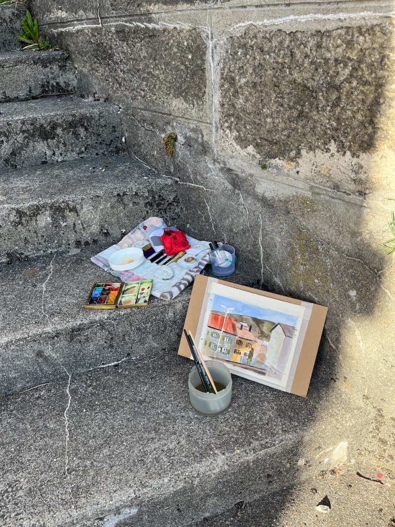
I painted this picture in watercolour-only. Usually I use pen. Here, I did a quick pencil sketch and then straight on with the colour. It was too cold to try to get any details or do any penmanship. The solid plainness of the houses seemed to demand flat colour washes. I deliberately left lines of white between the slabs of colour – the sun always catches edges.
Work in progress22 March 2024 16:30
Click a button below to share this post online, email it, or print it:























 Jane Sketching