Sketching in Crete: May 2018

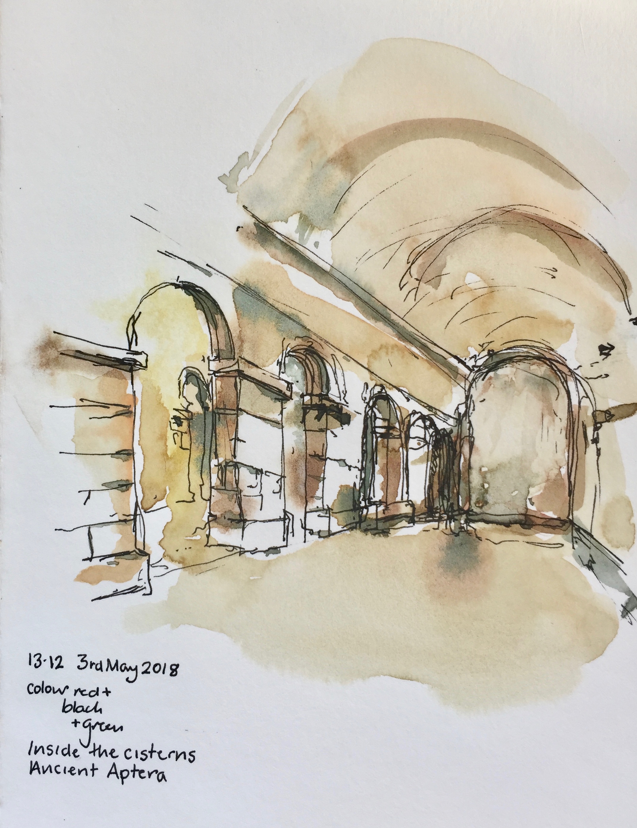
Aptera was a city in Greek and Roman times. The people went to the Theatre.

IMG_3951
Remains of the Greek and Roman Theatre at Aptera. The Greek period is something like 300 BC. Then the Romans adopted it when they took over 67 – 395AD. The Theatre was a total ruin when we first visited in 2011, with part of it missing and the stones used to make a limekiln. In 2017 the lime kiln was removed and the auditorium circle has been re-created.

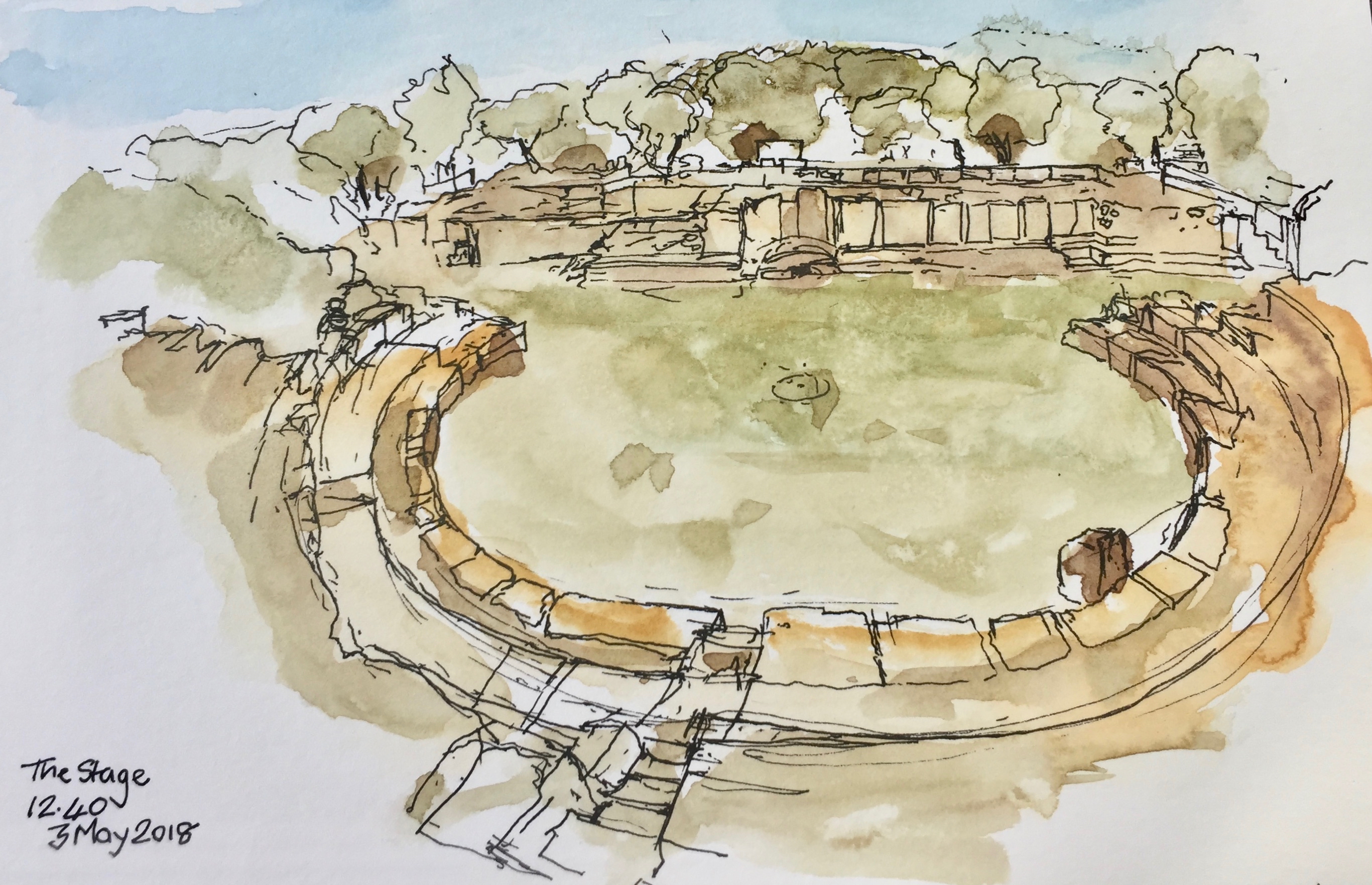
From the small slab in the centre, the acoustics are perfect. John gave a rendition of the speech of Richard III “Now is the winter of our discontent….”.  I heard it perfectly, at this distance.

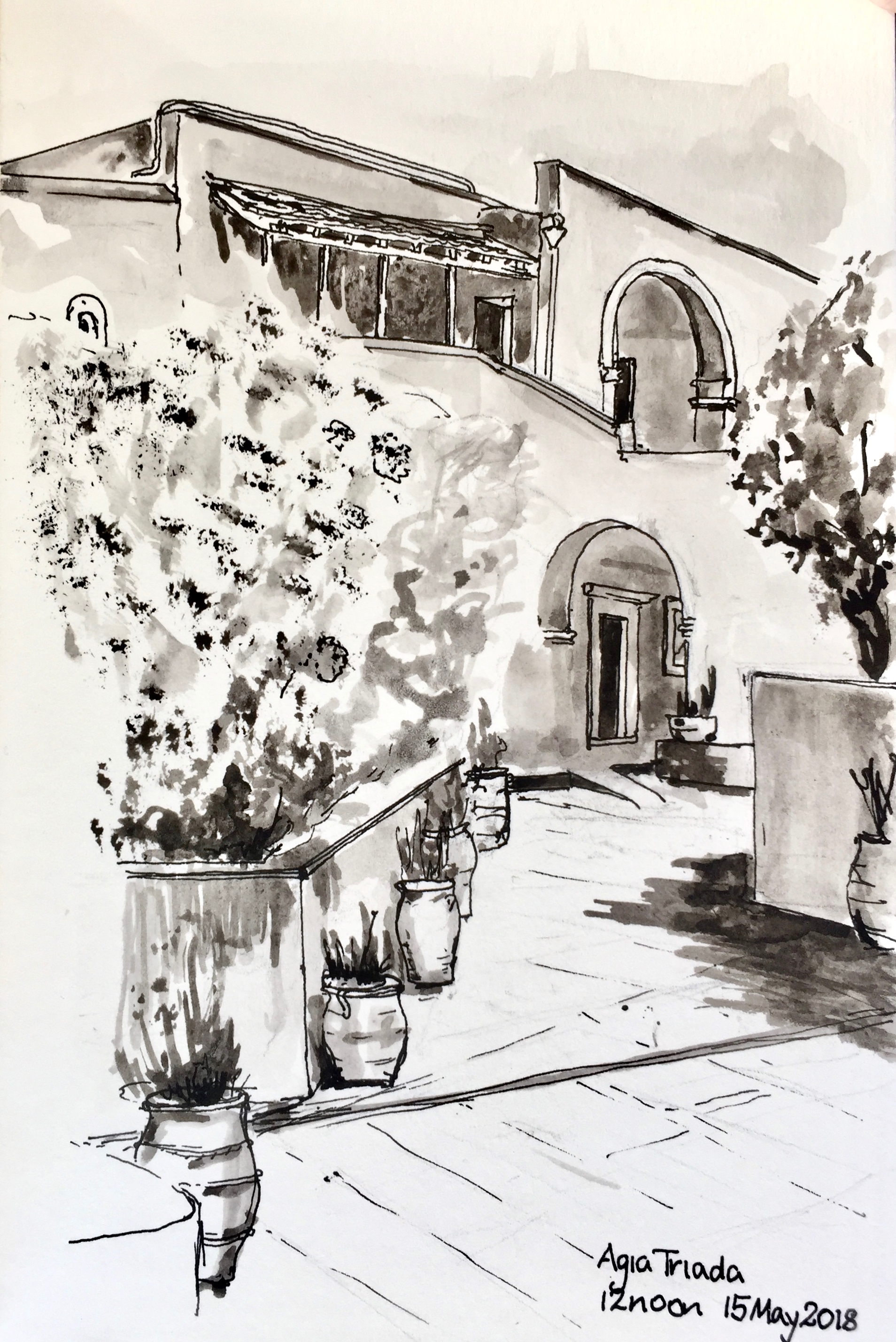
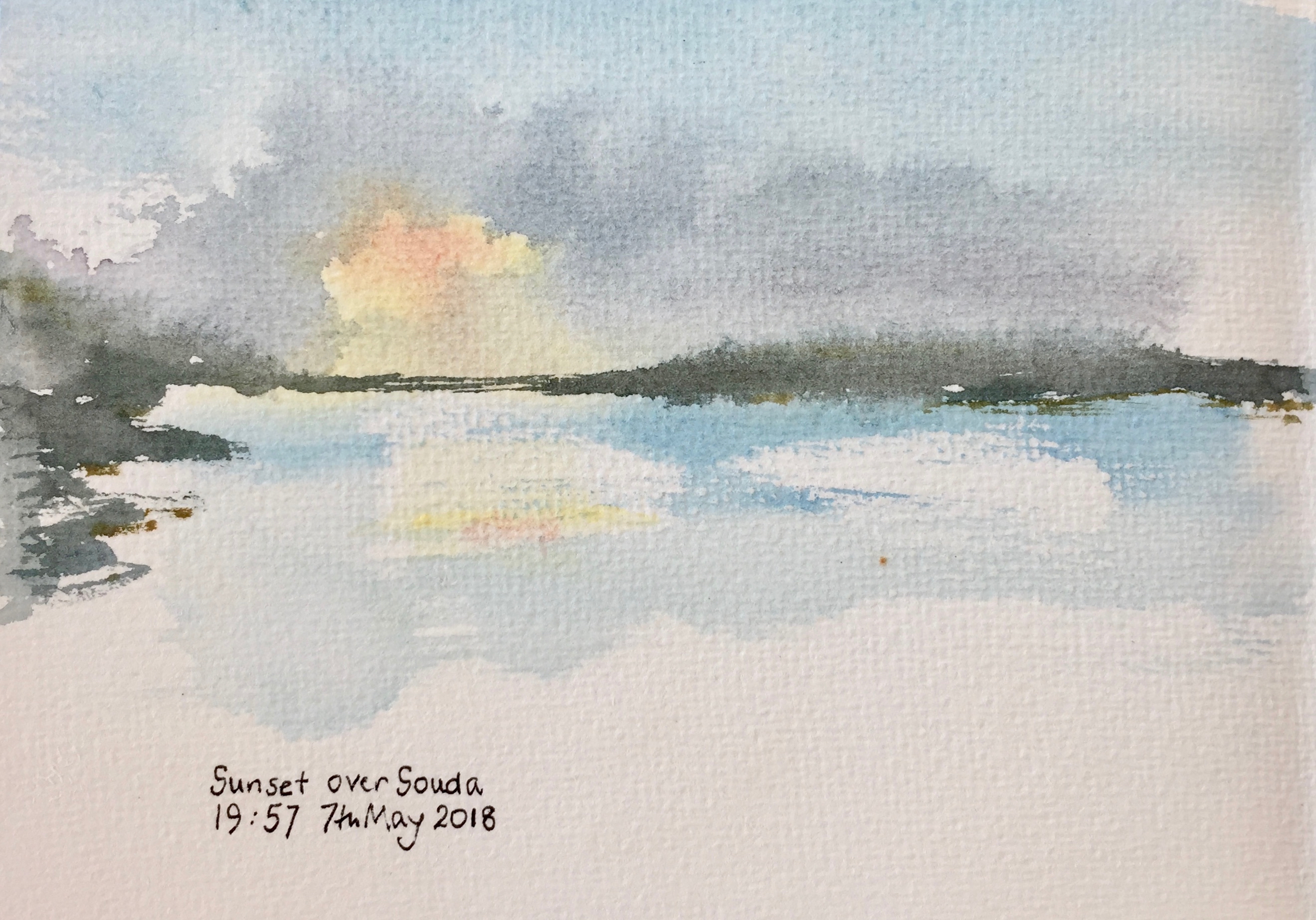
The place where we stayed looks out over the bay.

IMG_3959

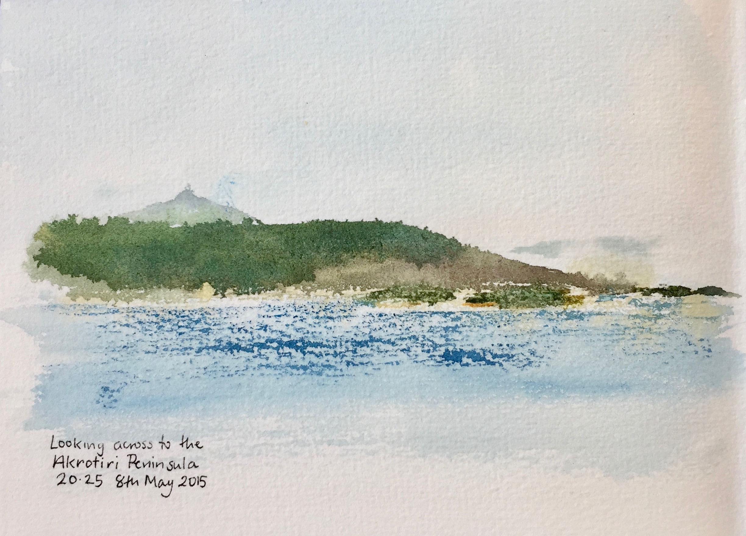
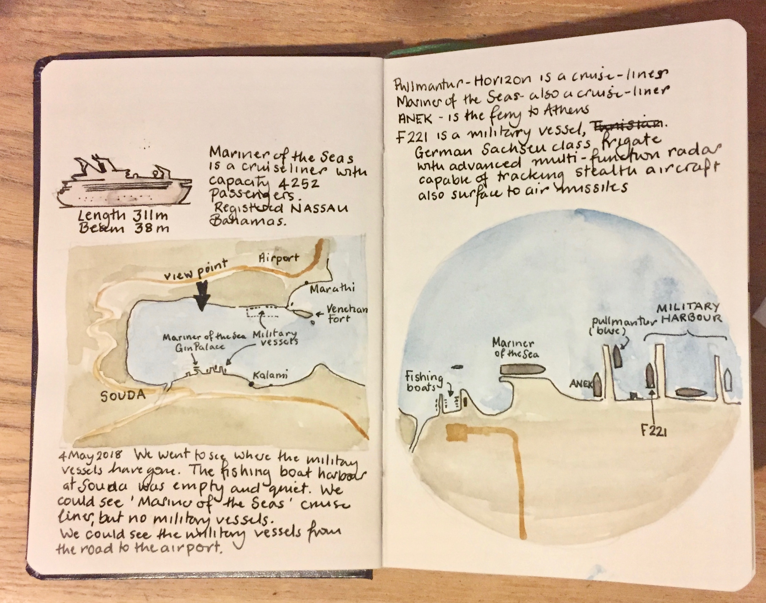
Military vessels pass by into the NATO base opposite, including submarines. Some of them go past, and into Souda.

We drove into Souda, to find out where they went. We found only a peaceful fishing harbour.

IMG_3953

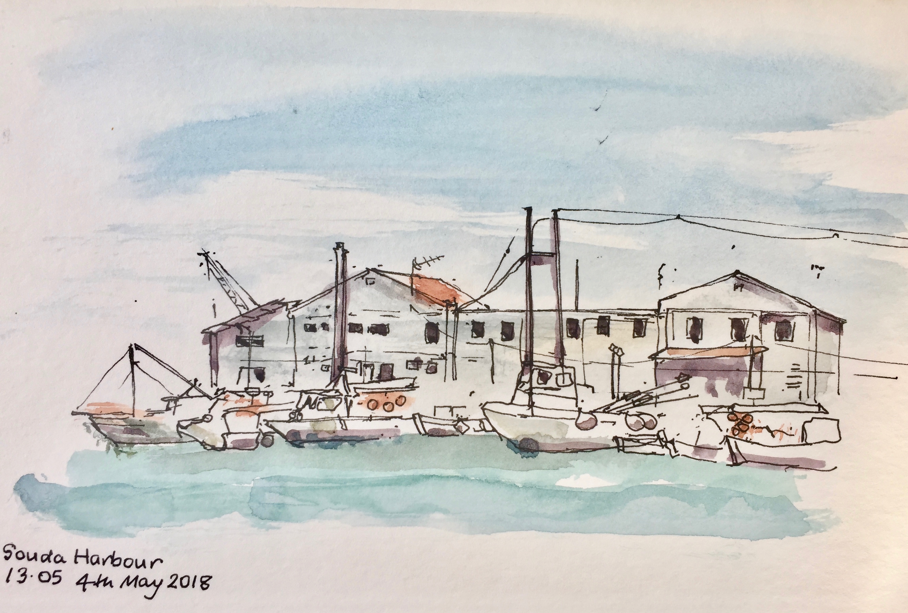
The military harbour is hidden.

IMG_3971

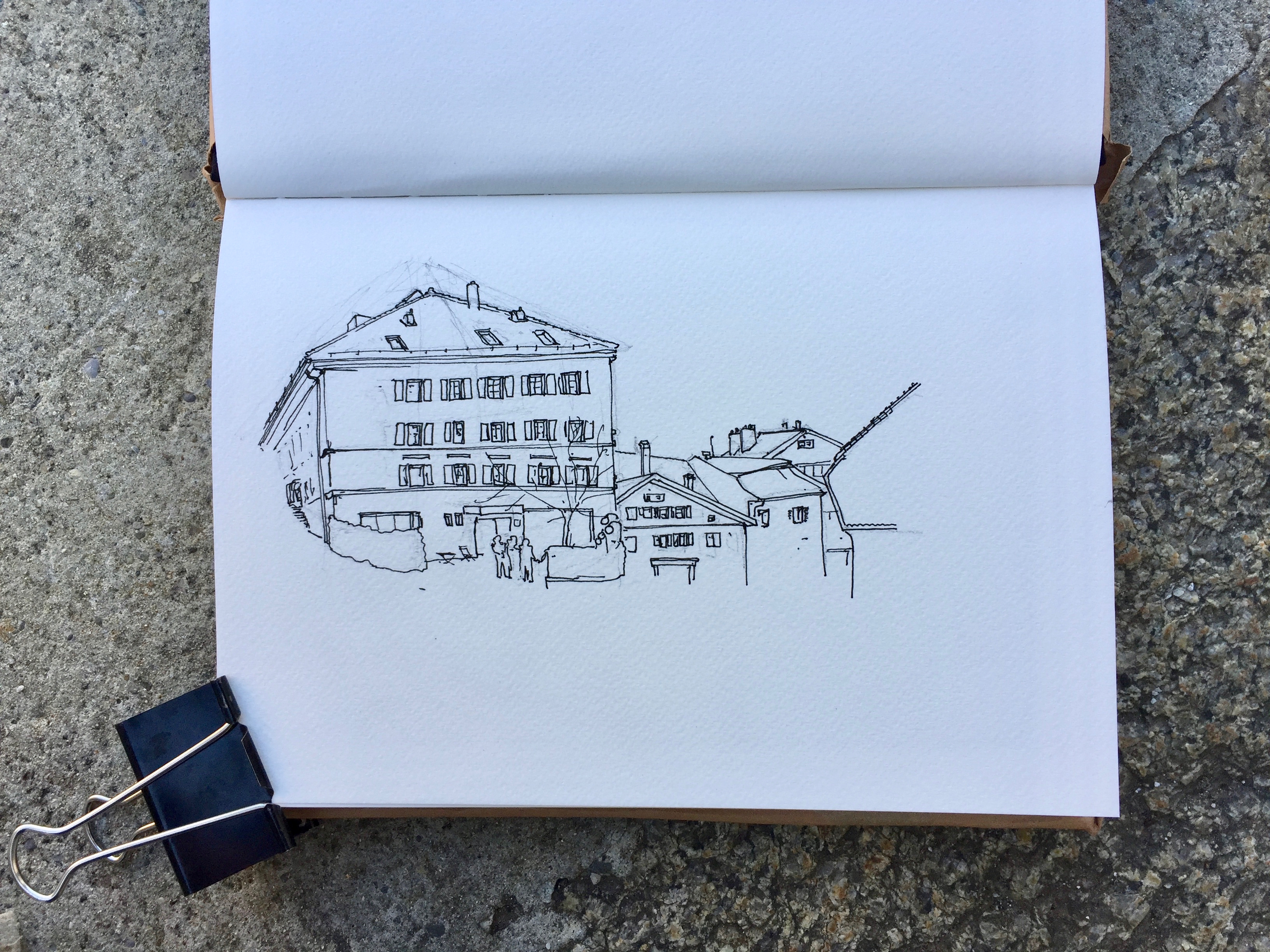
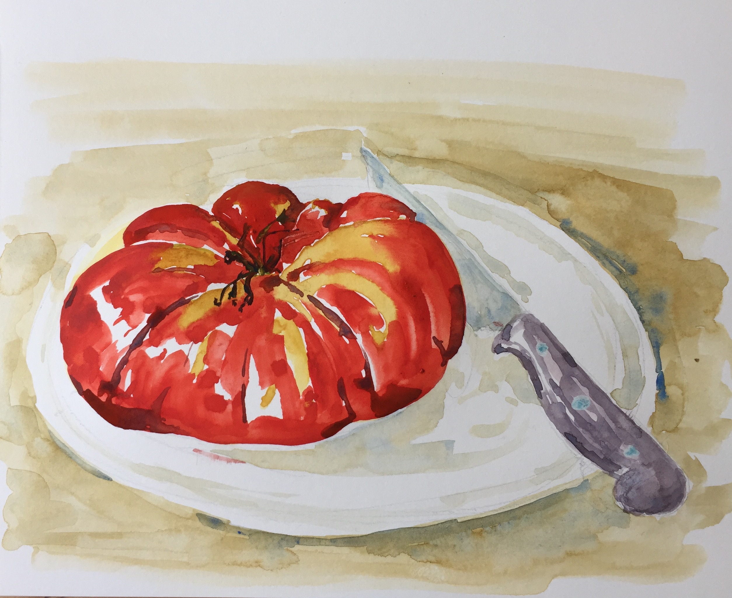
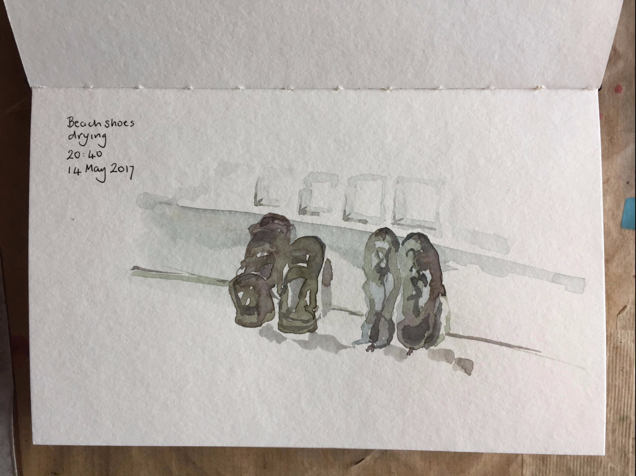
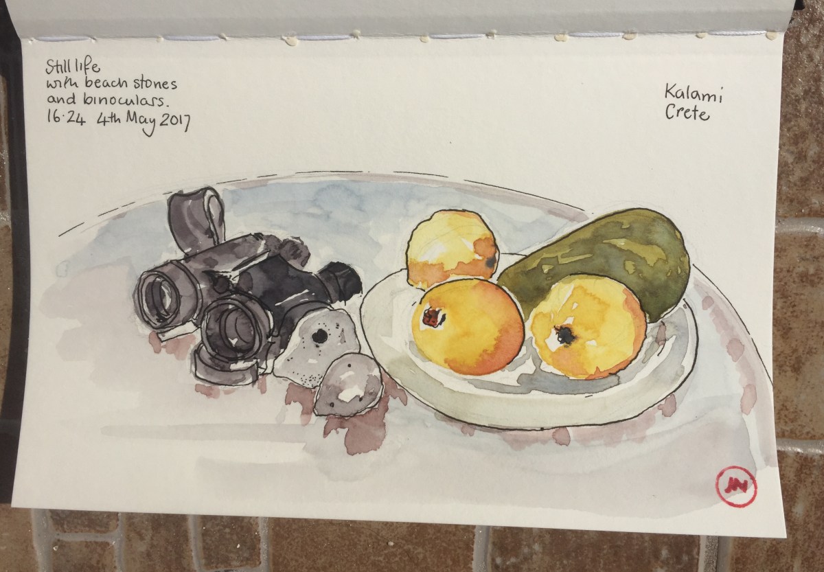
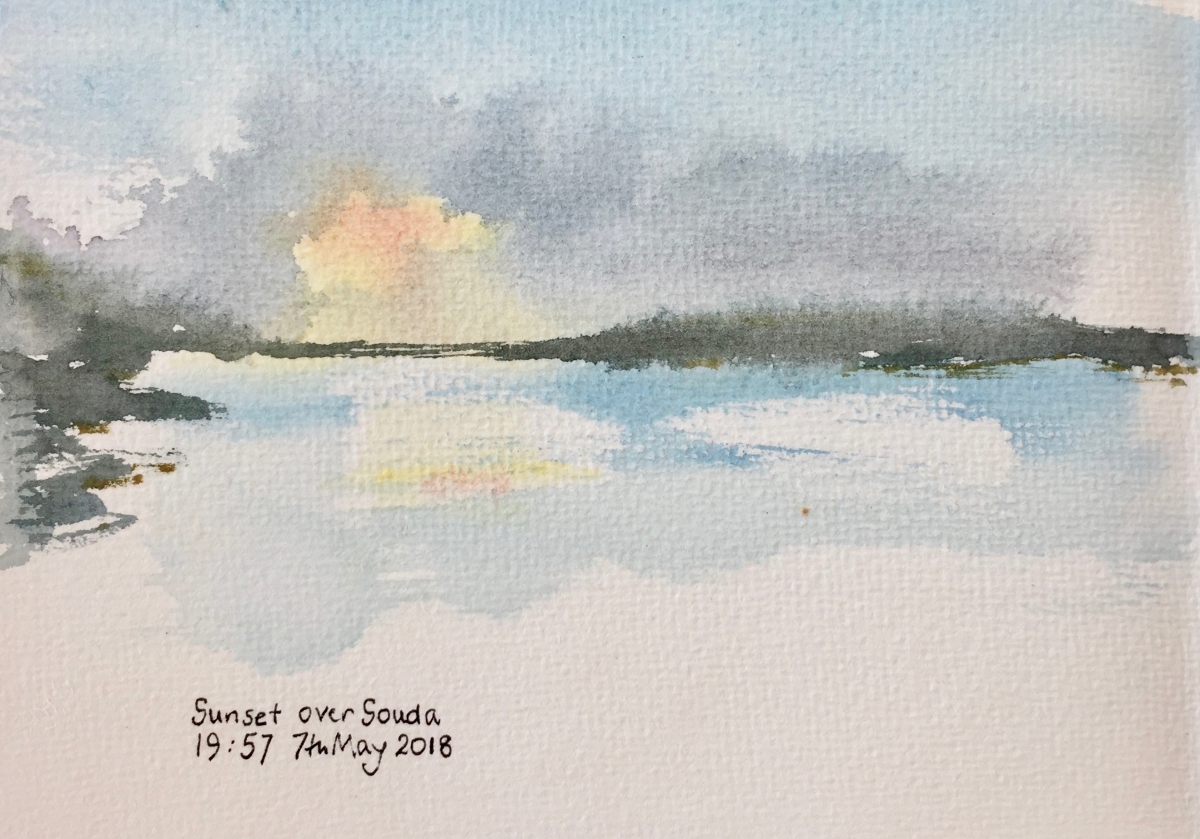
I took a new sketchbook on this holiday. It had rough pages which meant I needed to work in a loose style. There were some spectacular sunsets

IMG_3958
Watercolour in sketchbook from the Vintage Paper Company.

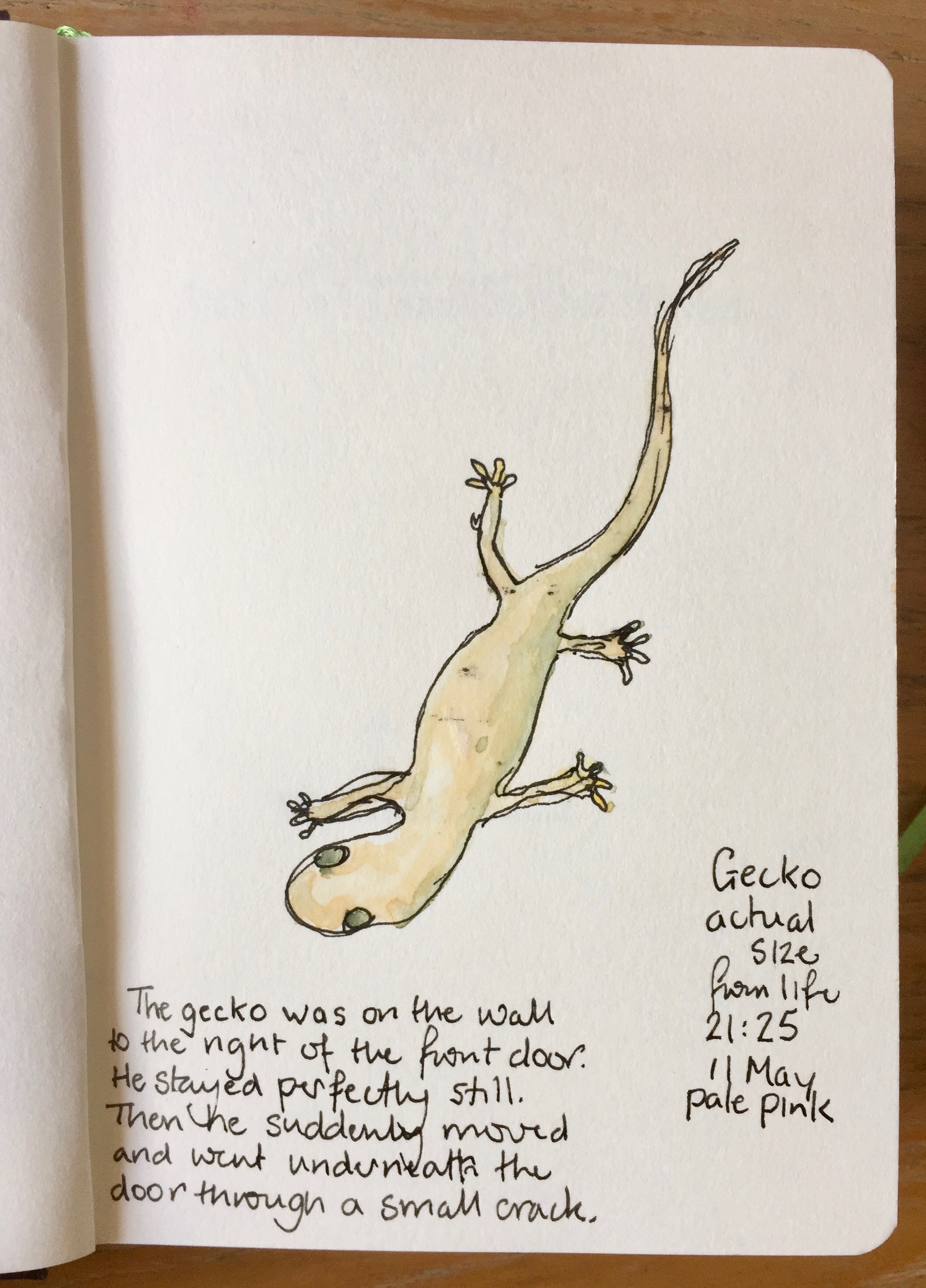
We shared the house with a gecko.

IMG_3965

There is a contrast between the peaceful location…..

…and the fearsome weapons of the NATO warships in the bay.

The ruins at Aptera have stood for two thousand years. Civilisations have come and gone in their time.

IMG_3952
Inside the Roman cisterns at Aptera. The city is mentioned in texts of 13th and 14th century BC. These Roman cisterns supplied water to the city. The city was destroyed by earthquake in 365 AD.

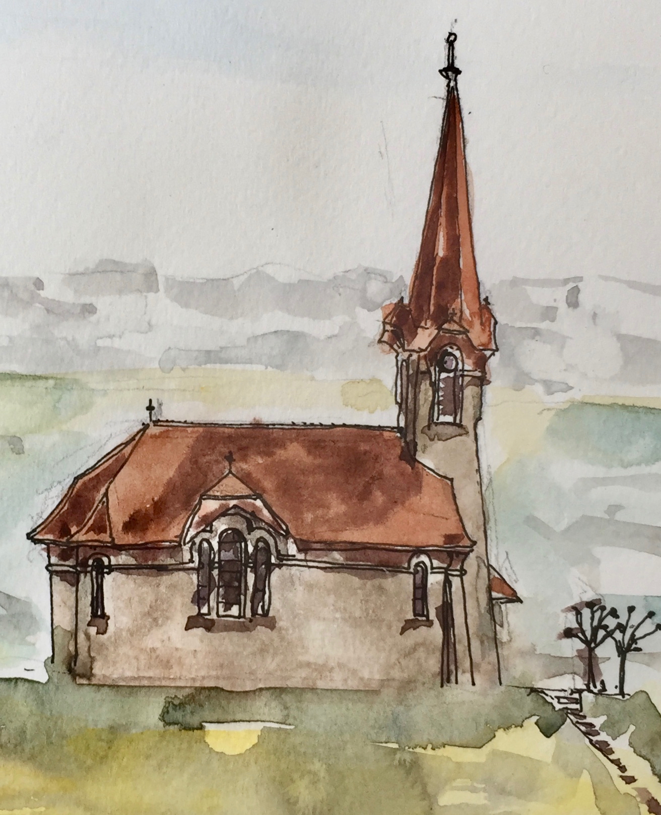
These pictures were done on location in various notebooks, using watercolour, pencil and De Atramentis Document ink.

IMG_3954
Agia Traida, view from the entrance, in Stillman and Bern Delta Series watercolour book, using only ink.


Sainte-Croix, Vaud, Switzerland

I visited the Hôtel de France, Sainte-Croix in Vaud, Switzerland. Here is the hotel, from the street outside, just after I arrived.

IMG_3595 (1)

I had to wait in Geneva train station, for the train which goes to Yverdon-les-Bains. The sun came through the windows and people walked through the lighted space.

img_3597.jpg

The Hôtel de France is known for its absinthe.

IMG_3521

IMG_3598
I sketched the absinthe table. The bottles look like a group of people waiting for something to happen. Like people, the bottles have common basic characteristics, but each has their individual variations.

Glasses, too, have their characters.

IMG_3593

I walked down the ancient salt road to the village of Vuitebœuf. Here is the Église de Vuitebœuf from the rue du Culaz, which I afterwards found out is also on the ‘Via Francigena’ pilgrims’ route Canterbury to Rome (1900km).

IMG_3594

This church was constructed in 1904 to the design of Charles-François Bonjour.

I travelled back to London late Sunday night, on a crowded ‘plane from Geneva.

IMG_3488
Work in progress on the drawing of the Hôtel de France, 19 April 2018. Jackson’s watercolour sketch book, 7″ x 10″

Here are links to previous drawings in Sainte-Croix.

View from a Swiss Hotel

Some sketches of hotel tableware

Sainte-Croix, Vaud

Here is a link to the etching of the Absinthe Table: The Absinthe Table

The Absinthe Table

This week I experimented with hard and soft ground.  Here is “The Absinthe Table”, etching on copper plate.

IMG_3254 (1)

It’s based on a sketch I made at the Hotel de France, Vaud, Switzerland. They have a collection of absinthes for tasting.

Walking on the way to the print studio I decided I would do two colours. Furthermore, I thought that the second colour, with black, should be green, as absinthe is sometimes called the “la fée verte”. Rooting about in the leftovers box at the Print Studio I found some green ink.

The long process of making the plates took all morning. I watched the rain fall into the canal. Perhaps some of this atmosphere went into the print. Making a two-colour print means:

  1. placing the colour-ink plate on the press.
  2. roll over until the plate is out but the paper is trapped under the press roller
  3. lift the press blankets and remove the plate without shifting the paper or the template
  4. get the black-inked plate
  5. put that plate very carefully in the same place on the template
  6. replace the press blankets and roll back over

The potential for error is great. The most obvious error is to put the second plate in up-side-down.

I printed the plates in the afternoon. The error that happened first time round was that the green ink didn’t print at all. Not a dot. Examining the tube very carefully, reading the writing between the splodges on the tube, I saw that it was “block-printing ink”. Lesson: block printing ink does not work for etching/intaglio process. OK.

This is why the background is brown, using the Charbonnel etching ink which I had brought with me. This is very reliable, but is brown not green.

Here is the single colour black, one plate in hard and soft ground.

IMG_3253

Here is an out-take, the very first print of this series. The bottles are in hard-ground only, and the registration is totally off. But perhaps that weird dislocation is appropriate for a picture of an absinthe table.

IMG_3255

Here’s a sketch of the absinthe table from February this year:

fullsizeoutput_15a9


The Cuttlefish

I made a collage postcard inspired by “the Blue Planet” series on BBC2.

This is the cuttlefish. The sea bed is made of breakfast cereal, and the seaweed is strands of unraveled rope.A fish-like being at the top is made of a speckled feather I found.

The post card went off on its journey to Switzerland on 1st Dec. I hope it gets there.

IMG_2196

Martin Hicklin’s work inspires these collage postcards.

Some sketches of hotel tableware

I have been experimenting with pen and ink. Previously, I have used waterproof ink, with watercolour on top. This “pen and wash” technique depends on the ink staying where it’s put. See, for example, the urban sketch on this link.

Recently, inspired by the work of Nick Stewart  https://quinkandbleach.wordpress.com, I have been trying non-waterproof ink.

Here are four sketches, done in the Hôtel de France, Sainte-Croix, Switzerland. Click an image to enlarge.

They are all done using only Robert Oster Signature Fountain Pen Ink, colour: Black Velvet. This ink has the property that is produces a chromatograph effect, blue and pink, as it runs and dilutes with water. See, for example, the left hand side of the “wineglass” drawing, where you see black, blue and pink.

I’m using a dip pen: the Pensive Pens Serendipity dip pen.

All of this is quite a challenge to accomplish, especially as the pictures were done in a Swiss dining room, on white tablecloths. No ink drops contaminated the pristine environment. But I had to be very careful.

Tomato from Montcigoux

fullsizeoutput_18ae

I had to sketch it before we ate it.

This tomato was cultivated by Madame Sauté of Montcigoux, in the commune of Saint-Pierre-de-Frugie in Dordogne, France.

Watercolour on Fabriano Studio Watercolour 300gsm Hot press paper. 8″x10″. About 30minutes.

IMG_1276

Beach shoes drying

A warm evening, an experiment in watercolour-only – no pen and ink!

Eventually the night came, and the light faded.

img 0107

About 30 mins, watercolour only.

Gilded Bronze Gerfalcon

img_9705

Woodcut, after a statue seen in the British Museum “Sicily Culture and Conquest” exhibition, 24 April 2016. He stood about 12 inches high and dates from 1200AD or so.

This woodcut is done in Shminke Prussian blue AquaLino relief ink, on the marvellous Albion press at East London Printmakers. Fabriano Unica Cream paper from Great Art. Woodcut block 16cm by 11cm from Intaglio Printmaker.

Woodcut: “Contact”

This is a woodcut, inspired by a huge stone sculpture in the Berlin Tiergarten.

The sculpture was made in limestone  in 1961 by Pierre Szekely (1923-2001), a Hungarian sculptor. It stands about 7 ft tall and has depth, about a foot thick. Wikipedia gives the name of the sculpture as “Contact”. I don’t know if it is still there. I saw in in 2012, in the snow, and it looked like an amulet, or sacred object. The shape is both anthropomorphic, and other-worldly. I like the fact that it has feet. I find the shape is satisfying. If I had an amulet, it would be shaped like that.

img_9649

Woodcut with prussian blue Schminke Aqua Linoprinting ink. Size of woodcut, 2 inches by 3 inches, approx. Done yesterday at East London Printmakers.