
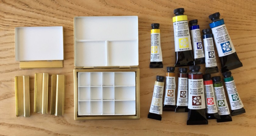
This is my bespoke small watercolour paintbox made by David Cooper of Classic Paint Boxes.
It has 12 Daniel Smith colours which were a birthday present. The picture shows the first pouring, while the paints are just poured and still wet.

The paintbox has a clip so I can fix it to my sketchbook, and also a mixing well. There are two spare clips, in case I lose one.
Here is the clip in use:

Here are the colours, all Daniel Smith:


I made a selection using online advice from Teoh Yi Chie of Parkablogs, and the extraordinary detail on pigments posted by Bruce MacEvoy on Handprint.com.
These are all “single pigment” colours. In other words they have just one chemical colour. Cobalt Blue is “PB28”, for example. Some other colours in the range are made from more than one pigment. I sought single pigment colours because I use only 12 colours. I wanted to be able to mix three of them without losing brilliance or transparency. Three pigments mixed are probably still brilliant and the little dots of colour still distinct. That’s the theory. If twelve pigments are mixed it will make a sort of mud colour.
Here is a detailed list, including the descriptions and data from the Daniel Smith website and colour chart.
T: Transparency: T= Transparent, S=semi-transarent, N=opaque
G: Granulation: Y=yes, N=No
Stain: Staining: 1 = non-staining, 4=high staining
| Colour name | DS description | T | G | Pigmt | Stain |
| Cobalt Blue | Cobalt Blue (PB28) is a semi-transparent peaceful blue. This colour harks back the blues of the Renaissance period and is the ideal hue for creating mountain scenes. | s | y | PB28 | 2 |
| Prussian Blue | Prussian Blue is a deep black-blue. Lightfast and transparent, with a medium to high staining strength, this colour disperses and diffuses easily and evenly. | T | Y | PB27 | 3 |
| Cerulean Blue Chromium | Cerulean Blue Chromium (PB36) is a deep sky blue. It is highly permanent, low-staining and creates lovely granulation when in a wash. | S | Y | PB36 | 2 |
| Phthalo green BS | Phthalo Green (Blue Shade) is a deep intense green with a blue undertone. A transparent and super staining green, this colour is ideal for glazes whether dark, luminous or clean. | T | N | PG7 | 4 |
| Pyrrol Scarlet | Pyrrol Scarlet is a fire engine red similar in colour to Cadmium or Permanent Red although cleaner in colour. This modern synthetic-organic pigment disperses evenly as it is less granular than Perylene hues. | S | N | PR255 | 3 |
| Perylene maroon | Perylene Maroon (PR179) is a dark-red brown hue. This paint is semi-transparent and highly staining. Pleasing textures can be created when Perylene Maroon is used with a salt application. | S | N | PR179 | 4 |
| Nickel Titanate Yellow | Nickel Titanate Yellow is a semi-transparent yellow green colour that appears opaque when in masstone. This colour is ideal for creating dark flesh tones as it is low staining. | S | Y | PY53 | 1 |
| Hansa Yellow Mid | Hansa Yellow Medium (PY97) is yellow with a whisper of orange. This colour is an excellent primary mixing colour | S | N | PY97 | S |
| Yellow Ochre | Yellow Ochre (PY43) is a yellow-orange brown colour. This transparent shade is a sublime mixing colour and its uses are almost limitless as it works well with all other transparent pigments. | T | Y | PY43 | 1 |
| Burnt Umber | Burnt Umber (PBr7) is a rich dark brown colour. It is low-staining and semi-transparent. Burnt Umber can be warmed with a little Alizarin Crimson or cooled with blue. | S | Y | PBr7 | 2 |
| Buff Titanium | s | y | PW6 | 2 | |
| Green Apatite Genuine | Green Apatite Genuine is a dark, almost brown, olive green in masstone. The product becomes more of a vivid green when made into a wash. | S | Y | 2 |
Here is an initial colour chart, made in Shetland, July 2018, to try out the colours:

Update
On 25th July 2019 I updated the colours.


Here are the colours I replaced:
- Yellow Ochre, replaced with Mars Yellow
- Nickel Titanate Yellow, replaced with Perinone Orange
- Buff Titanium, replaced with Naples Yellow Red (Rembrandt colour)
I also moved the colours around so tree clear primaries were in a column on the right, and the colours which make good blacks are in a column above Prussian Blue.
I added the Naples Yellow Red because I know it, and use it to make grey. It’s a three pigment colour, the only one on this palette that is not single pigment. Its pigments are Mars Yellow + Perinone Orange + White Titianium.
The main purpose of the revision was to get the Orange in, to make a good black in two colours. It makes black with Prussian Blue.

It is a very hot day in London. I discovered I could lift out the colours from the box, using a blunt wooden stick. They are somewhat rubbery. I cut the Cerulean Blue in half with scissors.


Then I could move them to another place in the box, or wrap and store.
