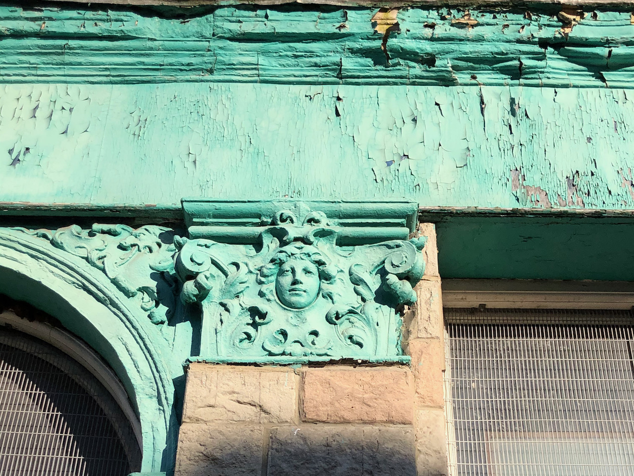
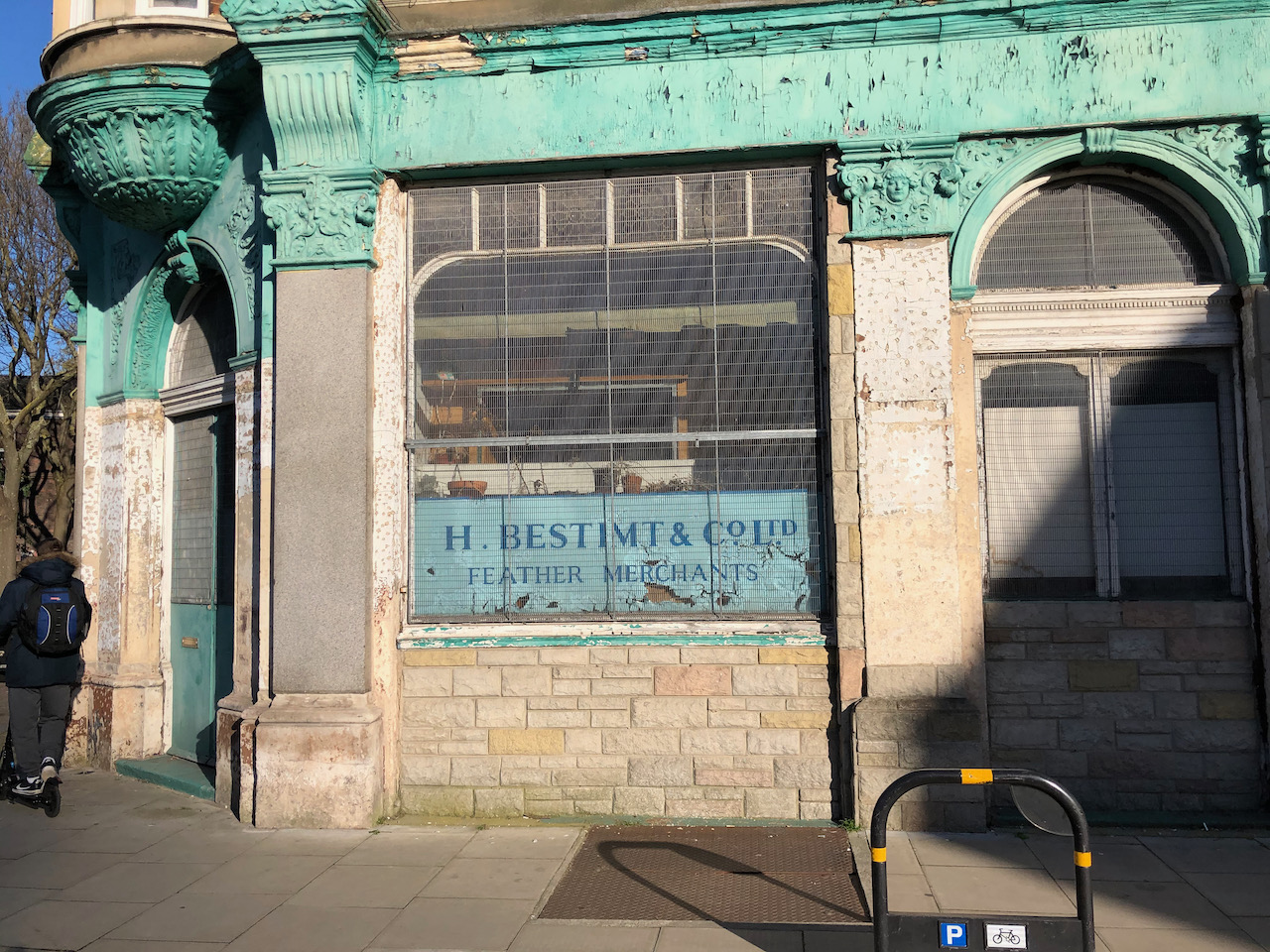
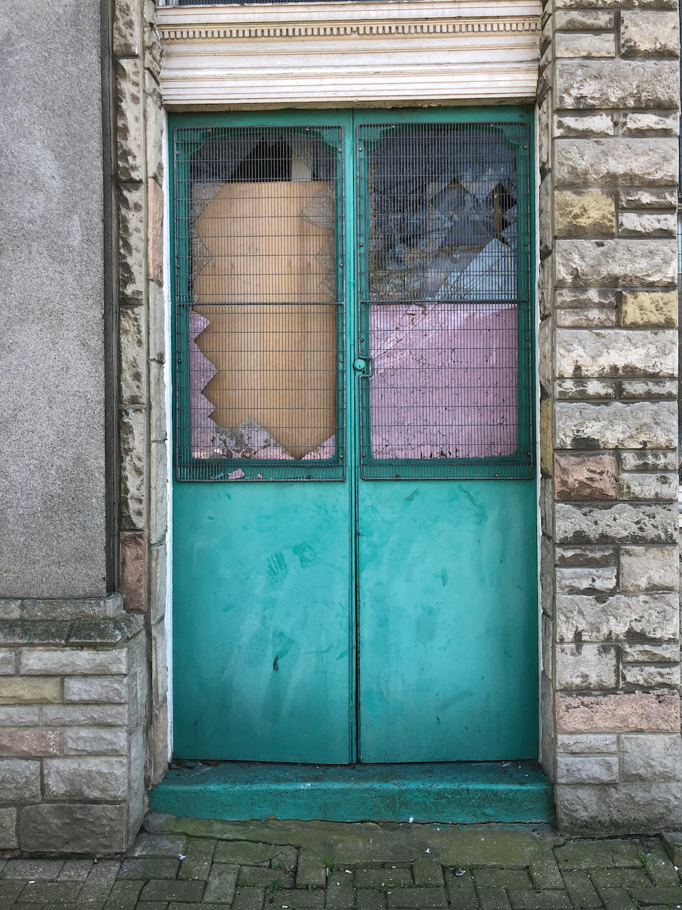
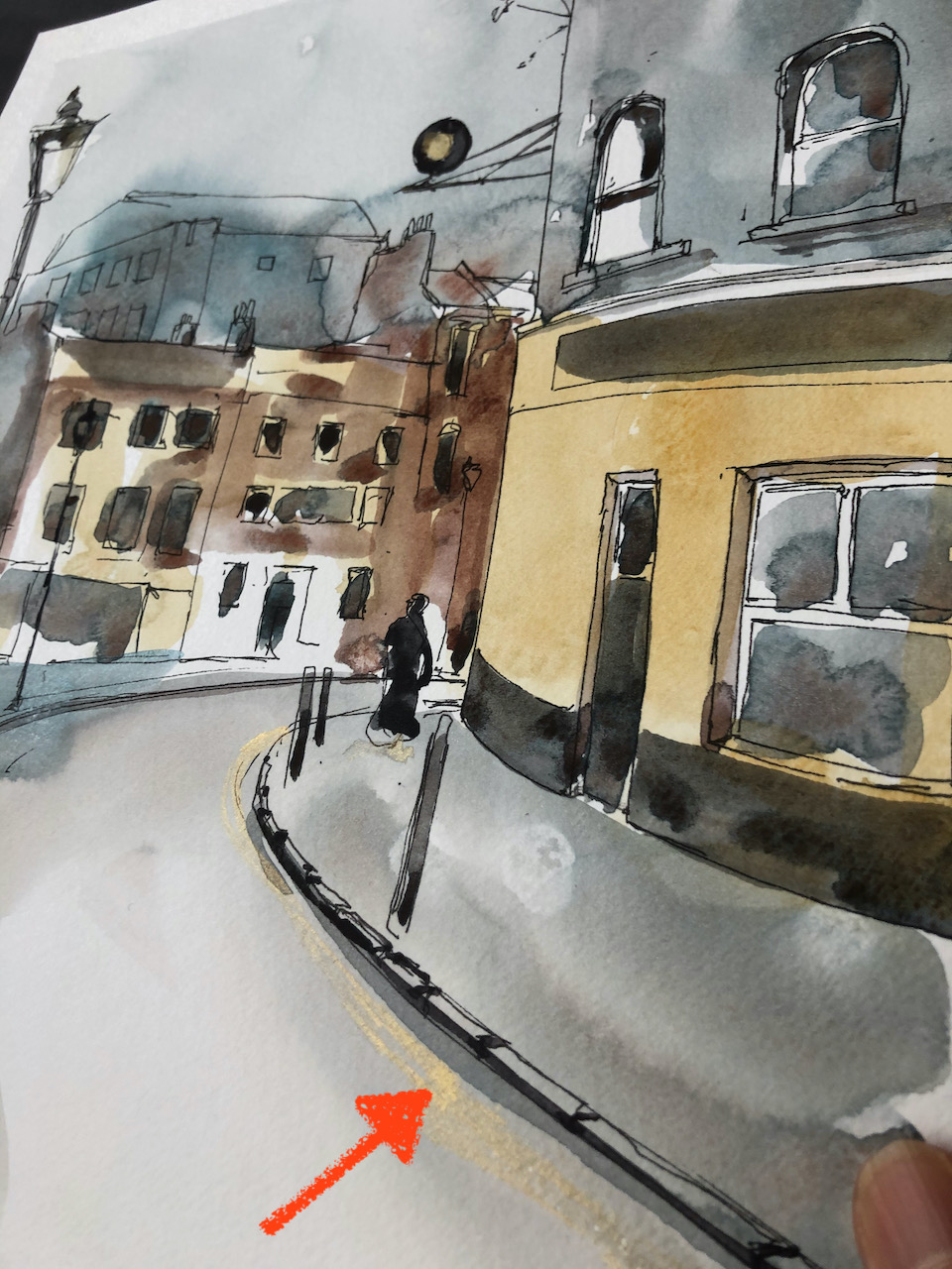
Here is Plumage House, 106 Shepherdess Walk, London N1.
Plumage House, 7″ x 10″
This was a feather factory. According to Spitalfields Life this operated until 1994. The building is now rather shabby, though in a dignified way.
I wonder what will happen to it?
In the drawing, the main colours are Fired Gold Ochre, Buff Titanium, Phthalo Turquoise, and Perylene Maroon, with Mars Yellow and Green Apatite Genuine for the green.
Shepherdess Walk (the main street North-South) and the location of Plumage House.
Click a button below to share this post online, email it, or print it:
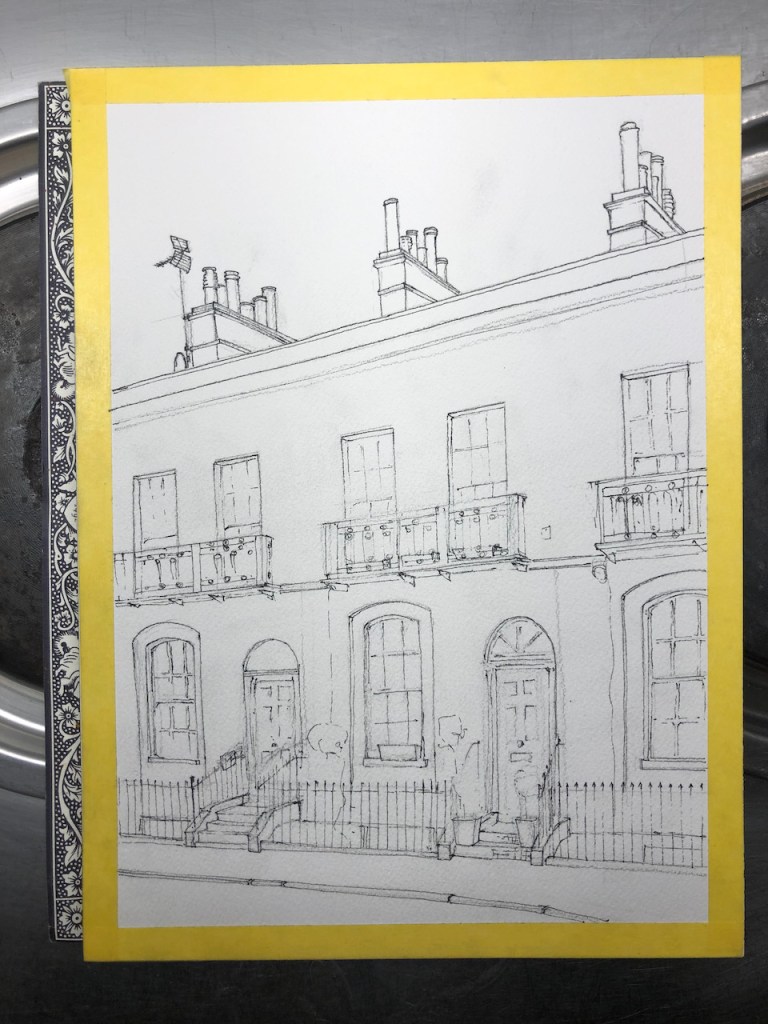
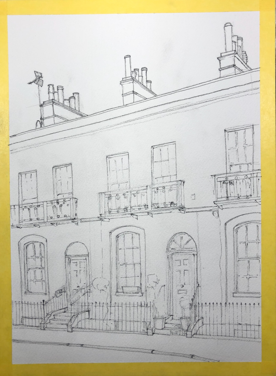
This house is in a lovely row of Georgian houses in Shoreditch, London N1
A Townhouse in Stoke Newington, Hackney, N1. 9″ x12″ [SOLD]
The drawing was done for the people who live in the house.
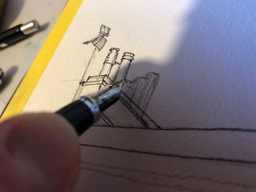
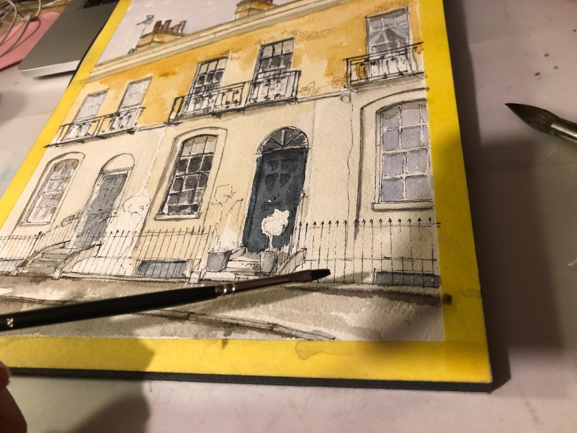
I made the drawing from sketches on location, photographs, and memory. Here is work in progress:
Sailor pen
Inking
Ink done.
Paint: Rosemary Brush series 302 (flat) size 2
Rosemary Brush series 302 (flat) size 2
Preliminary sketch on location (rain on sketch…)
Here is a juxtaposition of the “ink” image with the “colour” image. Move the slider to compare the two. The yellow frame round the ink image is masking tape, which I use to protect the edges of the picture while I am working.
The colours used in this sketch are: Mars Yellow, Buff Titanium, Phthalo Turquoise (W&N), Perylene Maroon, Prussian Blue, Lavender, and Fired Gold Ochre. All colours are Daniel Smith except the Phthalo Turquoise which is Winsor and Newton. The ink is De Atramentis Document Ink Black, which is waterproof, applied with a Sailor fountain pen (pictured). The brushes I used were:
Rosemary Brushes Series 302 size 2, which is a small flat brush, useful for windows,
Rosemary Brushes “Rose of England” series 201 size 12 which is a large synthetic round brush. It goes to a fine point as well, so it’s incredibly useful.
I did the railings and other small details with a Winsor and Newton Series 7 size 2 sable round brush.
The paper is Arches 300gsm cold-pressed (“NOT”) 9″ x 12″ in a block.
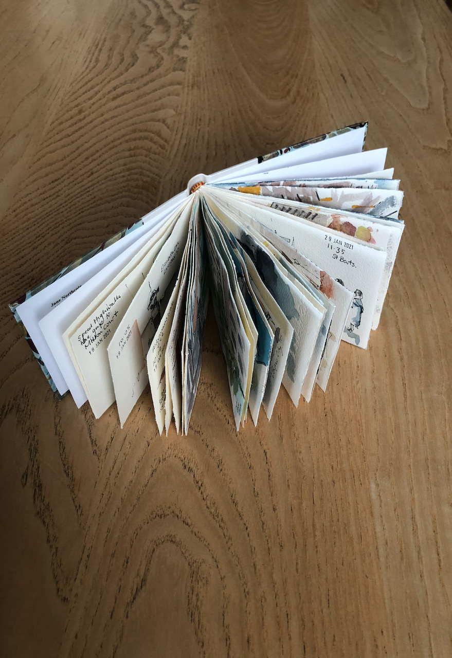
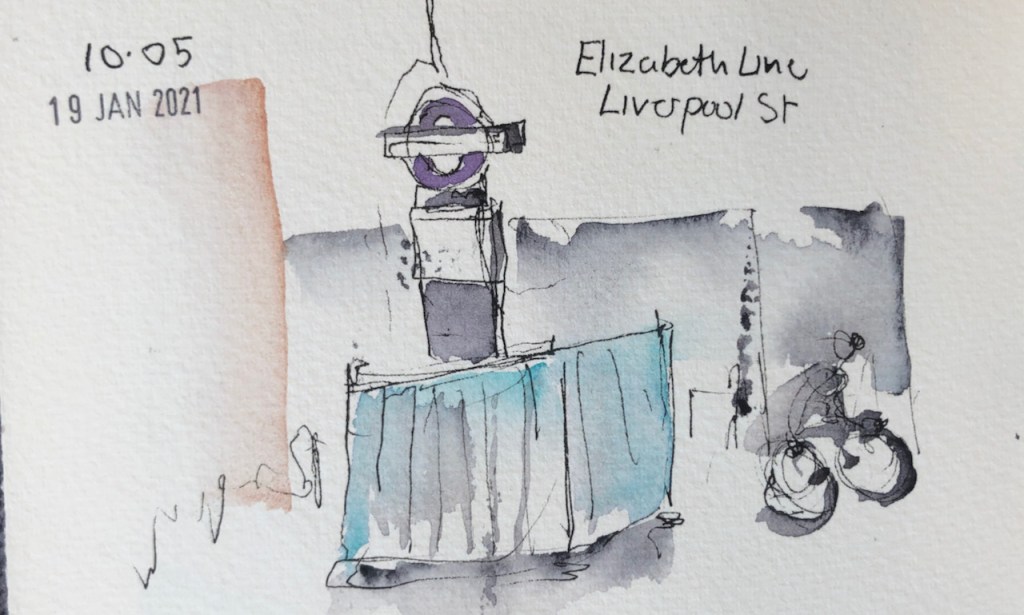
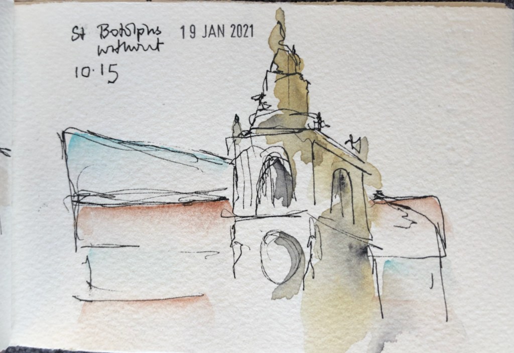
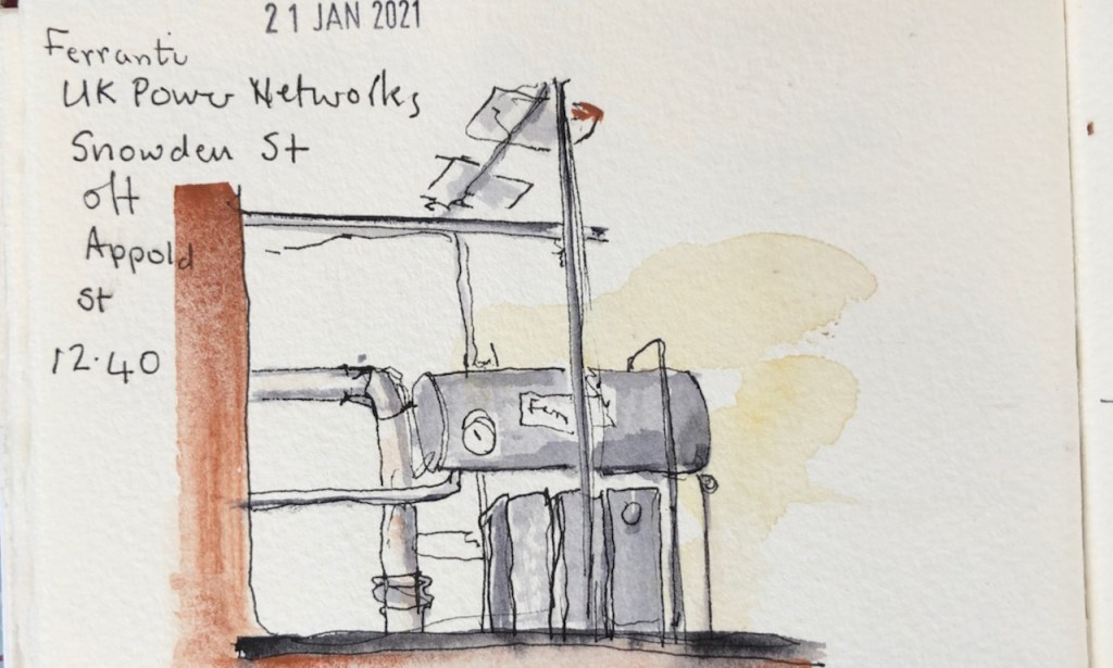
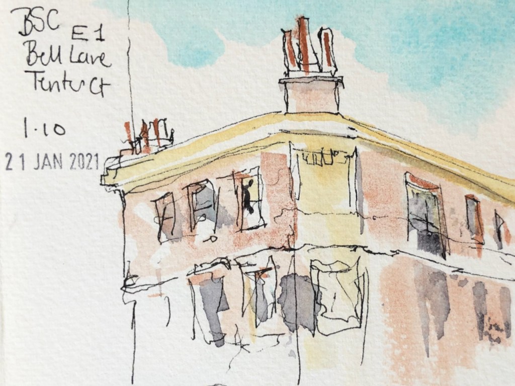
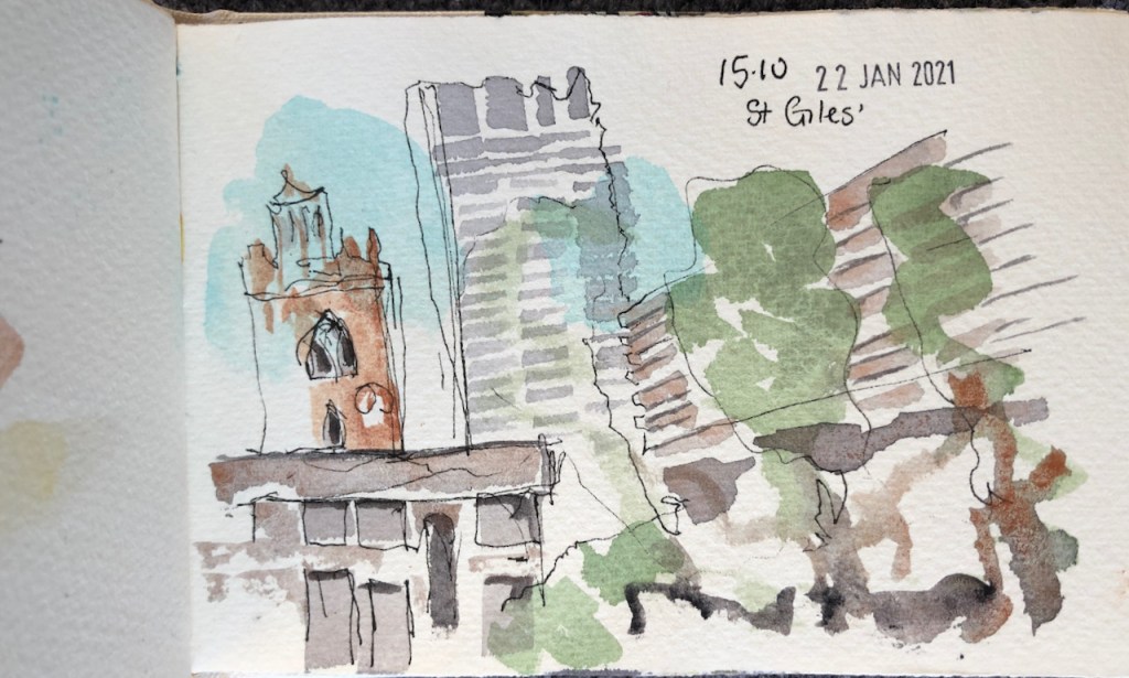
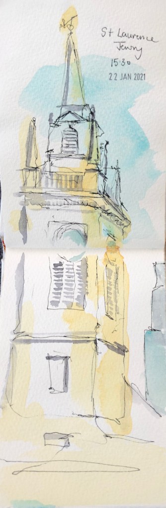
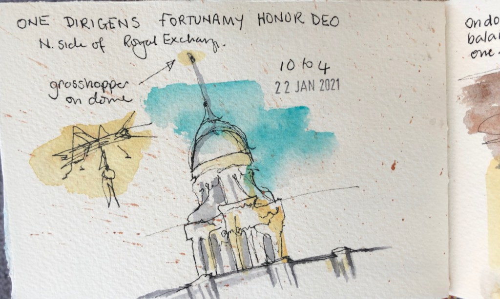
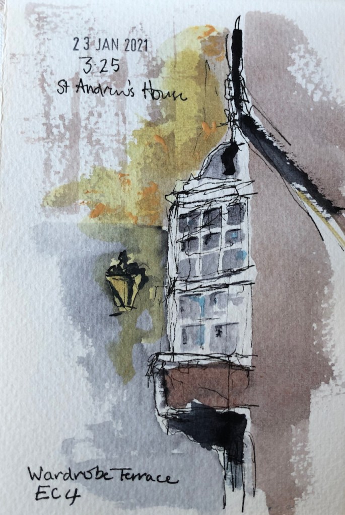
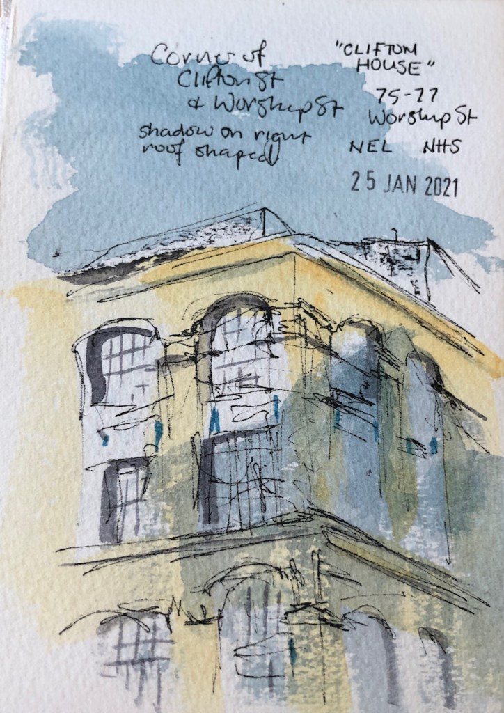
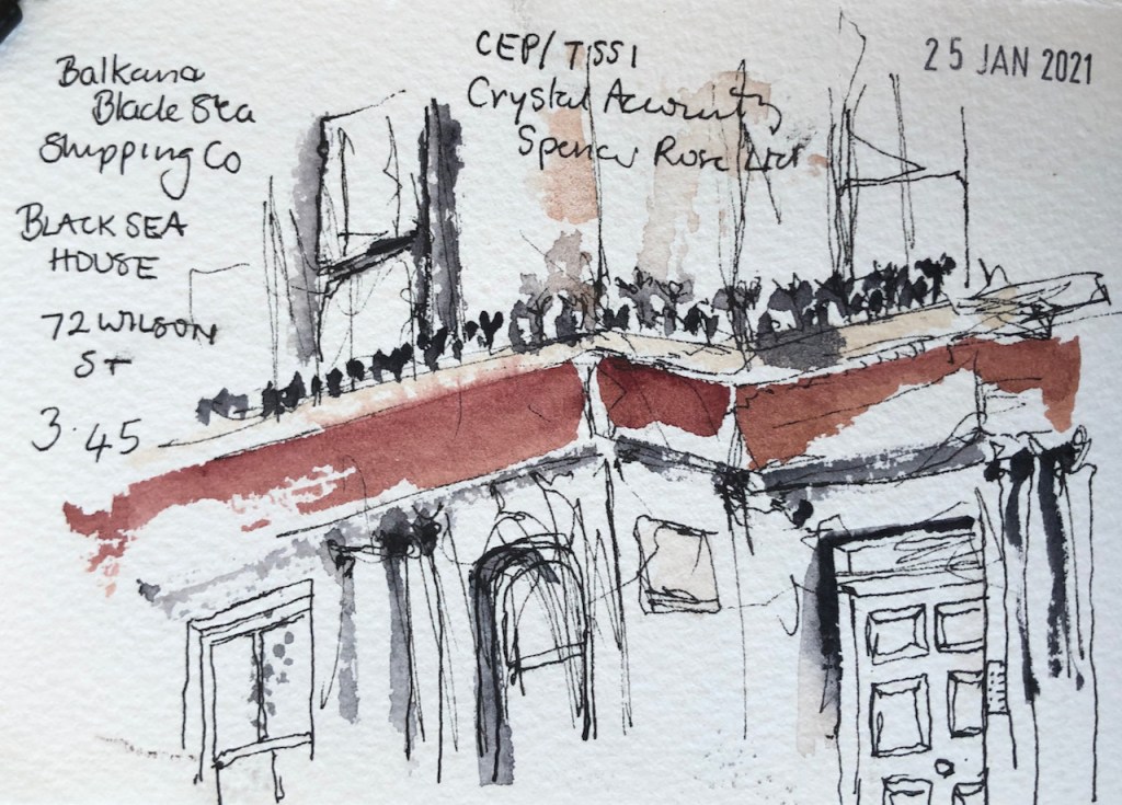
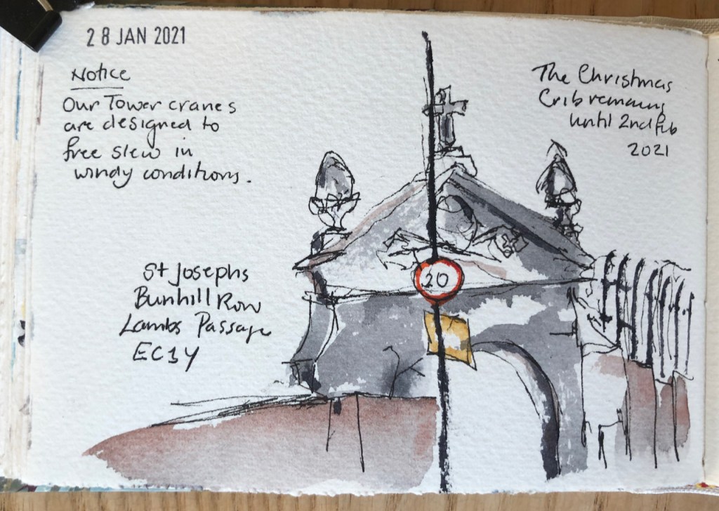
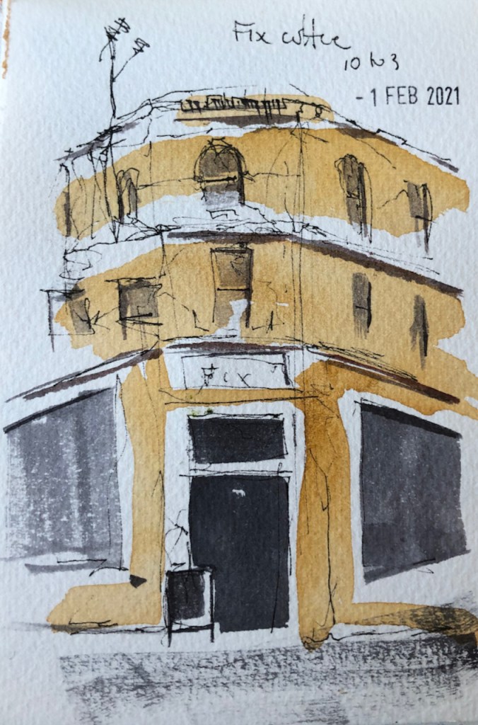
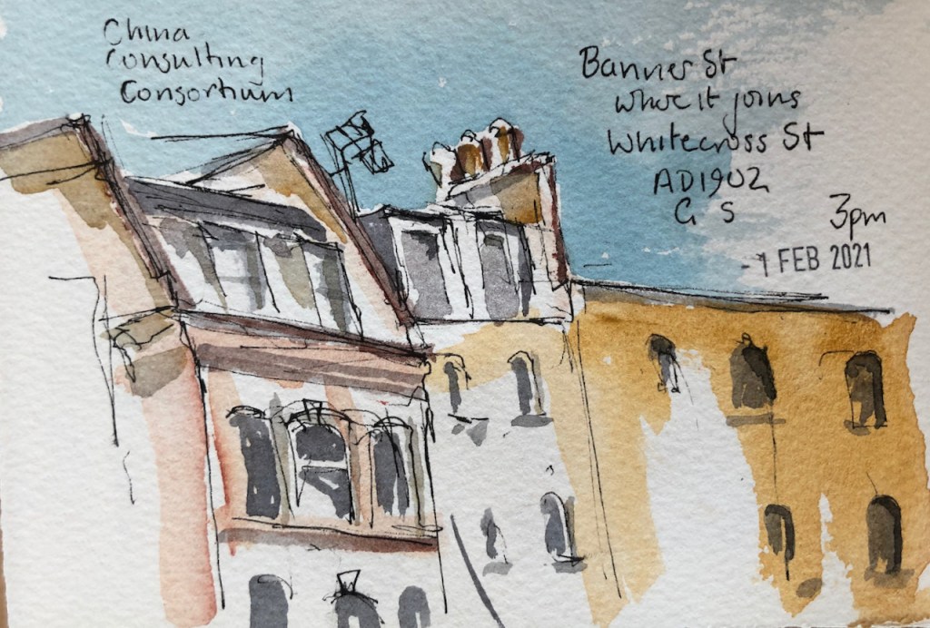
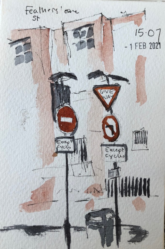
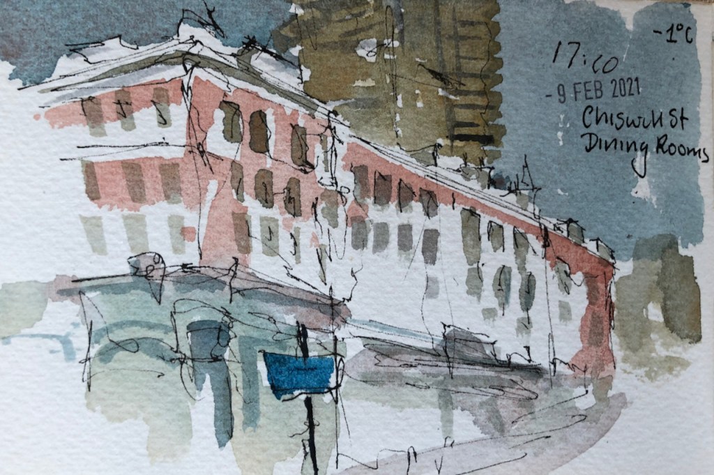
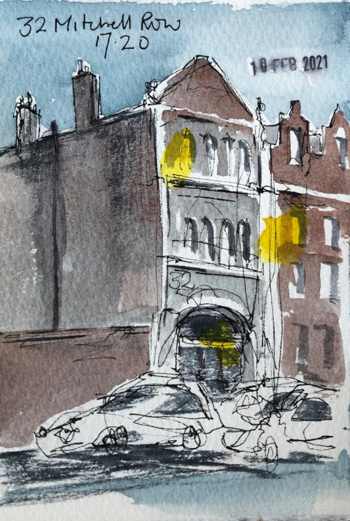
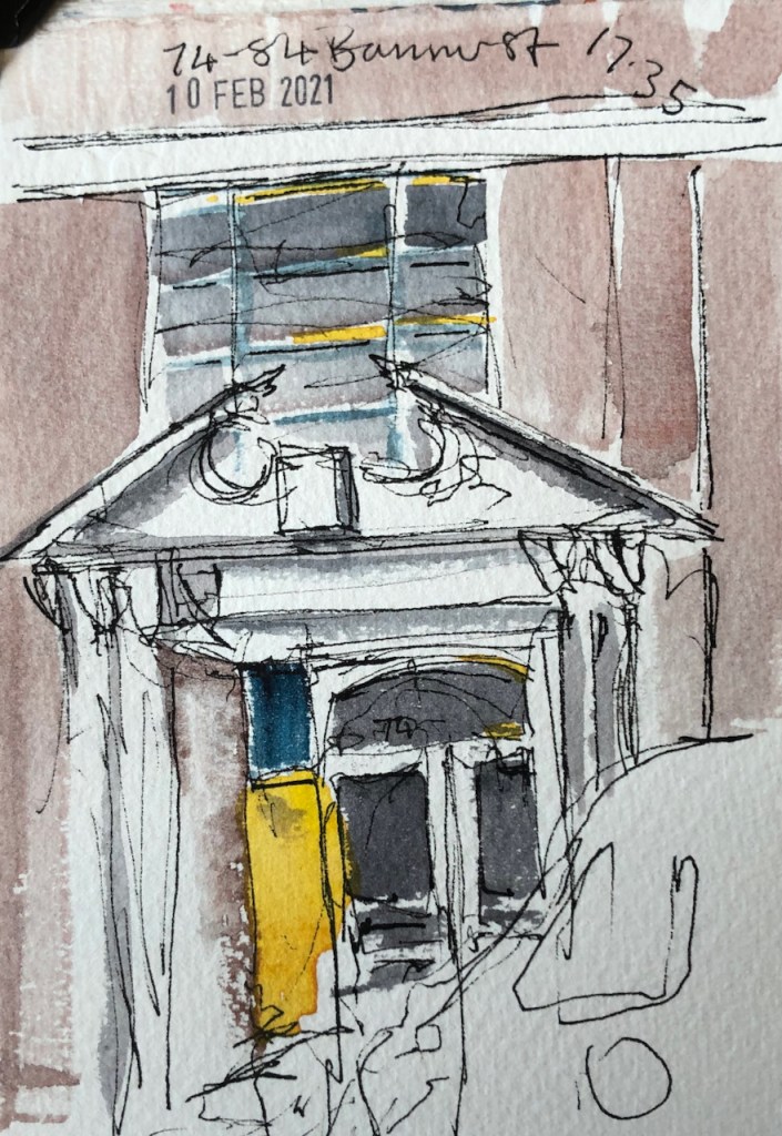
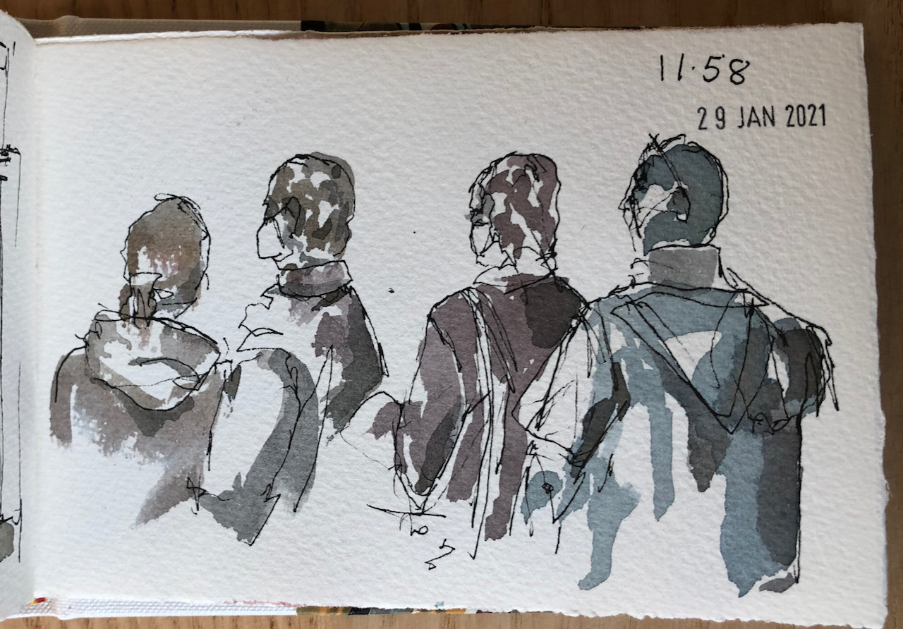
Here are some tiny sketches I made as a result of local walks. I have a small sketchbook, about 3½ inches by 5½ inches, the size of a big mobile phone. On my walks, I pause for a minute or so to notice a view, a detail. I make a few marks in the sketchbook, to remind me. Then when I get home, I make the sketch in watercolour, using the marks, and memory. I am trying to train my memory.
Monument on the South East corner of Finsbury Square.
Royal Exchange
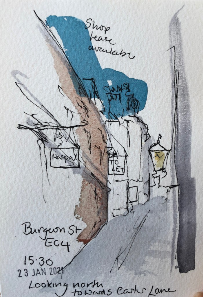
“Shop lease available” – many “To Let” signs…
St Joseph, Catholic Church
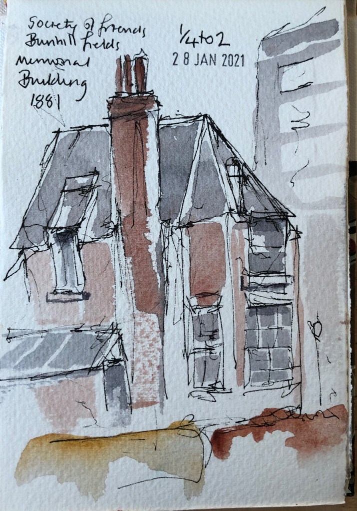
Quaker meeting house.
So many instructions…
The pub is closed.
COLPAI building under construction, Central St
Near St Luke’s
Old doorway, modern windows.
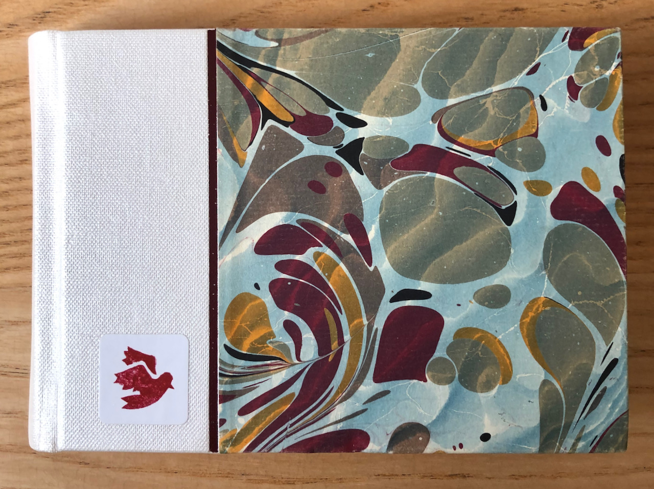
Here is the sketchbook:
It is from The Vintage Paper Company of Orkney. It was bound by Heather Dewick, @heatherthebookbinder on instagram. The paper is Saunders Waterford 200gsm Cold Pressed.
A nice small size for all occasions:
St Barts Hospital, “Welcome to the Vaccine Hub”
Colours are all Daniel Smith Watercolours. Pen is Sailor Reglus fountain pen with De Atramentis Black document ink (waterproof).
Click a button below to share this post online, email it, or print it:
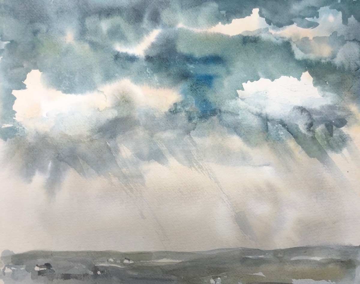
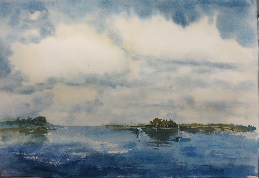
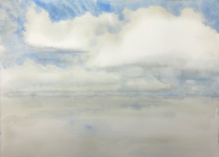
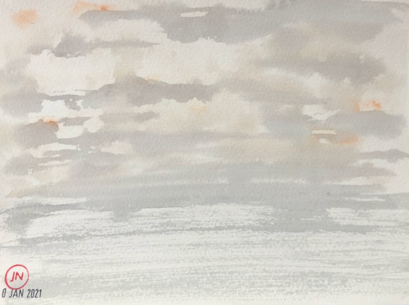
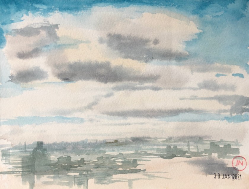
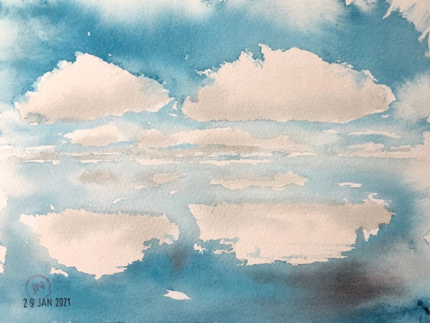
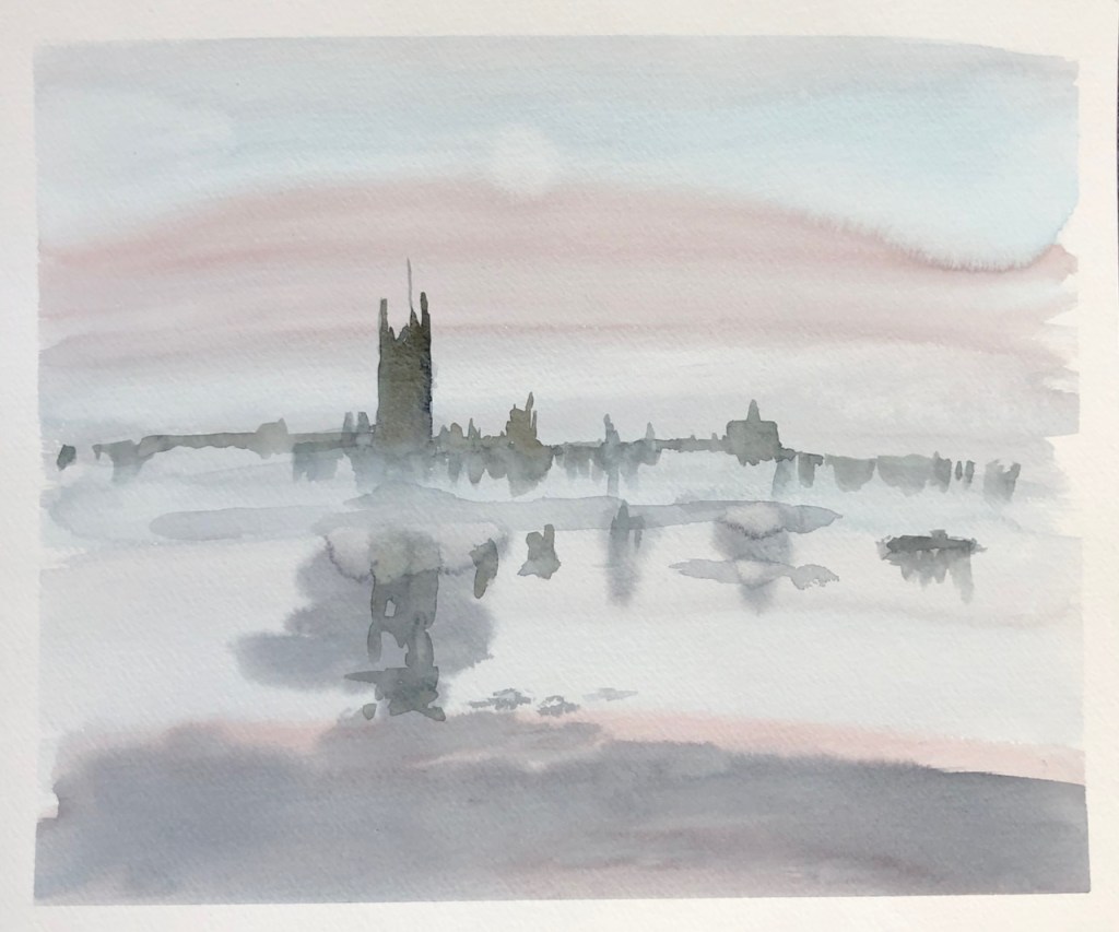
Here is a collection of cloud studies. This is me experimenting with “wet on wet” watercolour technique, from my desk. Click the image to see it bigger.
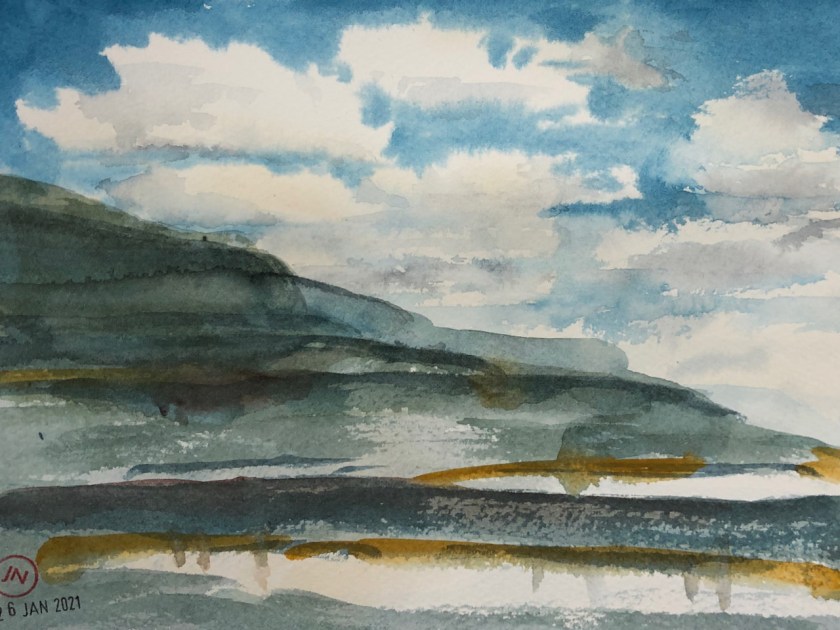
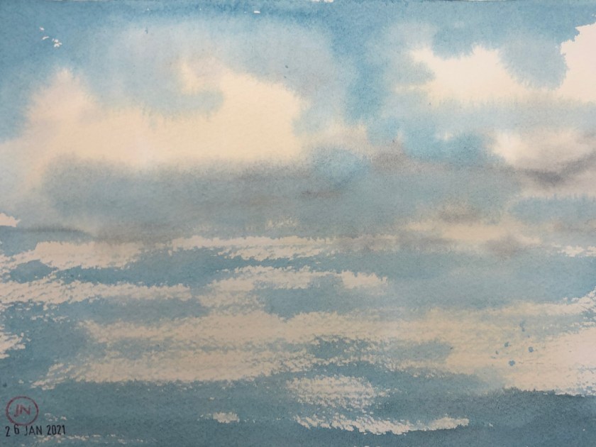
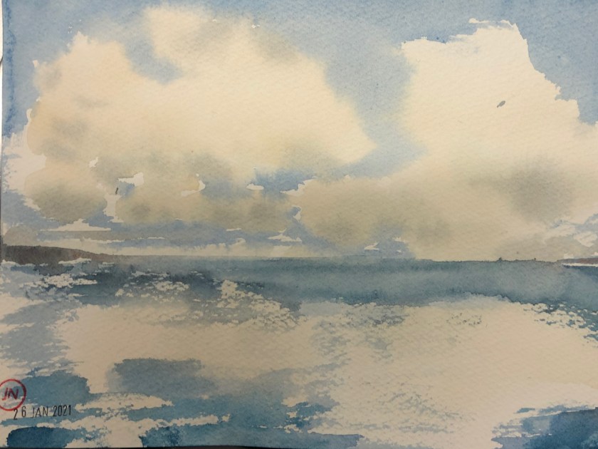
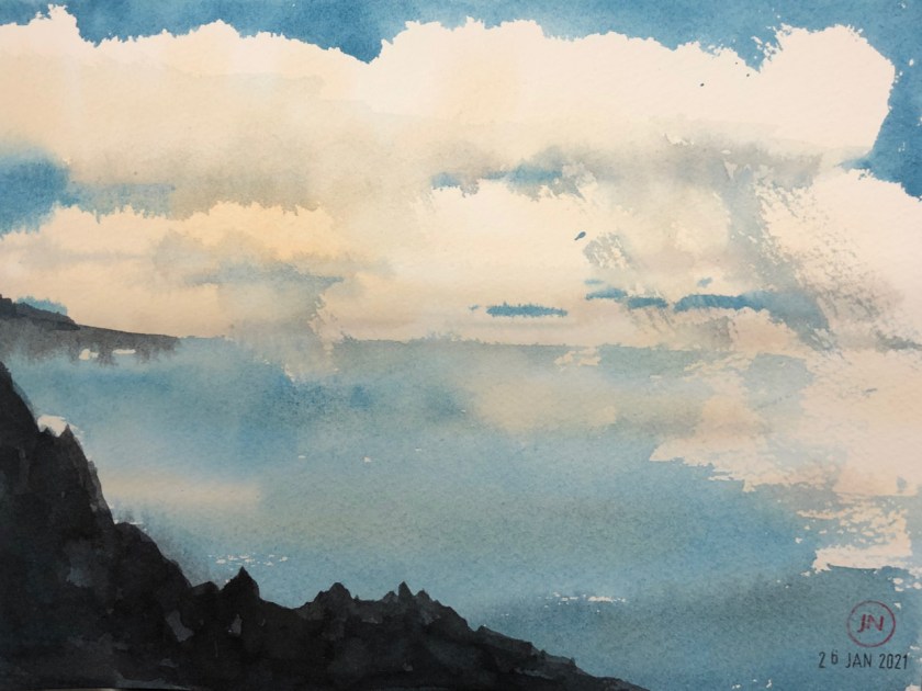
(1) Scene with boat (8″x11″)
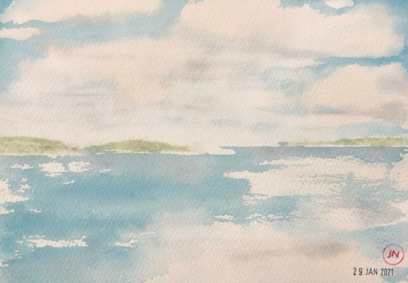
(2) Clouds and sea (15″x11″)
(3)Shetland (12″x10″)
(4) Walk on the cliffs (9″x6″)
(5) A calm day (9″x6″)
(7) Headlands (9″x6″)
(8) Clouds and rocks (9″x6″)
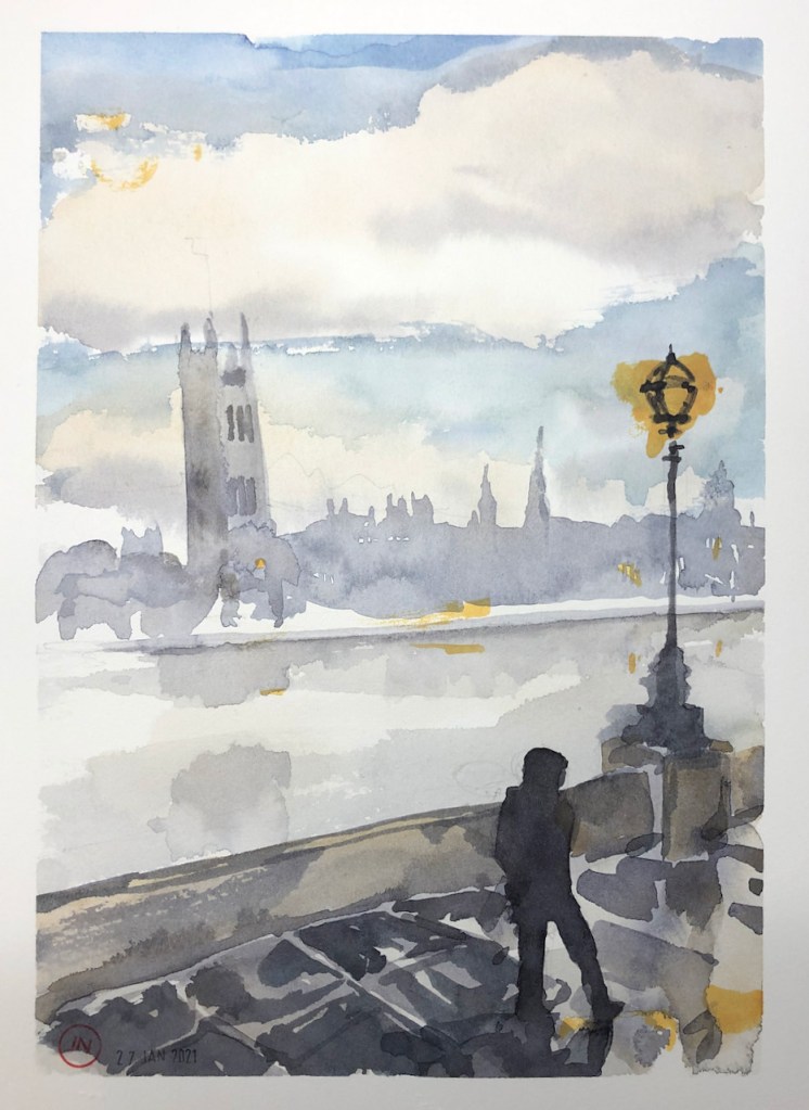
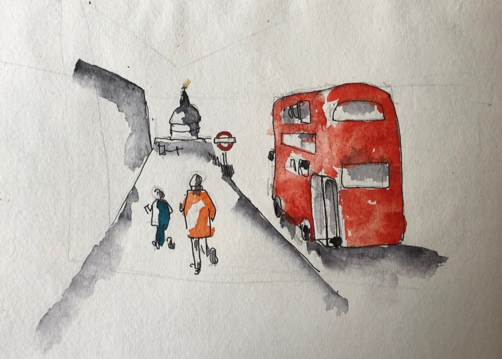
(9) Westminster (9″x12″)
(10) The North Sea (7″x5″)
(11) “..clearing from the West later” (7″x5″)
(12) Clouds in the sea (7″ x5″) [NFS*]
(13) Headlands (8″x6″)
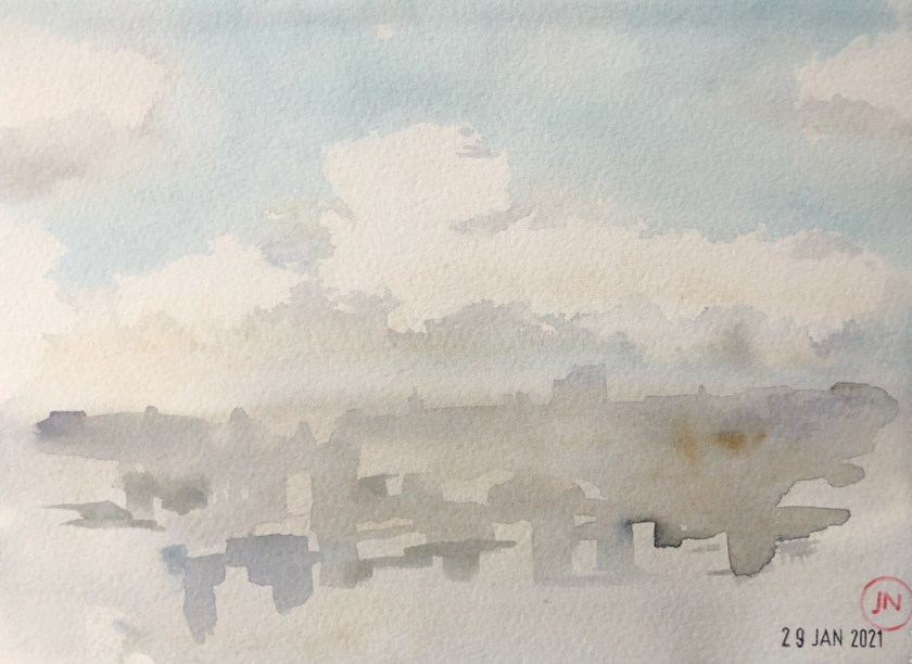
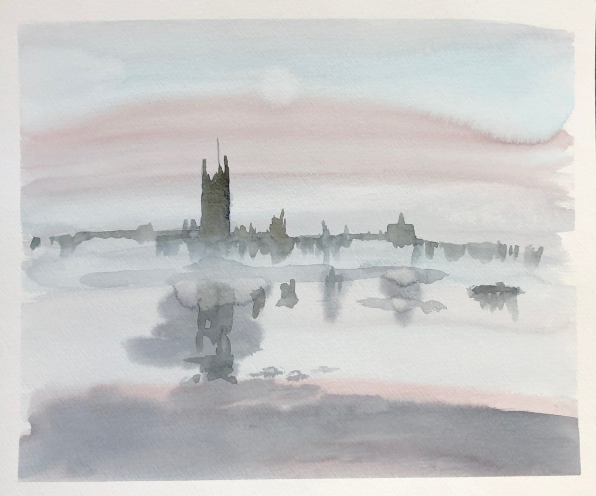
(14) Mist over the city (7″x5″) [NFS*]
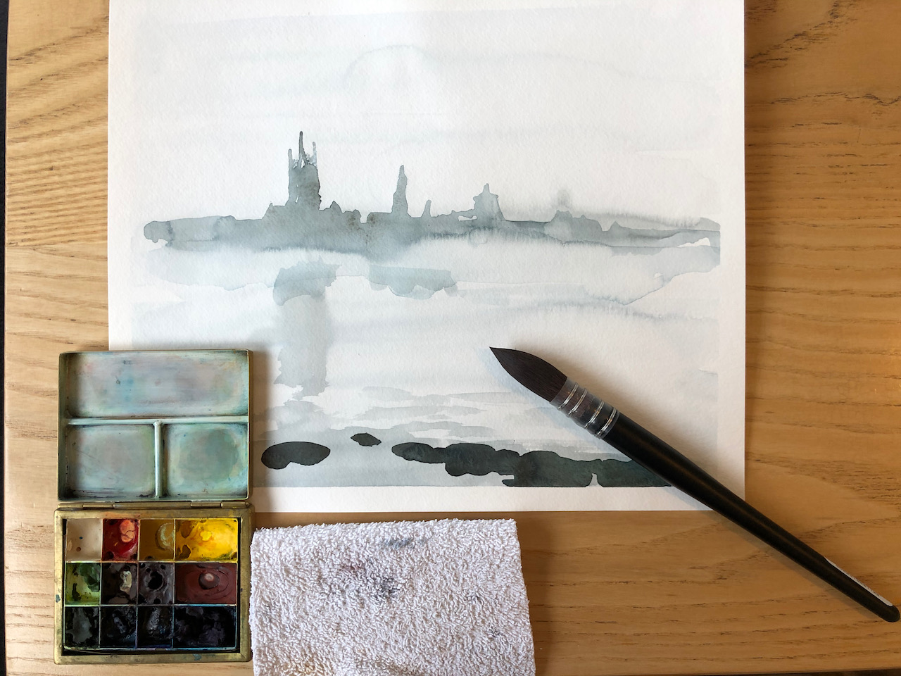
This wet-on-wet technique is a learning curve. For one thing, it makes my desk where I’m working all wet. I’m not yet sure how I’m going to translate this technique into a method I can use on location. I’m working on it. It’s certainly fun to see how the watercolour flows. The technique is a bit unpredictable, like tie-dying, or sourdough baking or surfing. One has to learn to guide rather than control.
I’m learning this wet-on-wet technique from the talented watercolour artist Matthew White in a video I’ve been watching.
Click a button below to share this post online, email it, or print it:
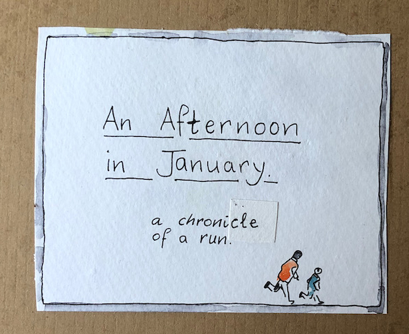
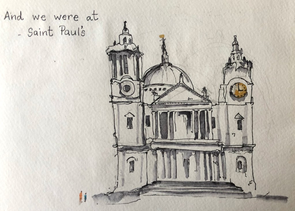
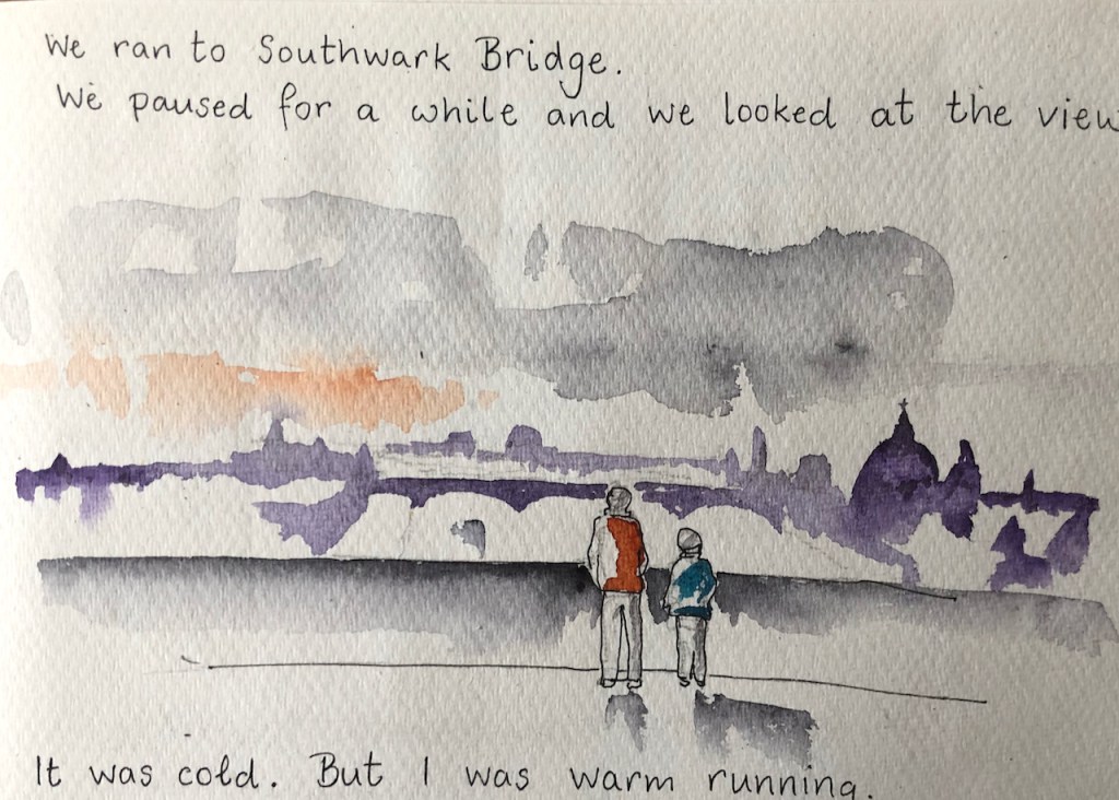
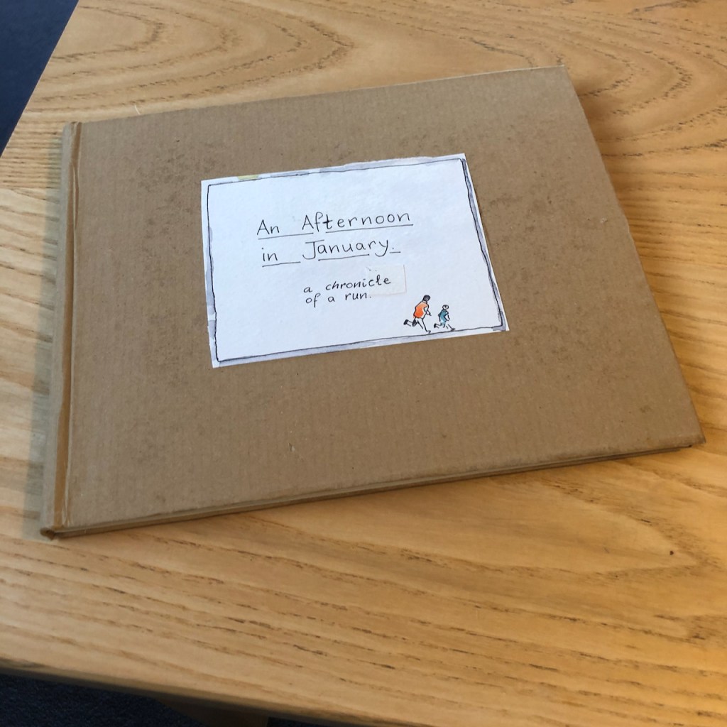
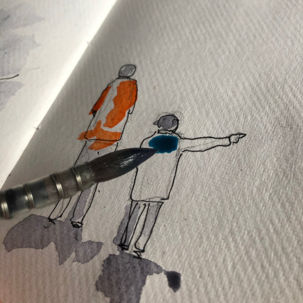
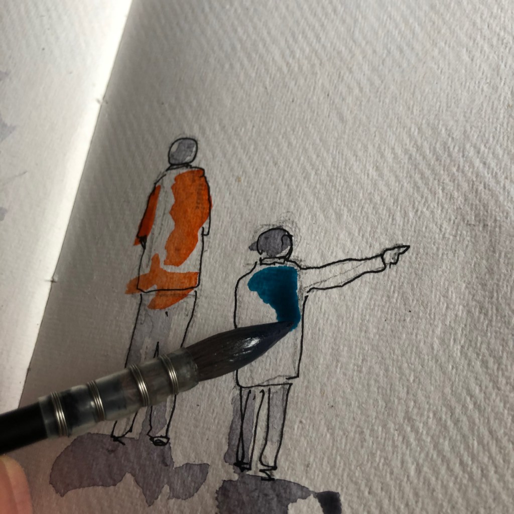
I made a book for a young friend. It describes one of our recent adventures: a circular run we completed together, before lockdown. Here are some of the pages:
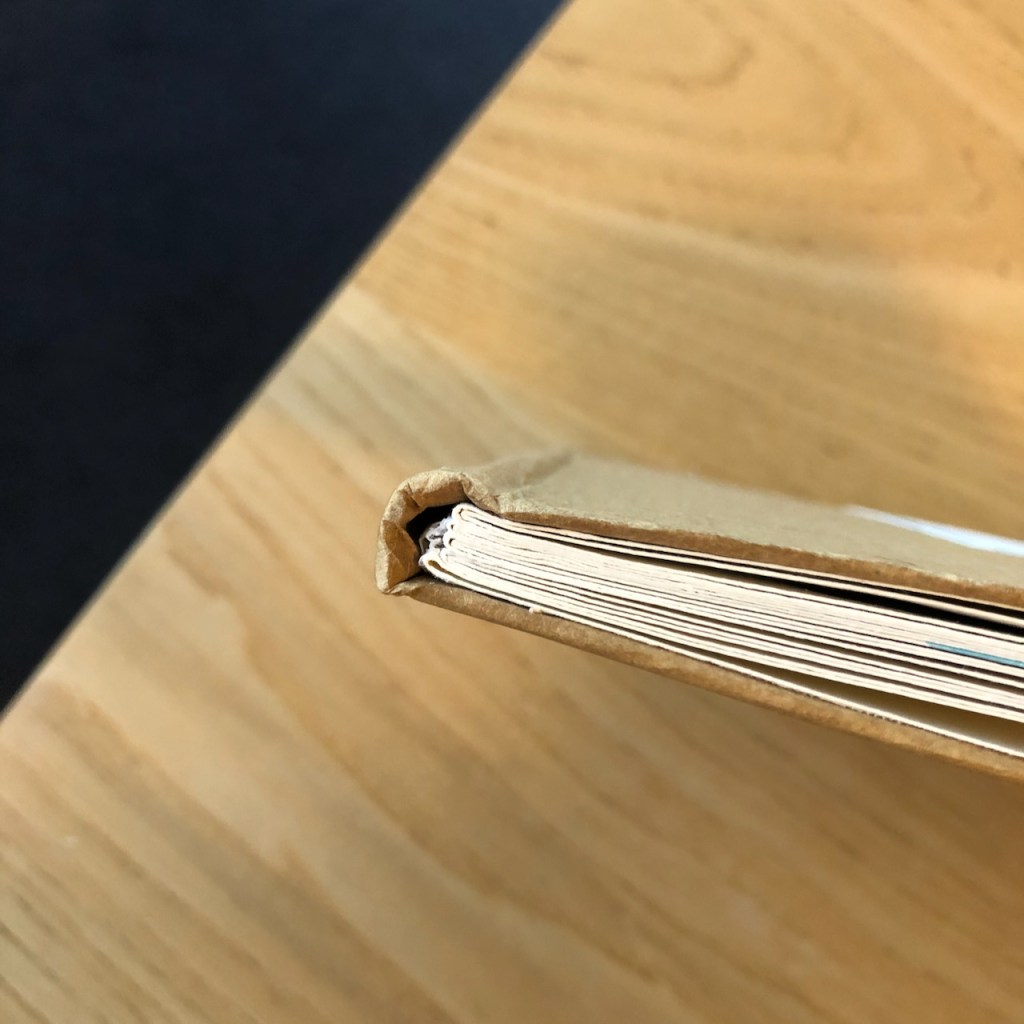
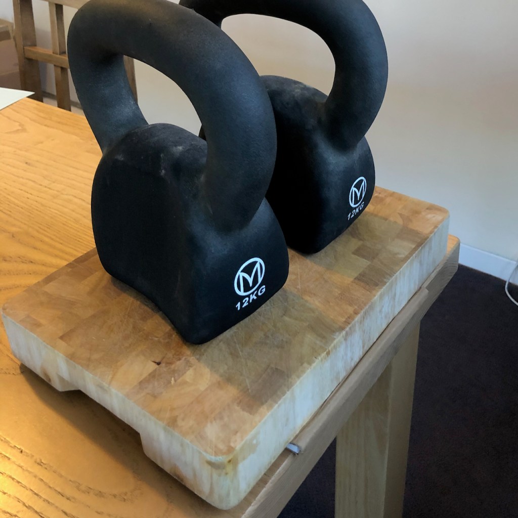
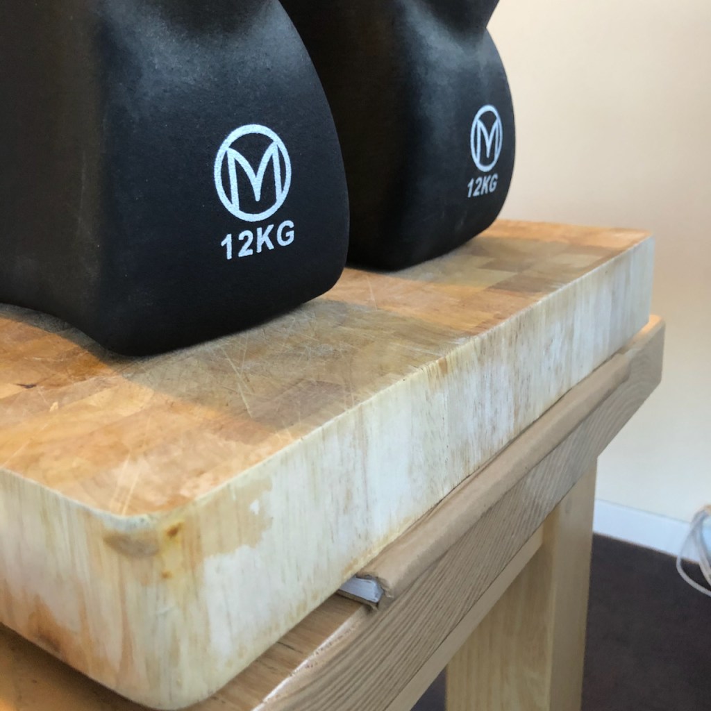
Here is the book under construction. The binding was made from the stiff cardboard from the back of drawing pads, strengthened at the spine with scrim, and covered in brown paper. In the absence of a bookbinding press I used two 12kg weights, and the breadboard. There were 32 useable sides (16 leaves), 4 signatures of 2 sheets and 1 signature of 1 sheet. The paper is Khadi smooth watercolour paper.
Work in progress on the book.
Click a button below to share this post online, email it, or print it:
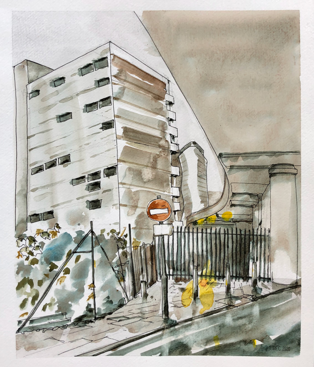
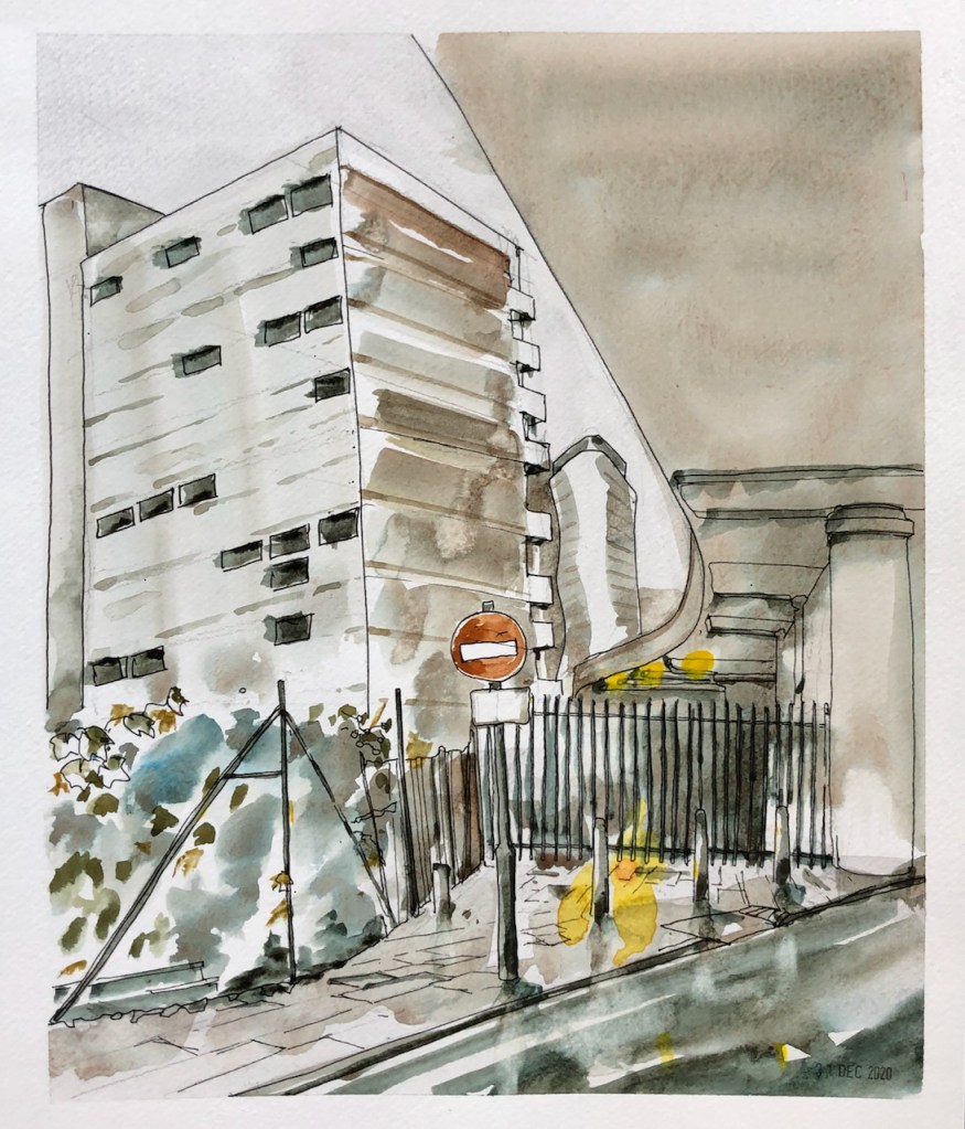
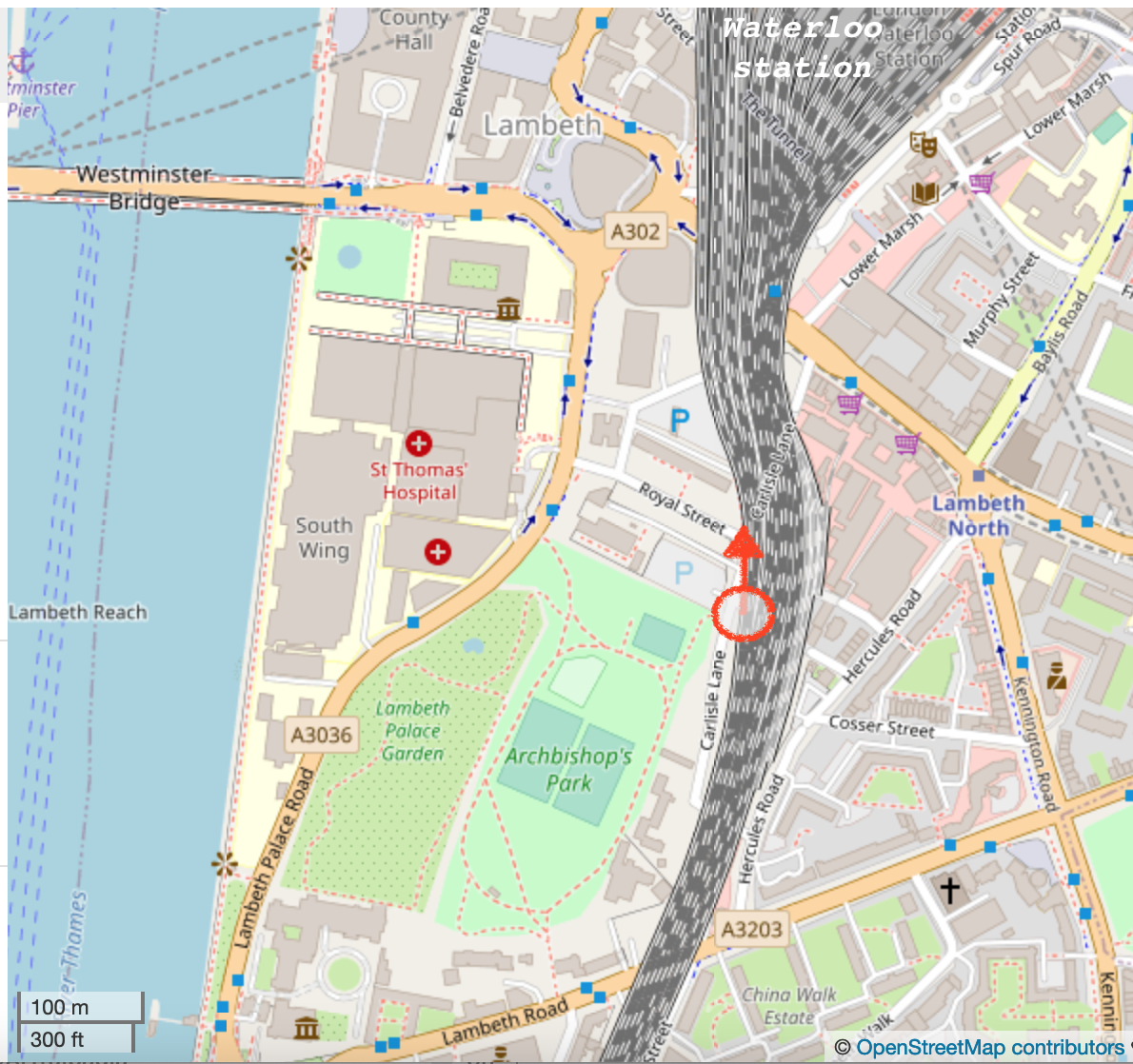
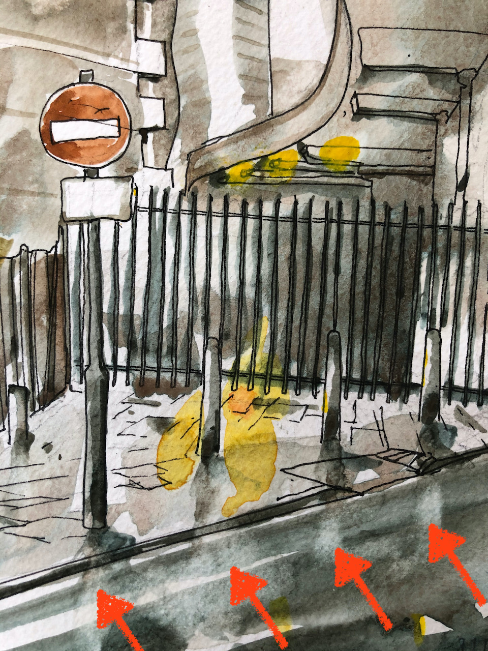
There are some wonderful railway arches near Waterloo. They are architectural marvels, with striking mathematical curves and uncountable numbers of bricks. Here is a view from underneath one such arch, on Carlisle Lane, looking North towards Waterloo.
Carlisle Lane, looking North. 12″ x 10″ From photo reference, 31st Dec 2020
Map showing location of drawing, (c) Open Street Map contributors. Click to enlarge.
The building on the left of the picture is “Canterbury House” on Royal Street, built 1959-1960. The greenery at the front is part of gardens and allotments, adjacent to Archbishop’s Park.
The white notice below the “No Entry” sign says “Except cycles”.
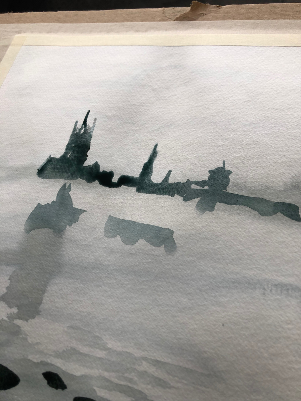
Here is a close up of the picture. The parts marked with arrows show where I lifted the wet paint off the paper to make a white mark.
The main colours are Phthalo Turquoise, Fired Red Ochre and Mars Yellow, with a bit of Transparent Pyrrol Orange for the traffic sign. This is on a sheet of Jackson’s watercolour paper, 12″ x 10″.
Click a button below to share this post online, email it, or print it:
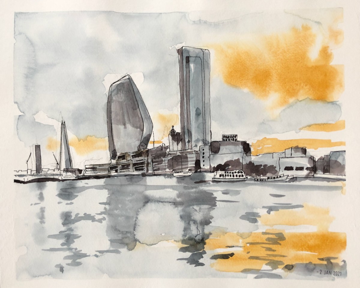
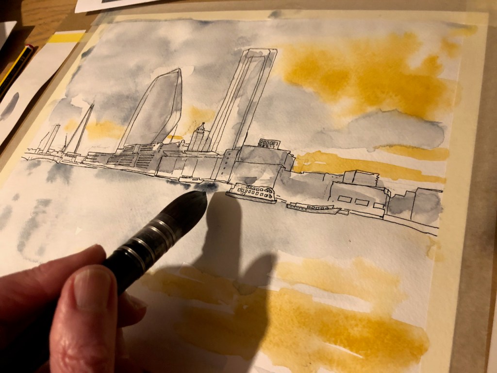
This is the South Bank of the Thames, near Blackfriars Bridge, seen from the North Bank.
South Bank (1), from photo reference. 2nd Jan 2021. 12″ x10″ sheet.
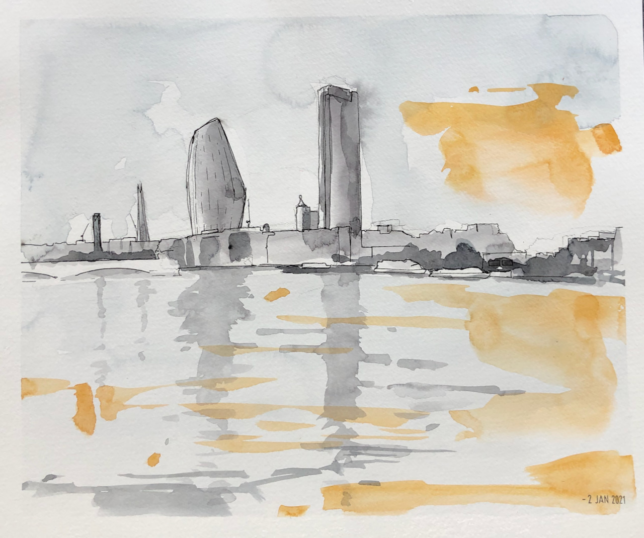
This was part of my experimentation with Jackson’s watercolour paper. Jacksons Art Supplies sent me a pack of 50 sheets, and asked for an honest review. 50 sheets is a lot of paper, and so I’ve felt able to experiment. I’ve enjoyed using it. Here is another version of the same scene.
South Bank (2), from photo reference. 2nd Jan 2021, 12″ x10″ sheet
Jackson’s also sent a few brushes, one of which was an enormous “Raven” mop brush. This has a soft furry head. It is great fun to use as it holds so much paint.
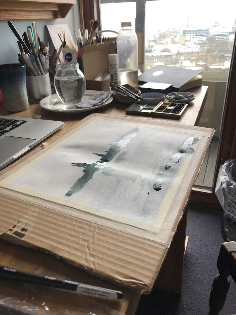
Here is the Raven brush in action. Although it is huge, it comes to a small point, so I can make little dots, or add a small amount of colour to a wash, as here.
The paper is capable of taking “layers” of paint, as you see here. The grey and the orange overlap without becoming a muddy mess. I was painting indoors, so I could allow each layer to dry, which is important in order to avoid a mush.
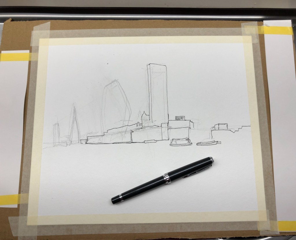
Here is work in progress. I taped the paper to a piece of corrugated cardboard from a delivery box. The white strips down the edges are to give me somewhere to try out the colours.
Last year, before the first lockdown, I drew this view in a sketchbook on location:
Here’s the South Bank seen from the Victoria Embankment on the North Bank. Here you see the modern blocks, with the older wharves in front. The low red building towards the right is Oxo Tower Wharf, formerly a factory making OXO cubes, now a place with workshops for jewellers, a restaurant and various cafés. The…
Click a button below to share this post online, email it, or print it: