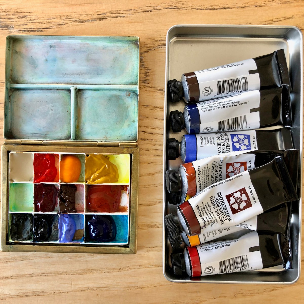


I refreshed the colours in my palette. This watercolour palette is by David Cooper of Classic Paintboxes: see my article about this box.
Here is the updated colour list. I moved the Fired Gold Ochre to a bigger space. There are three new joiners, and three colours are moved out. The three that moved out are: Green Gold, Burnt Umber, Hansa Yellow Mid.
- Buff Titanium
- Transparent Pyrrol Orange
- Permanent Yellow Deep (new joiner)
- Mars Yellow
- [Empty]
- Perylene Maroon
- Transparent Brown Oxide (new joiner)
- Fired Gold Ochre
- Green Apatite Genuine
- Prussian Blue
- Lavender (new joiner)
- Phthalo Blue Turquoise
Buff Titanium is a good colour for concrete and plaster, and for modifying other colours to make them less bright.
Transparent Pyrrol Orange is a weathered red, I use it for pillar boxes, or highlights on brickwork.
Permanent Yellow Deep is a new colour for me, replacing Hansa Yellow Med. I found the Hansa Yellow a rather cold colour, so I’ll see what the Permanent Yellow Deep does.
Mars Yellow is a colour I use a lot. It’s an earthy yellow, great for brickwork, concrete with lichen, and for making dull greens
Perylene Maroon is a very intense dark red. A little goes a long way. It’s handy for the podium tiles in the Barbican, and to make black with Prussian Blue, or for darkening any green.
Transparent Brown Oxide is another new colour. I found Burnt Umber a bit boring. I wanted to see if this brown was more useful. I hope it is yellow in dilute amounts and so I can make dark brown fading to sun-washed straw tones.
Fired Gold Ochre is a lovely granulating colour. It makes bricks, or earth. I also add it to other colours to make them granulate more. Unlike Perylene Maroon, a lot goes a little way – you have to splurge it on to get the colour. I’ve put it in a big palette space so I have enough.
Green Apatite Genuine is a luxury colour, real gemstone – a bright green with black flecks. This is sunlit ivy. I have just this one small piece left.
Prussian Blue is surprisingly bright when dilute and gloriously dark in the mass. I use it to make black, with browns or Perylene Maroon.
Lavender is the third new joiner. It is a granulating blue which I hope will make useful greys with the browns. Also evening skies.
Phthalo Blue Turquoise is my go-to colour for London skies. It’s a cold non-granulating blue.
I have one empty palette space in this twelve-space array. I have some Pink Rhodenite Genuine on order.
