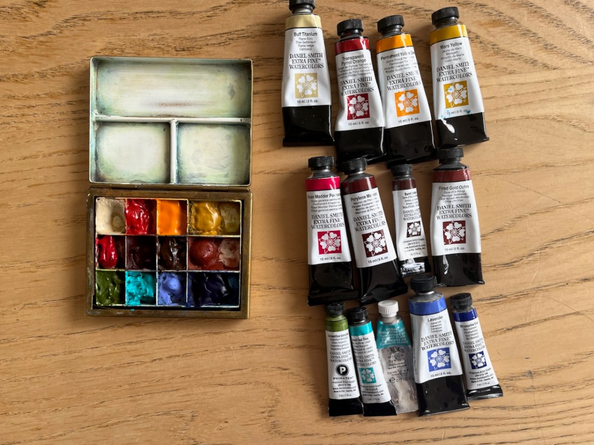

Another refresh of the colours in my palette. This watercolour palette is by David Cooper of Classic Paintboxes: see my article about this box.
Here is the updated colour list. The top row is unchanged: I liked the Permanent Yellow Deep and it’s stayed. The colour for the empty space is a pink: Red Madder Permanent. I find pink a really hard colour to mix: and it turns up frequently in the urban scenes I paint – graffiti, flowers, doors, brickwork. The Brown Oxide was not a great success: it doesn’t make a decent black. So Burnt Umber went back in there. This makes a good black/grey with Ultramarine Blue (a new joiner). The green on the bottom row is now Serpentine Genuine. This is an amazing colour which is highly granulating and separates out into green and red when unmixed. Very useful for foliage. Cobalt Turquoise Light is another new joiner, an impossible colour to mix and it’s needed for a summer sea, a bright sky. This is a W&N colour. The tube is nearly finished: its a useful colour. I’m going to try the very similar DS colour: Cobalt Teal Blue, which is the same pigment, PG50. The Lavender is a lovely colour and stays in. My dark blue is now Ultramarine Blue. Prussian Blue and Phthalo Blue Turquoise are moved out.
- Buff Titanium
- Transparent Pyrrol Orange
- Permanent Yellow Deep
- Mars Yellow
- Red Madder Permanent (new joiner)
- Perylene Maroon
- Burnt Umber (replacing Transparent Brown Oxide)
- Fired Gold Ochre
- Green Serpentine Genuine (replacing Green Apatite Genuine)
- Cobalt Turquoise Light (W&N) – to be replaced by Cobalt Teal Light (DS)
- Lavender
- Ultramarine Blue (replacing Phthalo Blue Turquoise)
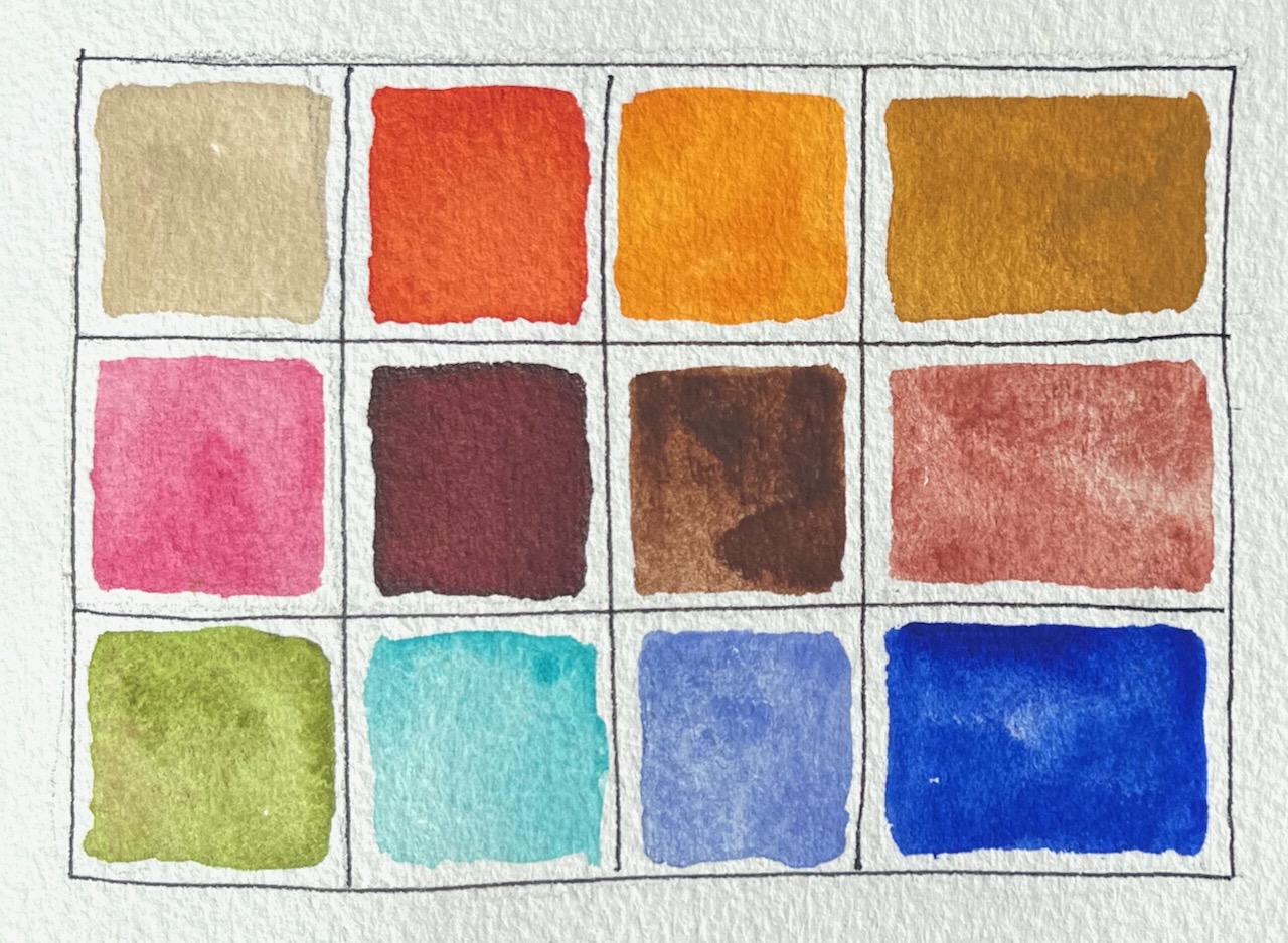
Buff Titanium is a good colour for concrete and plaster, and for modifying other colours to make them less bright.
Transparent Pyrrol Orange is a weathered red, I use it for pillar boxes, or highlights on brickwork.
Permanent Yellow Deep is a new colour for me, replacing Hansa Yellow Med. I found the Hansa Yellow a rather cold colour, so I’ll see what the Permanent Yellow Deep does.
Mars Yellow is a colour I use a lot. It’s an earthy yellow, great for brickwork, concrete with lichen, and for making dull greens
Perylene Maroon is a very intense dark red. A little goes a long way. It’s handy for the podium tiles in the Barbican, and to make black with Prussian Blue, or for darkening any green.
Burnt Umber is useful and natural looking. It makes black with Ultramarine Blue.
Fired Gold Ochre is a lovely granulating colour. It makes bricks, or earth. I also add it to other colours to make them granulate more. Unlike Perylene Maroon, a lot goes a little way – you have to splurge it on to get the colour. I’ve put it in a big palette space so I have enough.
Green Serpentine Genuine is a luxury colour, real gemstone – a bright green with red flecks. It mixes well with other colours. Makes good foliage.
Cobalt Blue Turquoise or Cobalt Teal Blue (P50) This is good for lighter skies.
Lavenderis a granulating blue which is useful for skies and toning down other colours. It is a natural-looking colour.
Ultramarine Blue is good for skies except that it granulates.


