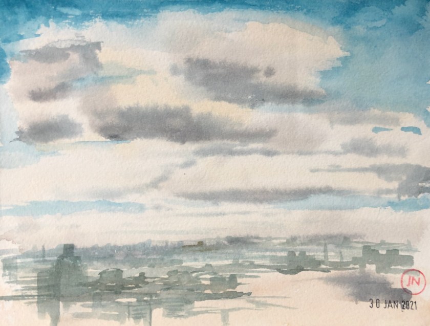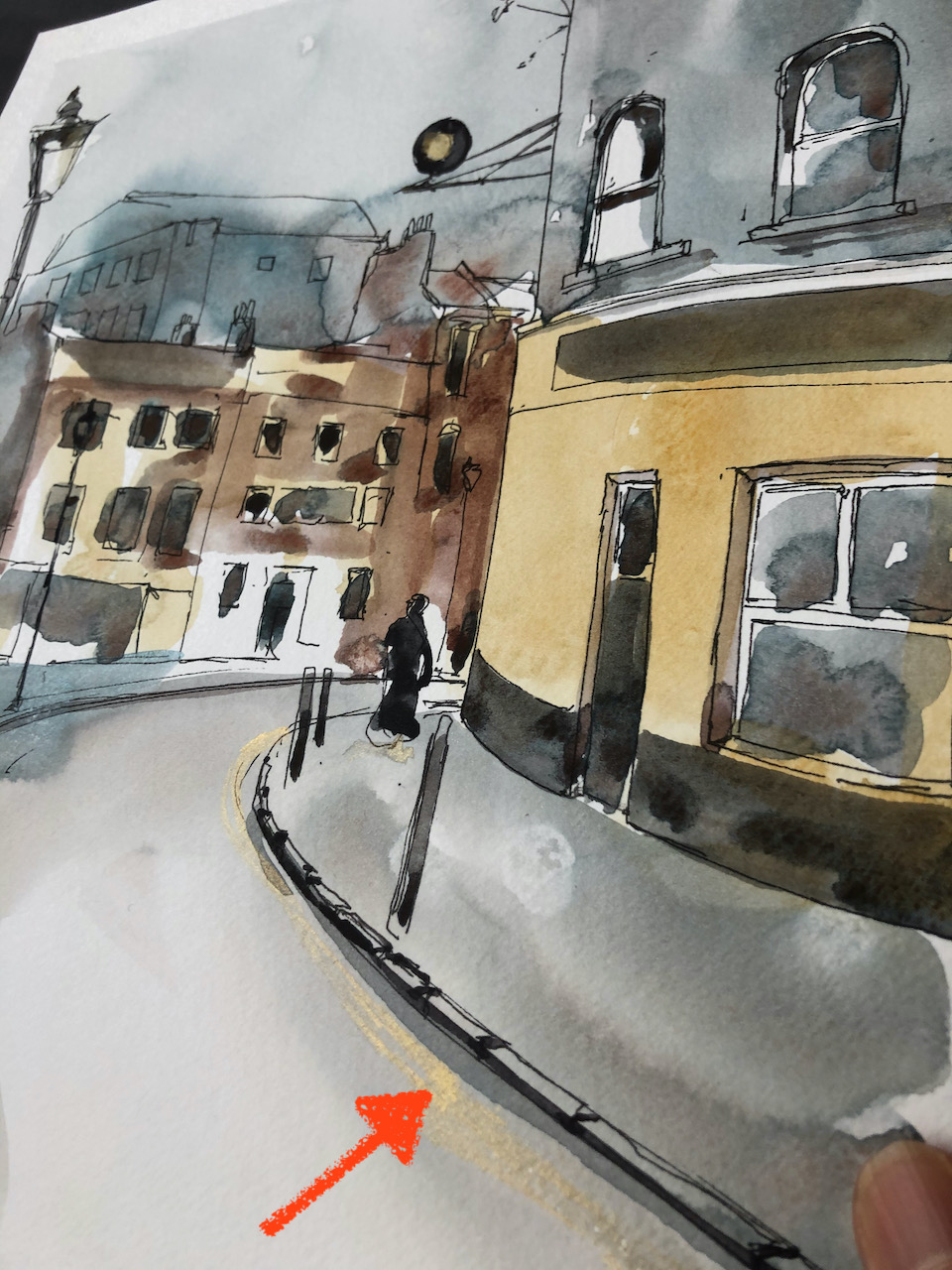

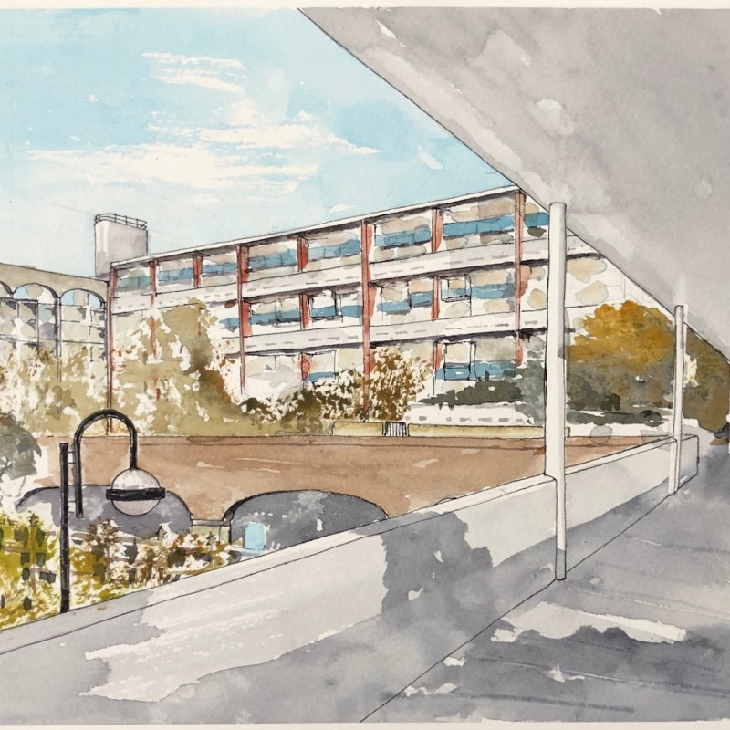
Here is the view from a top floor flat in Stanley Cohen House, Golden Lane Estate.

You can see right across the estate to buildings on the far side of the Goswell Road. That’s Basterfield House on the right, and Crescent House in the middle, with the scalloped roof.
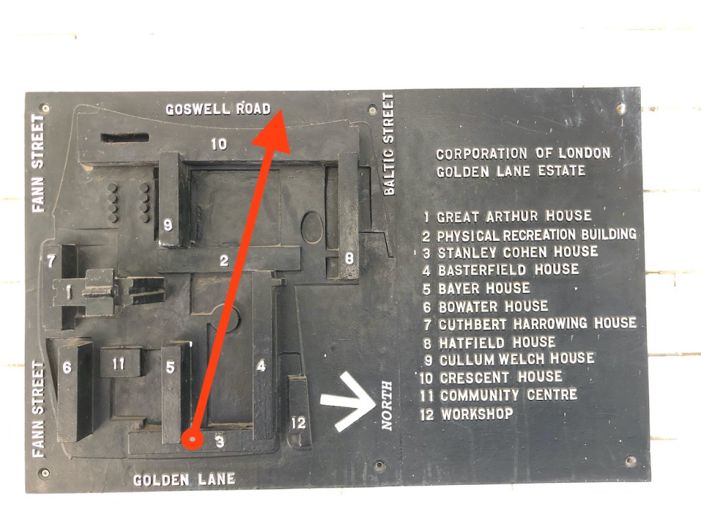
Here are some maps:


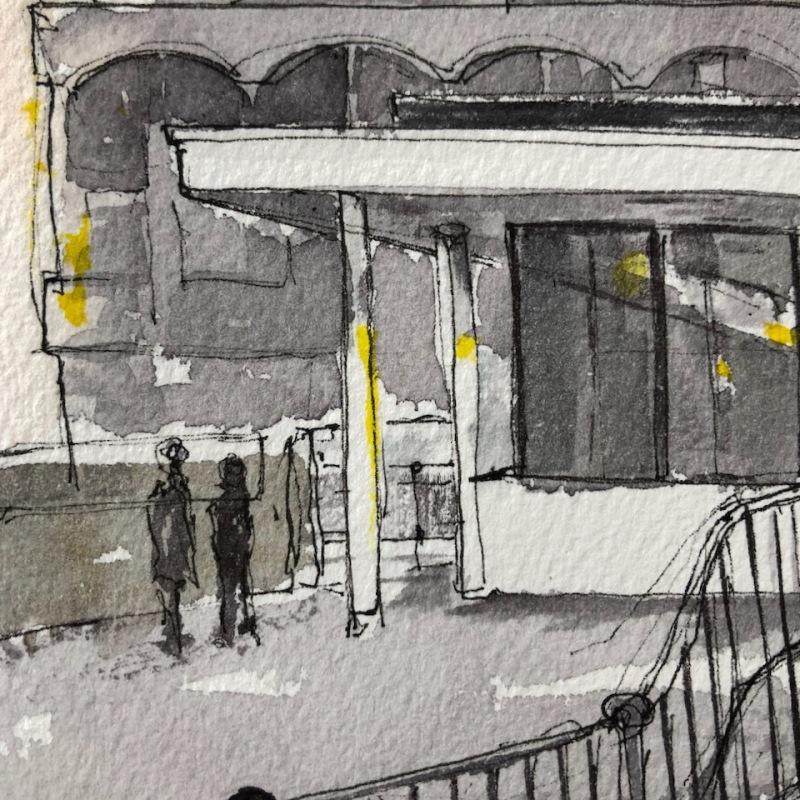
In the centre of this drawing is one of the features I particularly admire in the Golden Lane Estate. There is an “outdoors room” at Podium Level integrated into the Leisure Centre. The space feels like a room: it is roughly square and has a roof. On one side are glass windows which overlook the swimming pool, and on the other side the windows look down into the indoors exercise space. I feel sure that the architects in the 1970s anticipated that this outdoors space would be used for Yoga, or Martial Arts, or perhaps storytelling. They might have envisaged yoga mats, bean bags. It seems to me to be so clearly part of the Leisure Centre, that it must have been intended for a group exercise of some sort. It is now well maintained, but not used (as far as I can tell), except as a transit route. I drew a picture from there.
There was also an “outdoor room” on the way to the top floor flat in Stanley Cohen House, as well as splendid outdoor walkways with long views out to the west.

This generosity with public, communal and informal spaces seems to me to characterise a certain view of society, in which people would want to meet, improvise, and interact with strangers and neighbours. There is a certain value placed on “empty” and unallocated space: it represents “possibility” offered to residents, who may have better ideas than the architects about how to use their space. This shows humility and humanity in the design. A vacant outdoor room represents an invitation to residents and passers-by: “come in, make of this what you will, do something here”. There is a space in which to pause and breathe. It is very different from the modern developments, such as the Atlas Building or Eagle Point, whose stark vertical walls cut off the Outside from the Inside. Every square inch has an allocated use. The architects have decided in advance which space is to be a “lounge” or a “cinema” or a “gym”. There is no “empty” communal space. The designers have decided in advance what you will do here.
I applaud the empty spaces and white-walled “outdoor rooms” in the Golden Lane estate, just as I value the huge areas of unadorned public space in the Barbican: they are places in which your mind is free. Long may they remain.
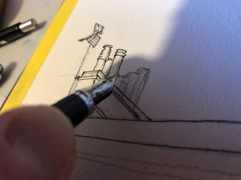
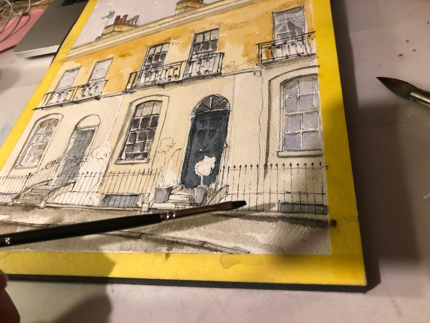
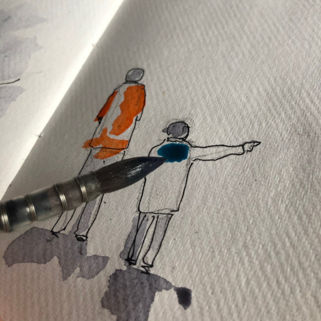
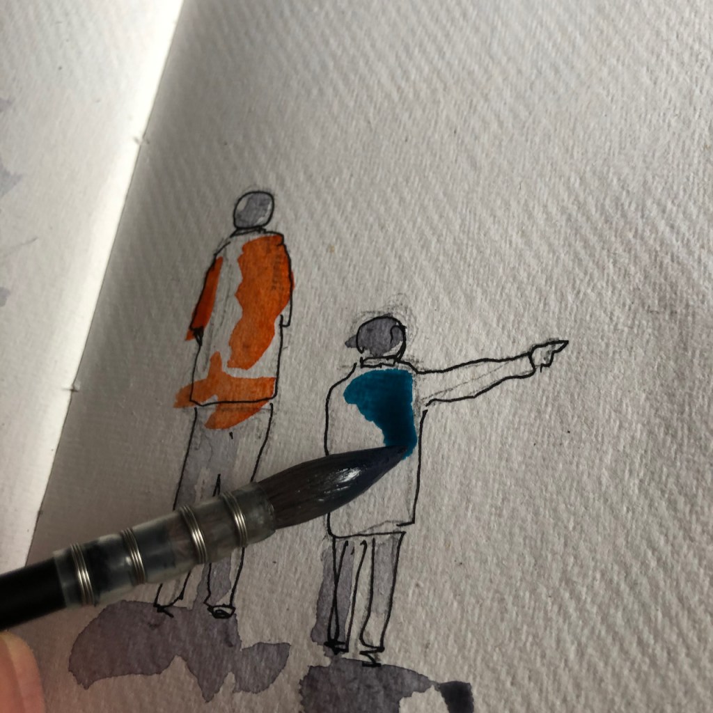
I perhaps had these thoughts because I was drawing my picture from an empty unfurnished flat. I was kindly given access by the owner, while the flat was being redecorated between tenants. Here is work in progress on my drawing.

Finished drawing 
Taking a pause 
Pen 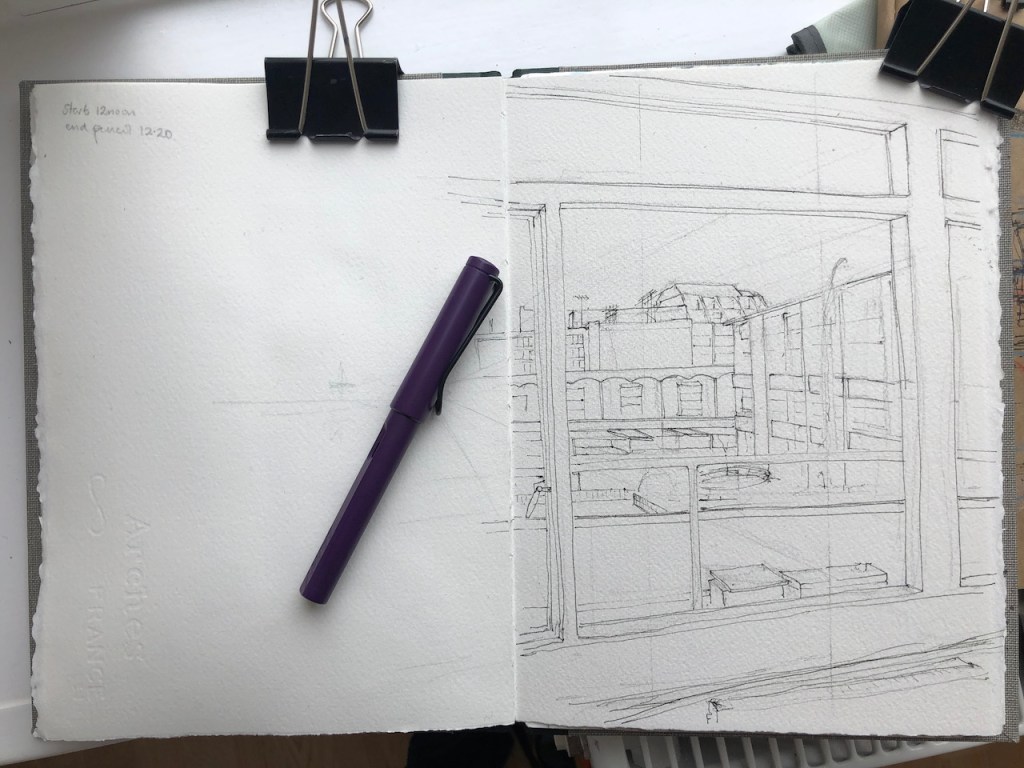
Pen (Lamy Safari) 
Pen 
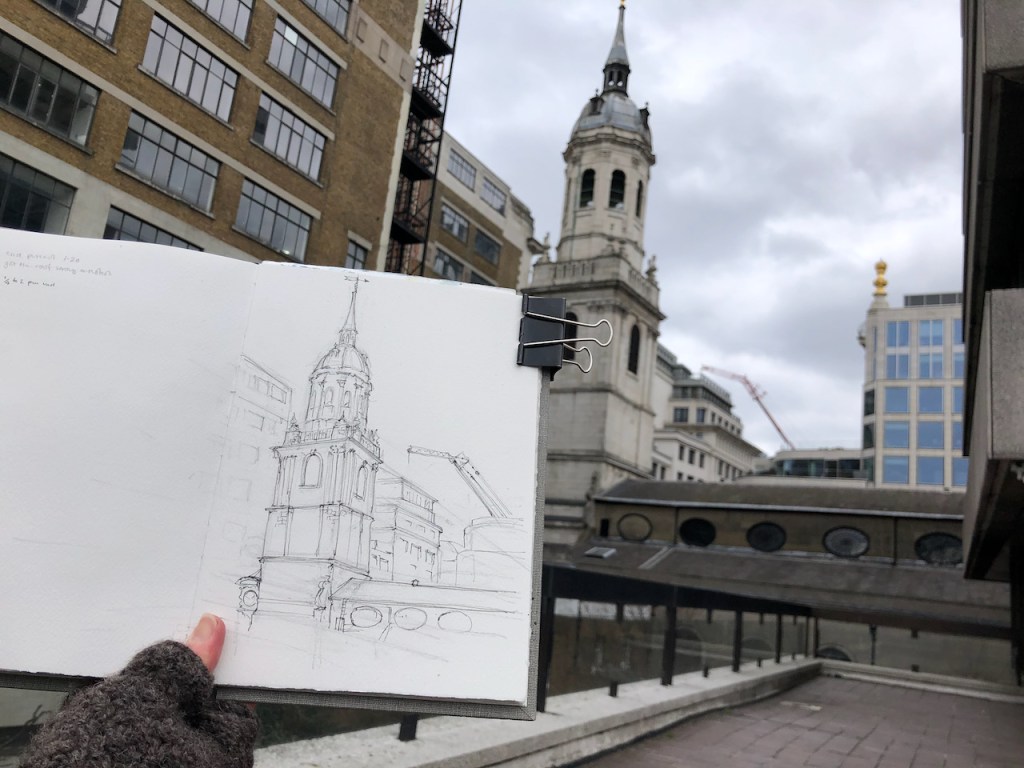
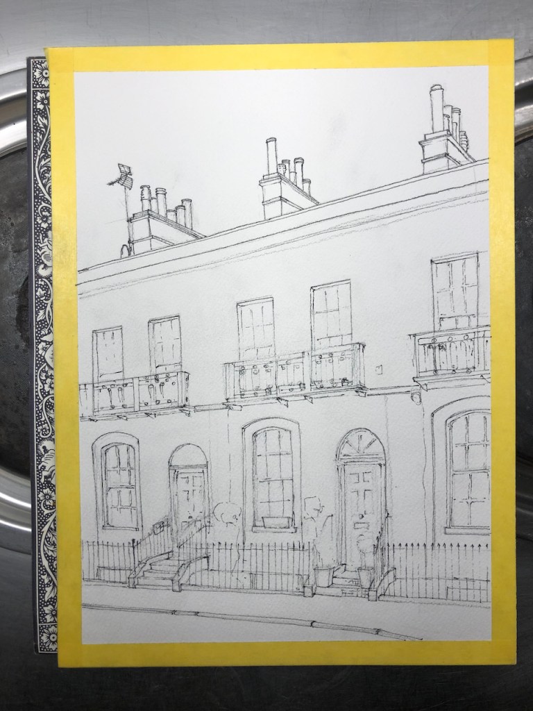
Pencil underdrawing 
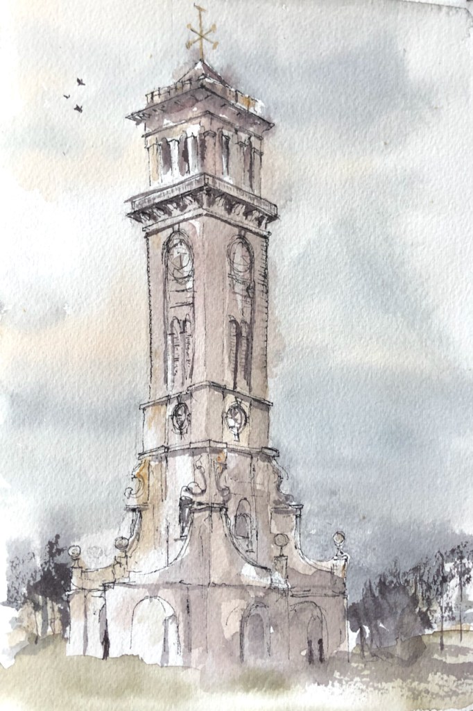
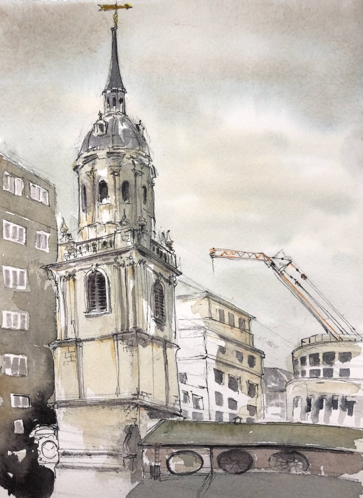
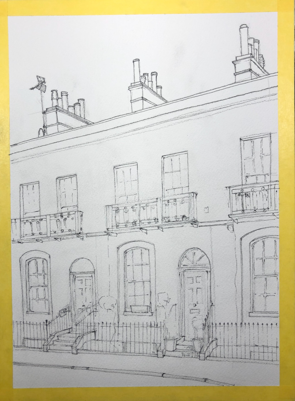
Preliminary sketch 
Preliminary sketch
The main colours in this picture are: Phthalo Blue Turquoise (W&N), Prussian Blue (Jacksons), Perylene Maroon (DS), Mars Yellow (DS), plus Transparent Pyrrol Orange (DS) for the balconies on Basterfield House, and a small bit of Green Gold (DS) on the lighter parts of the tree.
Here are tools:

Home-made tool wrap 
Pen: Lamy Safari 
Brushes from Cornillissen and Rosemary & Co
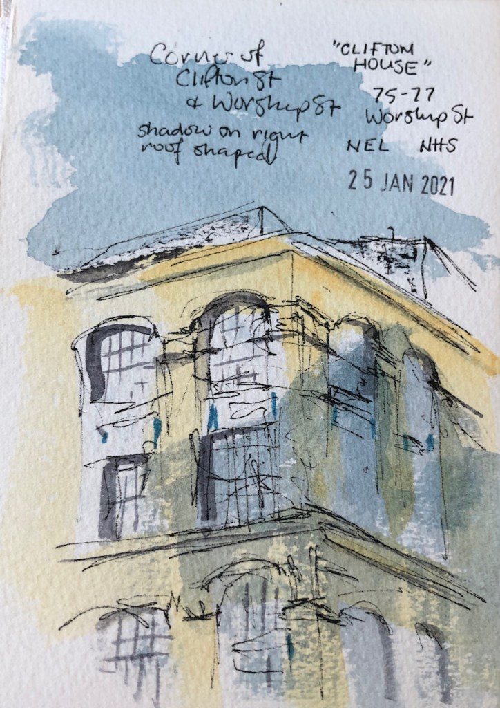
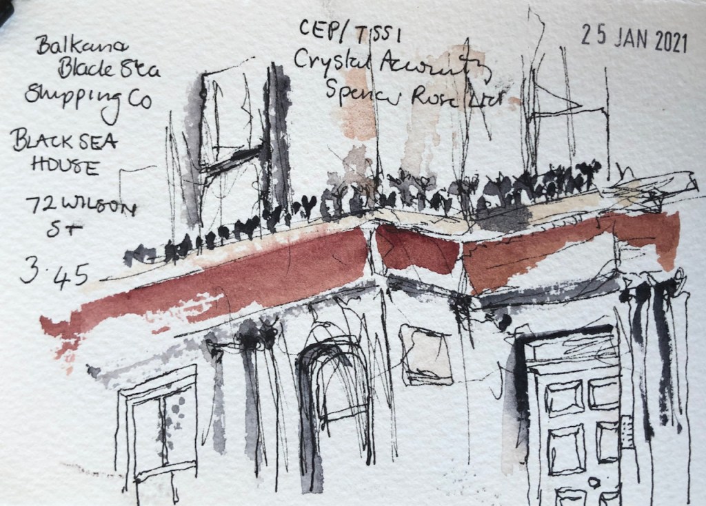
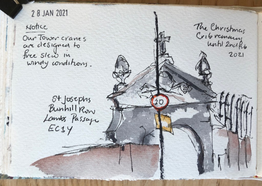
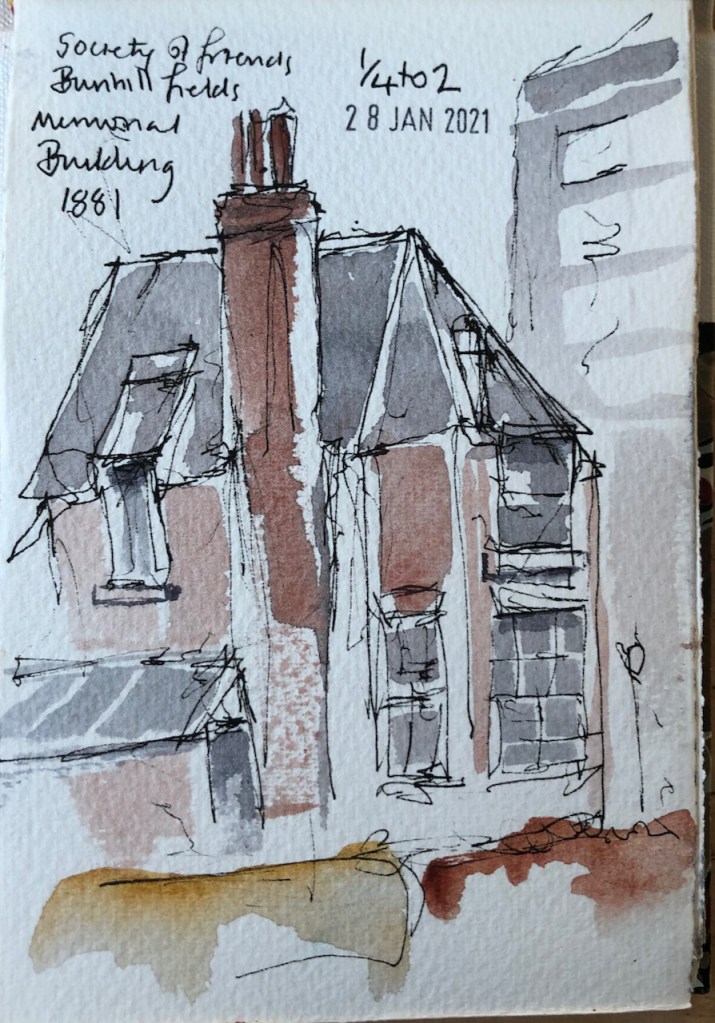
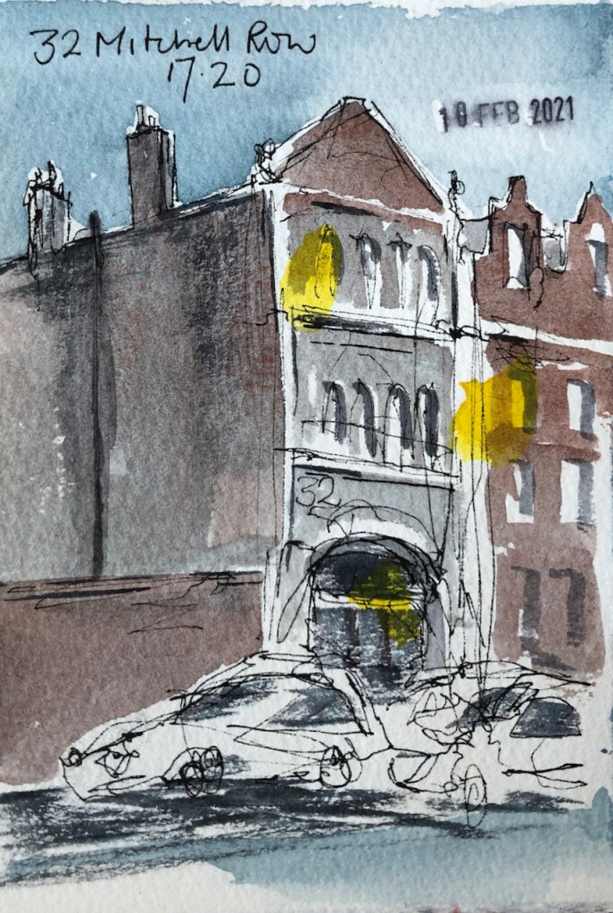
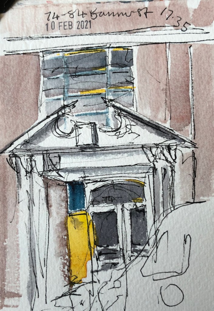
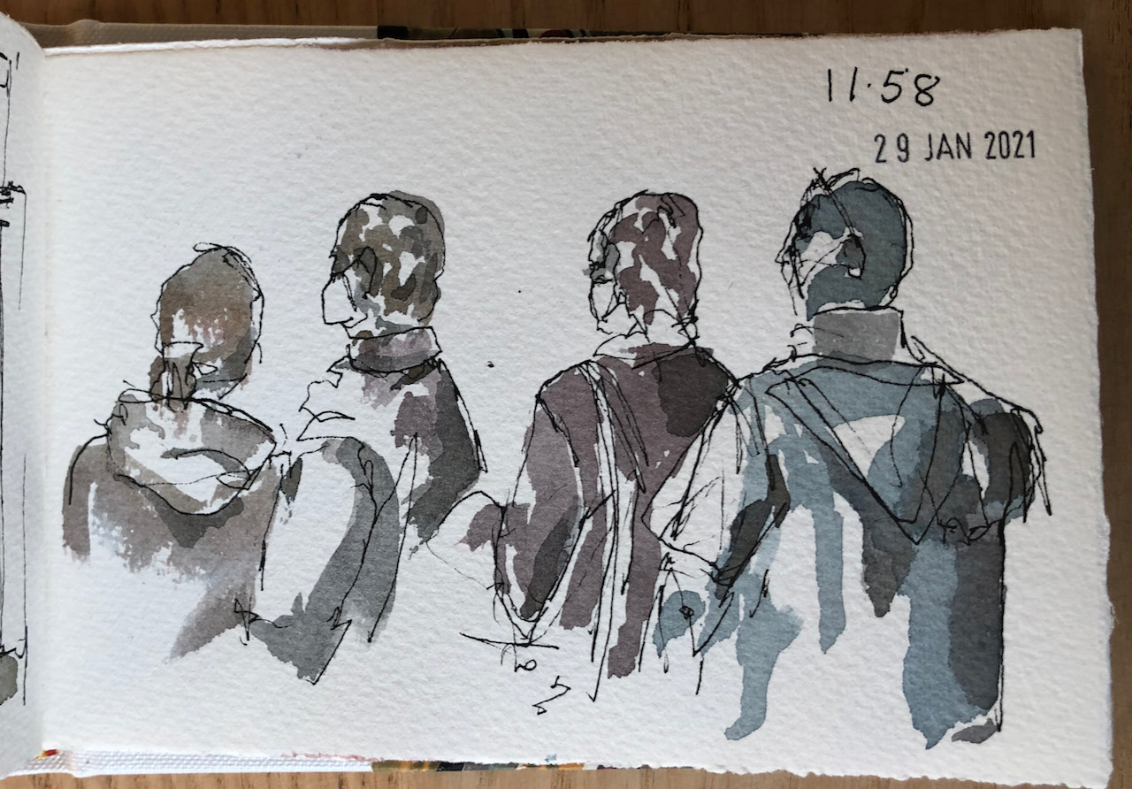
Here is a list of the drawings I have done in the Golden Lane Estate:


Something went wrong. Please refresh the page and/or try again.