Britannic House and Angel Court

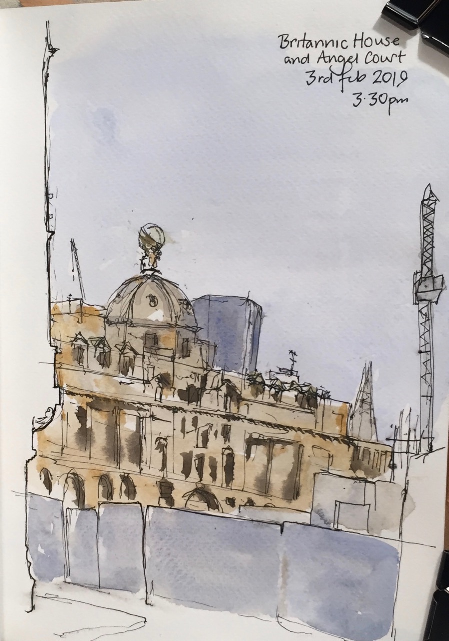
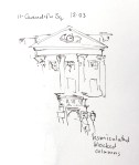
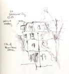
Here is a view of Britannic House, 1 Finsbury Circus, from the back entrance of Moorgate Station.

IMG_1238

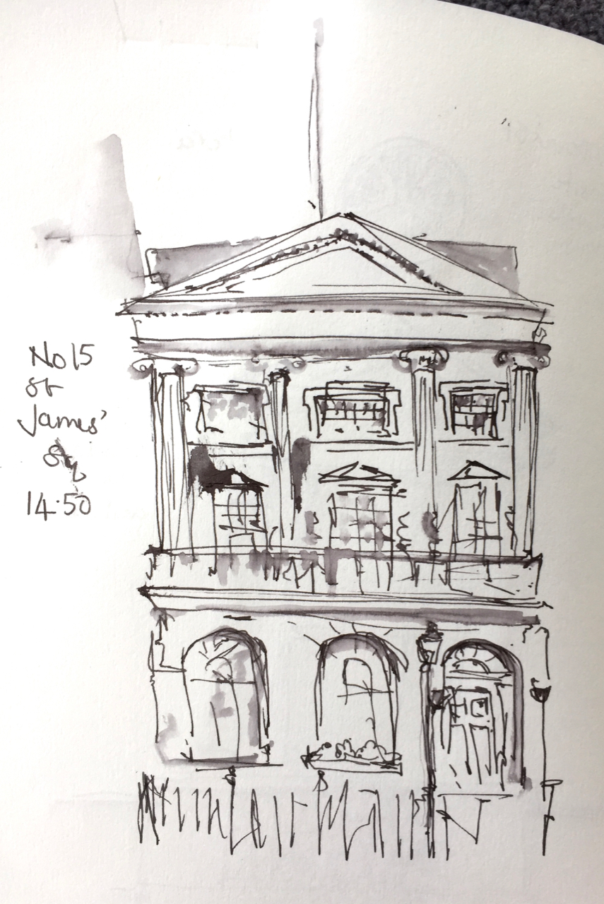
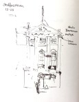
It was 5 degrees C. I was standing outside 45 Moorfields, at the junction with New Union Street.

Behind the blue hoardings is the Crossrail site. When the buildings above Crossrail are finished, this view will have gone.

As I was drawing, young people emerged at intervals from Moorgate Station, pointing their mobile phones like laser guns. They glanced up from the screen, and chose New Union Street. This is a poor choice. New Union Street doesn’t go anywhere you want to go. It joins Moor Lane about half way along Willoughby House in the Barbican. Then you have to turn either left or right. Either way is a long draughty walk.

Nobody asks for directions these days. Eventually a young woman hesitated. My curiosity overcame me. I asked if she needed directions. “No”, she said, “I’m just going to “Bad Egg”. It’s that way, isn’t it?” She pointed down New Union Street, no doubt following the advice of her phone. “Well, no,” I said, “You’re best off going this other way, and across the Piazza”. She looked doubtful, and glanced again at her phone as if asking it for permission. But she followed my instructions. She will get there ahead of the people in front who are walking three sides of a square. The phone doesn’t know about the Piazza in front of City Point, which is where “Bad Egg” is located. “Bad Egg” is a very noisy restaurant. I walk past it on the way to Moorgate.

I carried on drawing. More young people emerged and set off down New Union Street. I let them go. Then a woman emerged and walked in the other direction, pointing her phone at the Moorgate Crossrail site. She kept walking until she was right close to the hoardings, and then stopped. She looked accusingly at the hoardings. They should not be there. She should be able to walk south unimpeded. But there is a huge Crossrail site in the way. Evidently this feature was not apparent on the online map. She rotated gently, but still the reality on her phone refused to match the reality on the ground. She made an impatient gesture and walked out of sight, towards Moorgate.

After I finished the drawing I wondered what the tower was that is behind Britannic House. So I walked in that direction, and found it is “Angel Court Bank”, a multi-use office space.

It soars up, planted in a very ancient part of the city, near the Bank of England. Angel Court itself is an alley way which joins Copthall Avenue with Lothbury.

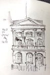
I liked the disjunction between the smooth modern architecture and the decorated banking halls on the other side of the alley. The black thing on the pavement is a hunk of black granite intended as a bench. It has slots cut in the side to stop skateboarders using it as a jump.

IMG_1236

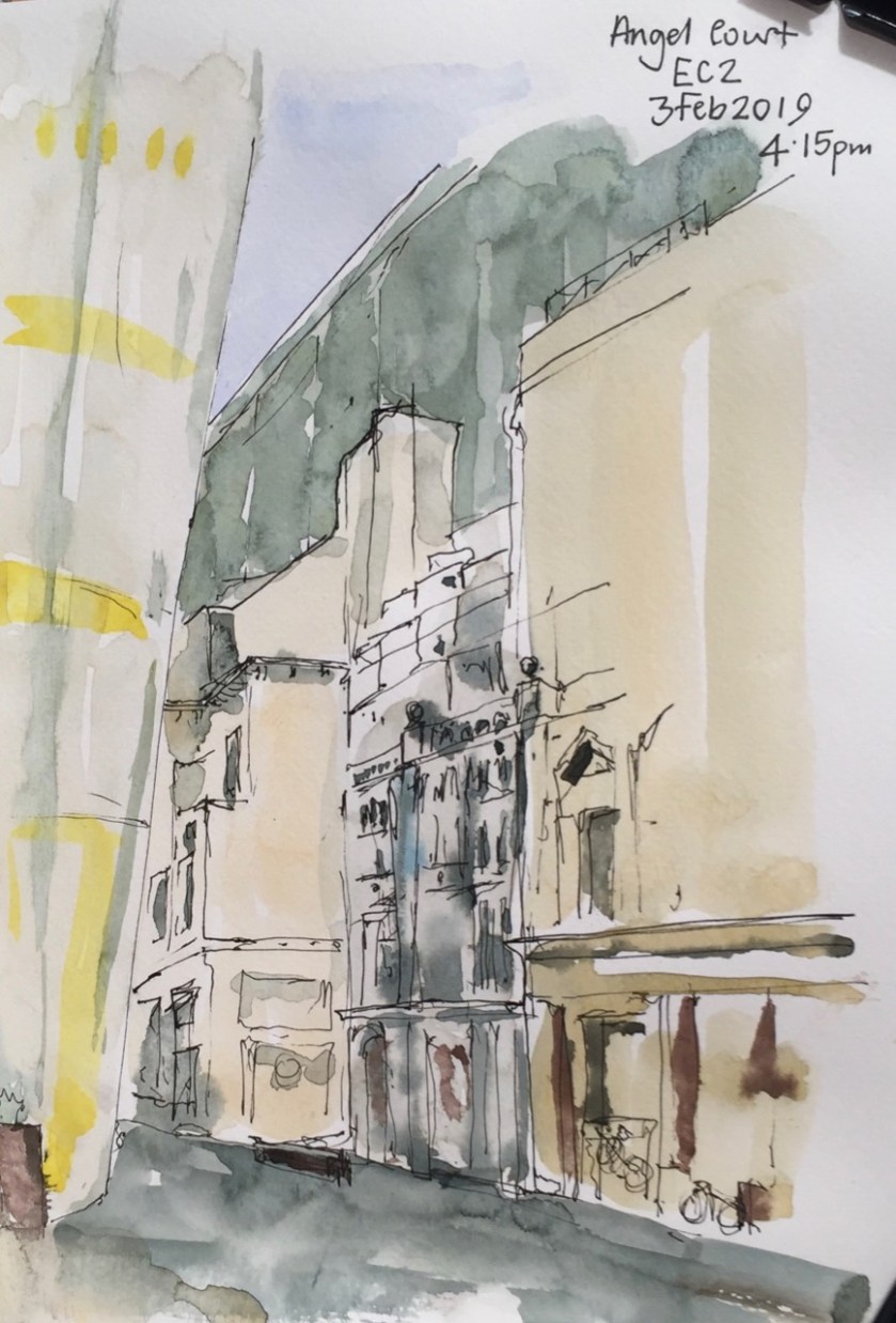
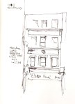
In this picture you see the modern tower “angel court bank” on the left. It is also called “One Angel Court”. It slopes outwards, as you see, and is totally smooth, made of curved glass, which must have been really hard to assemble. On the other side of the street are old banking halls, once grand. Number 11 is the one which is ornate, in the centre of the picture. It is dilapidated, apparently empty. Its pillars really are green and white marble, albeit that one of them is held together with a rusty iron band. On the right of the picture is Numbers 9-10. I was surprised to see the bikes locked to its iron railings, as this practice is generally frowned on, and bikes are cut down. This building also looks empty, but a notice in the window declared that it was inhabited by “live-in guardians”. A note on the letter box instructed the Royal Mail where to put the post for residents. The bikes, evidently, belonged to the live-in guardians. They have great place to live, for the time being.

I was really cold by this time and my eyes were streaming. So I came home.

I have down Britannic House before:

1 Finsbury Circus, across the Crossrail site


Here’s a bit, from the “Open House” site, on Angel Court:

Original design
Fletcher Priest Architects, 2017
Refurbishment
Fletcher Priest Architects, 2017
Type
Restaurant/bar, Offices
Period
Contemporary
  • Overview

    Fletcher Priest has completed Angel Court for Mitsui Fudosan UK and development partner Stanhope. The last tower of the ‘first generation’ of tall buildings in the Bank of England Conservation Area, Angel Court is located at heart of the City’s financial district.

  • Refurbished

    Extensive studies were initially carried out to examine new-build, re-build and refurbishment options for the 1970s structure before it was decided to replace all but the core and foundations of this 25-storey building, increasing the net area by 60%. The new tower hovers above pedestrianised Angel Court, formerly a cut-through from Lothbury to Copthall Avenue, now improved to create 40% more public realm.

  • The Translucent Building

    The most noticeable aspect of the tower is its skin, which flows as a softly curved homogenous surface around the walls and roof of the original octagonal form. During the day, glimpsed through the close-knit grain of the City’s streets, its translucency gives it a distinctive, light presence. These effects come from a double frit, a ceramic dot baked onto the glass surface, which allows views from inside to out and offsets solar gain. The sculpted lower garden floor buildings with deep-set windows faced in rough-hewn Carlow Blue limestone sit comfortably in their context and contrast with the softly curved tower. At night, the tower transforms to reveal a simple square grid to match the lower buildings, unifying the whole composition.


St Giles and Bastion House

Today Urban Sketchers London held a “sketch crawl” in the Barbican. So I joined them. An astonishing number and diversity of people assembled inside the entrance of the Barbican Centre at the appointed time of 11am. I counted about 35 and then another dozen or so joined. All shapes and sizes of people, tall, short, studious-looking or flamboyant, quiet or talkative, smart or windblown, old or young, all were there. I knew I was at the right place because everyone had a very obvious “drawing bag” or rucksack, and some were sporting a neat red Urban Sketch London badge.

img_1150

A few words and then off we all dispersed. To my surprise I found a good place very quickly. A wall, at ground level, looking over the Lakeside Terrace and St Giles. I liked the way St Giles was surrounded by Bastion House, and framed by the massive concrete of Gilbert Bridge. I also thought I would be sheltered from the wind. I was wrong about that. In fact, the location seemed to be at the bottleneck of a wind-funnel, and at times the wind was painful, as well as being very inconvenient for my drawing materials, which shifted about and jumped down off the wall.

img_1149

Another Urban Sketcher came up and elected to draw the same view. She had an interesting concertina type sketch book, which she said was her “collage sketchbook”. The wind very soon got under that and unravelled the concertina right across the walkway. She got it under control though, and finished her sketch. She was doing a number of sketches in different locations. I did just the one.

I finished it at 12:50. By that time I was thoroughly cold, and glad to go back inside the Barbican Centre. All the levels were by now densely populated with people participating in all sorts of events. The Urban Sketchers, by some alchemy, found each other again and we put up our sketch books for everyone to see.

Everyone’s sketches were of interest. People had done very different things. I suppose that’s obvious, but it was startling how different they were. One person had made very precise and delicate engineering drawings of brackets. Another had a wonderful atmospheric wash of the church. Someone else had done the fountains and their environment, in firm black lines against a shadowy orange background with white water. Others had outline drawings in crayon, or detailed drawings in sepia ink, and someone had done a sketch on their iPad.

One of the organisers made a panoramic film of the drawings so I look forward to seeing them on the Urban Sketch London website.

It was a good experience and I’ll aim to go to another later in the year.

Sketching in Norwich

Norwich is two hours from London on the train.

I tried sketching the landscape as it went by:

These were tiny drawings, each about 2 inches by 3inches.

Here is the inside of Norwich Cathedral.

fullsizeoutput_3233

The picture shows the Norman nave of the cathedral. This building was started in 1096 and took about 50 years to build. The stone comes from Caen, in France, and was shaped there. It is a cladding. The structure is mortar and flint. One of the pillars in the picture has a spiral pattern on it, and is matched by another spiral one on the other side. But on the other side the spiral cladding doesn’t go up to the top, as though they ran out of the special stones. I wondered if these spiral stones are used elsewhere, or if they are still waiting at Caen. Or did someone make a mistake in their arithmetic?

I learned from the guide, Mark Hill, that a bishop is in charge of a diocese, not the cathedral. The Dean is in charge of the cathedral. The bishop has a special seat called a cathedra, which is to the right of the choir, and separate from it. And the Bishop’s seat has a hugely ornate covering.

At the Sainsbury Centre for the Visual Arts at the University of East Anglia, there was an exhibition of sculpture by Elizabeth Frink.

I sketched her warrior figures which are called “Riace”:

They had slightly strange proportions, rather short legs and wide shoulders. All are greater than life size. There were about 5 or 6 of them, and they seemed to be moving.

Elizabeth Frink (1930-1993) was a British sculptor and printmaker. Whenever I walk through Paternoster Square I say hello to her sculpture there: The Paternoster. It shows a shepherd and his sheep. When I first moved here, this sculpture was temporarily in the Barbican, next to the Museum of London. It was at ground level, so children used to climb on the sheep and hold onto their ears. The ears were bright and shiny. When the Paternoster Square renovation was complete (2003), the statue was moved back. But it is on a high plinth, so inaccessible. I think that’s a pity. I don’t think the Paternoster minded children riding his sheep.

paternoster_sculpture,_paternoster_square
The shepherd and his sheep, Paternoster Square, 2012.


Great Arthur House from the Barbican Podium

Here is Great Arthur House from the podium ramp near Blake Tower. You can see Blake Tower on the left. At the bottom of the picture is the ramp that goes down into the Car Park at Bunyan Court.

Several stories below me, at ground level, there was an assortment of discarded furniture and paint tins, and a huge skip full of Christmas Trees being collected for recycling.

fullsizeoutput_31dd

It was really cold out there. I saw a black cat sliding in between the debris.

This picture done on Fabriano Artistico loose sheet,  8inches by 10 inches. About an hour, on location.

New Year 2019

Happy New Year!

I made a woodcut.

IMG_0951

This is a greetings card, about 7″x5″.

It is from two woodblocks, one orange and one blue. Here is work in progress at East London Printmakers:

In the background you see the Albion press I used for printing. It is a wonderful cast-iron machine.

As well as the greetings cards I tried an experiment with chine collé on Japanese paper.

IMG_0885

And this was an out-take that I liked:

IMG_0881

The inks made marvellous patterns on the glass when I was cleaning up:

Perhaps I could entitle that last one “Window into the unknown”?

Happy New Year 2019!


In the footsteps of Nelson

440px-Young_Nelson
Captain Horatio Nelson, painted by John Francis Rigaud in 1781, with Fort San Juan in the background.

For our Boxing Day walk, John researched places in London associated with Vice-Admiral Horatio Nelson (29 September 1758 – 21 October 1805).

First we saw some houses of the period, and then went to the various places that Nelson lived or visited in London. My mission was to draw very quick pictures. We had a lot of places to visit, and I didn’t want to hold up the expedition. Here are my sketches, in the order of our visits.


We saw and named architectural details.  On 11 Cavendish Square we noted the “blocked vermiculated columns”
IMG_0925 (1)
“Vermiculated” means wormlike. It’s a really useful adjective. “I found it impossible to follow his vermiculated arguments.” ” After navigating the vermiculated back alleys, we emerged at last onto the main square.”

We saw ionic columns on Stratford House. These are the ones with scrolls at the top. Above the columns is the “metope” or frieze. On this there were “bucrania” which are bulls skulls.
IMG_0926 (1)

An “aedicule” is a house shape with columns each side. At 37 Dover Street we saw a window in an aedicule.

IMG_0931
A window in 37 Dover Street, opposite Nelson’s House

Here is our route:

Screen Shot 2018-12-27 at 09.25.32

It took us 5 hours and was 14km.

After the Georgian London visits in the West End, we walked to Trafalgar Square to see Nelson’s Column, and then along the Strand, where we saw the site of a silversmith he visited. Nelson went along the Strand in his carriage to receive his “Freedom of the City of London”. At Temple, the cheering crowds unhitched his horses and hauled his carriage themselves.

We arrived at St Paul’s Cathedral, where Nelson is interred.

I used Organics Studio arsenic gray ink, and a Lamy Safari pen with fine nib, from The Writing Desk. The book is a sketchbook from Seawhite of Brighton.

St Bartholomew the Less – etchings (1)

This morning I made an etching based on a sketch of St Bartholomew the Less.

000


Here’s the original sketch, which was made from the top of Maggie’s Centre in St Bartholomew’s hospital, by kind permission of the staff of the Centre.

The sketch was to explore the proportions, before making the more detailed watercolour drawings on this post:

St Bartholomew the Less

I thought the sketch was rather lively and might make a good etching. Here’s the copper plate I made:
IMG_0820

And here are some of today’s prints: (click to enlarge)

The plate needs a bit more work I think. The background could be darker and perhaps some shading on the tower itself. My idea is that I will print it with perhaps chine-collé. So I want to keep the design simple.

I just had the morning at the print studio today.

The paper is Chinese paper from Great Art. Numbers 11369 (soft), and 11565 (white, with a slight grid). The ink is Intaglio Printmaker Shop Mix Bone Black. The plate is 10cmx15cm copper plate from Great Art, which I prepared with hard ground 28 June 2018. I used the Rochard press at East London Printmakers.

Update:

14 March 2019 – Chine Collé


Strange landscapes from wood (1)

On a recent walk in Hoxton, I picked up a piece of wood. Perhaps it was part of a crate. It had interesting grain.

John cut it into smaller pieces with a saw.

Wood pieces

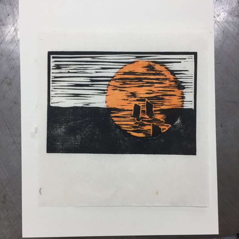
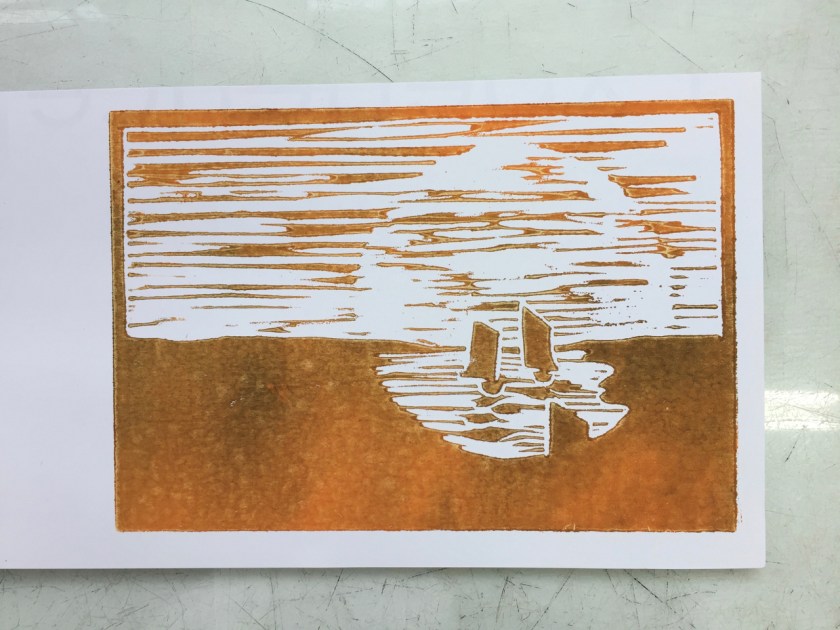
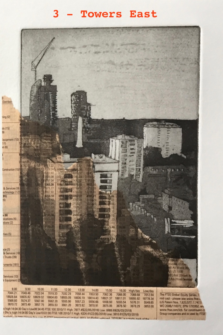
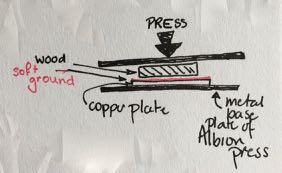
I was going to use them as relief blocks. Then I got talking to a fellow printer at East London Printmakers. She suggested I press them into soft ground and make an etching plate. Then I thought I’d use the Albion press to get sufficient pressure.

The technician, Dan, asked if I had aquatint on there, and I hadn’t. Can you put aquatint on top of soft ground? We went off to consult the studio co-ordinator. She said yes, aquatint was good idea.

So here’s the process:

  1. Prepare plate with soft ground
  2. Press wood into soft ground using the Albion Press. This makes an impression with darker places where the wood was.
  3. Put aquatint (dust) onto the plate, and fuse it with the gas burner. The soft ground burns and goes brown. The aquatint fuses onto the plate in the darker places. 
  4. Etch in acid, Edinburgh etch, for two minutes. 
  5. Clean off the plate and print.The aquatinted areas are dark.

Here’s the result.

IMG_0686
Wood block into soft ground. Printed from copper plate. “Strange landscapes”, on drying rack. Prussian blue ink on Vintage Paper Co paper.

Here’s the other block, with chine collé stripes added. I’m not sure which way up it should be. IMG_0696 
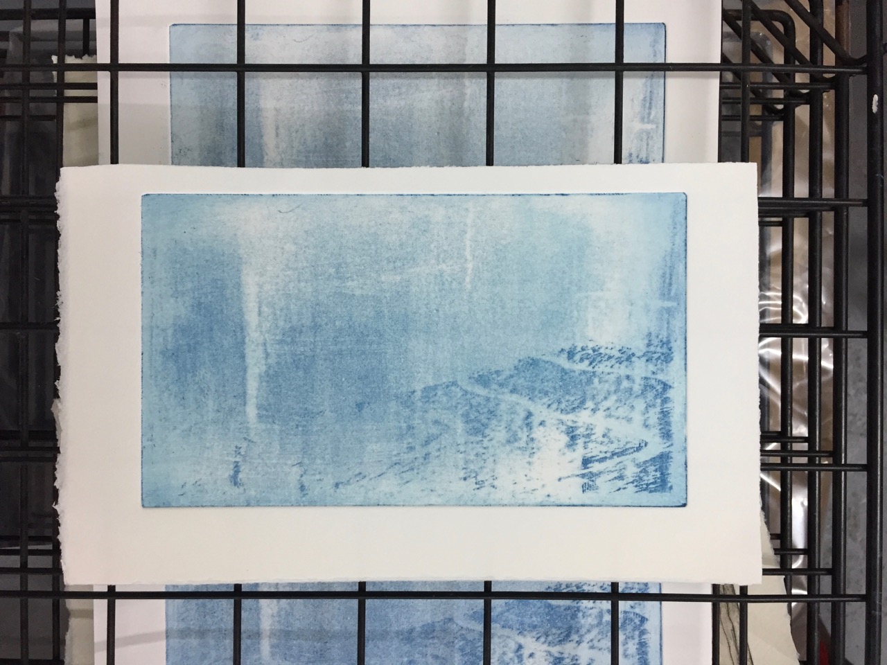
Since this whole session was experimental, I also used some experimental paper from the Vintage Paper Company. They say on the package: “This was made some time between 1969 and 1973 as waterleaf (unsized) printing paper by J Green and Sons (brilliant but now extinct British papermakers). I had it gelatine sized in December 2017 by Two Rivers Paper (brilliant and very much alive and kicking British papermakers” and they ask for feedback. I think it worked really well, and I’m now off to write them an email.

IMG_0687

March 2019: I used this plate to make some chine collé prints. See this link:/strange-landscapes-from-wood-2/

Towers East and Towers West – multiple prints

My idea was to produce multiple copies of “Towers East” and “Towers West”. These are aquatint plates I prepared a few months ago.  This post describes the process to produce the plates: Towers East and Towers West

The Towers are St Mary’s Tower and Peabody Tower, just to the North of the Barbican.

I made 14 reasonable prints, and 2 out-takes. I glued the out-takes into my notebook. I make one page per print session, and record what I did, what paper and ink I used, what worked and what didn’t. This is in an attempt to learn and improve my printing technique.

IMG_0656

Here are the 14 reasonable prints, numbered 1 to 14. Numbers 1-13 are on card 20cm by 30cm. This card size is intended as a greeting card. When folded it fits neatly into an A5 envelope. Number 14 is on larger paper. All are for sale,  £5 each plus postage. Please contact me by email via the contacts page, or leave a comment on this page. The red writing is on the online image here, not on the print.

Click on an image to enlarge it. It may take a little while to load.

The technique is “chine-collé” which is described here: The chine collé process

Here’s number 13 so you can see the format:

IMG_0642

Here is number 14 on the larger paper:

IMG_0644

These are all part of my “Towers Project” leading to an exhibition in the Barbican Library February 2019.

I work in the print studio at East London Printmakers. Prints are on Fabriano Unica Paper, using Intaglio Printmaker Bone Black ink. They are printed by hand on the Henderson press. Each print takes about half an hour to print.

St Bartholomew the Less

St Bartholomew the Less is a Chapel of Ease in St Bartholomew’s Hospital in the City. It’s just to the right of the main entrance from Smithfield.  You might not notice the door in the wall. Sometimes they put a board outside. I’ve been in a number of times. It’s a very peaceful, welcoming, place. Somehow, one feels the need to visit a place of prayer before, or after, a hospital visit.

I was invited to draw pictures of the church. The City Music Foundation, a charity, wants to use my pictures in its publicity. They are going to be based in St Bartholomew the Less. So the Managing Director of the Foundation, Clare Taylor, contacted me. She’d seen the pictures I’d done of The Charterhouse.

Here are the first two pictures of St Bartholomew the Less:

It was founded in 1123, by Rahere, a “courtier of Henry I“, according to the leaflet. The tower dates from the 15th century. “The three bells in the tower include one dating from 1380 and another from 1420” says the leaflet. I was interested in Rahere, because there is a Rahere St and a Rahere House which I have drawn.

Since the Foundation is a music foundation, I thought it would be a fun idea to draw the bells. By kind permission of the Parochial Church Council (PCC), whose representative efficiently produced a key, I was able to go up into the belfry. Bells, I found, are not so easy to draw as you might think. Like the human form, they have curves. And unless you get the curves exactly right, they look like a different character. Also, the belfry contained not only very ancient bells, but also 600 years of dust. It was indescribably dirty. But amazing. And very quiet inside, with all the noise going on outside. I wedged myself into the wooden frame, braced my back against a metal rod, and got started.

The platform into which I was wedged was not very big. I manoeuvred very slowly because I didn’t want to knock anything, such as a paintbrush, down into the depths. The best medium seemed to be black ink. Ink is a bit dodgy to manage at the best of times. But keeping it upright on an ancient wooden raft, in the semi-darkness, verged on the farcical. No-one was there to sympathise, except the bells, and they’d seen it all before.