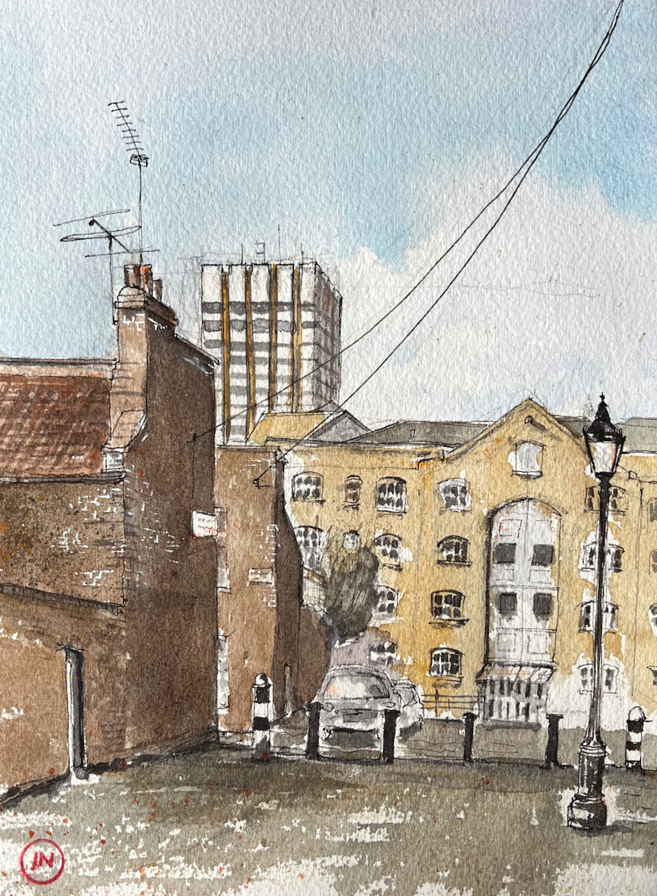
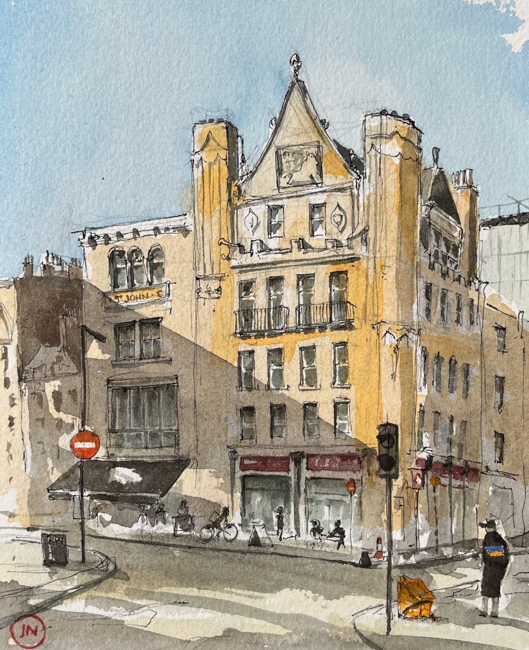
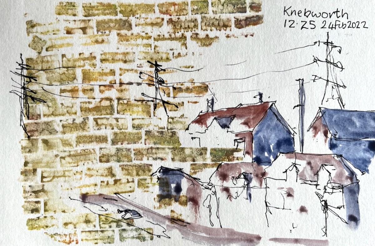
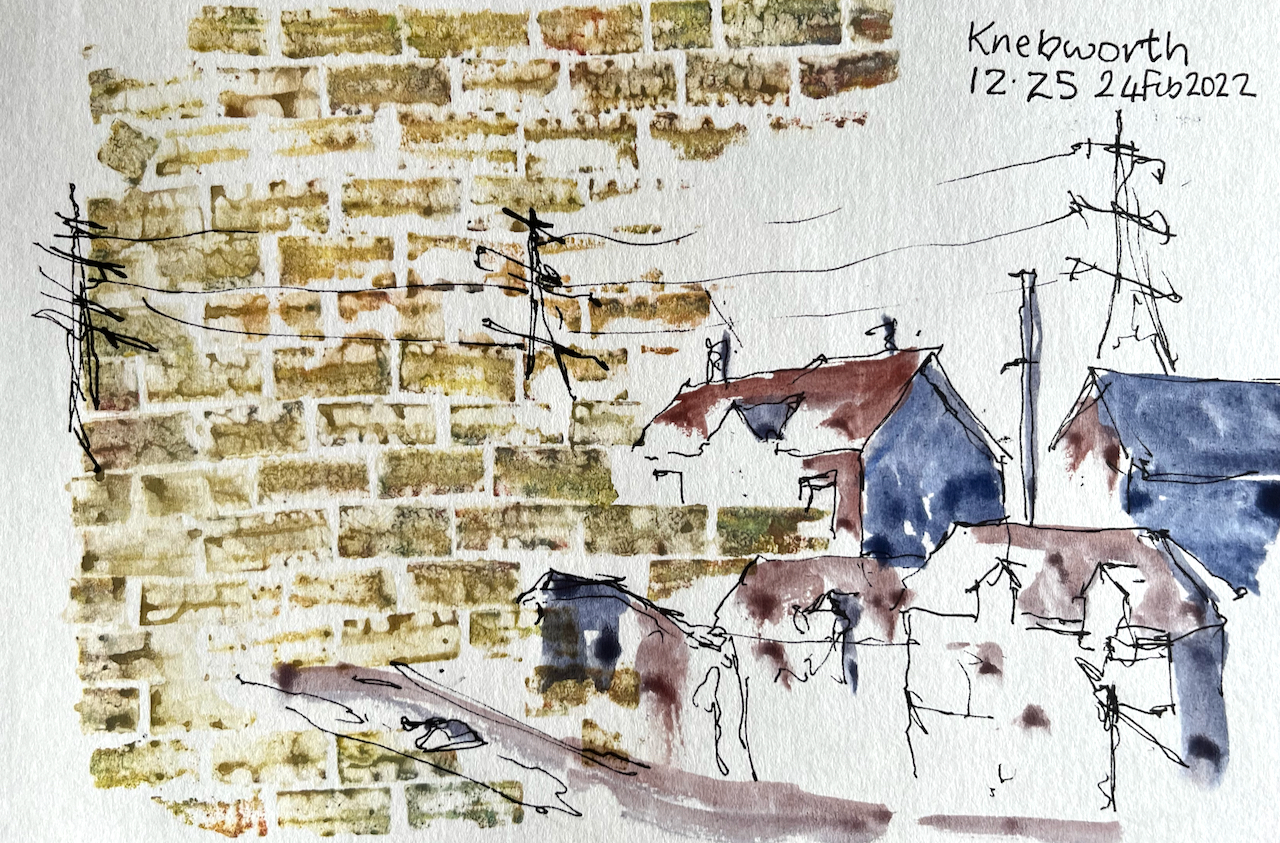
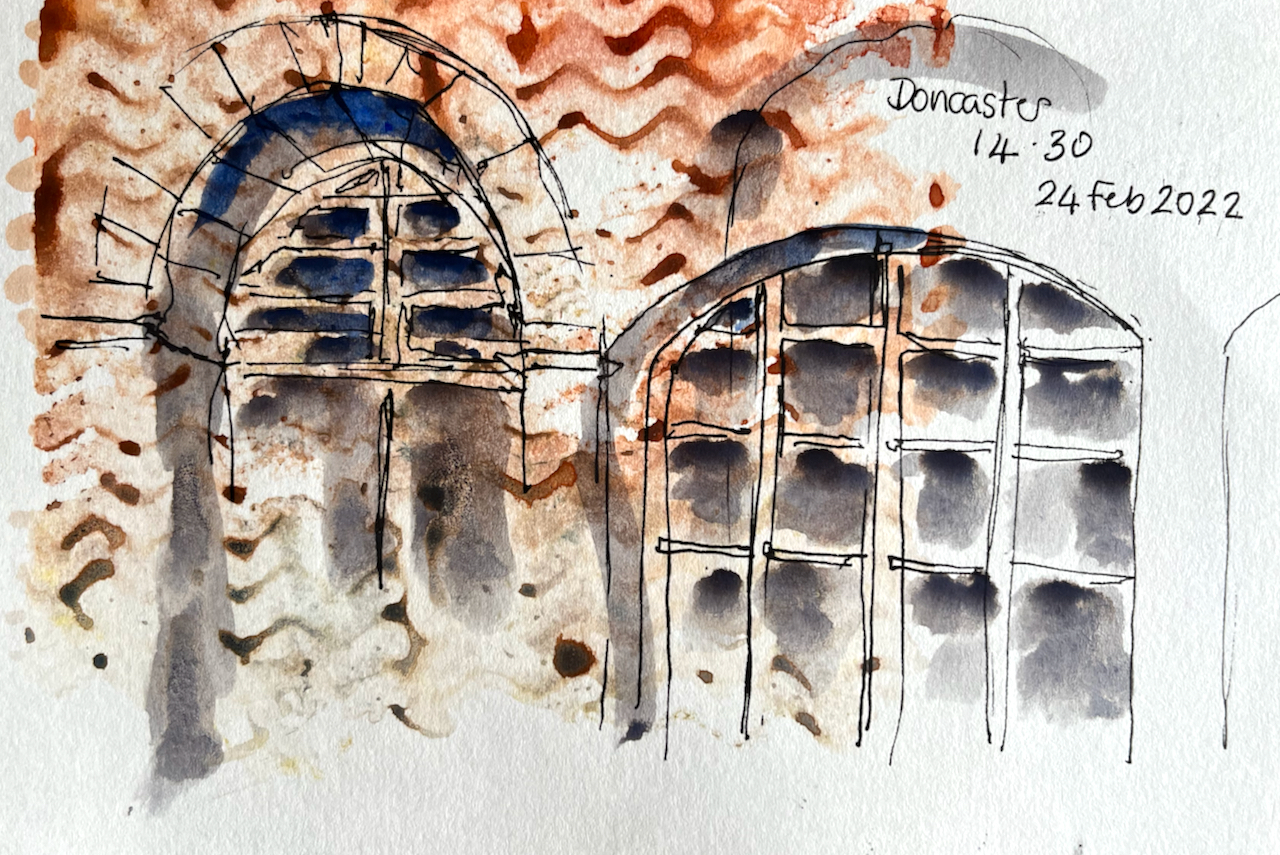
Usually, I use the “pen-and-wash” technique. I draw an urban scene in waterproof pen and then add the wash. This method is fast, and useful for outdoor work on location. Most of my urban sketching work uses this technique. Here’s are example:
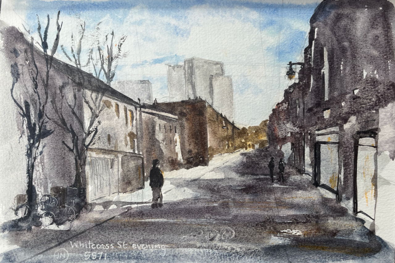
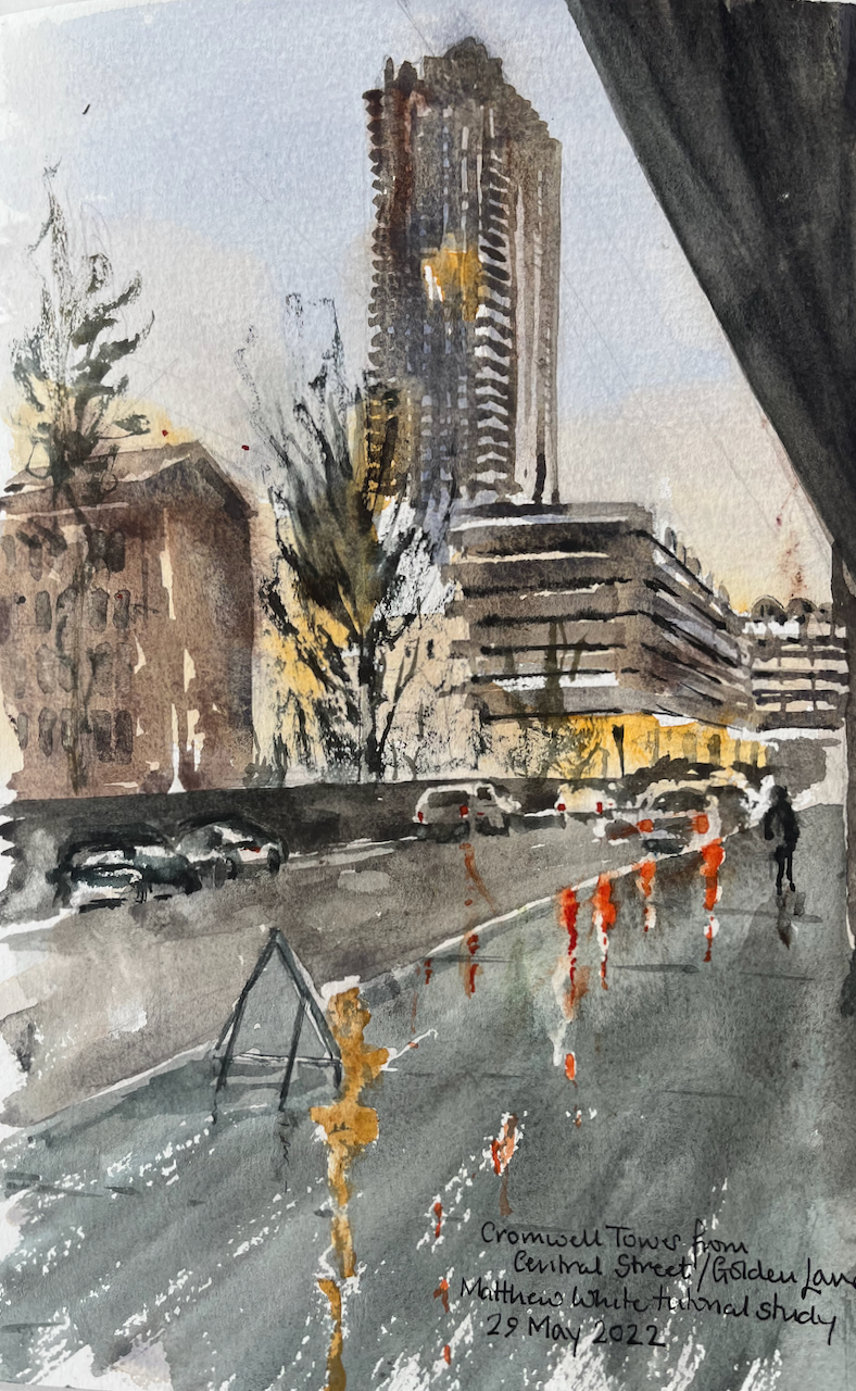
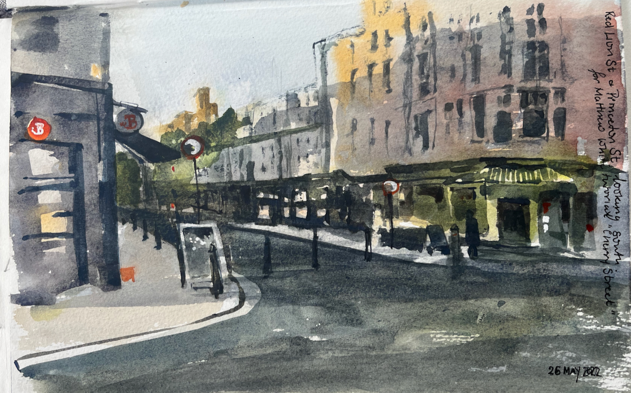
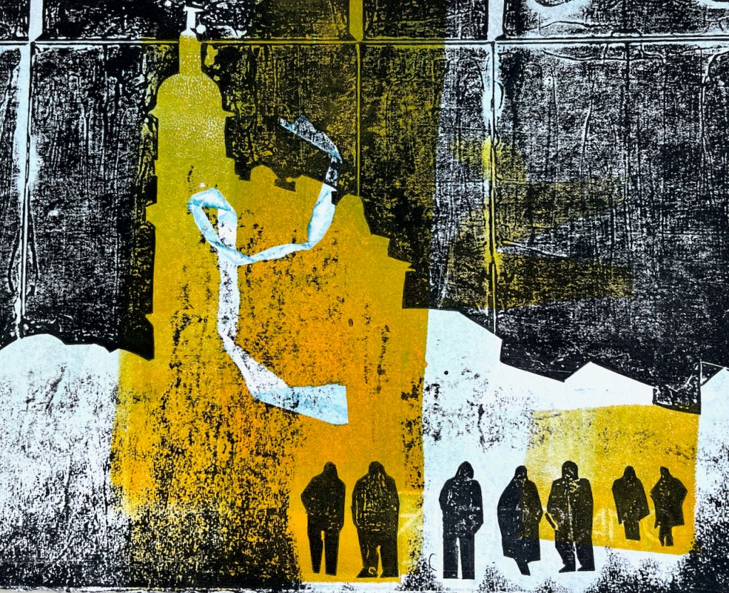
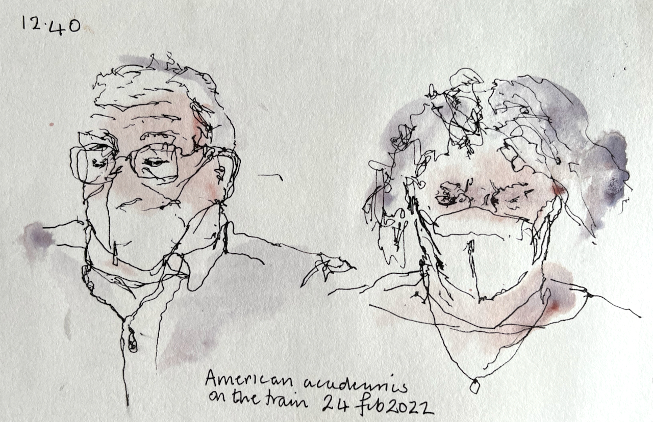
I wanted to try a “straight-to-watercolour” method. This involves looking at the scene differently. To go straight to watercolour I need to learn to see “shapes” rather than “lines”. I practised this with these three watercolours:
Whitecross StreetCromwell Tower from Golden LaneRed Lion Street
I worked learning from demonstrations by Matthew White . I hope to incorporate elements of this practice into my own work.
Click a button below to share this post online, email it, or print it:
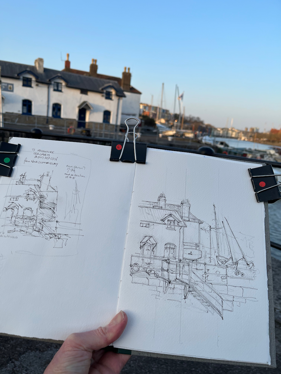
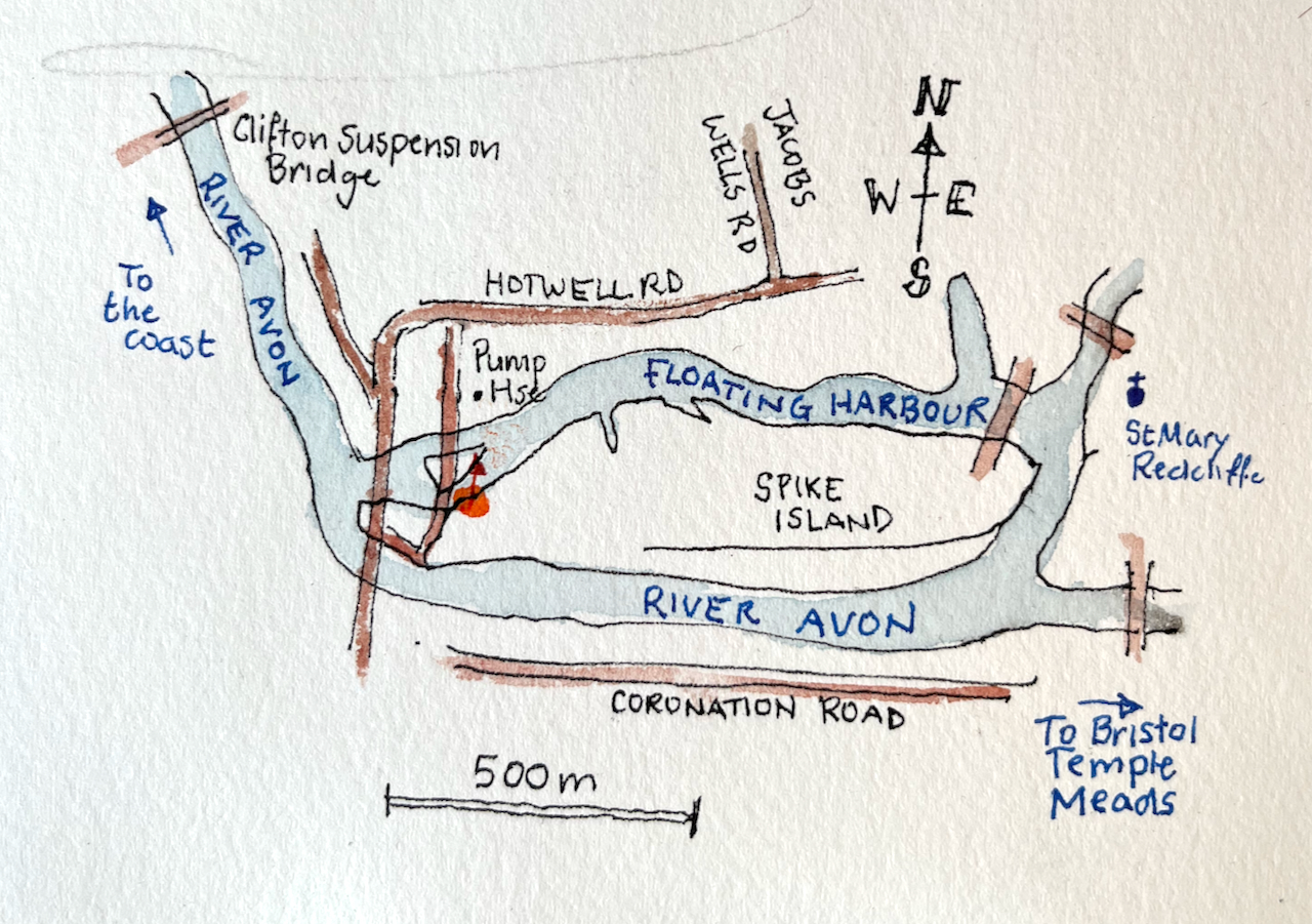
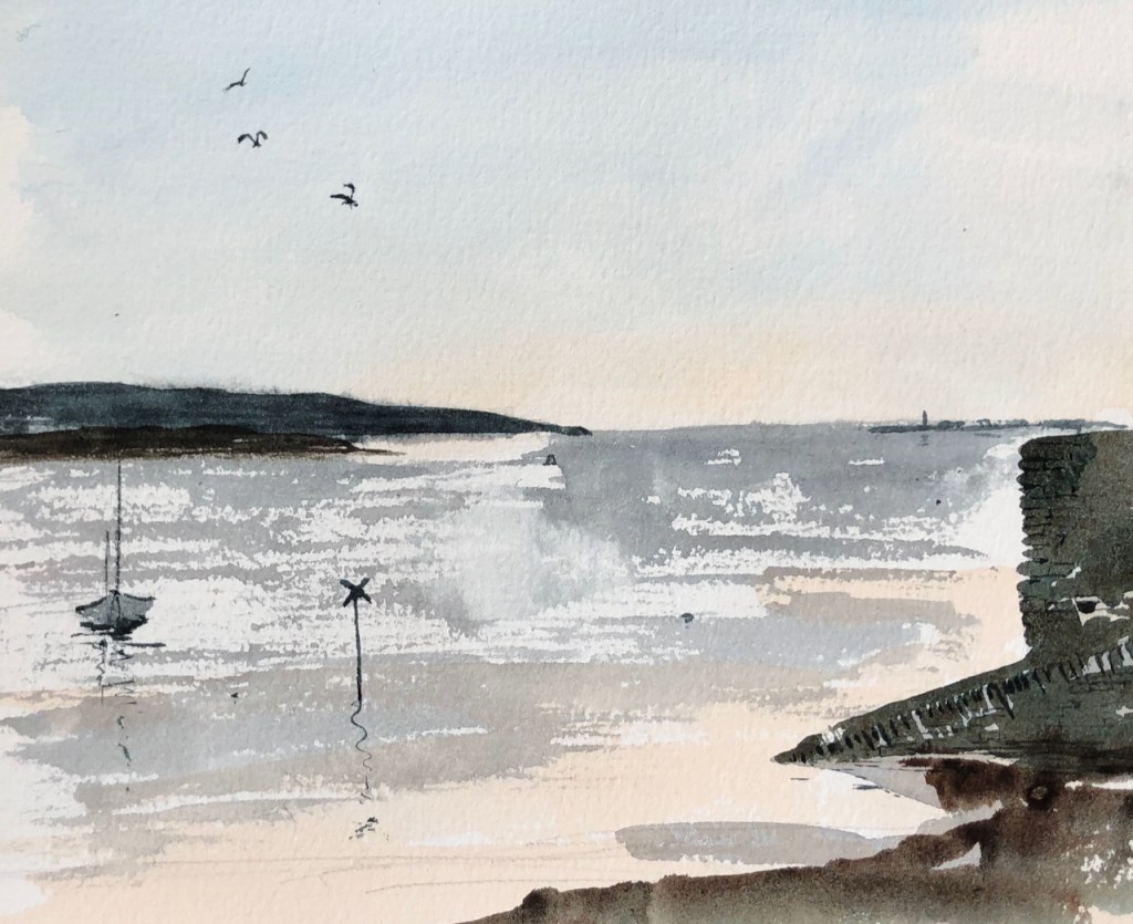
Wandering in a warm Bristol evening I rounded the harbour and found myself in Nova Scotia Place. This is a secluded domain, enclosed by water, and main roads. There is a pub, the Nova Scotia Hotel. People occupied the outdoor tables, with pints and conversation. I walked onto the small promontory and looked at the little cottages opposite.
Sketching at Nova Scotia Place, 22nd March 2022, 6pm
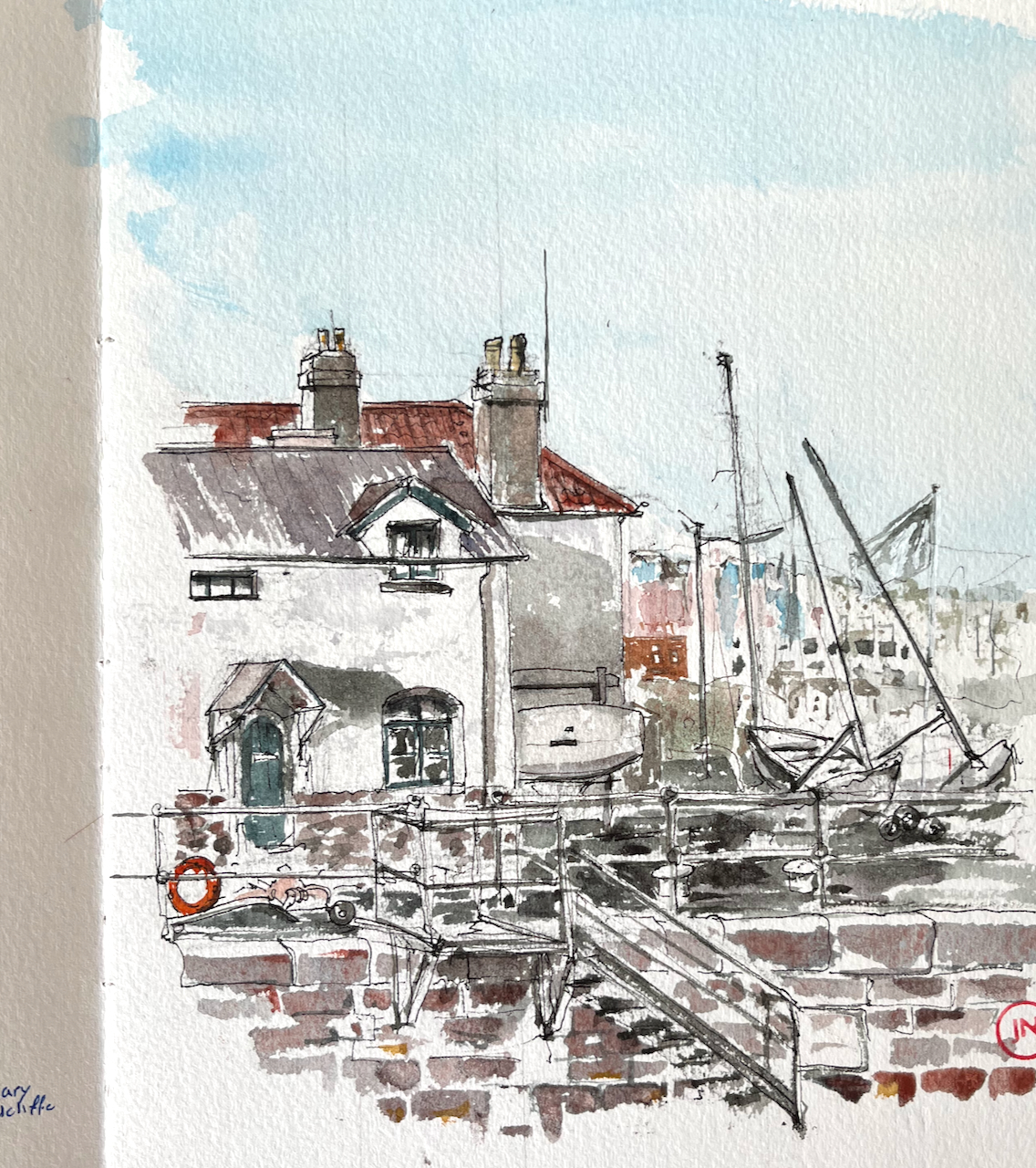
The warm evening became rather cooler. I packed up when I’d done the pen sketch. The bench that I had been using was a memorial bench:
In memory of Alan Helliwell (German) remembered by family, freinds and work colleagues of Underfall Yard who died too early. 7/2/1961 – 03/10/2009 after several near misses.
Later I put on some colour:
“TS Adventure Sea Cadets” cottages seen from Nova Scotia Place
Click a button below to share this post online, email it, or print it:
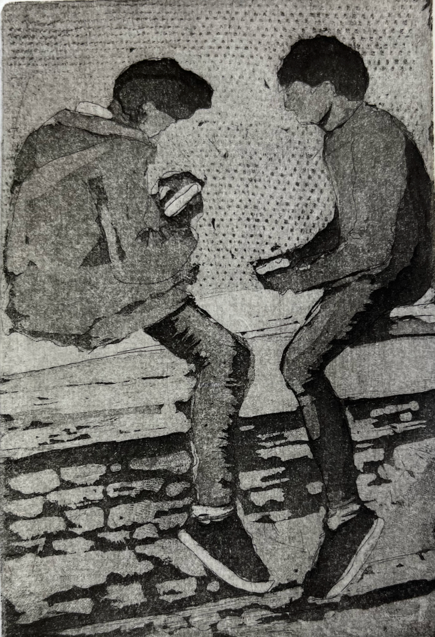
Here’s a print I made at East London Printmakers last week.
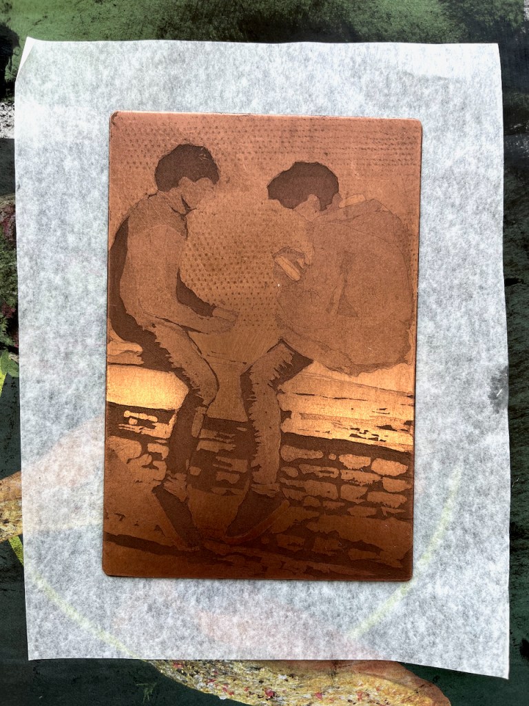
Two boys, etching, image size about 5inches by 3inches
I wanted to show how concentrated these people were, immersed in what they were doing, sitting on the wall.
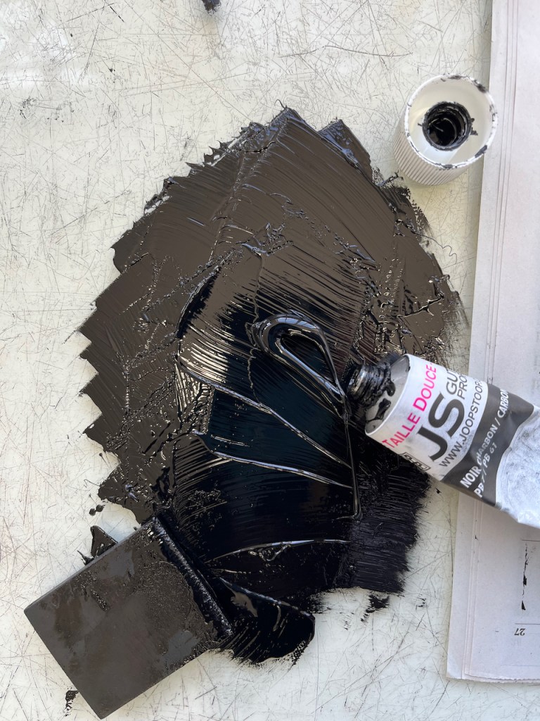
It is printed on Fabriano Unica paper, using Charbonnel F66 traditional etching ink. Here is the copper plate:
The plate is made with hard ground lines, soft ground patterns, and three aquatint sessions.
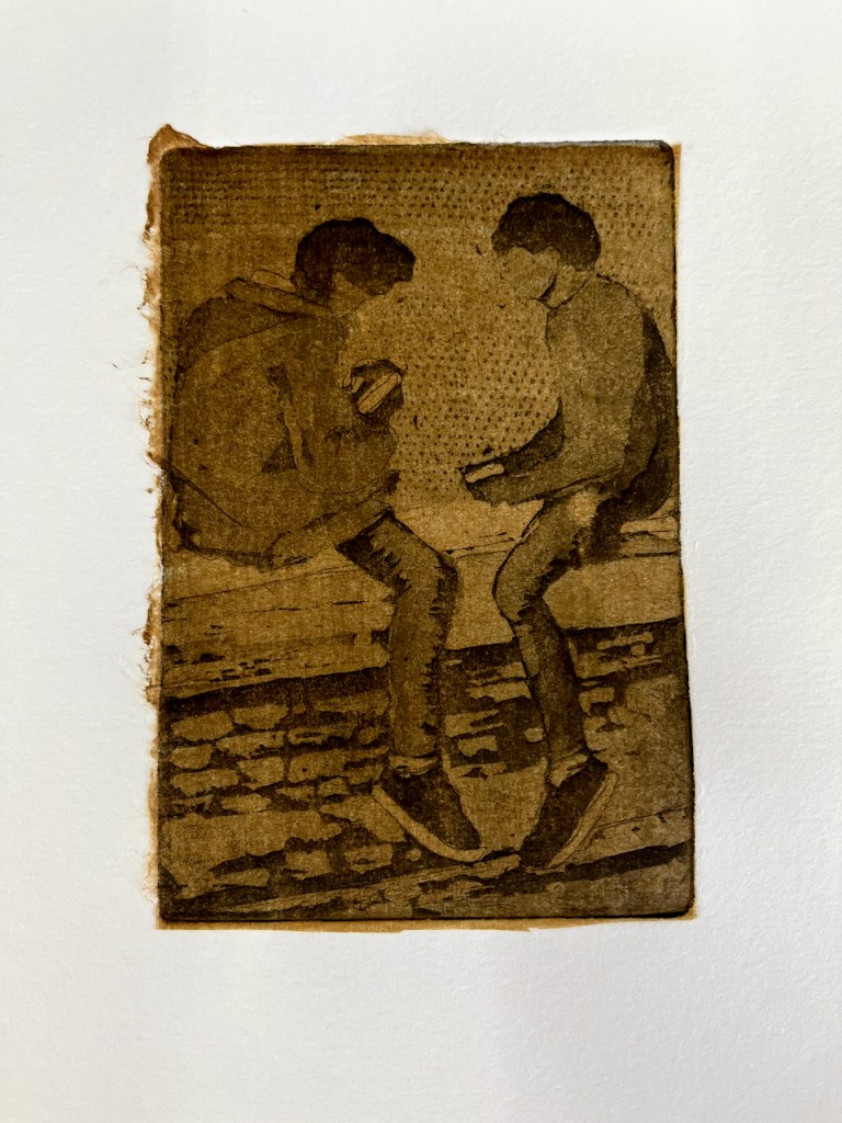
I made some variations of this print. Here is one, using chine-collé.
Two boys, warm brown chine-collé
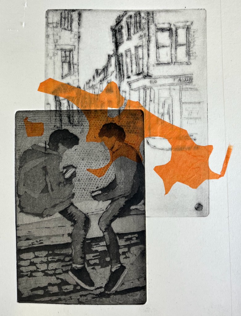
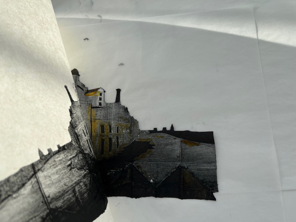
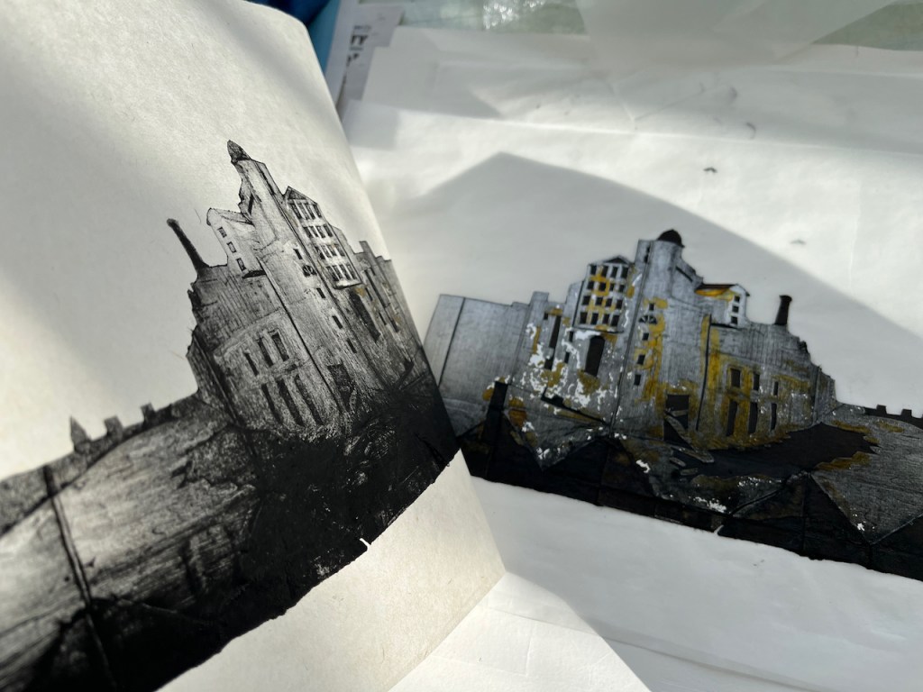
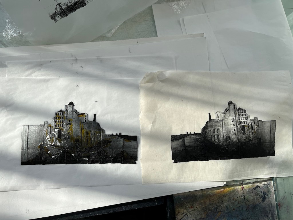
Sometimes in the printing process, magic happens. As I was packing for this print session, searching for paper, tissues, gloves, and other printing essentials, I encountered a thick envelope labelled “Old Prints”. I pulled out one of those, a street scene, with a vague idea of overprinting it. It is a drypoint I made years ago. The vague idea turned into a plan, and then a print. Here it is. I was really pleased with how it came out. The chine-collé is also a leftover from another project.
Two boys and street, combined image size about A5. Etching, drypoint and chine-collé.
Click a button below to share this post online, email it, or print it:
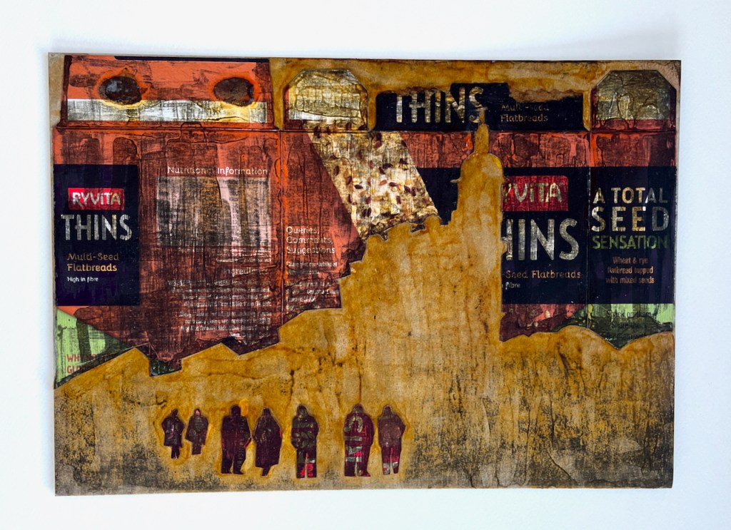
After I had cut out the packaging print plate of the Boston Arms, I was left with the “negative”: the top part of the plate. As it was on its way to the bin, I realised that I could use this to make another picture. So I retrieved it, and made this plate:
Relief plate*: top half is made of a biscuit packet. The bottom half of the biscuit packet was used to make the packaging print – see this post
I added a few people. This is a pub, so these are some people on their way to the pub.
I used this cardboard plate to make some prints. I painted it with shellac, to make it stronger.
Here are the prints, made on the Albion press at East London Printmakers. The prints are”collographs”: relief* prints.
I made the prints on top of some experimental monoprints made last year.
*A “relief” plate is one in which the ink is rolled onto the raised part of the plate. The raised parts print dark. A potato print, a lino print, woodcut or an ordinary rubber stamp is a relief print. This is by contrast to an “intaglio” print, in which the ink is wiped into the indentations and into engraved lines on the plate. The raised parts print light, and the lower parts print dark. My etchings and packaging prints are intaglio prints.
Click a button below to share this post online, email it, or print it:
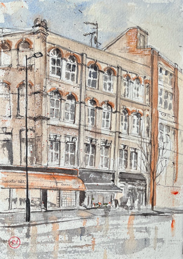
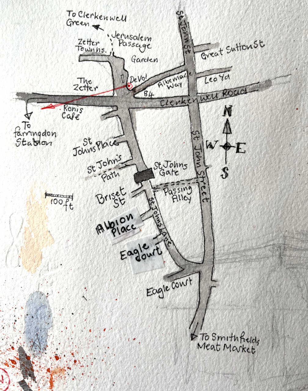
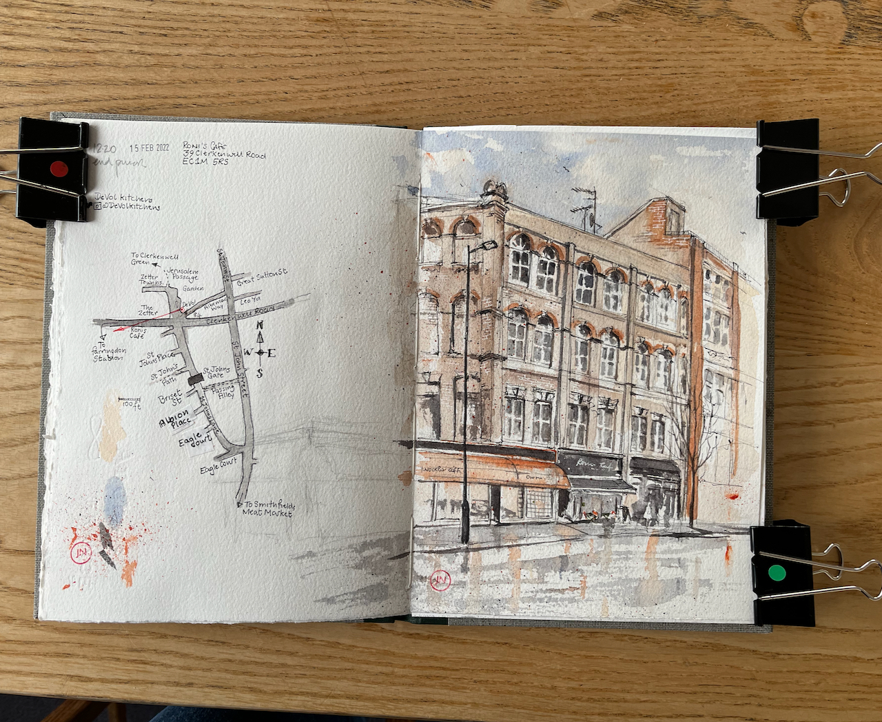
Roni’s Café, 39 Clerkenwell Road, 15th Feb 2022, 10″ x 8″ in Sketchbook 11
In the centre of the picture is Roni’s Café, where I sheltered to finish my drawing of 84 Clerkenwell Road.
My idea was to draw the view looking West along the Clerkenwell Road, from number 84. By the time I reached the spot, the rain was falling heavily. I spotted a large window. The people inside kindly agreed to host me for 45 minutes while I sketched my lines. Then I went out into the rain. I finished the picture at my desk.
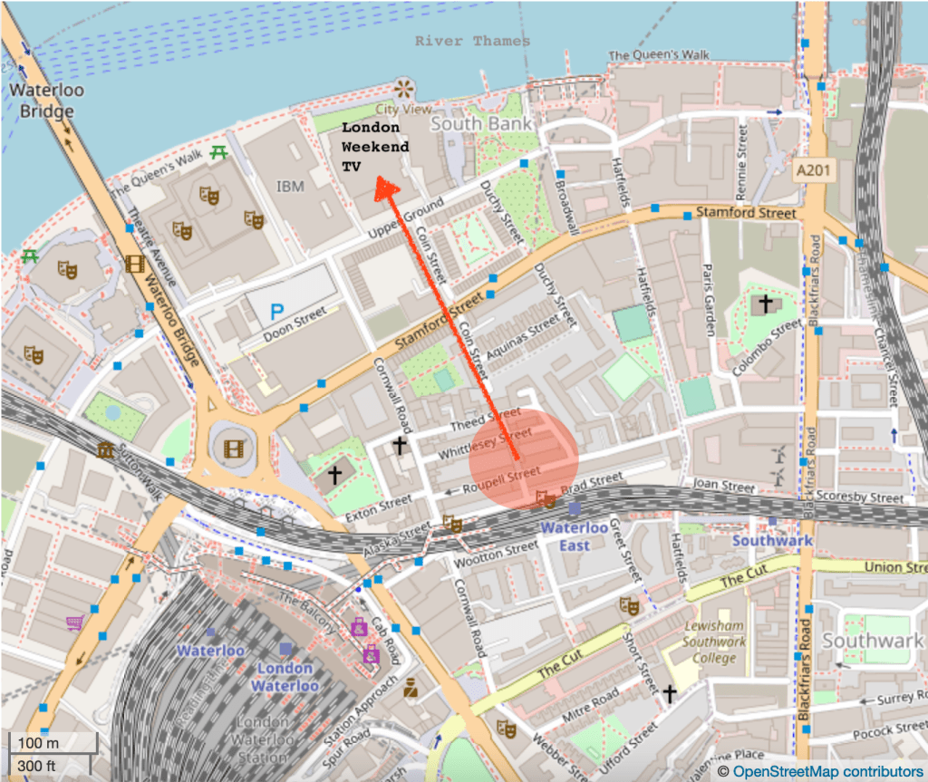
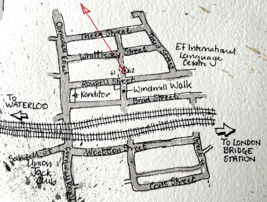
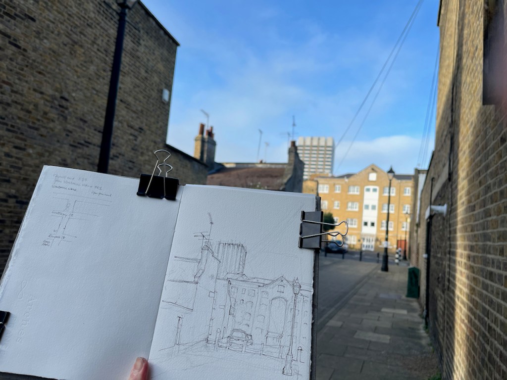
Here is a view of the tower of former London Television Centre building, seen from Windmill Walk, off Roupell Street near Waterloo Station.
LWT Building from Windmill Walk, 7th Feb 2022, in sketchbook 11
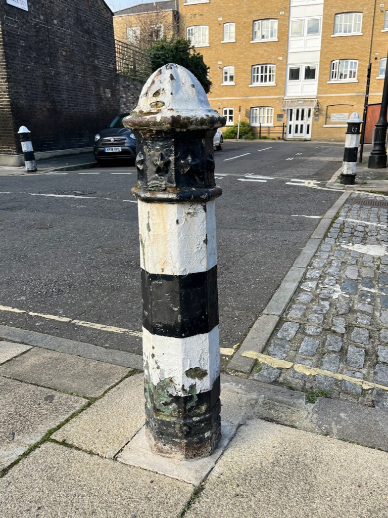
Bollard with stars.
I enjoyed all the wires and aerials! The swooping wire from the top right is a telephone wire or electrical cable. It’s unusual to see them above ground in London. Note also the marvellous bollards, which are mentioned in the Conservation Area Statement (Note 1).
Here you see layers of London development. In the foreground is Windmill Walk, part of the Roupell Street residential area built around 1824, and still residential. The paler building in the mid-distance is on Theed Street. It is a converted factory. It now contains some residential properties which I found listed on a holiday lettings site, and some offices listed on an estate agents’ site. Different accounts list it as a Violin Factory and/or a “Komptulicon Works”. Komptulicon was a sort of floor covering made of cork and rubber.
On the skyline is the London Television Centre, 1972, which I have drawn previously:
Here is a view of the London Television Centre, 60-72 Upper Ground, SE1. It is on the South Bank of the river Thames, a little to the East of the National Theatre and the Royal Festival Hall. It was completed in 1972 to the design of…
“[Roupell] street was laid out and construction started around 1824….. Roupell had built the street for what were described as “artisan workers” and the 1841 census provides a view of the professions of what must have been some of the first people living in the street. This included; painters, labourers, clerks, printers, bakers, carpenters, bricklayers, compositors, paper hanger, hatter, an excise officer, lighterman, warehouseman – all the typical jobs that you expect to find in such a street in 1840s London.” (A London Inheritance)
“Roupell Street Conservation Area” statement by Lambeth Council, 2007, describes the streets and details what can and cannot be done in modifications to the houses. It also mentions the “Komptulicon Works”, north of Windmill Walk.
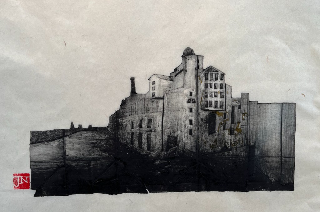
I am trying an experimental monoprint technique. The idea is to use packaging material to make intaglio “plates” which are then printed using an etching press. This is the first one. I printed it yesterday on the Henderson Press at East London Printmakers.
Anchor Brewhouse and Horselydown Old Steps, Monoprint. Image size 10″ x 6″
This is a real building, a former brewery, just to the South and East of Tower Bridge. That’s the river Thames you see on the left of the picture.
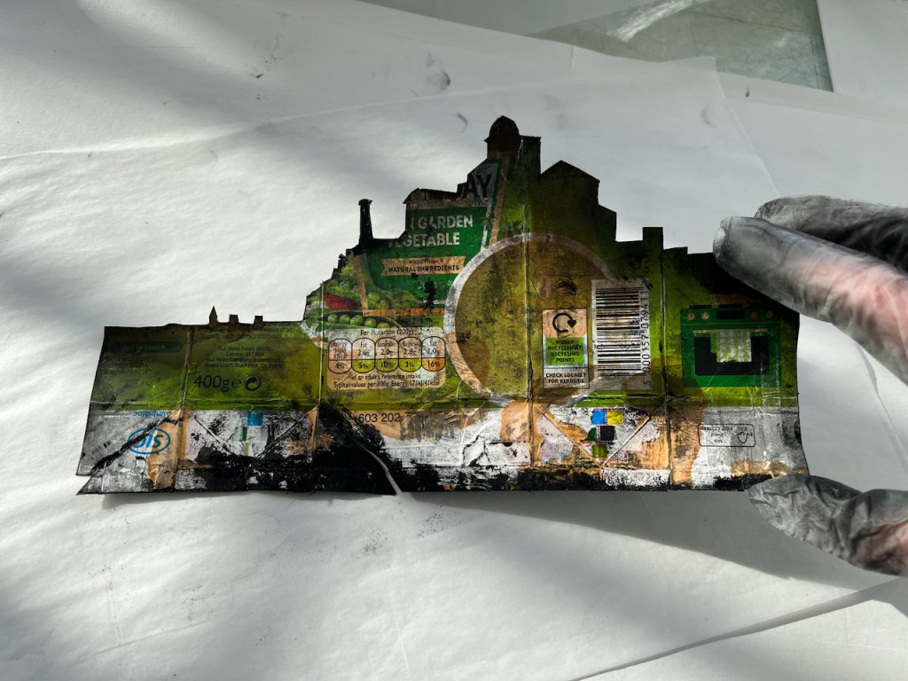
The “plates” are fragile, so I could only make 6 prints before the plate started deteriorating and the contrast started to go. Here is a picture of the plate, front and back. It is made out of a box of soup. I made the picture on the shiny, metallic-looking side, which is the former inside of the soup box.
Back of the plateFront (print side) of the plate, after inking and printing
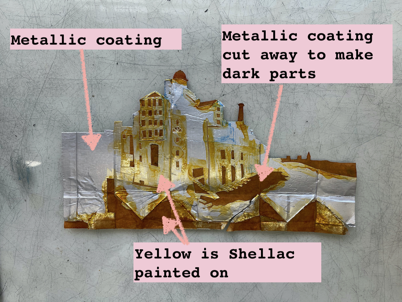
The parts which print dark are made by cutting out the metallic coating of the soup box, leaving the rough cardboard underneath. I painted the plate with button varnish (shellac in alcohol) to make it a bit stiffer and more durable. Here’s what the plate looked like before printing:
Plate before printing, with annotations
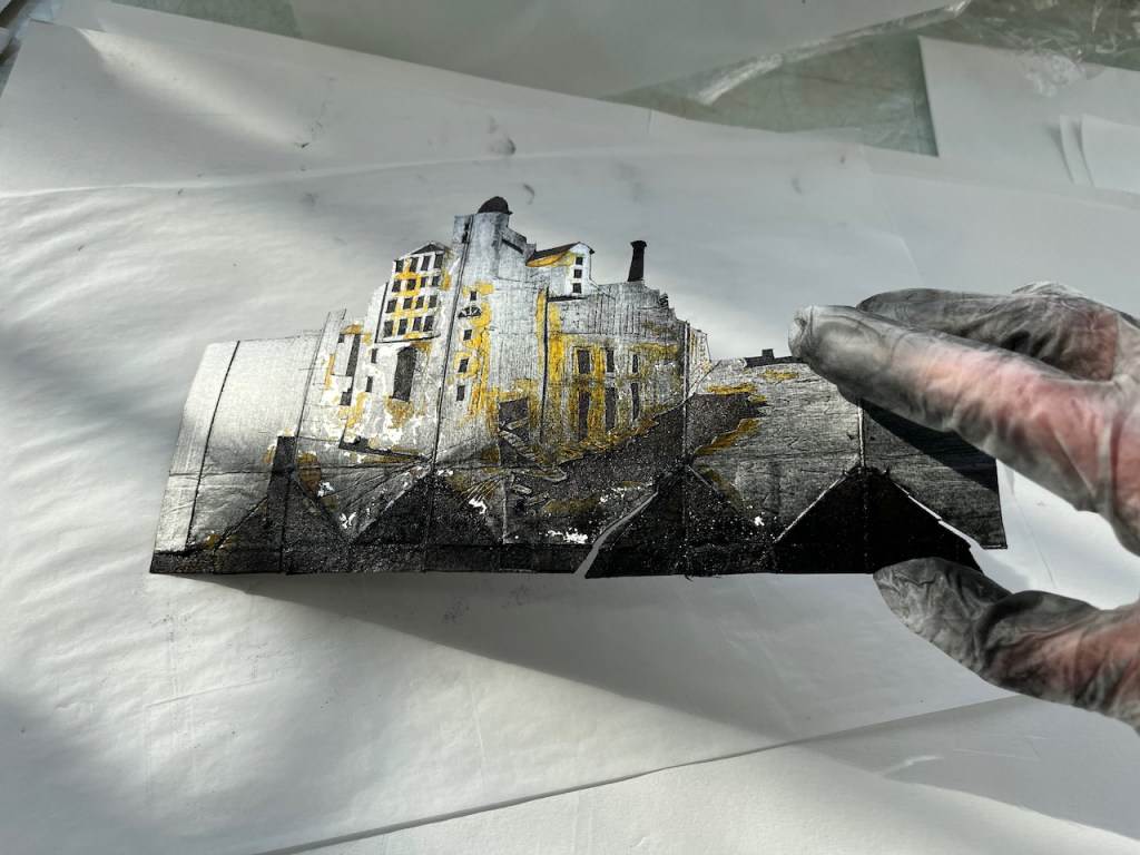
Here is one of the prints peeling off the plate:
Plate (left) and print (right)
I tried making a video, but it was too difficult to hold the plate, the paper and the phone all at once. And there’s ink everywhere which I was trying to avoid getting on my phone. Next time I’ll see if I can get a fellow printmaker to hold the phone.
Ink: “JS”carbon black
The ink is traditional black etching ink from Intaglio Printmaker in Southwark. The paper is Zhao Zhe Chinese paper ref 11369 from Great Art on the Kingsland Road. The red seal on the finished print is made with a Japanese stone seal with red ink gifted to me by my friend and mentor Katsuhisa Toda 戸田勝久.
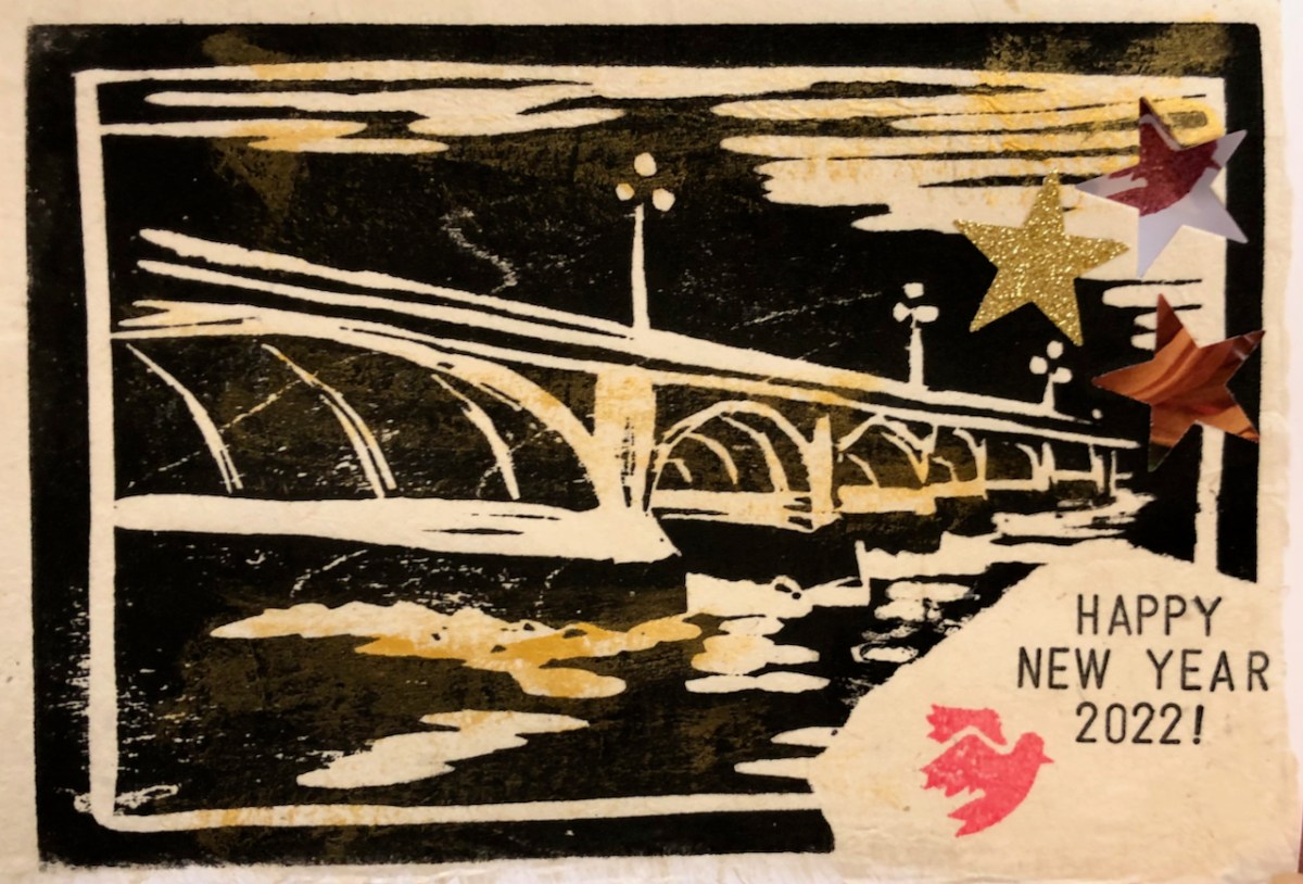
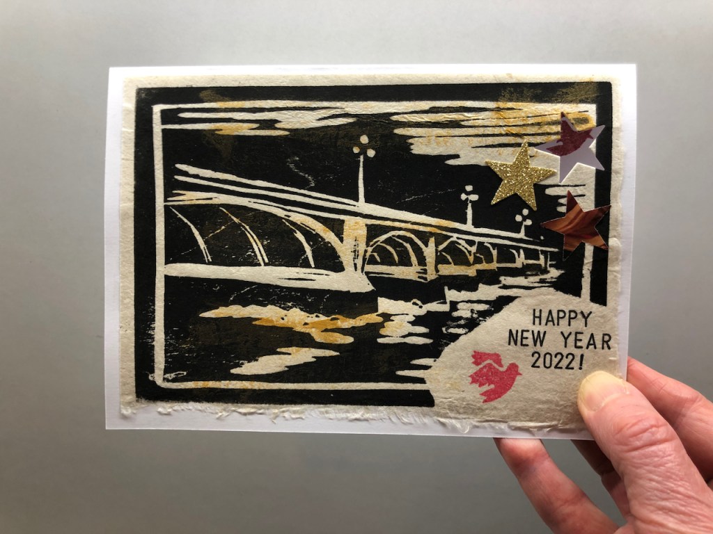
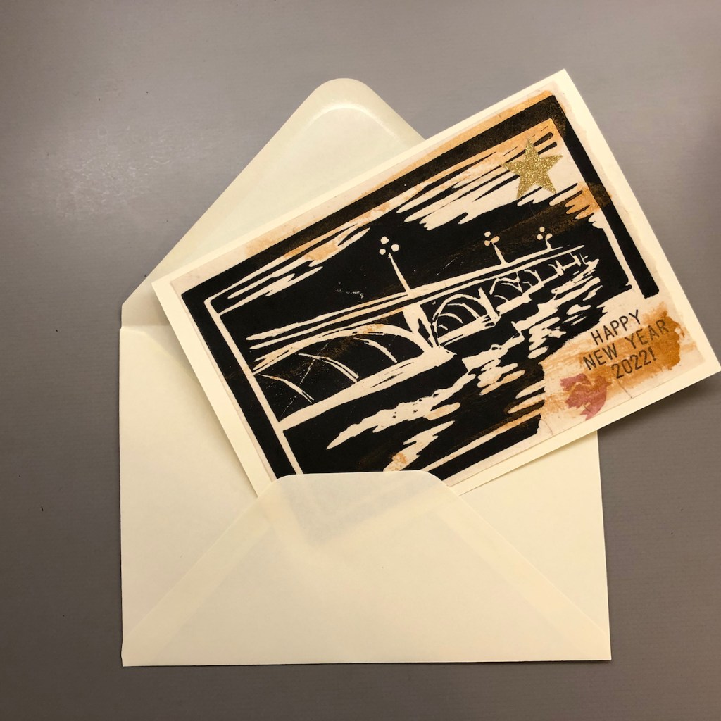
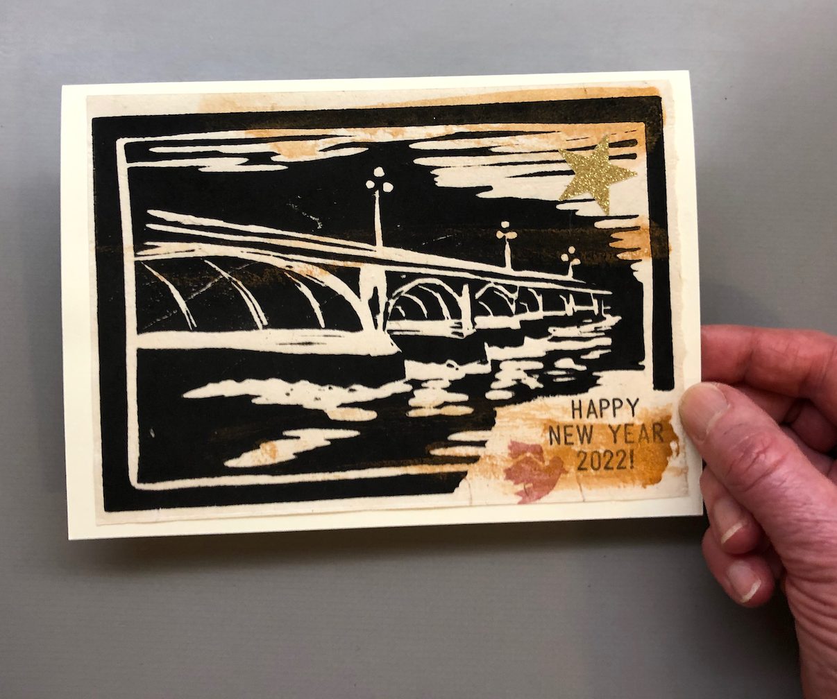
Happy New Year! Here is my New Year Card for 2022.
“Bridges” – woodcut + watercolour, collage and printing
May 2022 be kind to us all.
In London there are many beautiful bridges.
Regents CanalTower bridgeWestminster Bridge
One early morning I saw them all ranged out.
London Bridges at dawn, from the South Bank, looking West
I thought of them as images of hope: so many connections, so many different ways to get across, and that glow of the sunrise on the buildings beyond!.
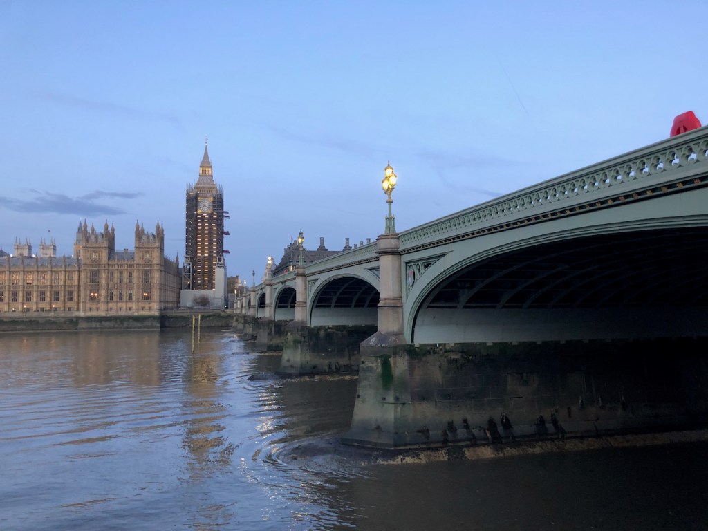
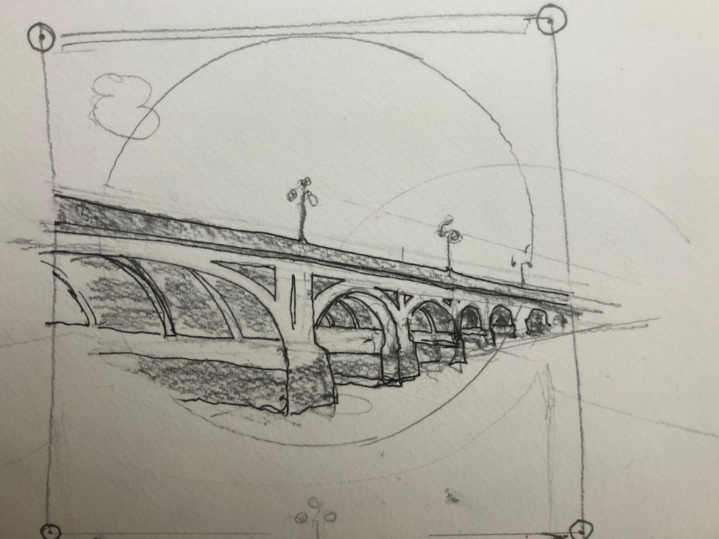
Westminster Bridge was my model. It took many efforts to get the design to work as a woodcut.
Design attempts
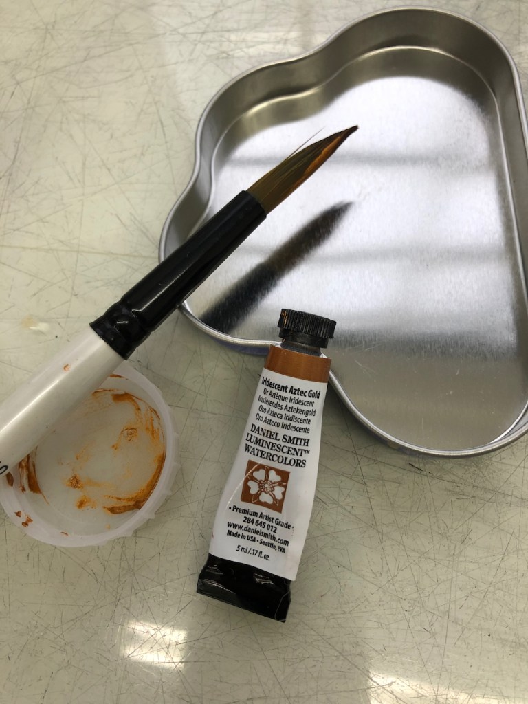
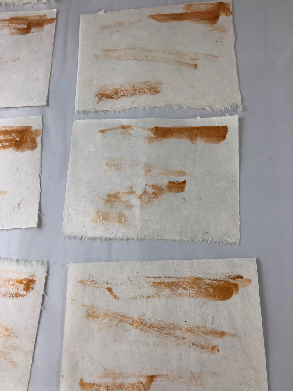
It needed a bit of glow, to echo what I had seen in the sunrise. So I used iridescent watercolour, put on before the paper was printed.
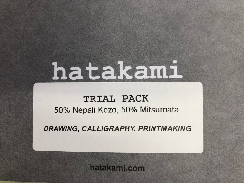
Daniel Smith iridescent watercolourWatercolour on paperPaper is “Hatakami” from Nepal via the Vintage Paper CompanyIridescent watercolour on Nepali paper
Here is the wood block:
“Bridge” woodblock 10cm x 15cm
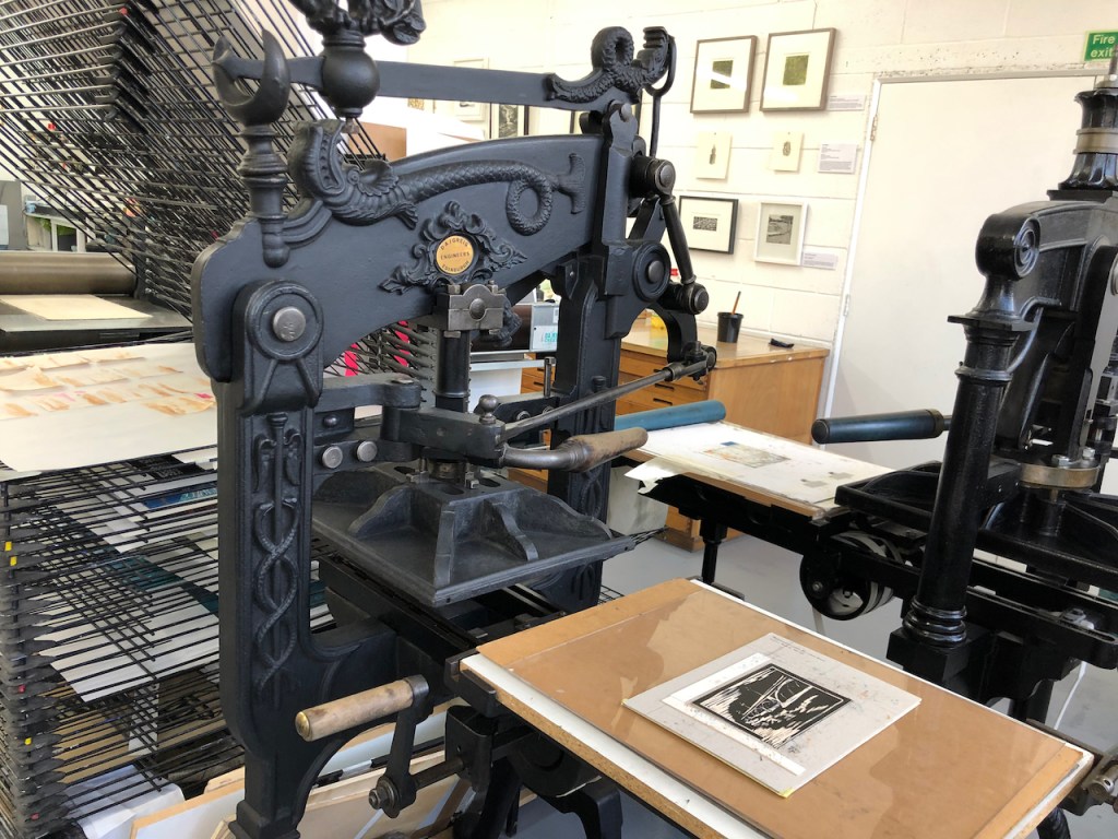
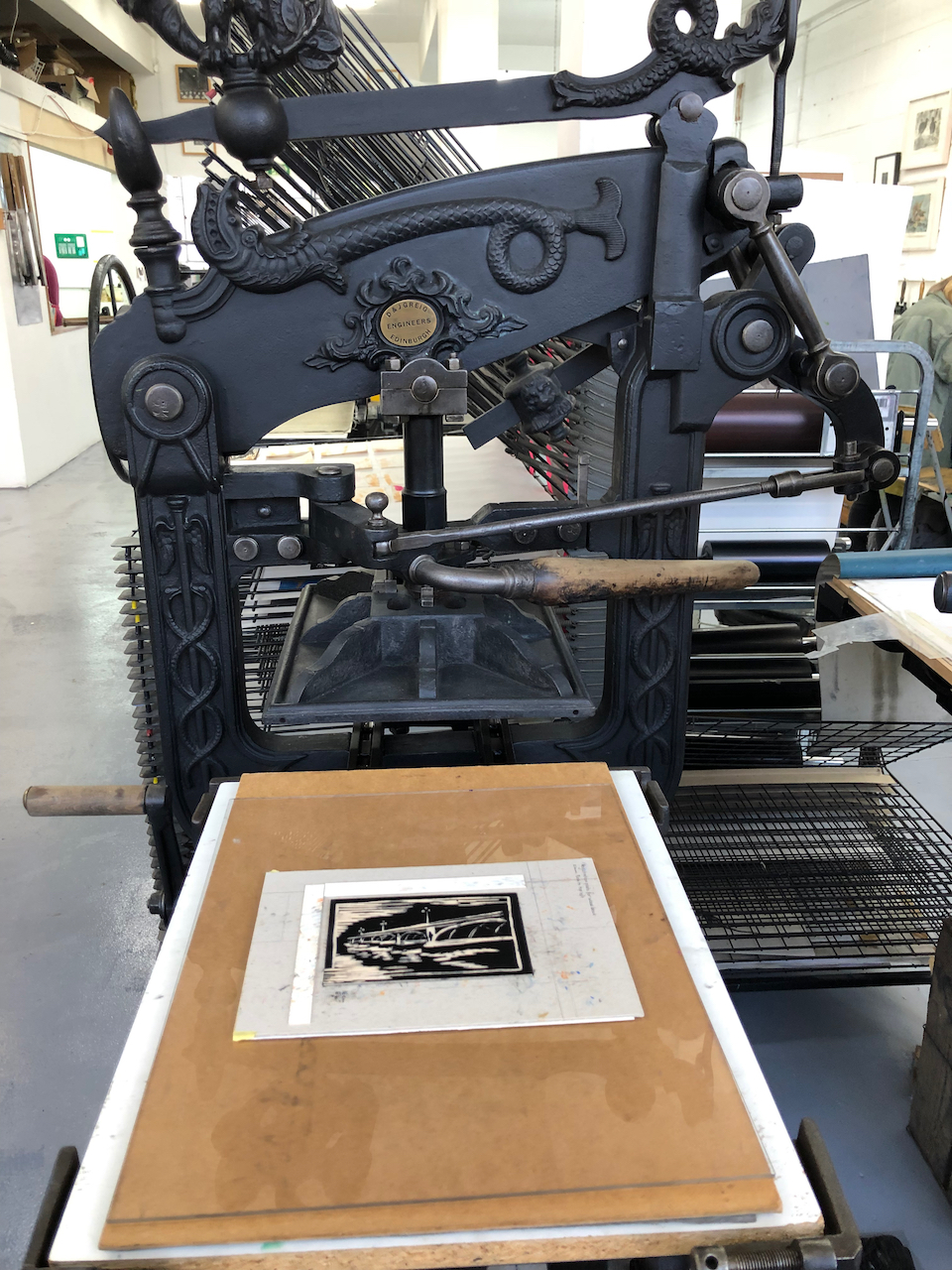
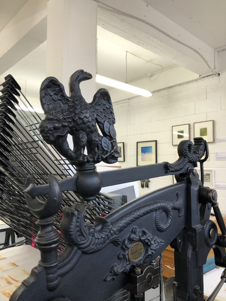
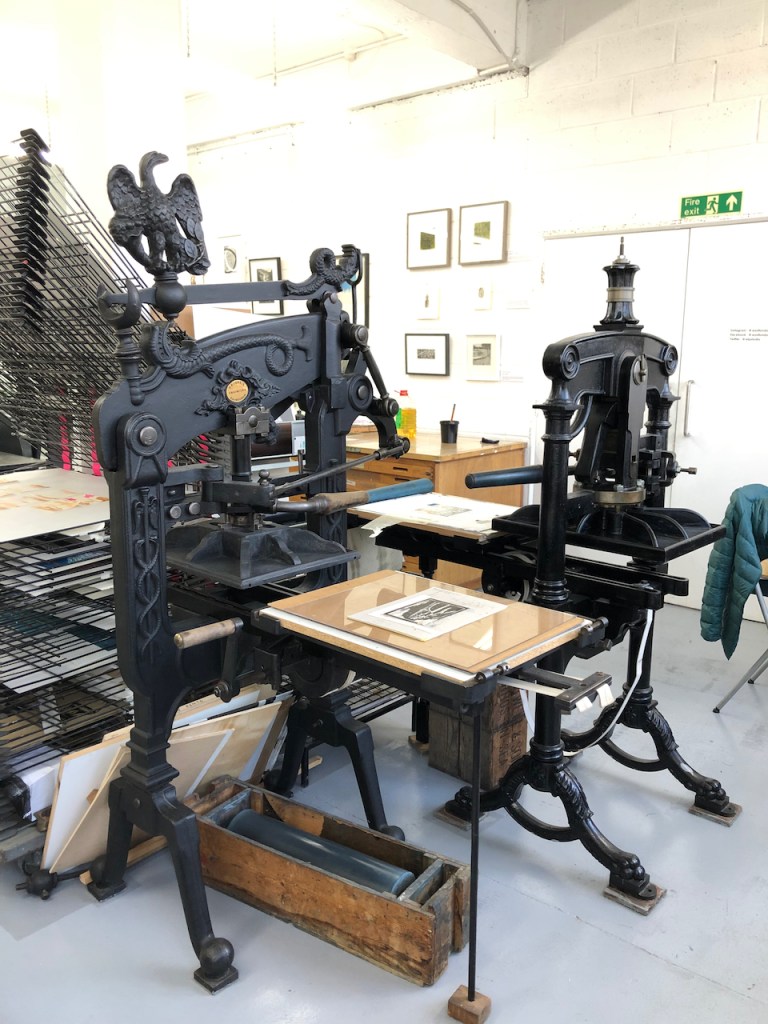
I did the printing at East London Printmakers, on a cast-iron press.
The press at East London Printmakers
Then back at my desk I assembled the cards and sent them off.
"Composed on Westminster Bridge September 3, 1802 " by William WordsworthEarth has not anything to show more fair:
Dull would he be of soul who could pass by
A sight so touching in its majesty:
This City now doth, like a garment, wear
The beauty of the morning; silent, bare,
Ships, towers, domes, theatres and temples lie
Open unto the fields, and to the sky;
All bright and glittering in the smokeless air.
Never did sun more beautifully steep
In his first splendor, valley, rock, or hill;
Ne’er saw I, never felt, a calm so deep!
The river glideth at his own sweet will:
Dear God! The very houses seem asleep;
And all that mighty heart is lying still!