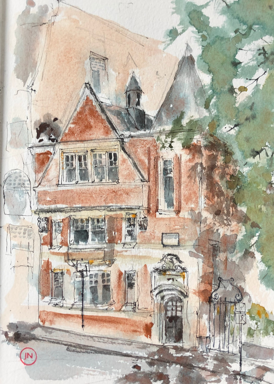
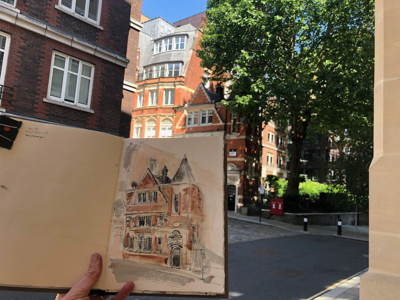
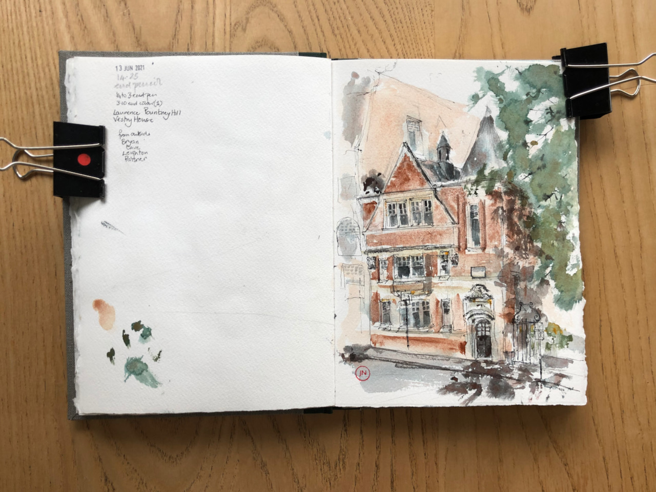
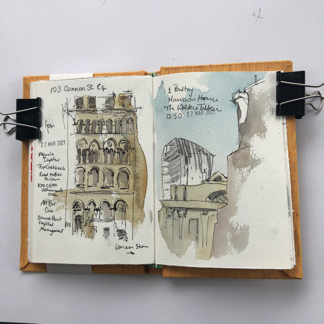
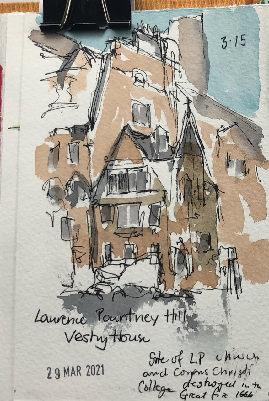
I walked in the back lanes between Cannon Street and Monument. Here is Vestry House on Laurence Pountney Hill EC4.
Vestry House EC4, sketched 13 June 2021, 15:10, 10″ x 7″ in Sketchbook 10
It is Grade II listed, listed in 1977. The listing says:
Late C19, red brick and stone. Stone doorcase with elaborate overdoor and pediment bearing the initials SP over panel of foliage inscribed Vestry House. 1st floor oriel window with big triangular gable over, projecting on scrolled consoles; 2nd floor windows in gable. Octagonal corner stair turret with pointed roof.
There is a blue tile further East along Laurence Pountney Hill. It reads:
Site of Laurence Pountney Church and Corpus Christi College.
Destroyed in the Great Fire 1666
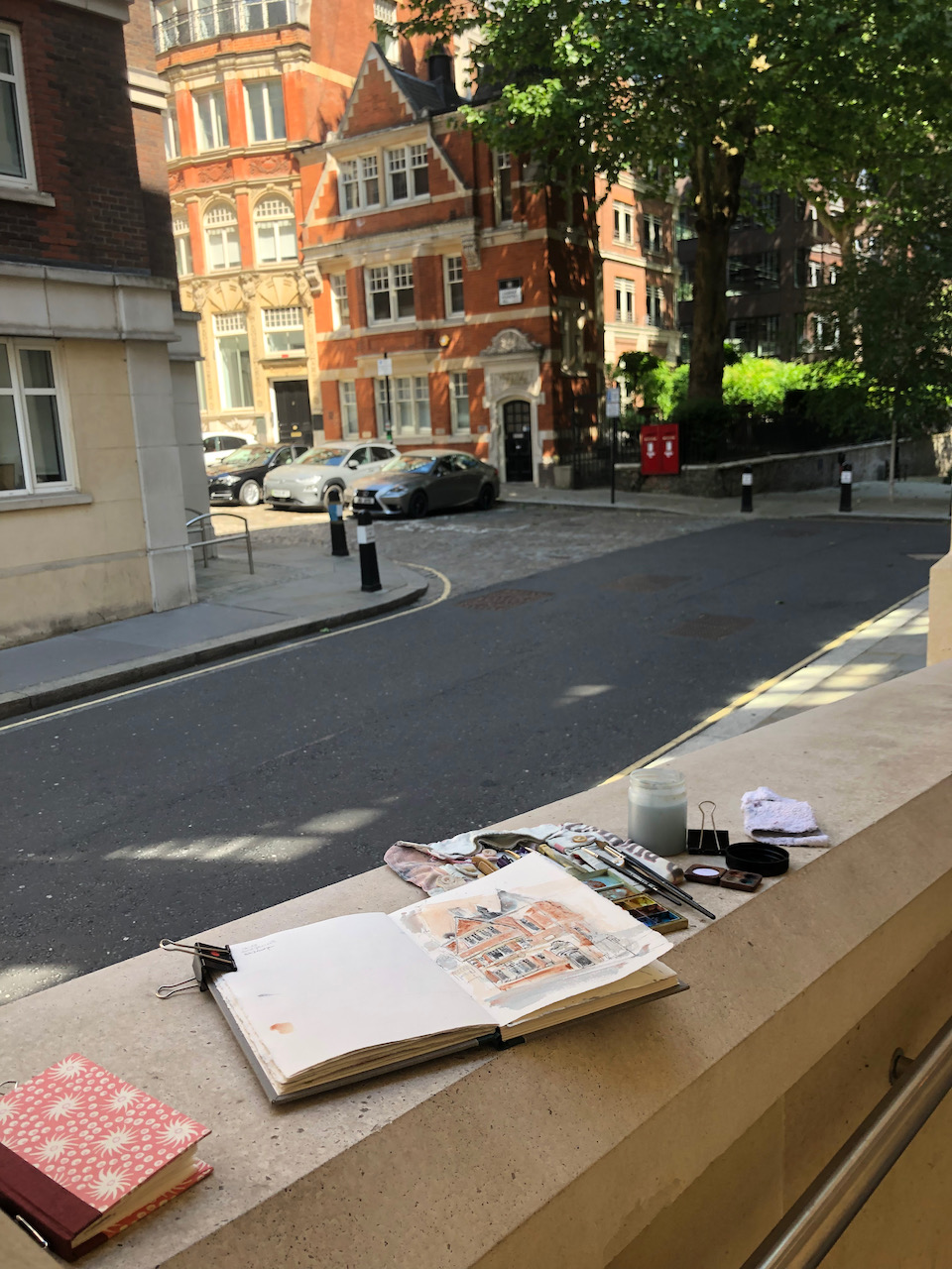
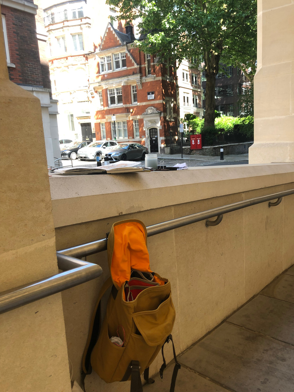
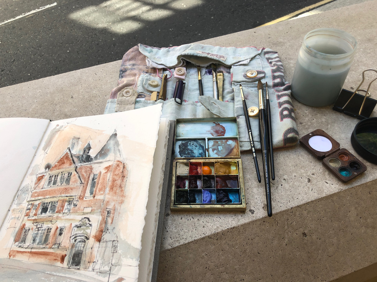
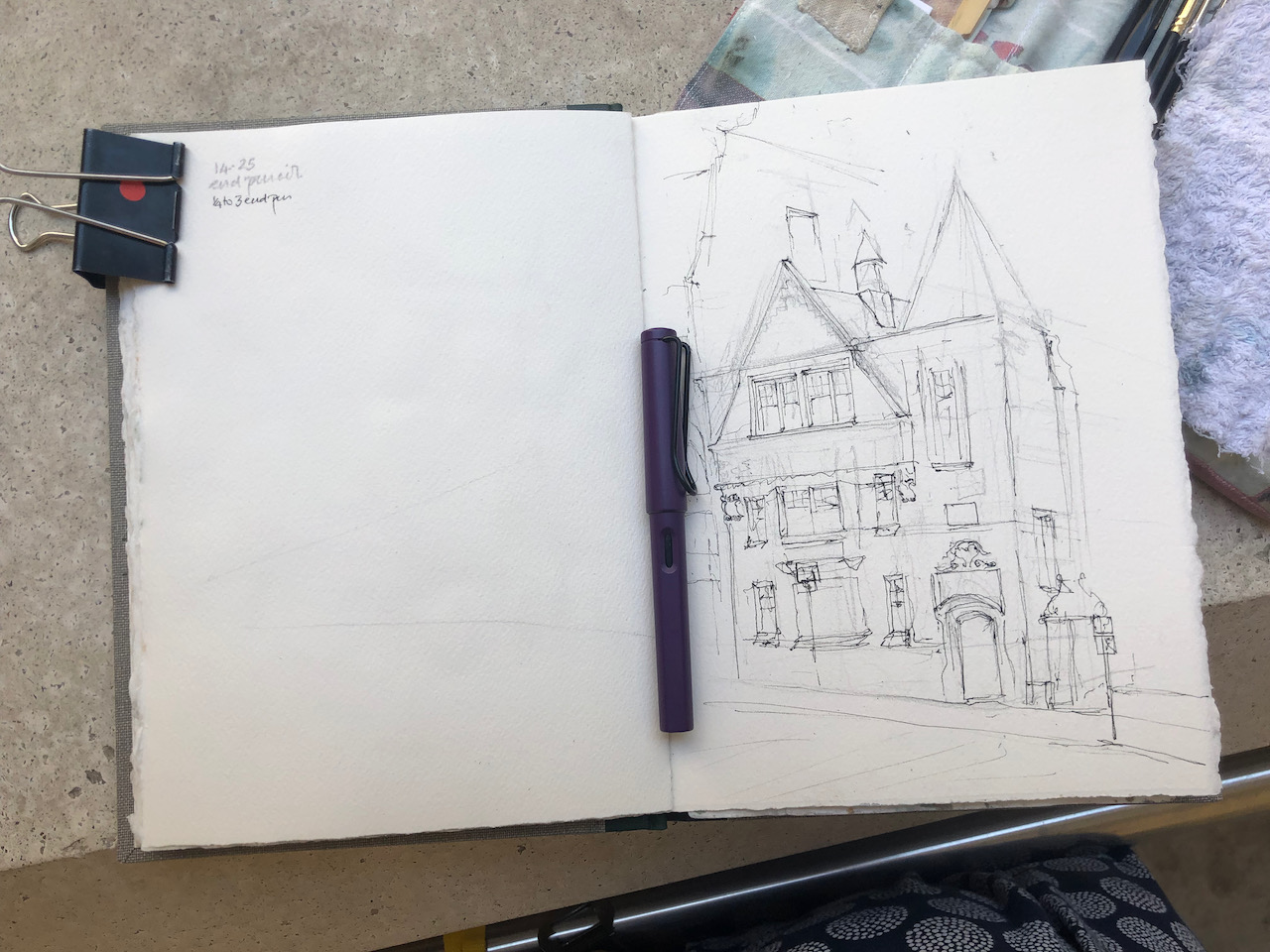
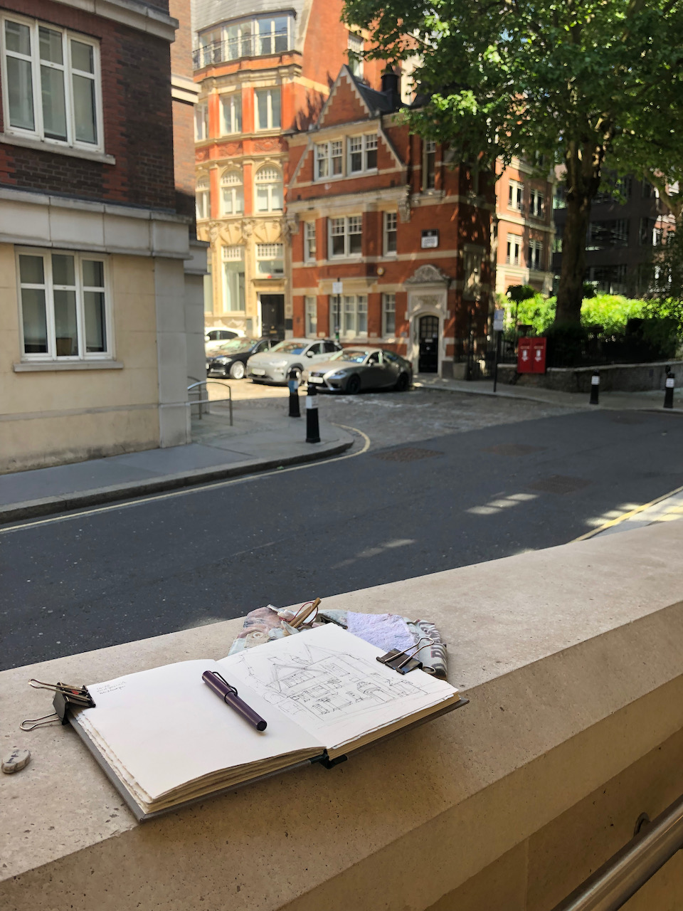
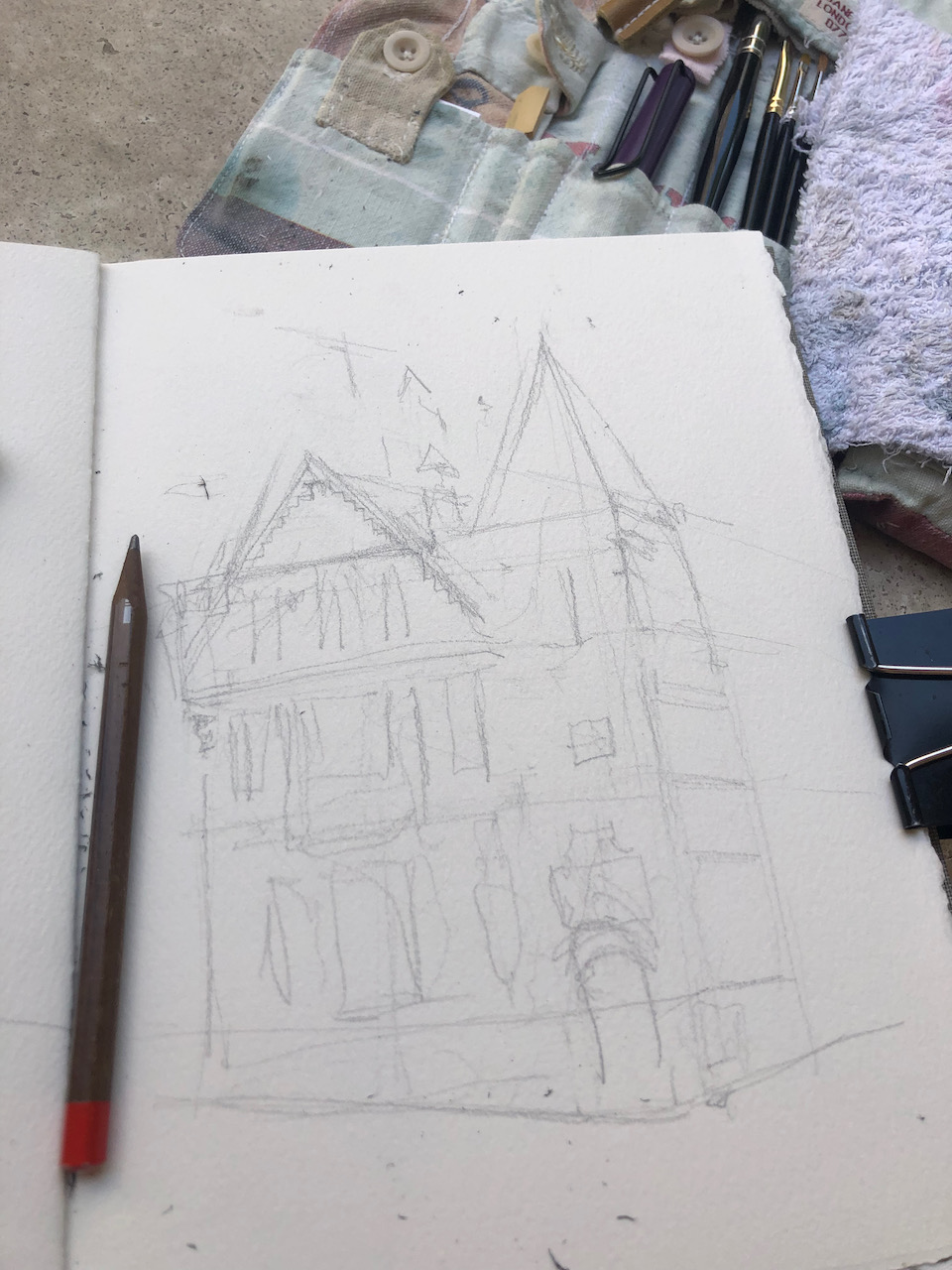
I sketched from a raised walkway on a modern office block opposite. Here are some work-in-progress photos.
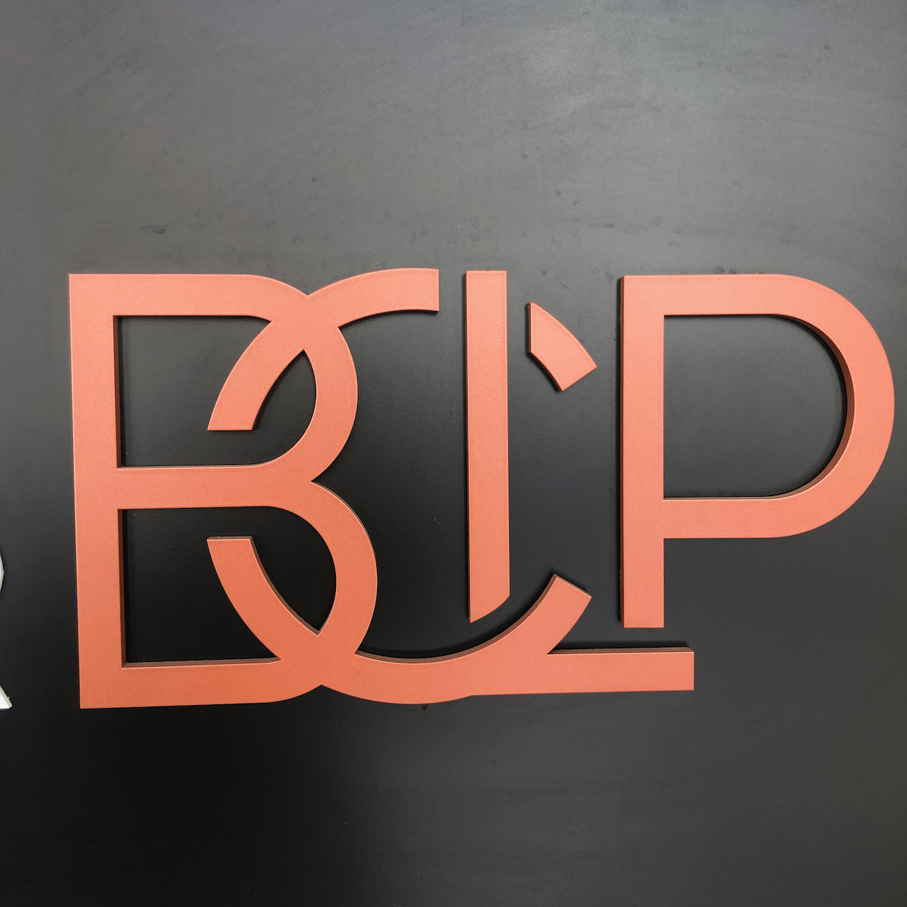
I stood in front of the offices of
Bryan
Cove
Leighton
Pilsner
Their logo cleverly captures all these initials.
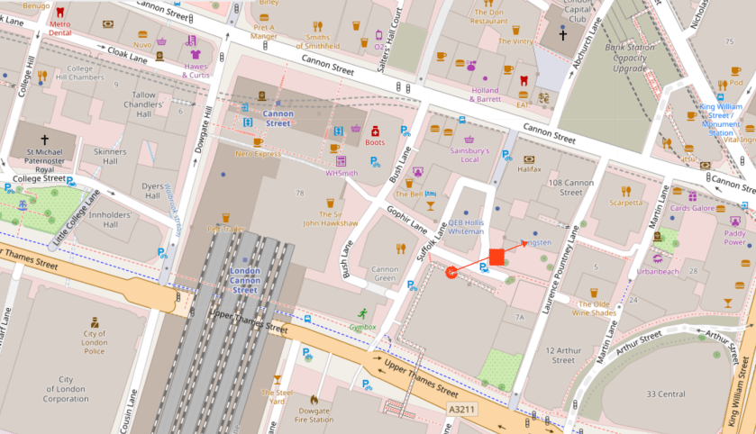
Here is a map showing the location of Laurence Pountney Hill. The red square is Vestry House, the arrow shows the sightline of the drawing.
Map (c) Open Street Map Contributors
The colours are Lunar Earth, Mars Yellow, Perylene Maroon. The grey is Perylene Maroon and Phthalo Blue Turquoise. The green is the same blue with Mars Yellow.
Click a button below to share this post online, email it, or print it:
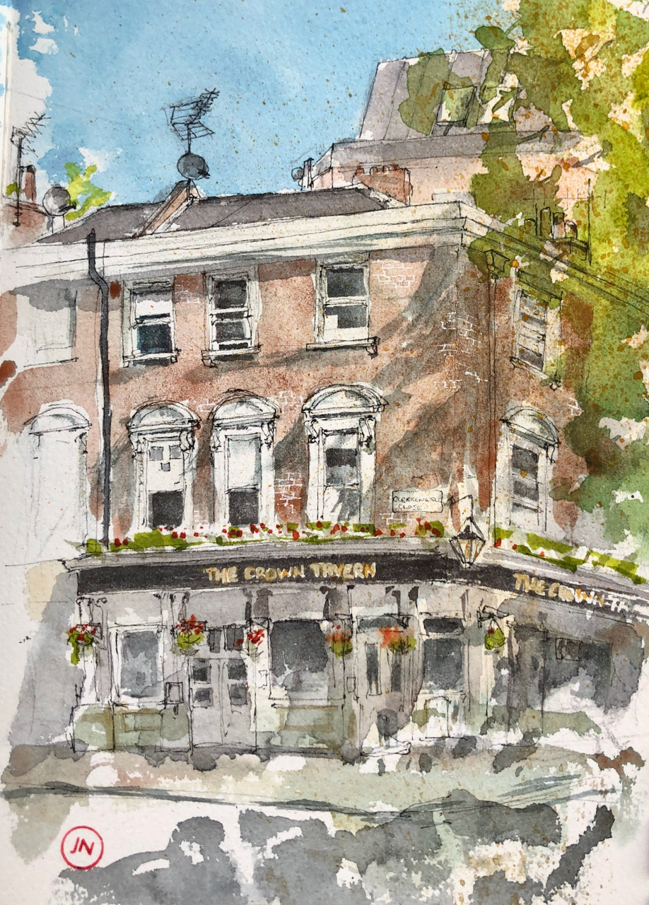
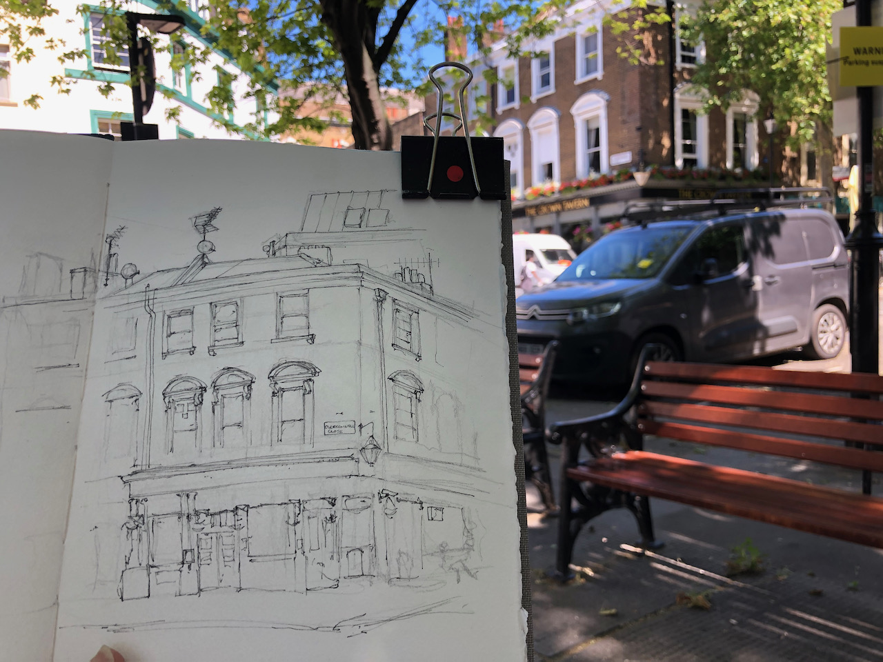
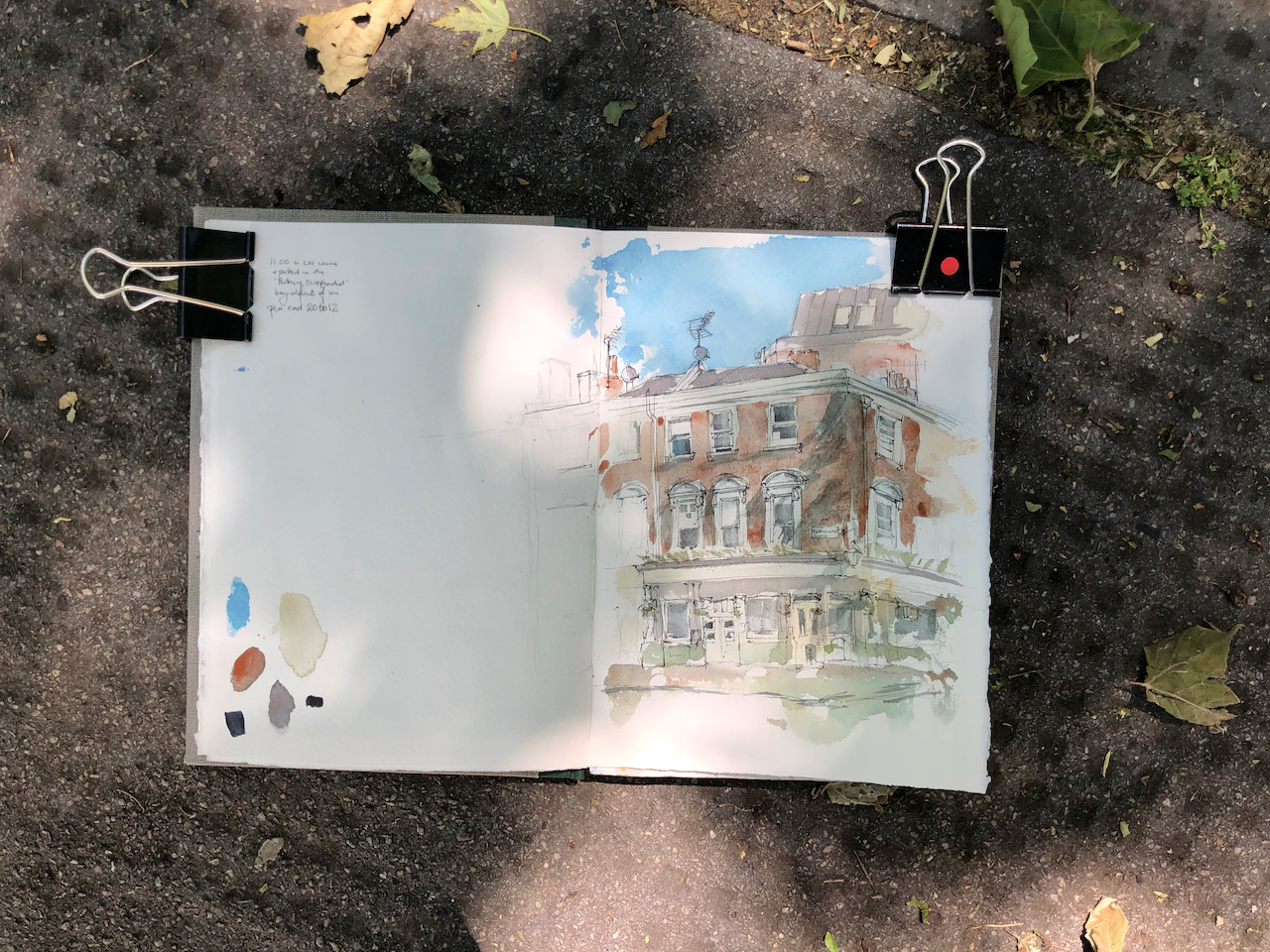
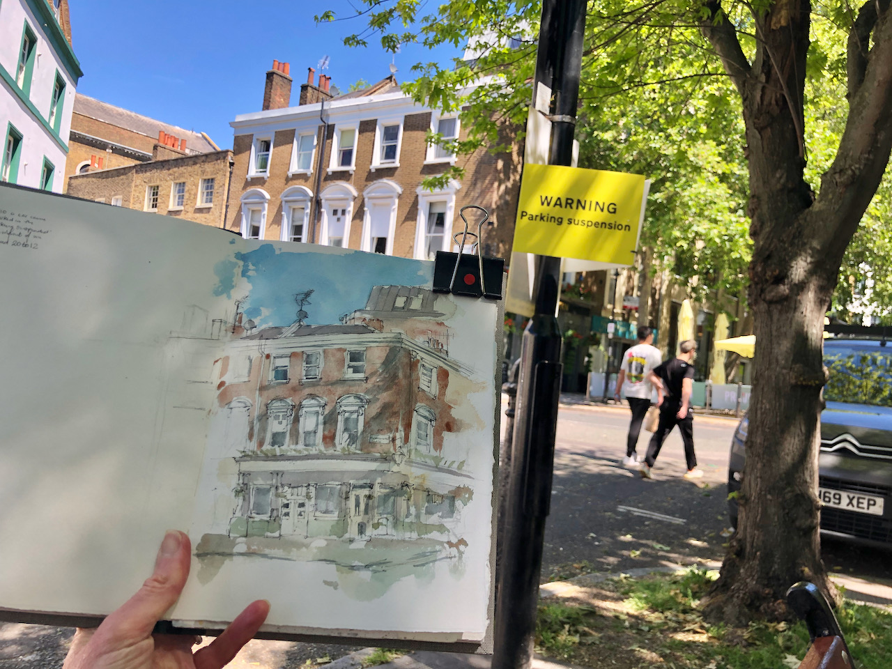
The pub frontage dates from 1900, according to the historic buildings listing1. The building is Grade II listed. There has been a pub here for a lot longer than that, though. A Freemasons Meeting here is recorded in 17862
The Crown Tavern EC1, sketched 9th June 2021, 12 noon, 10″ x 8″ in Sketchbook 10.
I sketched the pub on a sunny Wednesday lunchtime. Building work was in progress on the site behind me. The cafés opposite were open and people were sitting outside.
I moved my position several times while sketching this. First I stood by a hoarding, where I had an unobstructed view and something to lean against. After 15 minutes a big car came and parked on the “Parking Suspended” bay in front of me. It was a mini-cab. It sat there, its engine idling. Will someone please explain to me why drivers leave their engines running while stationery? It was a beautiful pristine summer day. And now I had diesel fumes. I considered various courses of action, including abandoning the picture, remonstrating with the driver, or starting my picture again from the other side of the road. I did none of those things, but moved a few paces so to get fresher air and a better view of the top of the building. 15 minutes later, the mini-cab circled round Clerkenwell Green, and came to rest in a new place. I think they were avoiding the traffic warden, who had appeared on a bicycle.
I continued my drawing standing up and then moved to a nearby bench which did not have such a good view, but where I could do my watercolours a lot more easily.
The pub itself was dark and silent until suddenly, at 12 noon exactly, the lights came on and a person emerged and placed the menu board outside.
“Taken fromSt Paul’s letter…”
Under the lamp a beautiful piece of signwriting reads, in gold:
” Taken from St Paul’s letter to the Hebrews Chapter 13 Verse 2″.
I could find no indication of what had been “taken from St Paul’s letter to the Hebrews”. So back in my office I looked it up. Verse 2 reads:
“Forget not to shew love unto strangers: for thereby some have entertained angels unawares”
This is my old school Bible “being the version set forth AD1611 compared with the most ancient authorities and revised”. Online, the New International Version gives “Do not forget to show hospitality to strangers, for by so doing some people have shown hospitality to angels without knowing it.”, which sorts out the double negatives a little better. But the thought that we might have ” … entertained angels unawares” is so succinct and entrancing that it stays in my mind as a beautiful image.
I finished off the drawing at my desk. The pub name is done in “pebeo drawing gum”. This is a synthetic rubber resist solution. I painted the letters with the drawing gum using a fine brush, on the white paper. It takes about 15 min to dry. Then I painted the dark background. Then that has to dry. Then I can rub off the drawing gum to reveal the white letters. It’s like magic.
The colours are, for the main picture: Phthalo Blue Turquoise, Fired Gold Ochre, Perylene Maroon, Mars Yellow, Lunar Earth. Lunar Earth is a strange granulating colour, it dries to a mosaic-like finish, which you can see in the brickwork of the pub.
I added highlights in Green Gold, Permanent Yellow Deep, and Transparent Pyrrol Orange. The pub lettering has some Iridescent Gold.
Here’s a map:
Sketch map showing the sightline of the drawing.
If you have been reading the Robert Galbraith/JK Rowling novel “Troubled Blood” then you will recognise these street names. The novel is wonderfully accurate in its geography.
I have drawn some other pubs and restaurants in this area:
…its varnish was peeling but it was heavy and strong….
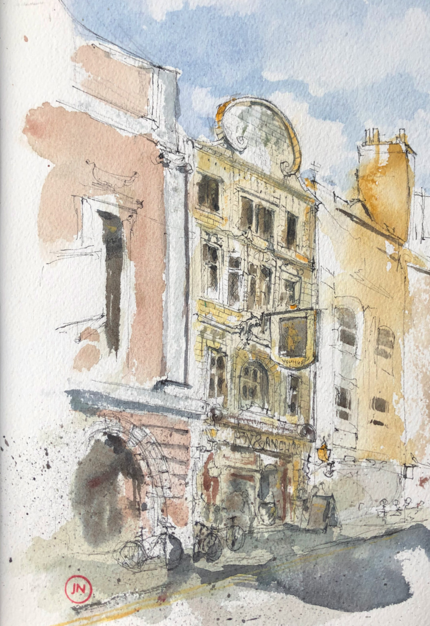
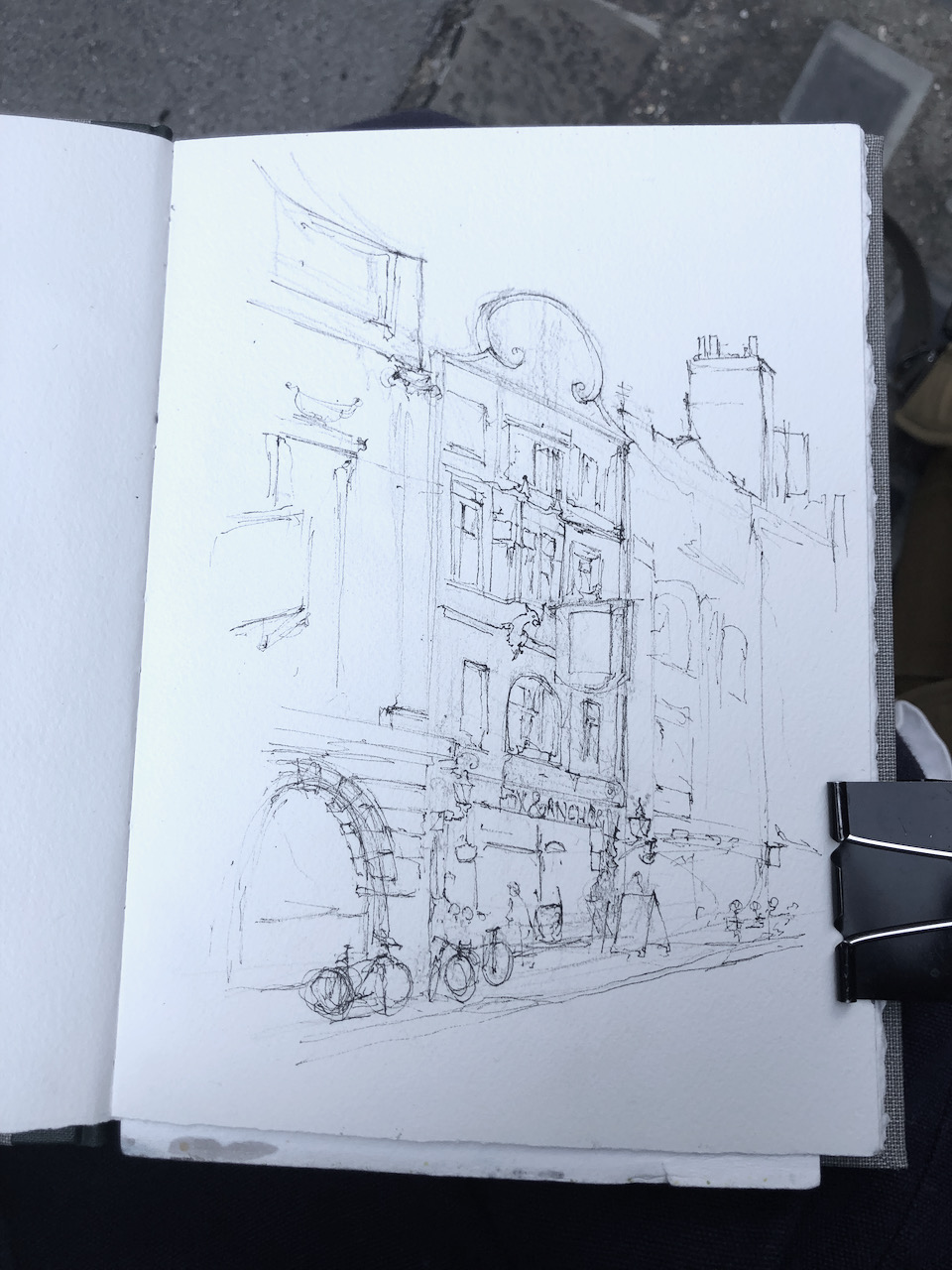
I set off on a warm afternoon intending to sketch a pub in Clerkenwell Green. On the way there, I walked along the north side of Smithfield. Down a side street I spotted a lone chair, placed as if waiting for me. It commanded an excellent view of the Fox and Anchor. I tried out the chair. Its varnish was peeling, but it was heavy and strong.
So I settled myself down and drew the Fox and Anchor. This is a very decorative pub. Pevsner* says it has a “joyful front of Doulton’s coloured tiles”. That’s Royal Doulton, the pottery company. I recommend the startling Royal Doulton building in Vauxhall, on the corner of Black Prince Road and Lambeth High Street. This is even more elaborate than the Fox and Anchor pub, since it was a living advertisement for the wares of the firm.
The Fox and Anchor dates from 1898. This date is on the tiles in that magnificent halo on the top, together with a picture of the Fox. The date is written in such flamboyant Art Nouveau script that it’s difficult to read. The whole of the front is tiled with ceramic tiles, in wonderful shapes, including tiles which go around the window frames. There is a dragon either side of the pub sign.
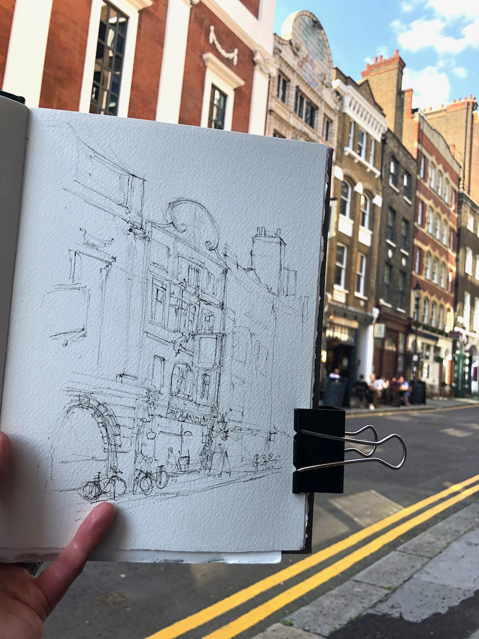
Fox and Anchor pub and hotel, EC1. Sketched 5th June 2021, 17:30 in Sketchbook 10. 8″ x 10″
This is a Young’s pub, open now. The Fox is shown on the pub sign, but not the Anchor. It has a special Smithfield licence, which means that it can offer beer for breakfast. This special licence is historically for serving the night shift meat workers at Smithfield. Someone of my acquaintance recounts stories of financial services workers in the City celebrating the end of projects with the Full English at the Fox, complete with pints of beer.
It is also a hotel. “Boutique” rooms are offered on its website. It must be a great place to stay!
I drew this picture between 4 and 5:30pm on a Saturday. The area was already becoming lively. A crowd spilled out of the “Be At One” cocktail bar.
Outside the Fox and Anchor people sat at tables quietly taking in the evening. And observing the person sketching, sat on a chair on the pavement opposite. As I noticed with my drawing earlier in the week, Londoners are losing their fear and are starting again with the social interactions. Several people came to say hello as I was working on the picture. Someone had seen me looking repeatedly up at the building and down at the picture. They had been discussing with their companion why I didn’t use a photograph. So they came and asked me, which was nice of them, and provoked an interesting discussion. Part of the answer is because “I like sitting here looking at the building,” and another part of the answer, which I struggled to express, is that I get a very different picture if I work from a photograph.
Another person came and asked technical questions. They use watercolours for life drawing, and wanted to know the name of the brown colour I use, which is Fired Gold Ochre. They also admired my paintbox.
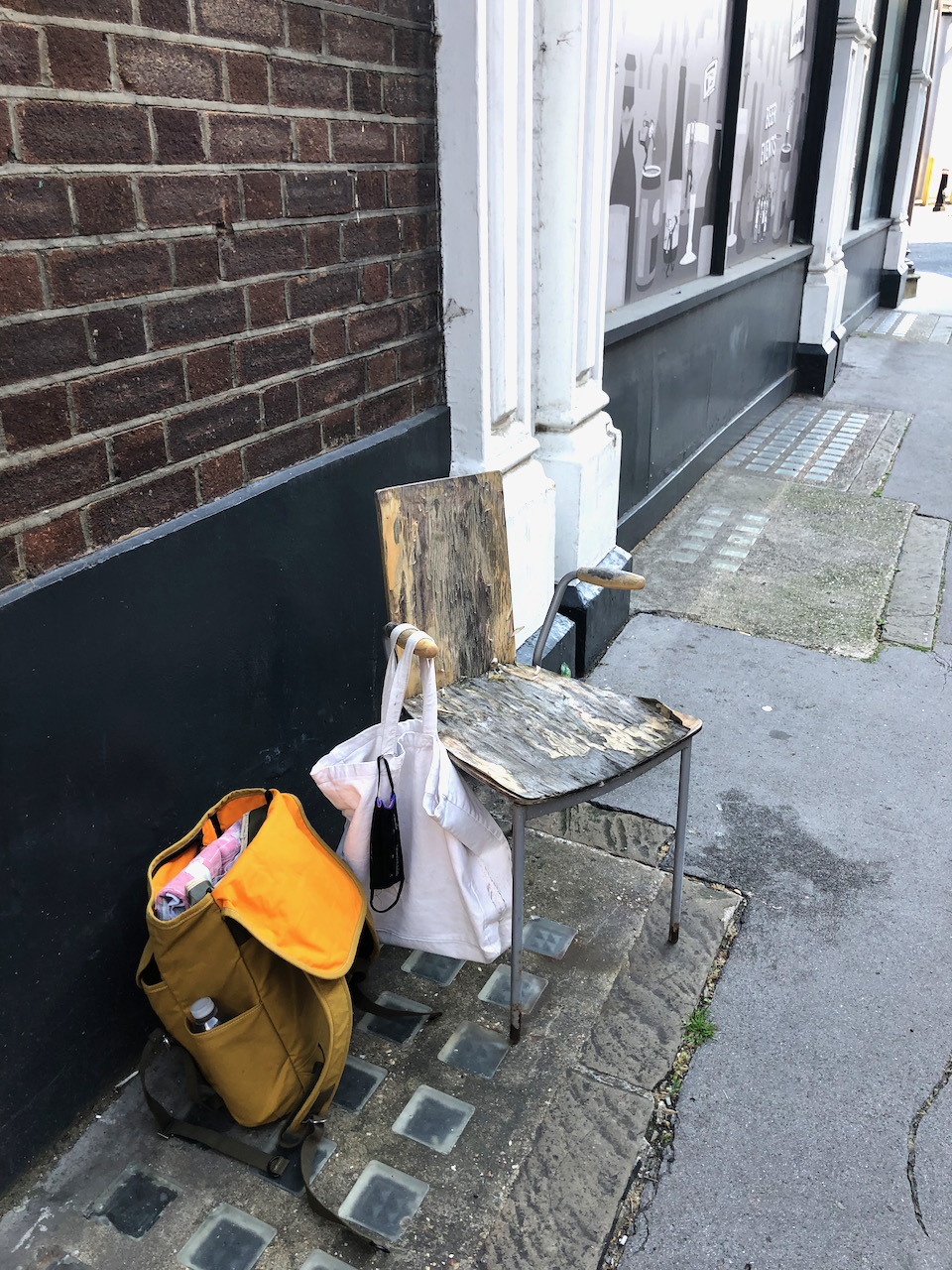
Here are pictures of work in progress and my drawing location:
Here is a map showing the line of sight of the drawing. The nearby street is called “Fox and Knot Street” which is intriguing.
The picture took an hour and a half, all on location. The colours are: Fired Gold Ochre, Phthalo Blue Turquoise, Buff Titanium, Mars Yellow, Permanent Yellow Deep. and some Perylene Maroon to make the grey colours. The yellow lines on the road are Naples Yellow.
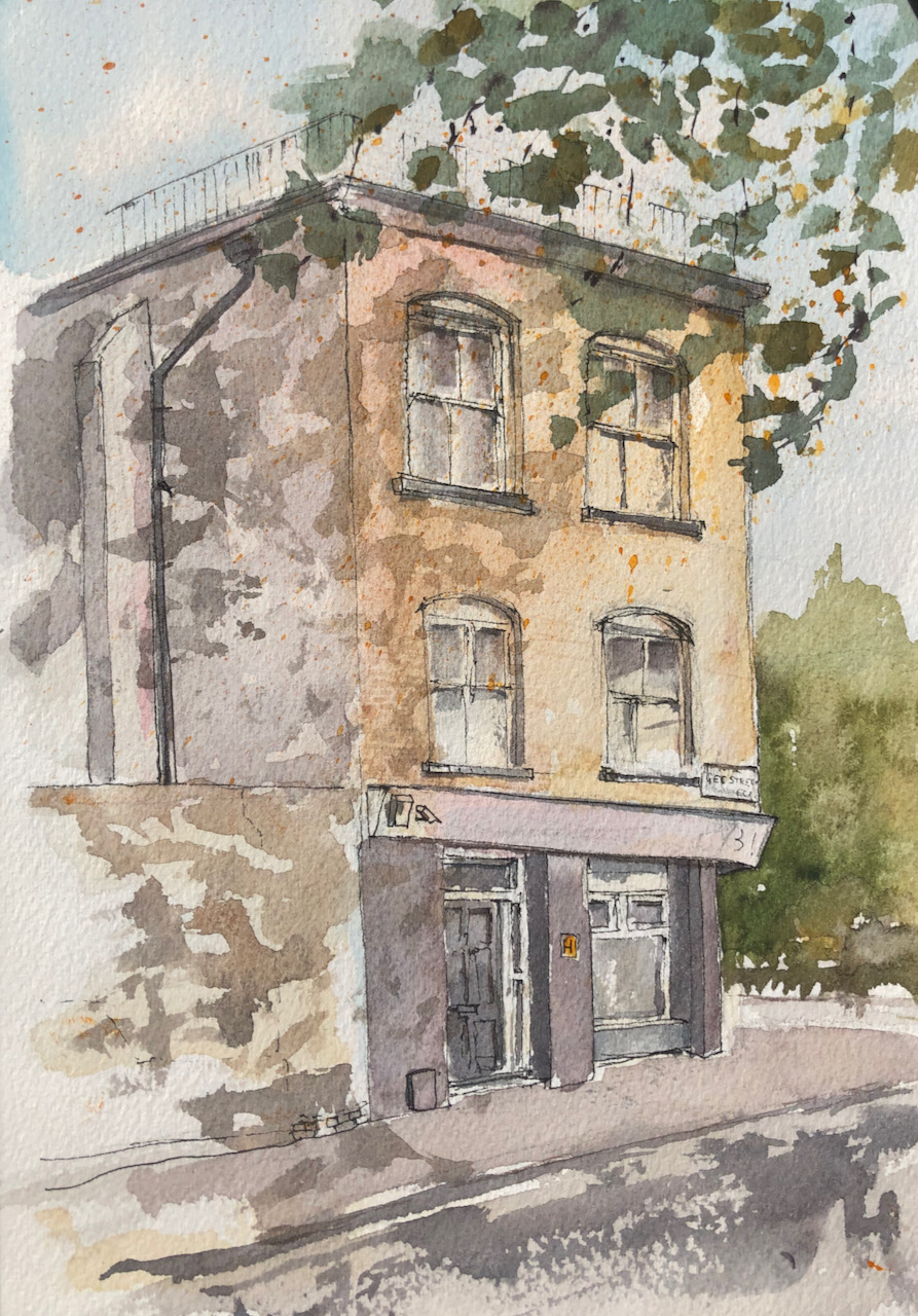
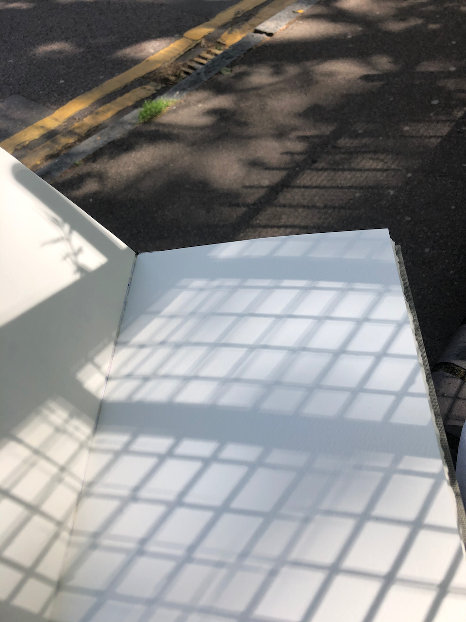
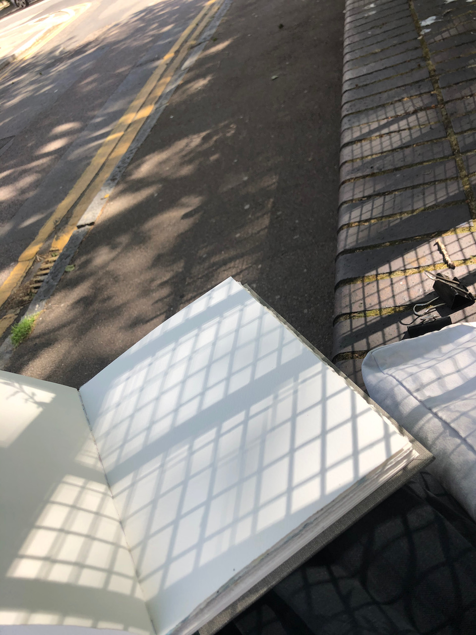
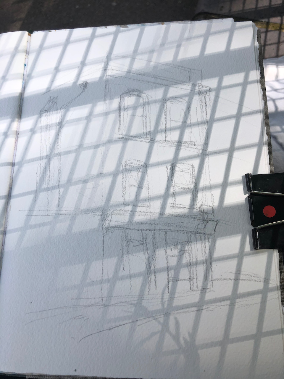
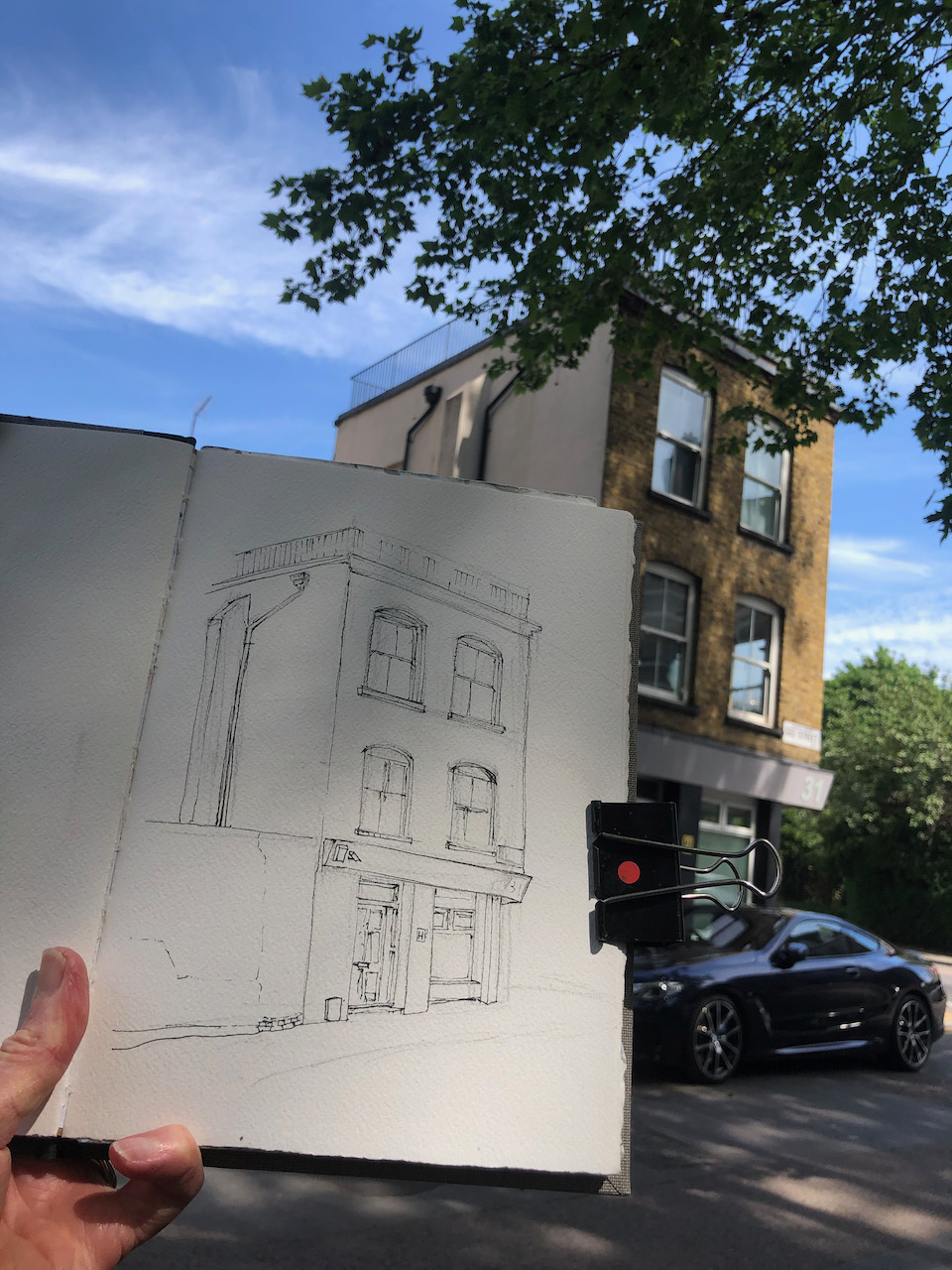
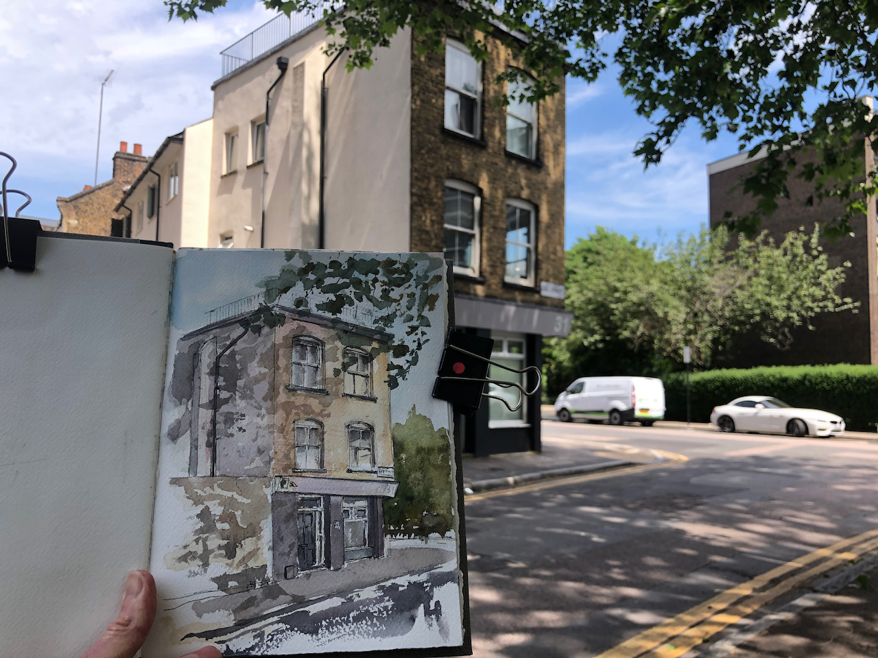
This house is on the corner of Central Street and Gee St, London EC1.
31 Central Street, EC1. Sketched 2nd June 2021 on location, 7″ x 10″ in Sketchbook 10
It was a lovely sunny day. I enjoyed the shadows on the house. When I sat down on the wall and got myself organised to sketch I found I had some startling shadows on my page.
See the drawing among the shadows.
…some startling shadows on my page….
While I was drawing, two people came up and chatted to me at different times. A man came, whose young son is a gifted cartoonist and illustrator. We talked about different styles of drawing, and how his son might develop his talent. Later a woman stopped to talk. She used to be an artist herself. She was interested to know why I was drawing that particular house. These people both preserved a respectful distance, but still chatted and appreciated the drawing. I am happy that people are talking again.
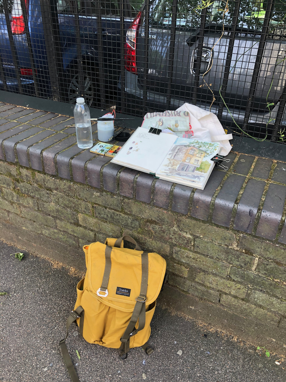
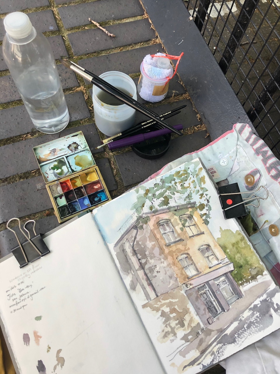
Here are some snapshots of work in progress and the location where I was drawing:
This drawing took about 2 hours, sketched and coloured on location.
The colours are: Mars Yellow, Phthalo Blue Turquoise, Perylene Maroon, Pink Rhodenite Genuine, Transparent Brown Oxide. The trees have some Green Apatite Genuine and Permanent Yellow Deep. There’s a Permanent Yellow Deep splatter across the leaves.
Here’s a sketchmap of the location:
Click a button below to share this post online, email it, or print it:
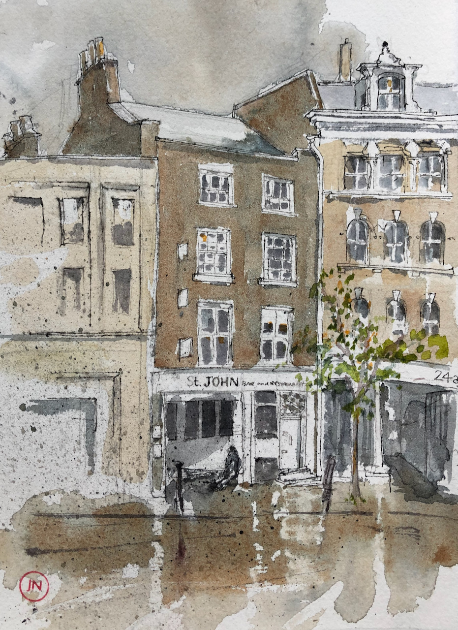
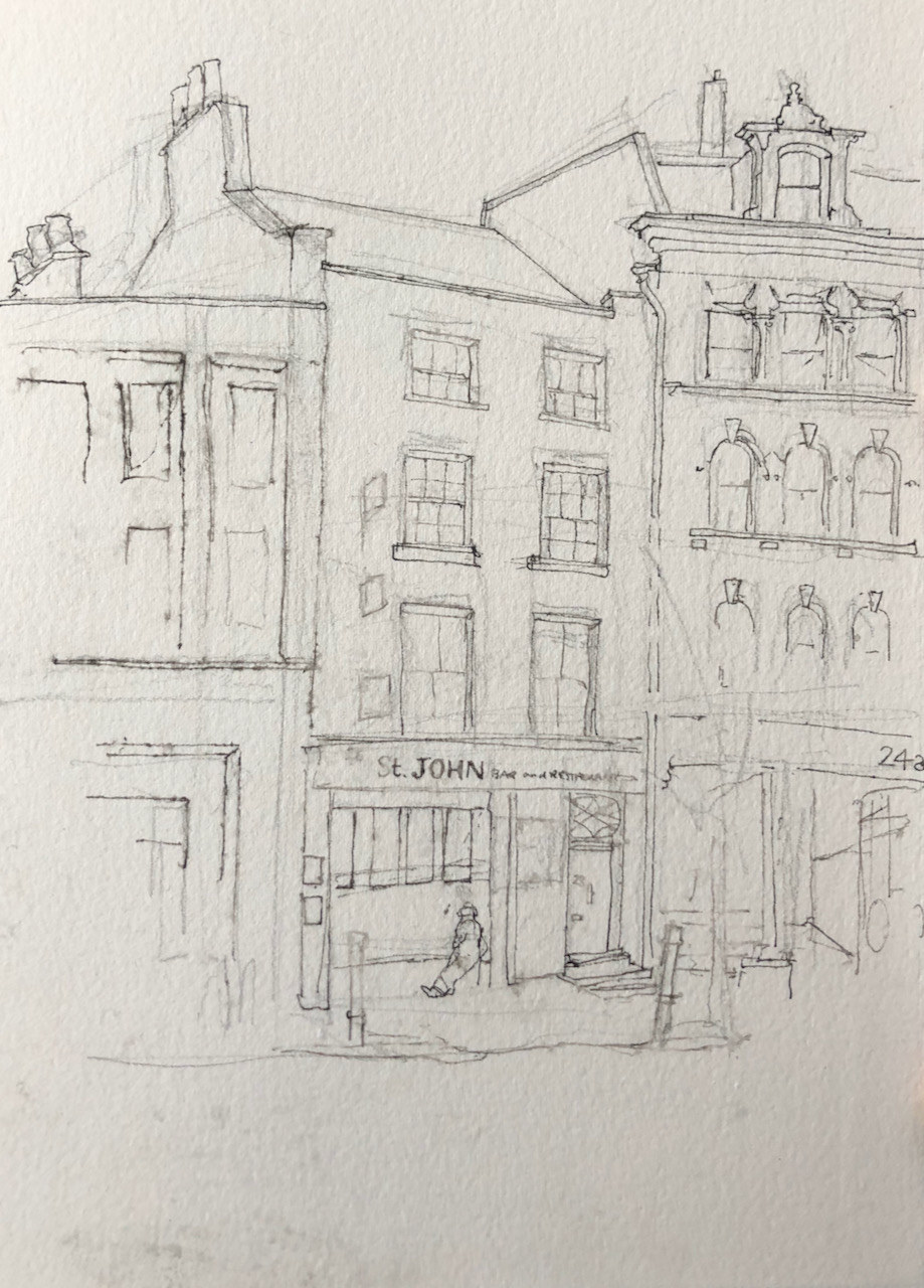
St John Bar and Restaurant EC1, 20 May 2021, 5pm. 8″ x 10″ in Sketchbook 10.
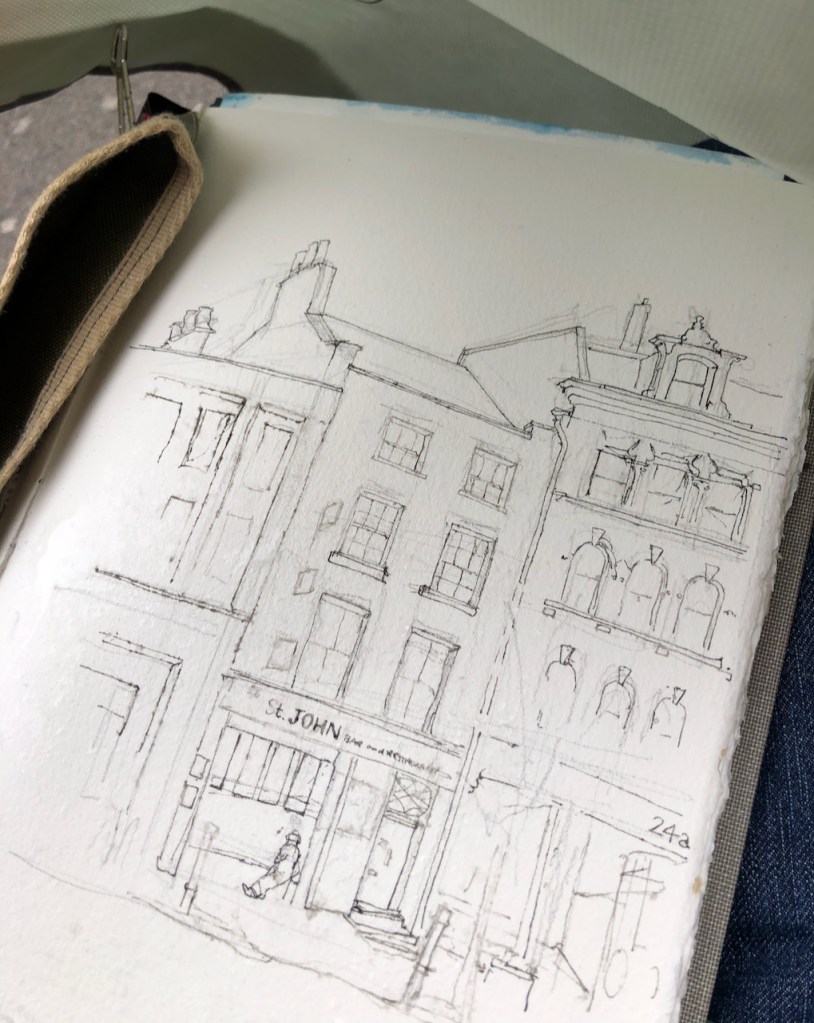
A photo on location in the rain.
Yesterday I went out for a walk with my sketchbook. I sat on the edge of a low stone wall and started drawing St John Bar and Restaurant. Then the fine rain came. It was blustery and I thought it would blow over. It did not blow over. It became a maritime wind-blown spray. I protected my drawing as best I could with a screen made from a bag I was carrying. It didn’t protect it very well.
The ink I use is waterproof ink. This means that once dry, it does not run if water is added. The key phrase here is “once dry”. In the fine rain the ink didn’t have a chance to get dry. It was diluted as I put it on the paper, so my lines became a rather subtle grey, and somewhat blotchy.
…lines became a rather subtle grey, and somewhat blotchy…
…like drawing on blotting paper…
The paper I use is Arches Aquarelle. It is what is called “heavily sized”, which means it has substances added to make it partly water resistant. This is so that watercolours stay on the surface. This sizing has the useful consequence that rainwater beads on the surface, at least initially. This is not advertised in the description of the paper, but is useful for those of us who try to paint outdoors in the UK. After a while, however, it yielded. The rain penetrated. The paper became soft and absorbent, and the lines from my pen became blotchy, like drawing on blotting paper: possible, but you get some unwanted effects. It also became rather hard to see what I was doing. My glasses were wet with raindrops and are not equipped with windscreen wipers. So at that point I stood up and packed up. Rainwater fell off me in rivulets, dangerously close to the place where the sketchbook sheltered under the rucksack. This sketchbook contains earlier drawings done in watercolour. I had visions of the previous drawings becoming blotchy abstracts.
At home I laid everything out carefully on the floor to dry out. The paper admirably remained flat. The previous drawings were not damaged.
I dried out. Everything dried out. Then I added the colour.
This picture took 45 minutes on location, colour took another 45 mins at my desk. The colours are Phthalo Blue Turquoise, Perylene Maroon, Buff Titanium, Transparent Brown Oxide, Mars Yellow. For the tree leaves: Green Gold and Permanent Yellow Deep.
Click a button below to share this post online, email it, or print it:
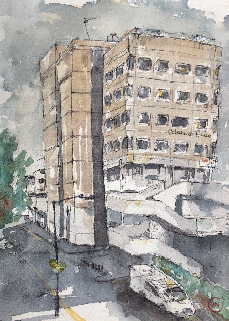
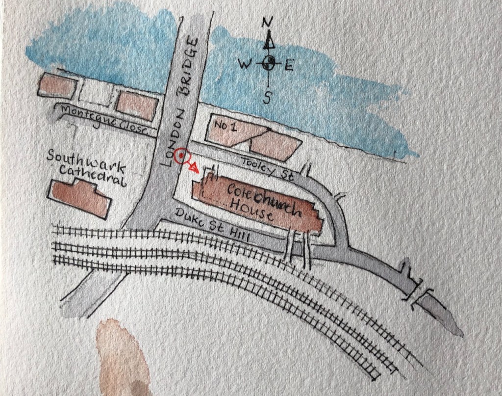
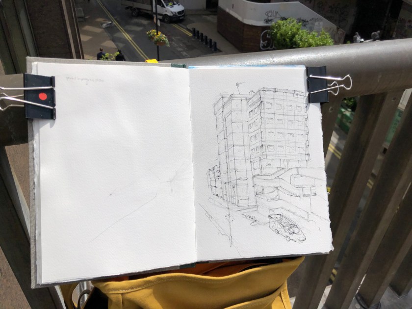
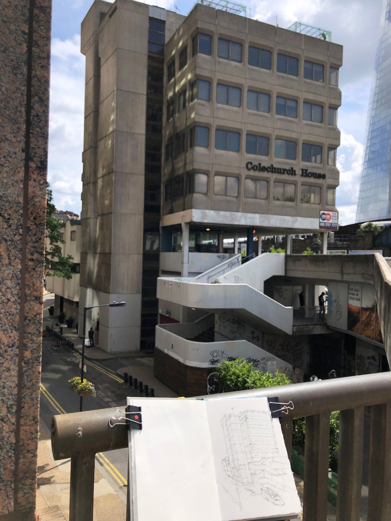
Aficionados of 20th Century brutalist architecture need to hasten to appreciate Colechurch House. It is due for demolition and redevelopment. This month’s post in the marvellous “London Inheritance” site informed me about the planning application, so I rushed over there to draw a picture before the building became swathed in plastic.
Colechurch House SE1, 18th May 2021, 12:30pm. 7″ x 10″ in Sketchbook 10
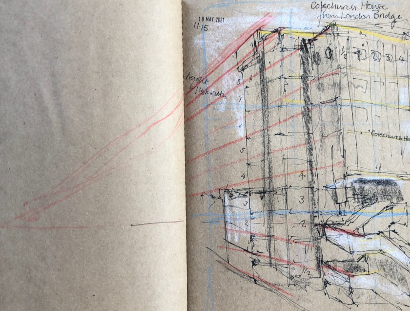
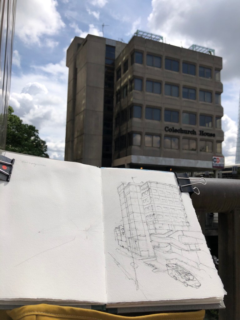
I drew this picture looking over the railings from London Bridge. This position commanded an excellent view of Colechurch House, but it meant I had my back to the passers-by on the pavement, which made me nervous. I strapped my rucksack to the railing and worked quickly. My drawing makes the building look a little precarious, perhaps that reflects my own nervousness standing in the wind on London Bridge, or perhaps it reflects the nervousness of the building as it awaits imminent demolition.
Here is work in progress. I completed the pen-and-ink on location and the colour at my desk.
Preliminary sketch
Colechurch House was completed in the late 1960s* to the designs of E G Chandler. Pre-pandemic, the area under the building at podium level contained a tidal flow of commuters walking between London Bridge Station and the City of London. The City of London Corporation entity known as “Bridge House Estates” owns the freehold. The site is in the London Borough of Southwark (called “LBS” in the press release below). The planning application is GLA reference 2020/6867/S1 and has been approved. Here’s the plan, according to the summary in the planning application:
“Redevelopment of the site to include demolition of Colechurch House, pedestrian footbridge and walkway and erection of an elevated 22-storey building (+ 4-storey basement) above a public park and providing office floorspace, retail floorspace, restaurant/café floorspace, leisure floorspace (all Use Class E), theatre and a bar (Sui Generis), delivered alongside public realm improvements, roof gardens, cycle parking, servicing, refuse, plant areas and other associated works incidental to the development.”
Here’s a press release from the City of London last year, announcing the development.
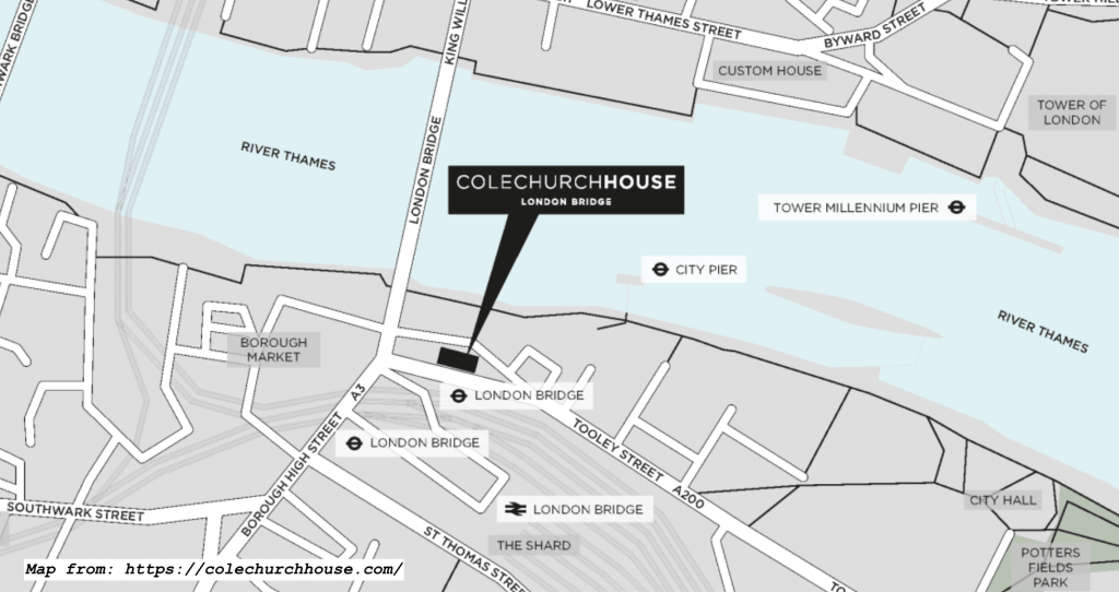
*Completion date “late 1960s” according to https://colechurchhouse.com/site, the website of the new development. It also says “It is named after Peter of Colechurch who designed the first stone bridge across the Thames here.”
Click a button below to share this post online, email it, or print it:
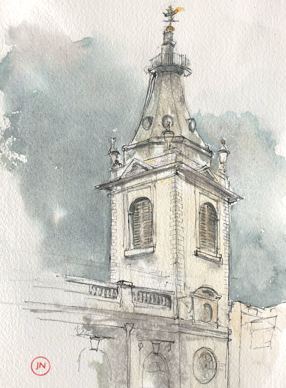
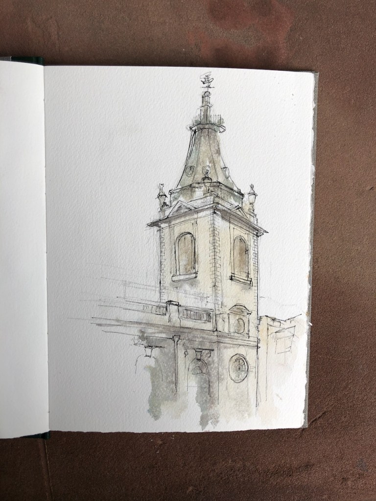
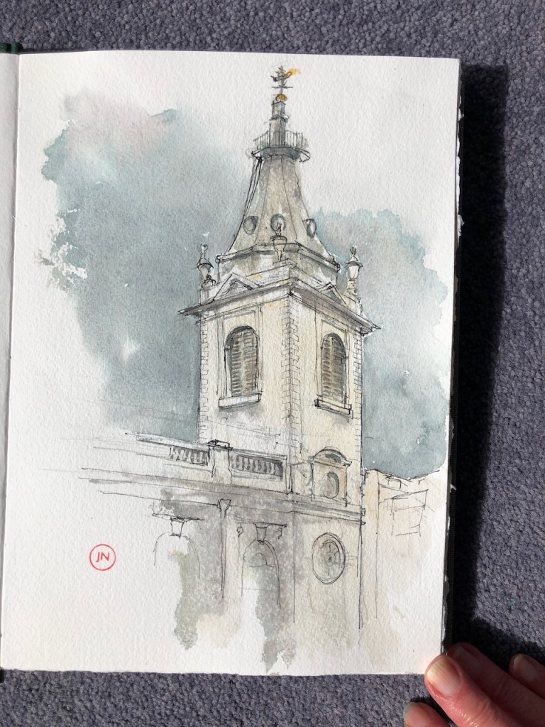
The church is dedicated to the 4th century St Nicholas of Myra. The name “Cole Abbey” is derived from “coldharbour”, a medieval word for a traveller’s shelter or shelter from the cold.
It still performs this sheltering function. There is a large squarish space inside, very open and light, with stained glass, tables, gentle murmurings. And there is the wonderful Wren café, a welcoming place. St Nicholas Cole Abbey is an active church, offering “workplace ministry” according to its website.
Yesterday, however, the church and the café were closed. I found shelter from the rain in the overhang of 1 Distaff Lane, Bracken House, and drew this picture.
St Nicholas Cole Abbey, EC4. 16th May 2021, 7″ x 10″ in Sketchbook 10
You see the magnificent trumpet shape of the spire. There is a boat on top! According to the Wikipedia entry:
This [weathervane] came from St Michael Queenhithe (demolished 1876), and was added to the spire in 1962.
Here is work in progress on the picture, and a map:
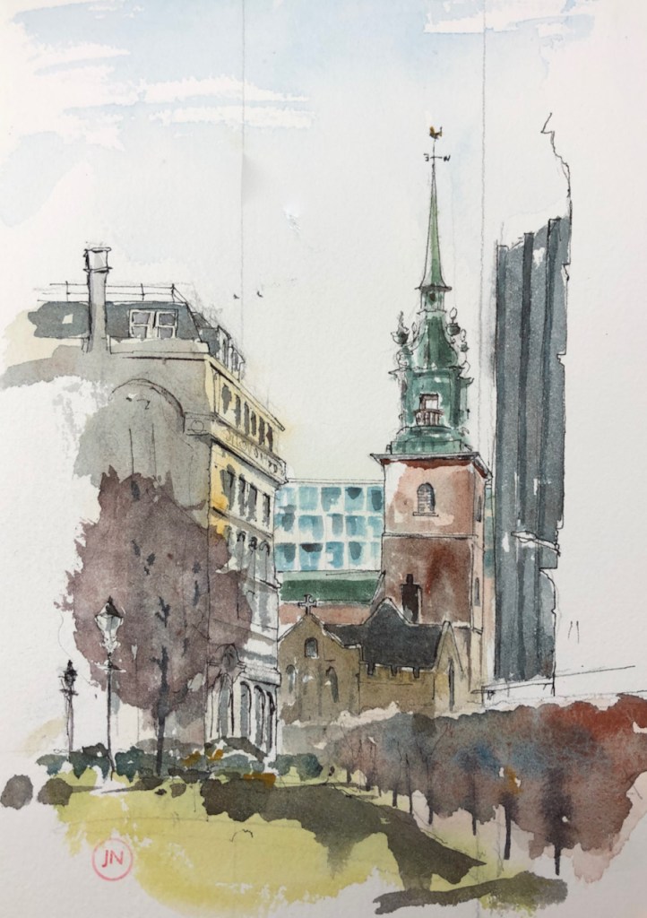
On sunnier days, I have drawn St Paul’s Cathedral from a bench to the south of the church:
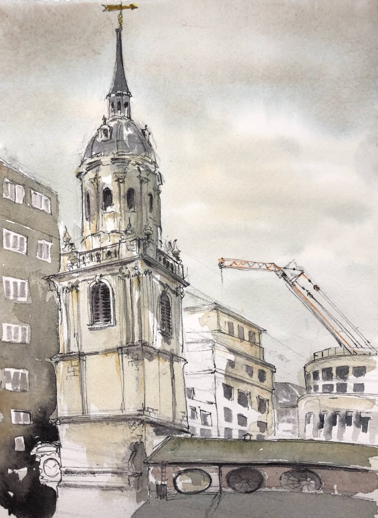
Wren Coffee has re-opened! This is a marvellous coffee shop in the Church of St Nicholas Cole Abbey, on Queen Victoria St. I went there and sat on the raised terrace, sketching the view Northwards towards St Paul’s Cathedral. The grey building in the foreground is a nightclub. It has dark windows, and a barred…
City Churches
This is one of an emerging collection of drawings of City churches. You can see the drawings so far by clicking this link:
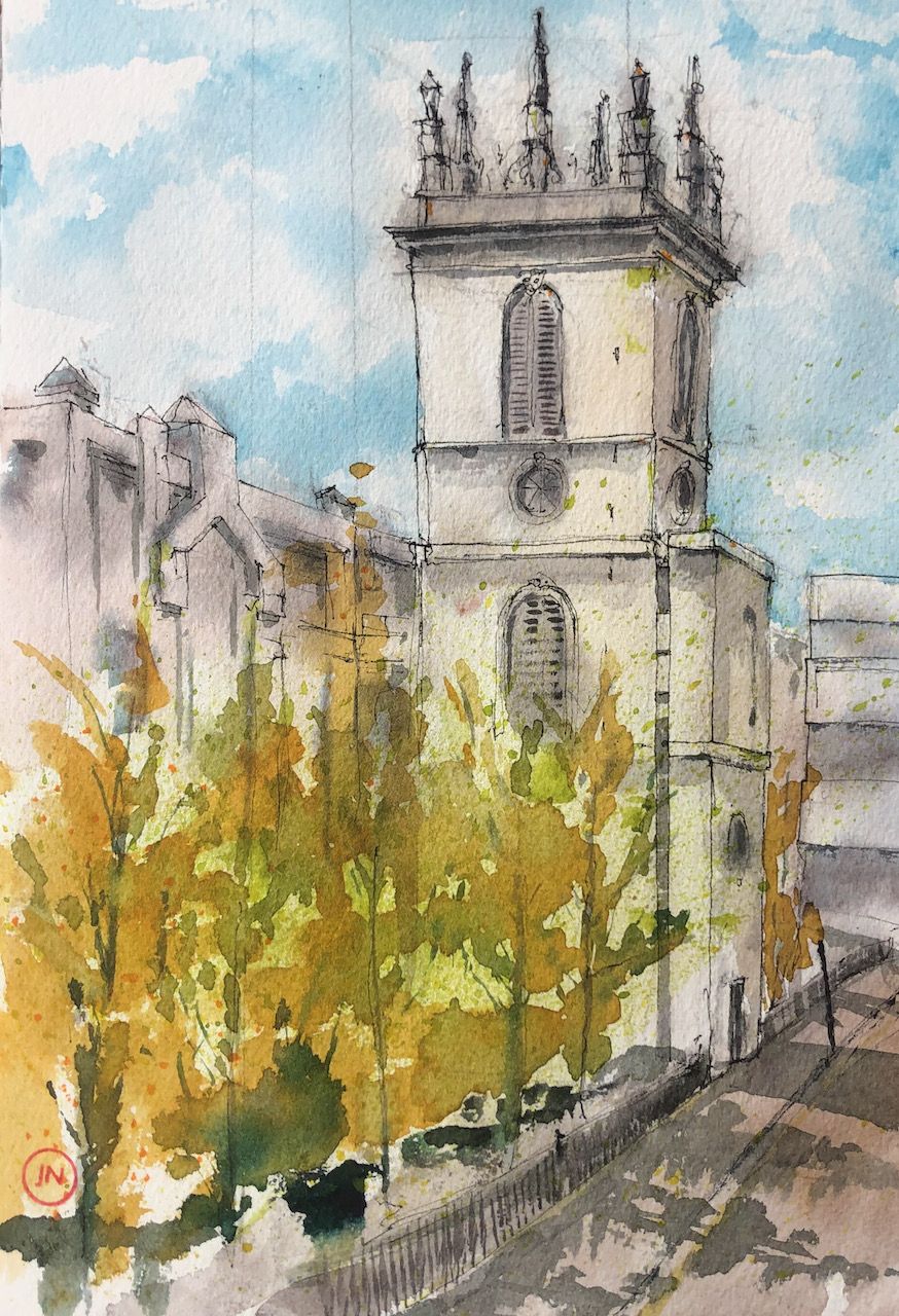
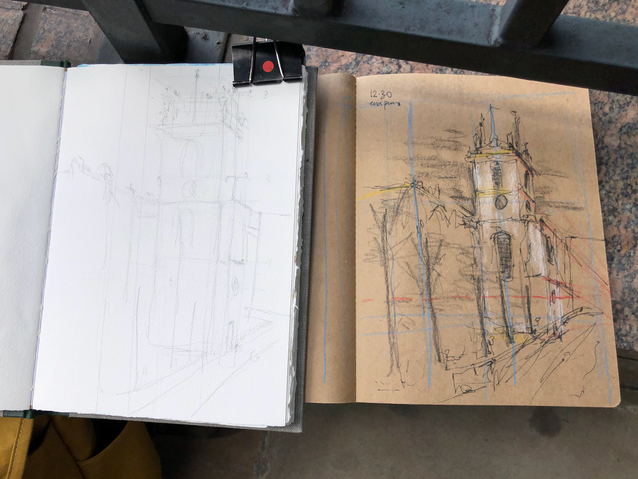
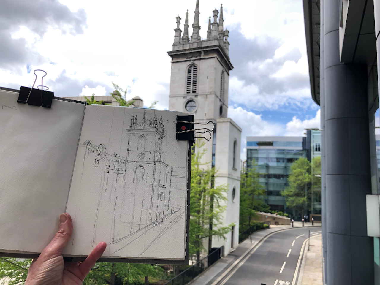
In a narrow sliver of land between Upper Thames Street and Lambeth Hill is the tower of St Mary Somerset. This is a Wren church, built in 1886-94. The body of the church was demolished in 1871, leaving only the tower. The tower was listed Grade I in January 1950. It is now being converted into a single private home, according to the website of architects Pilbrow & Partners.
St Mary Somerset, Upper Thames Street EC4, 7″ x 10″ in Sketchbook 10. 11 May 2021, 2pm.
I drew this picture from the footbridge over Upper Thames Street, on the North side, where it becomes Fye Foot Lane.
Map showing the position of St Mary Somerset, and where I was standing.
From this angle, Upper Thames Street is hidden behind the trees. The building on the left of the drawing is 1 High Timber Street. It’s an enormous post-modern building, which looks like offices.
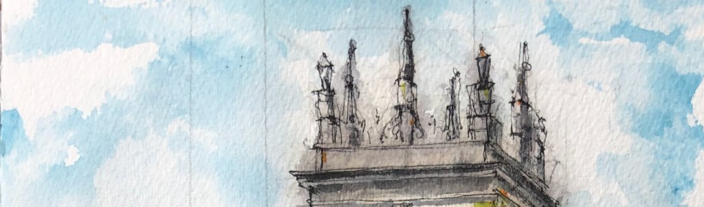
I enjoyed the top of St Mary Somerset. There is no spire, instead there are eight huge stone monuments. The Historic England describes it in the listing: “Parapet with 8 tall pedestals supporting urns at the corners and obelisks in between.” It looks as though it might be a board game, laid out on a huge square board, for giants of immense strength to play.
Top of St Mary Somerset: a fantasy board game?
The sketch took about 45 minutes on location. I completed it at my desk after lunch. The colours are: Phthalo Blue Turquoise, Permanent Yellow Deep, Green Gold, Mars Yellow, Perylene Maroon. Here are snapshots of work in progress.
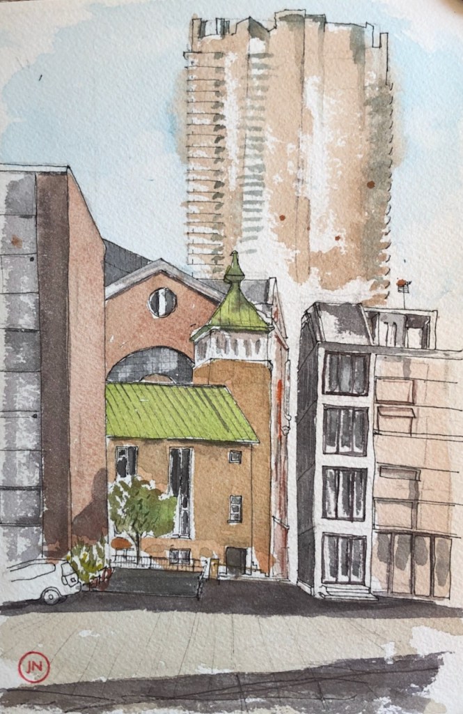
I have drawn various City churches. I enjoy the way they co-exist with the modern buildings.
Walking back from the Little Bread Pedlar with my bag of goodies, I came to a standstill in front of St James’ Church, Bermondsey.
This is a magnificent 19th Century church, with a dragon as a weathervane. There is a generous park around the church, and benches. I made a quick sketch.
After my lunch, I walked along the West side of the church and passed between huge stone gateposts. Looking back, the church was spectacular against a moody sky.
There were some convenient benches stacked outside a closed pub, so I sat down and made a longer sketch.
St James’ Church, Bermondsey, 7″ x 10″ in Sketchbook 10. 5th May 2021 14:15
From this angle, the church might be in the countryside. What you can’t see in the drawing is the half-timbered pub, which is just off to the left. It is called “The Gregorian”. The pub sign is a heraldic shield, with a black dragon facing a white dove. The motto below the shield reads “SHALOM”. I can find no explanation for why a pub in Bermondsey should have a greeting in Hebrew on its coat of arms. But there it is. The pub was closed, so I couldn’t ask them.
The church is remarkable in many ways. For one thing, it is enormous, and very solidly built. Walking along the West wall, I could see that there was a crypt along the entire length. The steeple has clocks on each of its four faces, which is commendable and generous, in my view. All of the clocks were working, and showed the right time, including the one which was facing North over the roof of the Nave, and thus invisible except by a narrow angle.
As I was drawing this, the rain started, and then stopped, and started again. Eventually I packed up and finished the drawing at my desk when I got home. I also found out more about the church. The first stone was laid in 1827 and it was consecrated in 1829. The church was built as part of a huge Church building programme, funded by central government after the Napoleonic wars. The fund was called the “million-pound fund” and the churches built are called “Waterloo Churches” or “Commissioners’ Churches” for the Church Commissioners who managed the programme. Wikipedia has a whole article on the subject. I found it interesting that the government would embark on such expenditure when surely its funds were depleted after the wars? Information on a notice board by the church says that the fund was established as a thank-offering for peace, and a memorial to the soldiers who had fallen. Wikipedia offers two additional explanations.
The demographics of the country were changing substantially in the first part of the 19th century. There were churches where there were insufficient people, and people where there were insufficient churches. This was certainly the case in Bermondsey, where the population quadrupled during the 19th century, from roughly 17 thousand in 1801 to over 80 thousand in 1901. The people were engaged in trades associated with the docks, such as ropemaking.
It was seen by the government as important to provide churches in order to prevent insurrection (note 1). Churches provided guidance, stability, and social control. The French revolution of 1789-99 lived in people’s memories.
St James’ Church accommodated 2000 people, when built. It continues to offer services and describes itself as an Anglican evangelical church, with a “vibrant and active congregation of all ages and backgrounds, drawn from many countries in the world.” This is from the information leaflet on the church website. (Note 3) This information leaflet contains the following picture of the restored dragon weathervane, which I couldn’t resist including here:
“Restored and regilded, St James’s dragon weathervane, returns to Bermondsey in 2018” (from St James Bermondsey History leaflet, Note 3, and vicar’s blog: Note 4)
According to the church website (note 2), the bells were cast by Mears of Whitechapel from the canon left behind by Napoleon. The architect was James Savage.
Here is work in progress on the drawing:
Wikipedia article quotes Port, M. H. (2006), 600 New Churches: the Church Building Commission 1818-1856 (2nd ed.), Reading: Spire Books, pages 15 and 16 ISBN978-1-904965-08-4
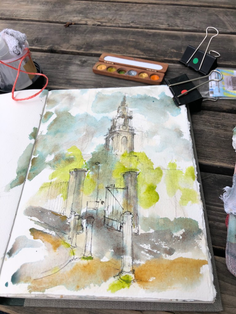
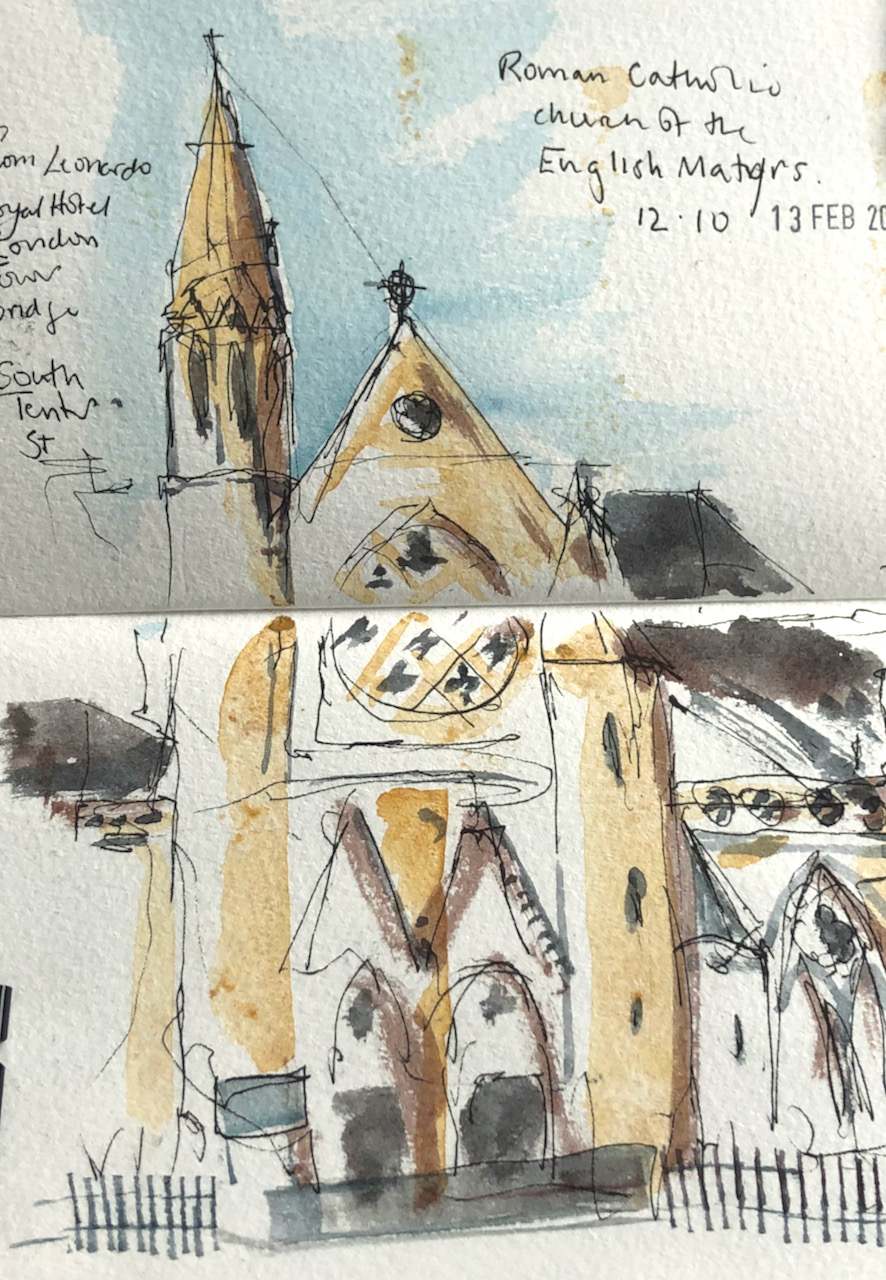
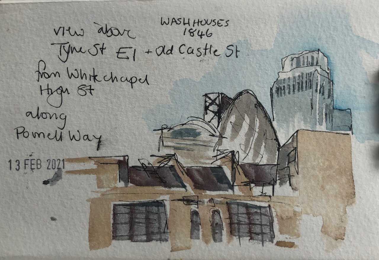
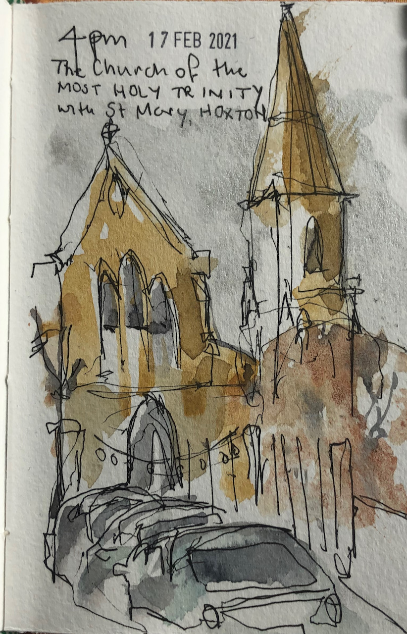
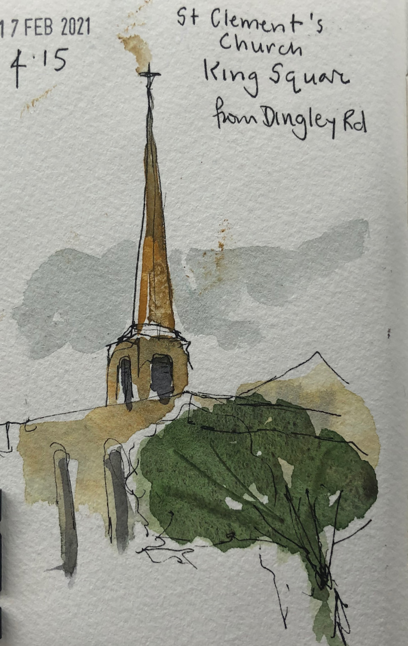
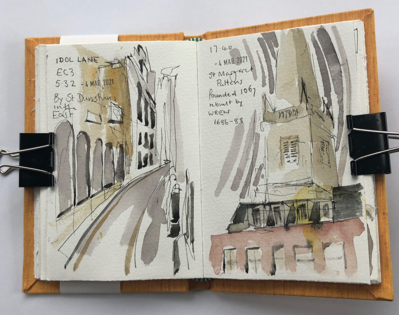
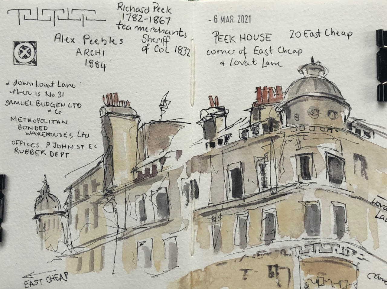
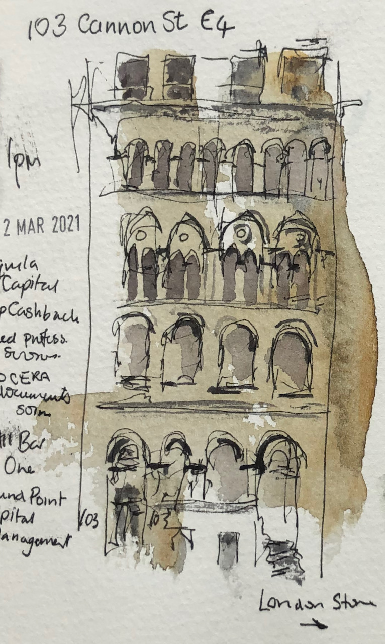
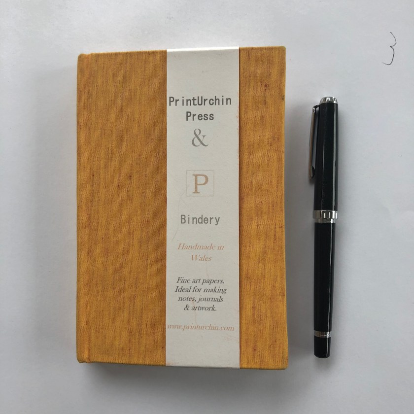
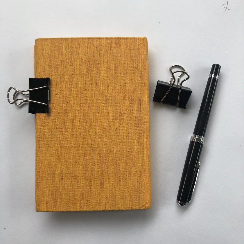
On my walks around the City, as lockdowns have eased, I carry a tiny sketchbook and make quick drawings. I’ve just finished microsketchbook number 2.
Here are some pictures from this sketchbook. Mostly I draw buildings.
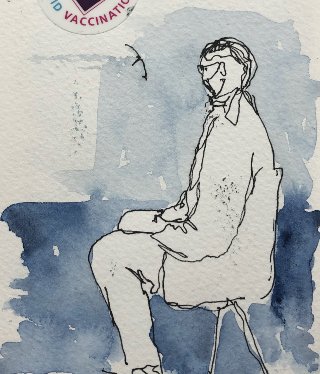
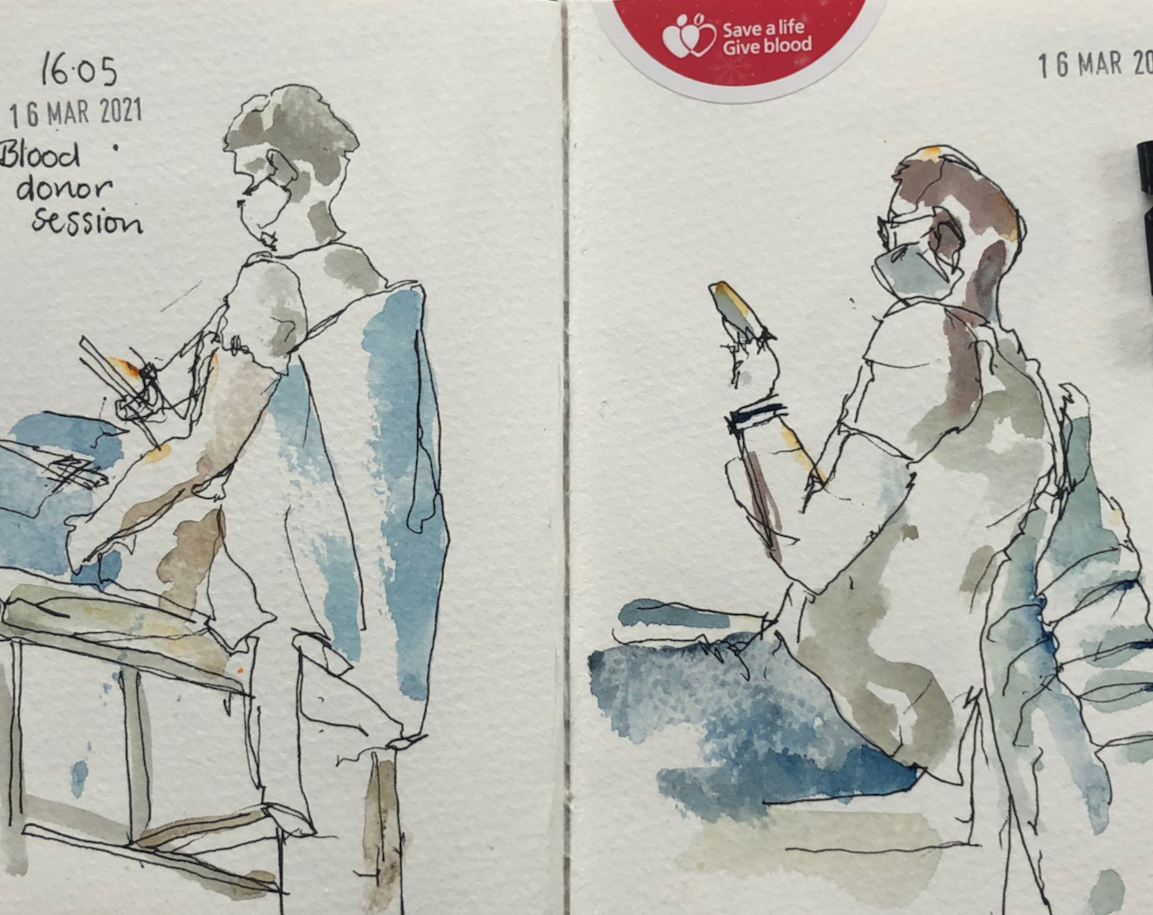
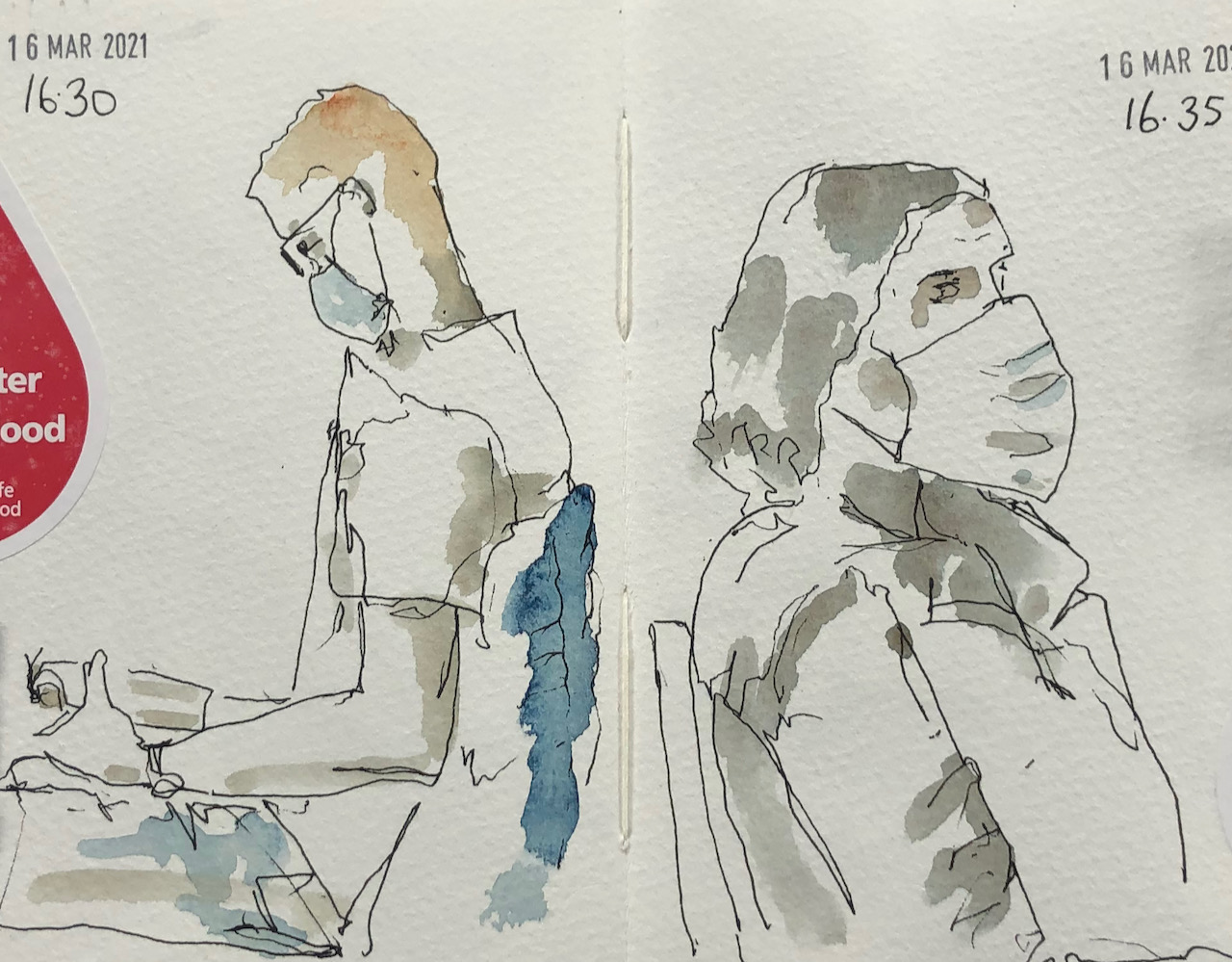
Sometimes I draw people, especially if I’m in a waiting room.
Microsketching sketchbook number 2 is 6″ x 4″ and came from “Print Urchin Press and Bindery” . The paper is real watercolour paper: Bockingford. I use De Atramentis document ink, black, which is waterproof, in a Sailor fountain pen with a fine nib. Then I put a watercolour wash over.
Microsketchbook number 2, Sailor pen, clips.
Now I am starting microsketchbook number 3.
Microsketchbook number 3, from Print Urchin press and bindery.
Here are some tiny sketches I made as a result of local walks. I have a small sketchbook, about 3½ inches by 5½ inches, the size of a big mobile phone. On my walks, I pause for…