Happy New Year!
Thank you for reading my posts and looking at my pictures. I appreciate your encouragement and comments.
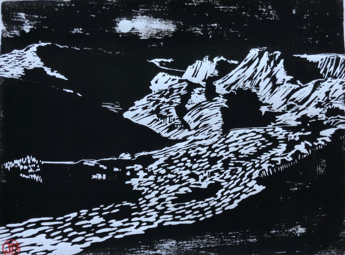
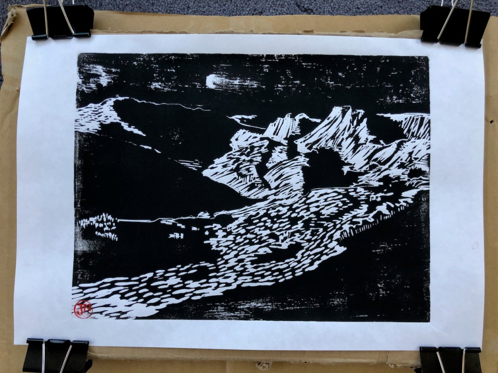
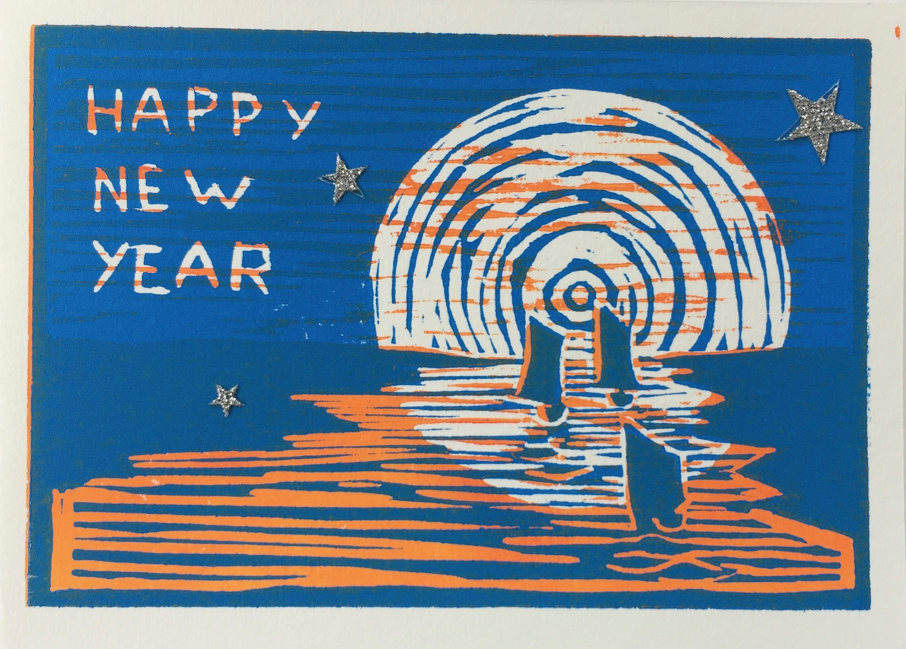
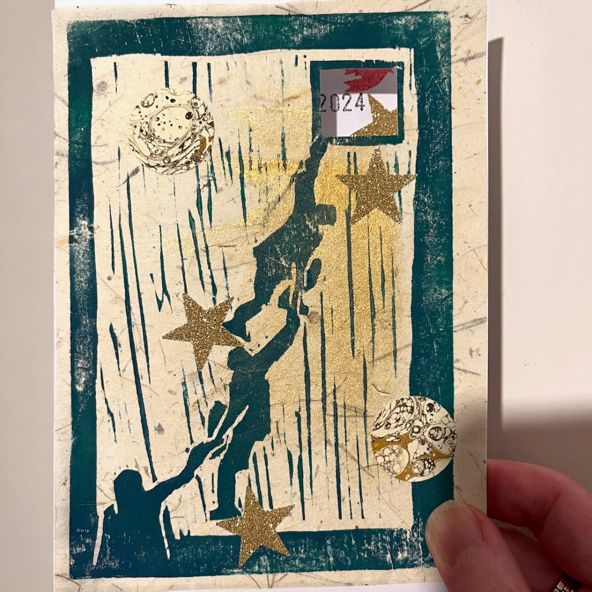
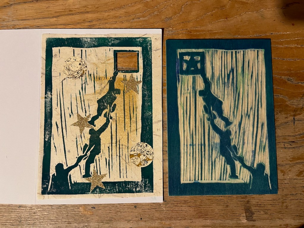
Here is my New Year Card for 2024.

I intended the image to be one of hope: of collaboration and of working together towards a higher goal.
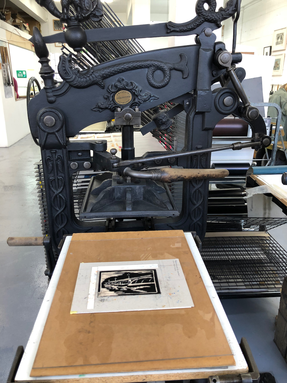
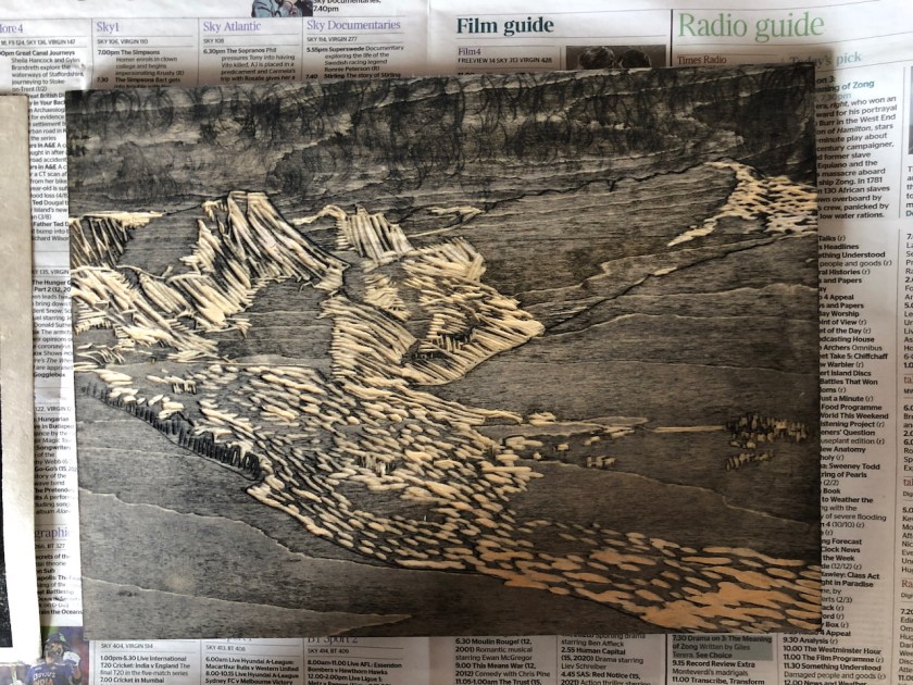
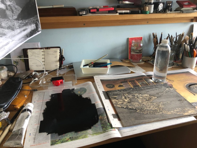
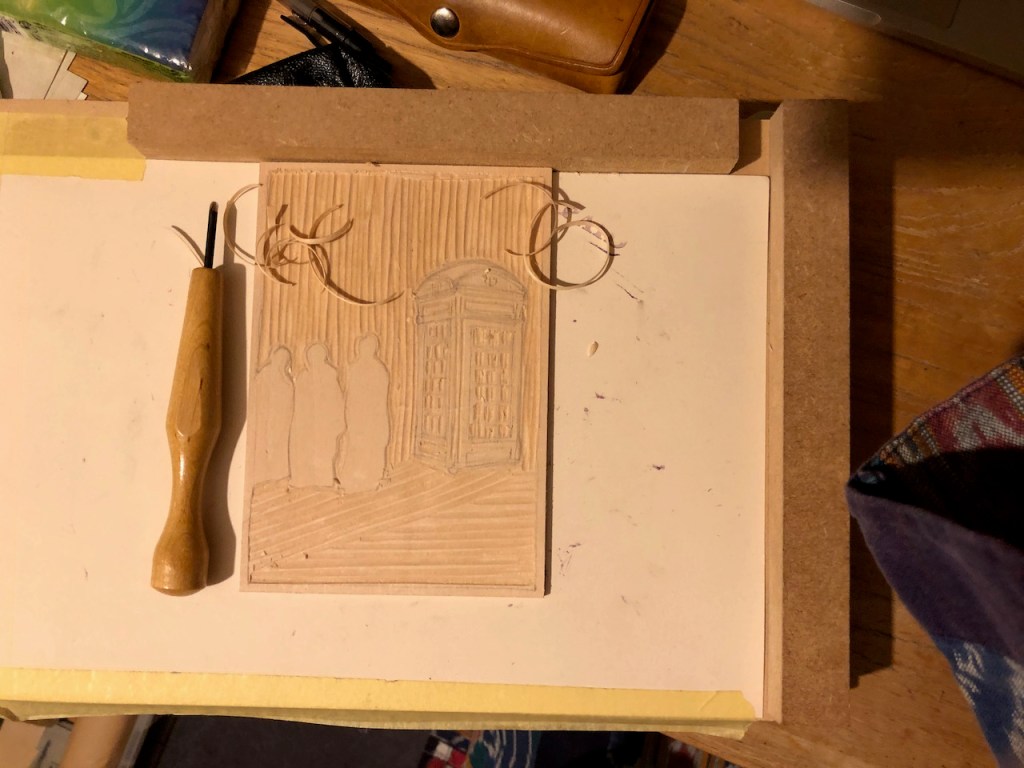
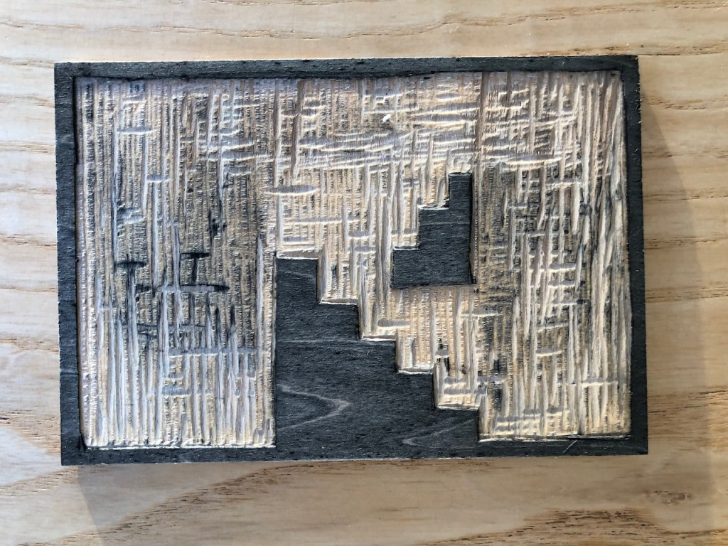
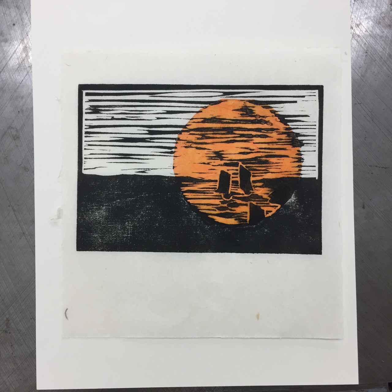
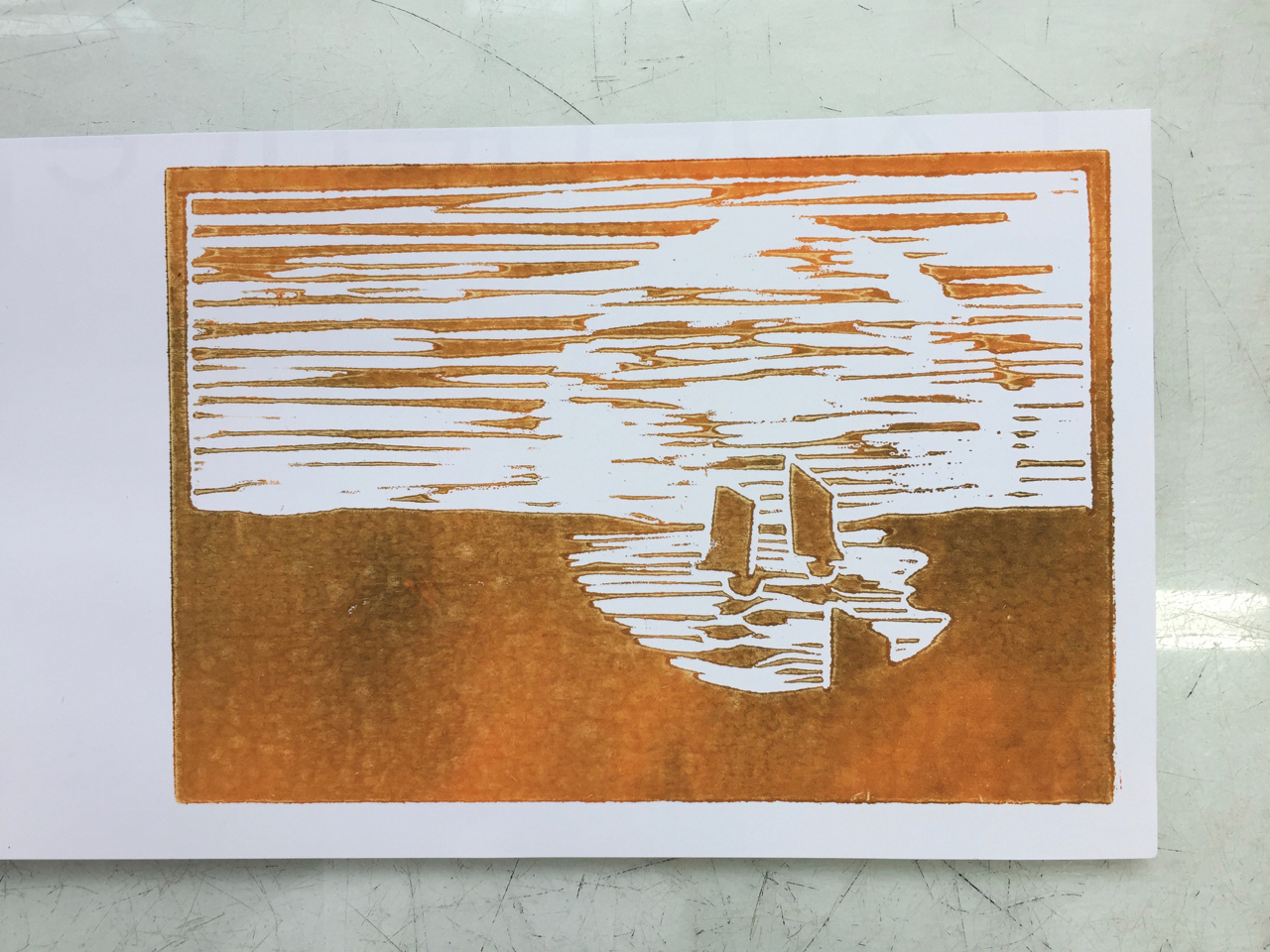
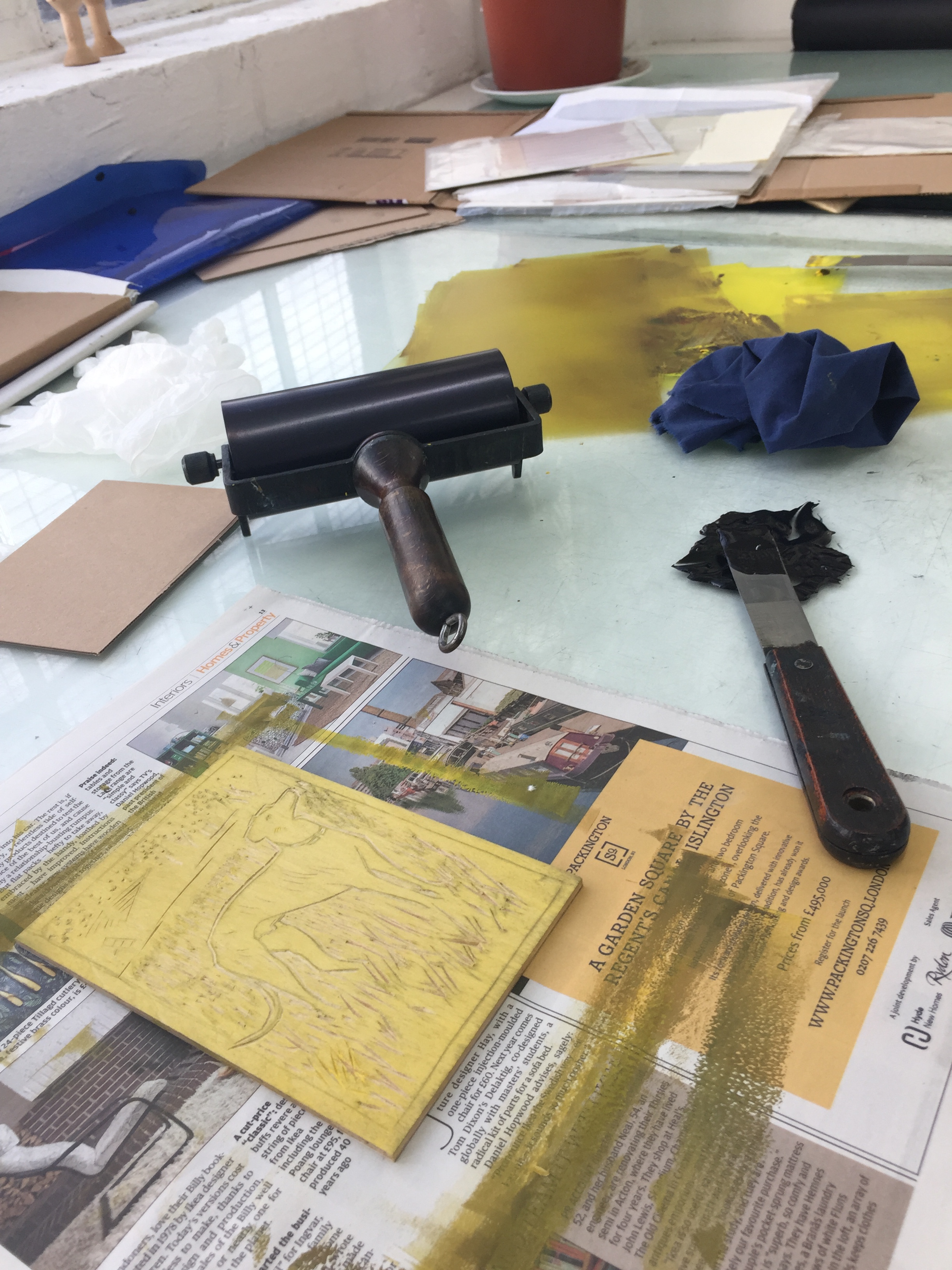
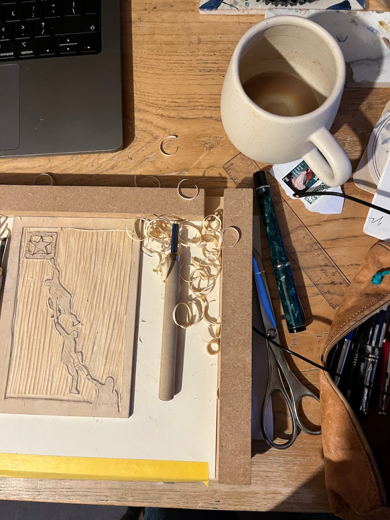
The main image is a woodcut on plywood. Here is work in progress:
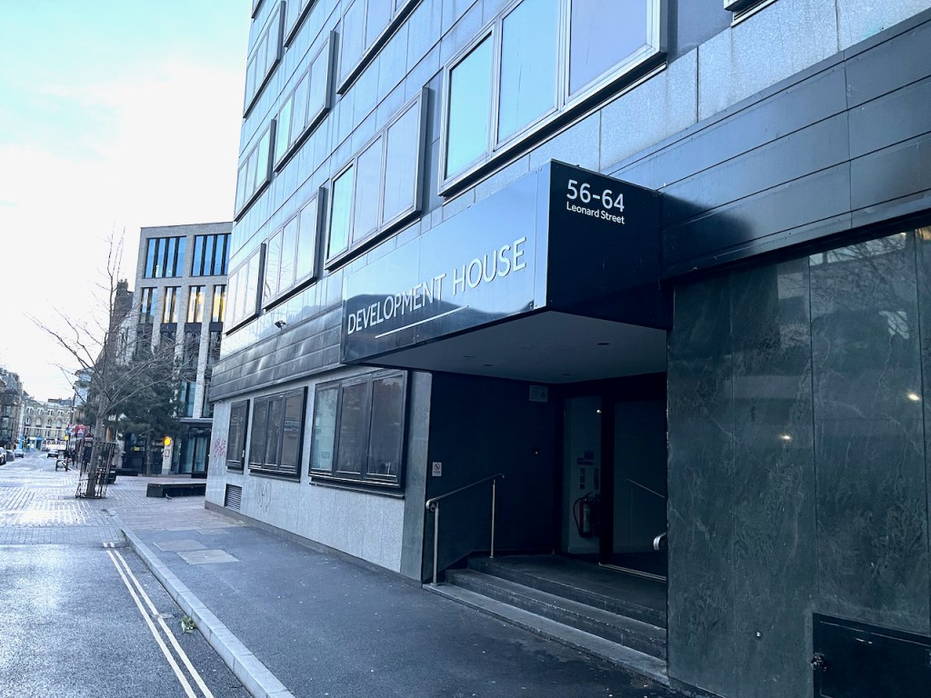
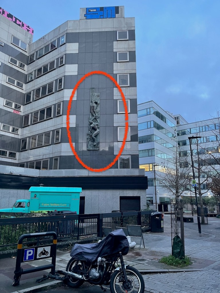
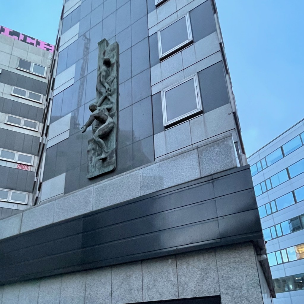
The woodcut image is inspired by a sculpture on the wall of a building in Hoxton. The building is called “Development House” 56-64 Leonard Street. I can’t find any attribution for the sculpture and would be interested to know who the artist is, if anyone can tell me.

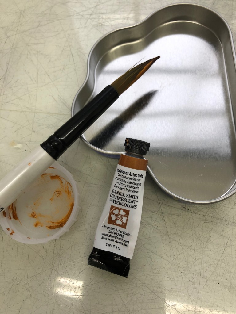
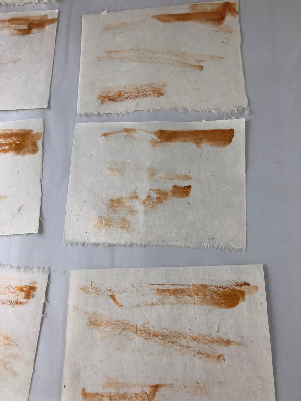
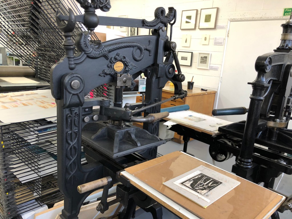
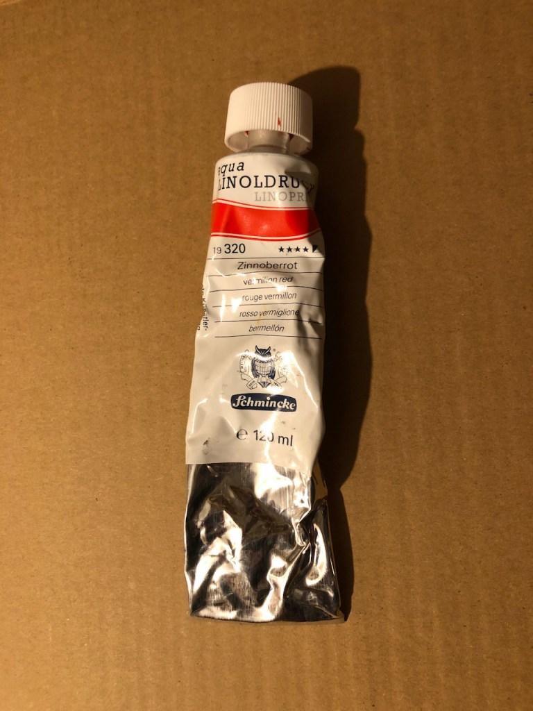
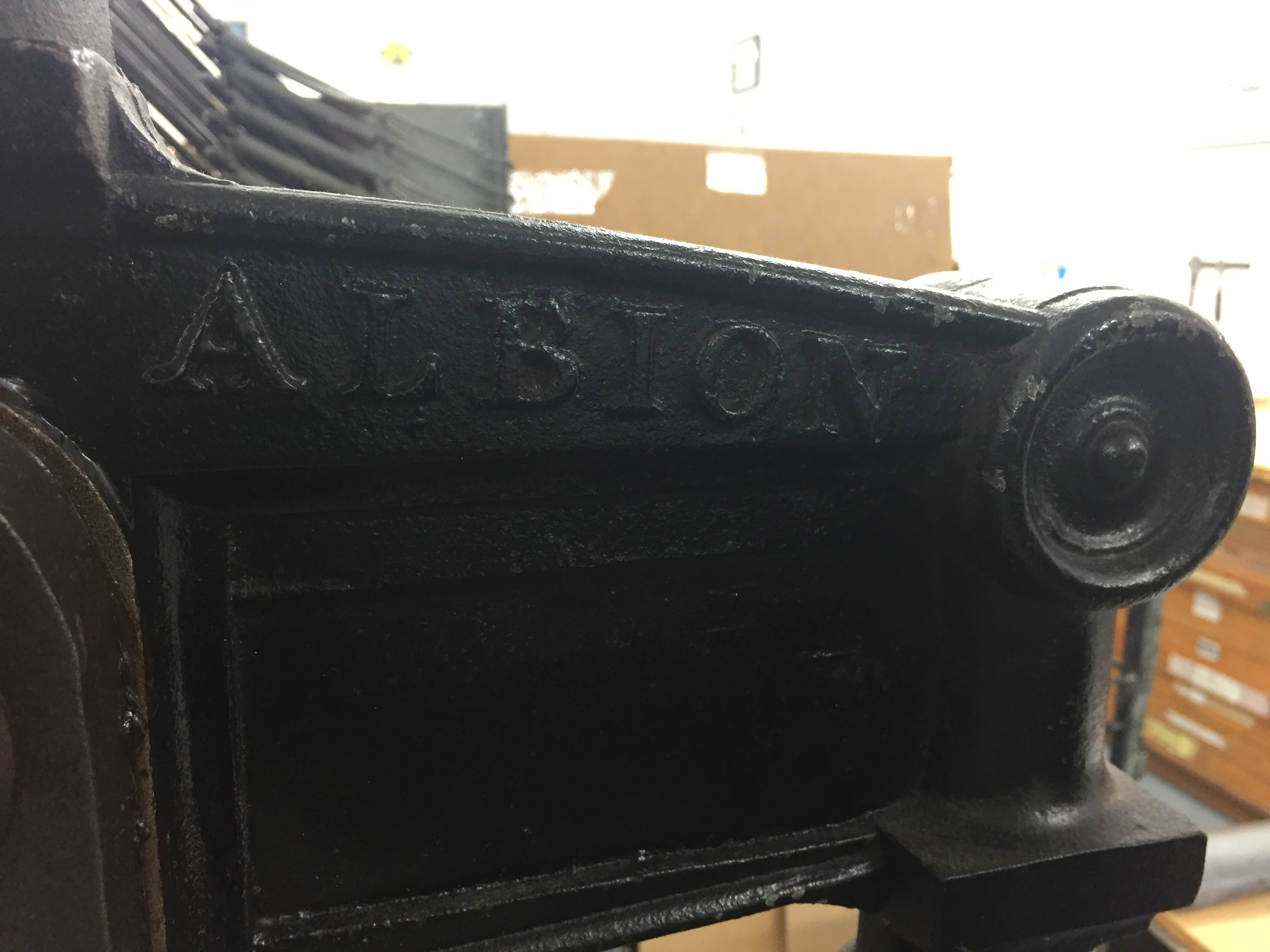
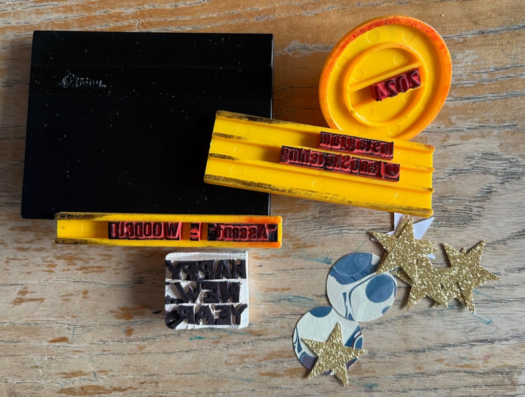
Technical information: The woodcut is on plywood, bought from “Great Art”on the Kingsland Road, not far from this sculpture. The ink is Schminke relief ink, applied with a roller. I printed the image by hand at my desk, using a roller and pressing the paper down with the convex side of a spoon. The paper is lightweight Thai Mulberry (45gsm) in various shades: sea grey, peppermint and natural, bought online from the “Perfect Paper Company”. The round “planets” are offcuts of marbled paper from the Wyvern Press. I cut the stars out of old sparkly wrapping paper, using a star cutter. The “Happy New Year” text is cut from a pencil eraser. Other text is from an old-fashioned printing outfit.
Previous New Year cards are here:

New Year 2018
Here are my greetings for the New Year, sent as cards. They are woodcuts,…
read more about this
New Year 2019
Happy New Year! I made a woodcut. This is a greetings card, about 7″x5″.…
read more about this
New Year Card 2020
Happy New Year! Here is my New Year Card 2020: It’s a two-plate woodcut.…
read more about this
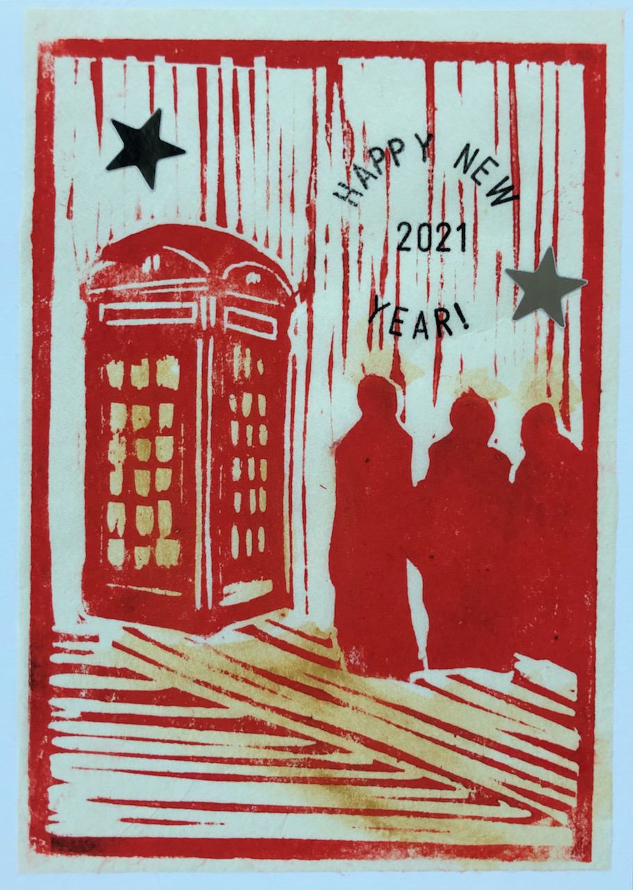
New Year 2021
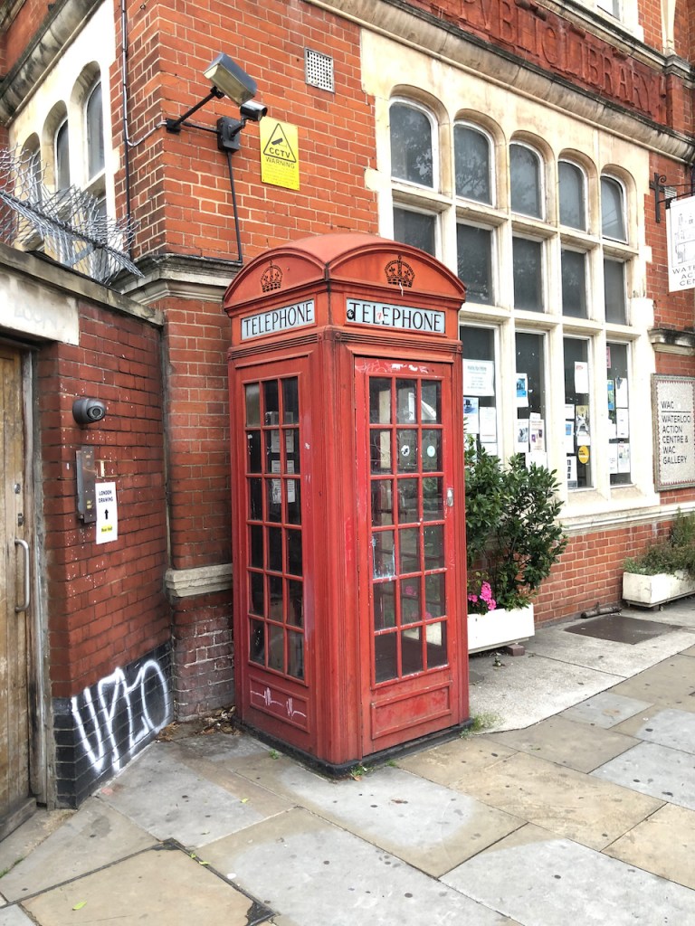
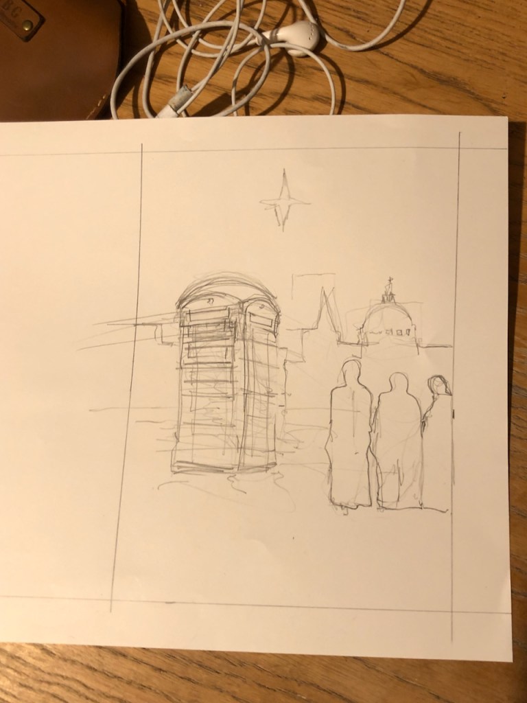
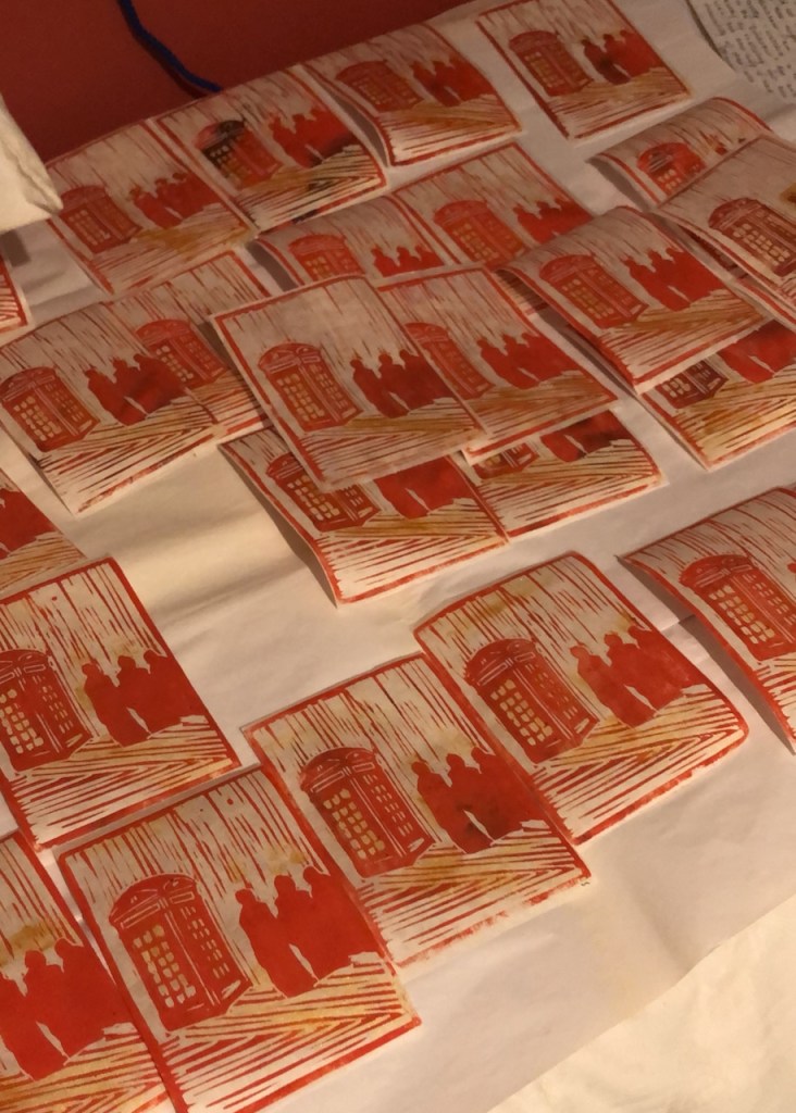
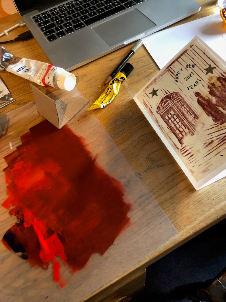
Happy New Year! My New Year card for 2021 shows a telephone kiosk. I…
read more about this
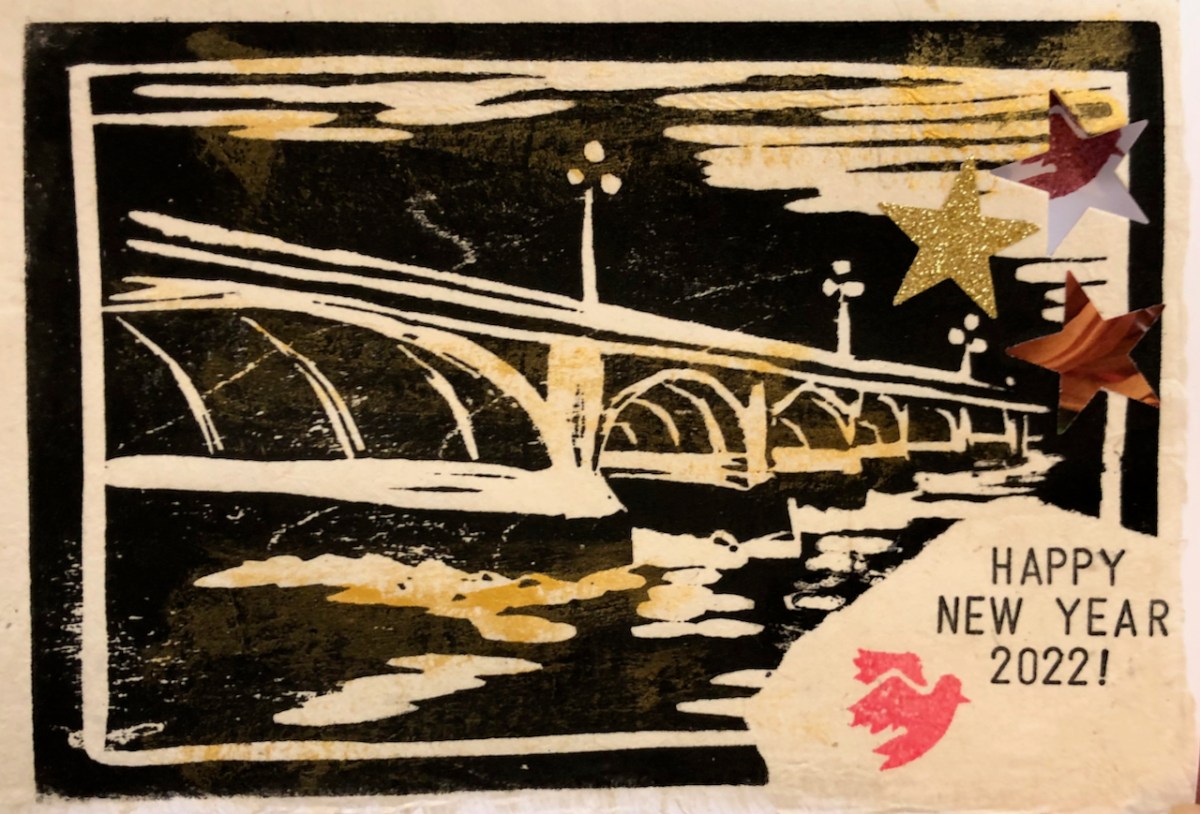
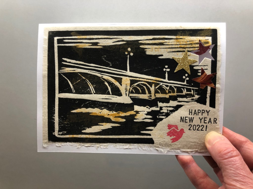
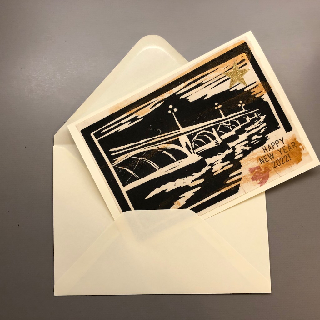
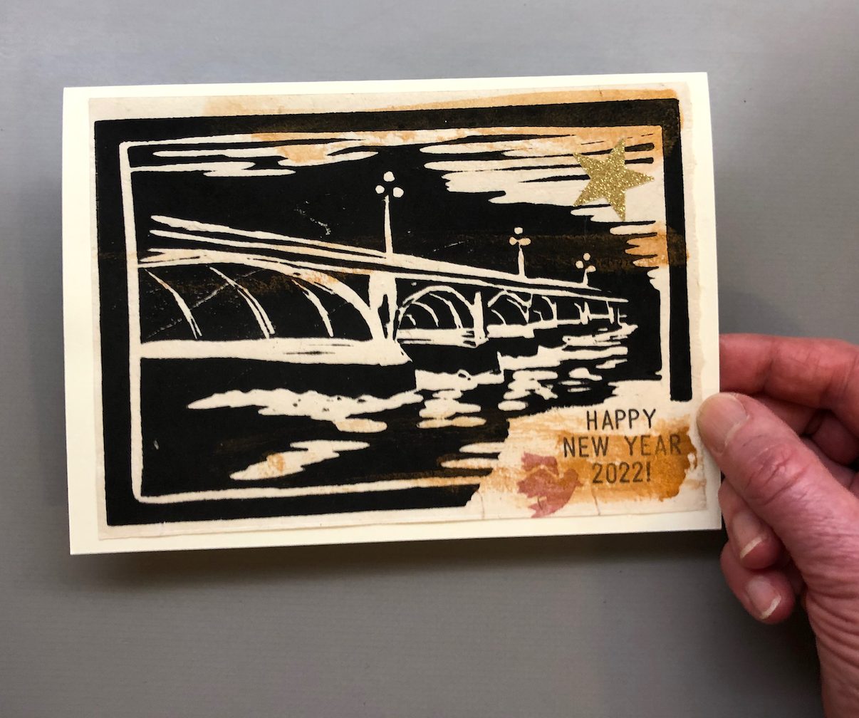
New Year 2022 – Bridges
Happy New Year! Here is my New Year Card for 2022. May 2022 be…
read more about this
New Year 2023
Happy New Year! I make New Year cards most years to send to friends…
read more about this