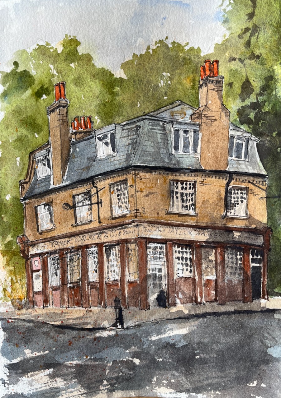
I walked to The Turks Head Wapping: a restaurant among trees. After a splendid lunch, I sketched the building.

The drawing took me about 50mins on location, pen and ink. I added the colour when I got back to my desk.
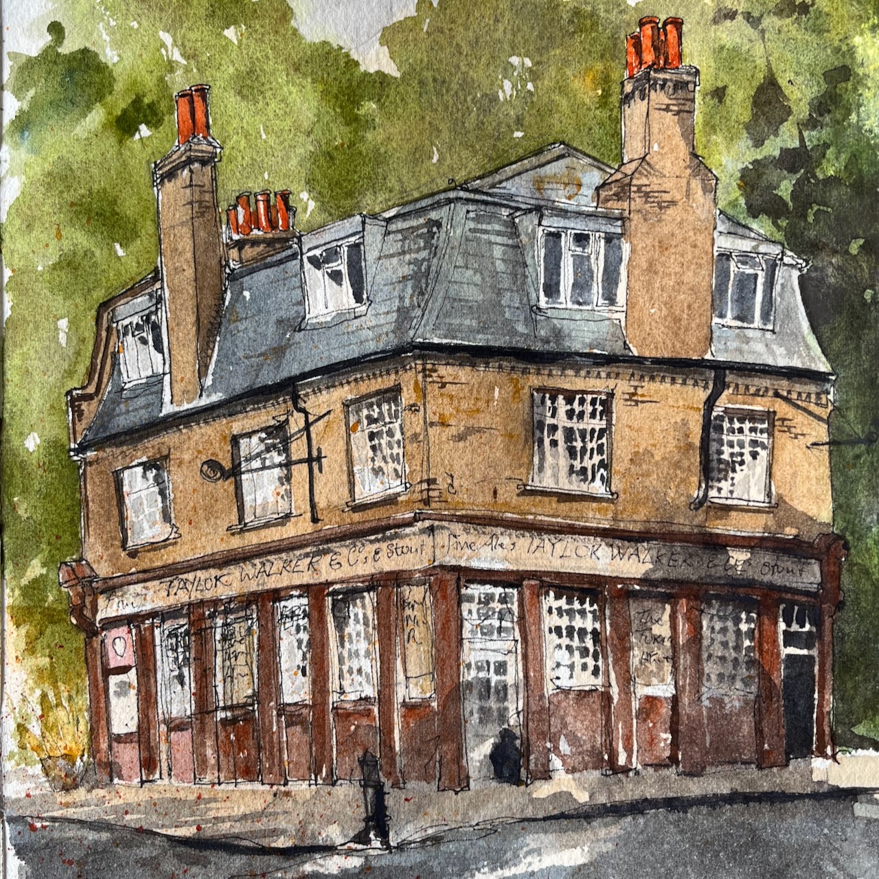
Marvellous chimneys!
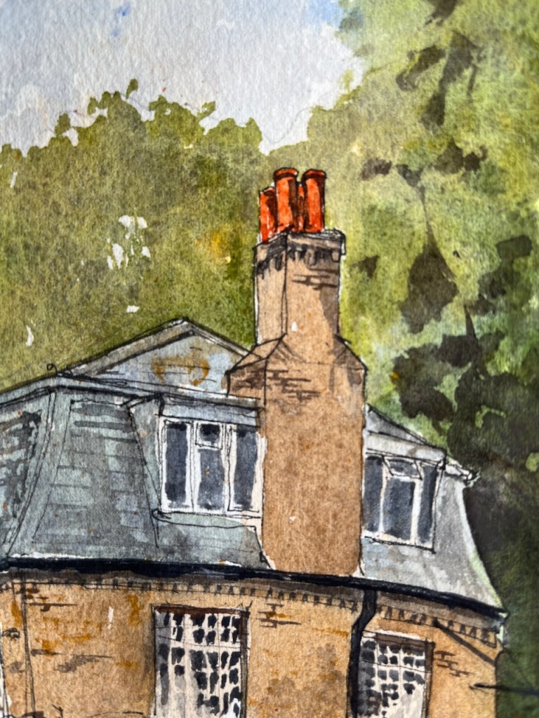
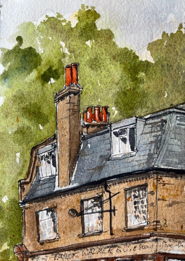
The chimneys are Transparent Pyrrol Orange. Other colours are: Green Serpentine Genuine, Mars Yellow, Burnt Umber, Ultramarine Blue, Permanent Yellow Deep, and Perylene Maroon to get the darker tiled walls. The blacks and greys are Ultramarine Blue mixed with Burnt Umber. These are all Daniel Smith watercolours. The paper is Arches Aquarelle 300gsm NOT, in a sketchbook made by the Wyvern Bindery in Hoxton.
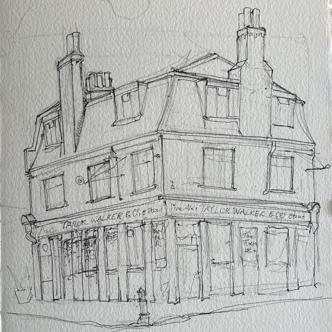
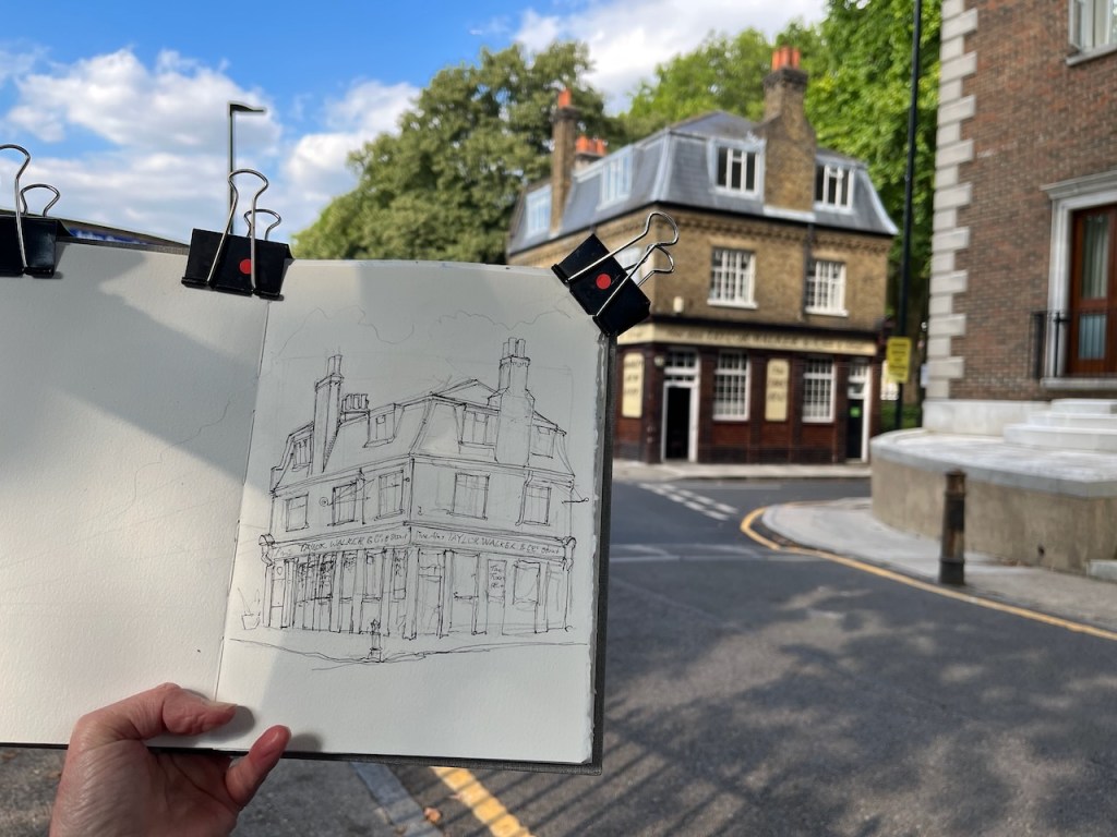
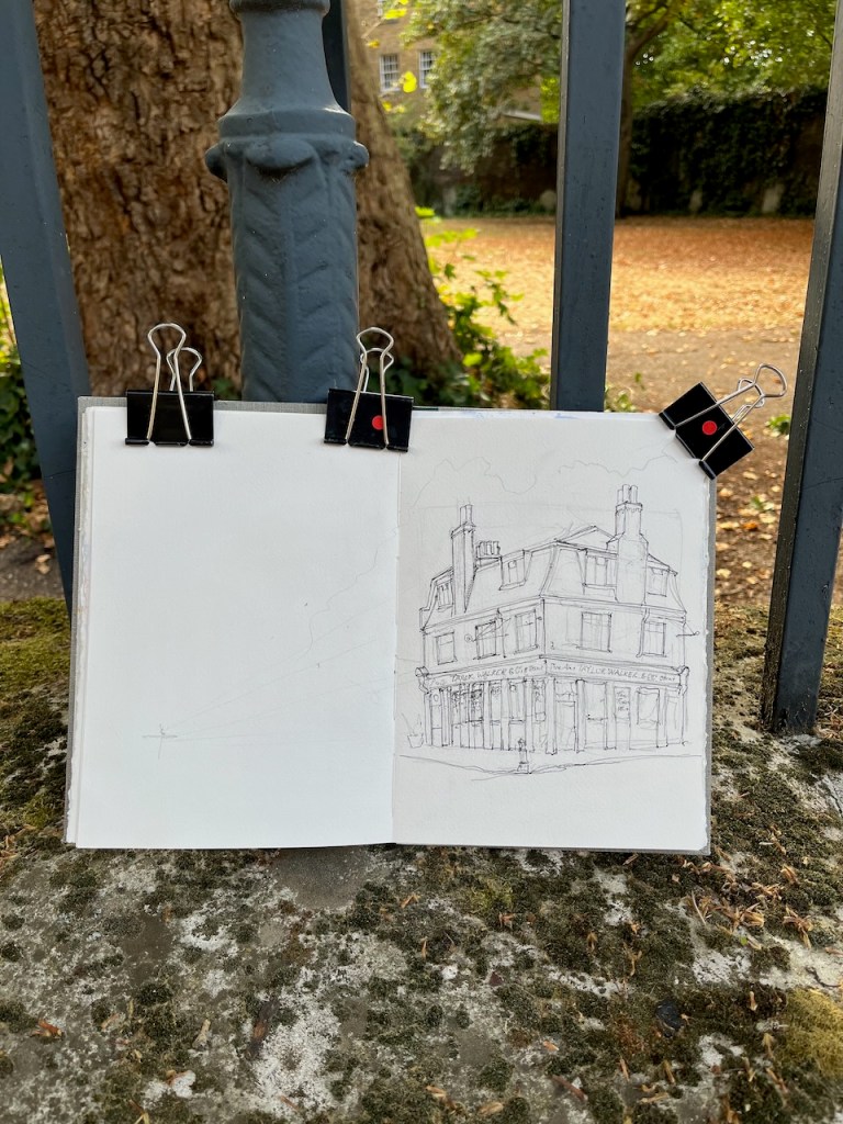
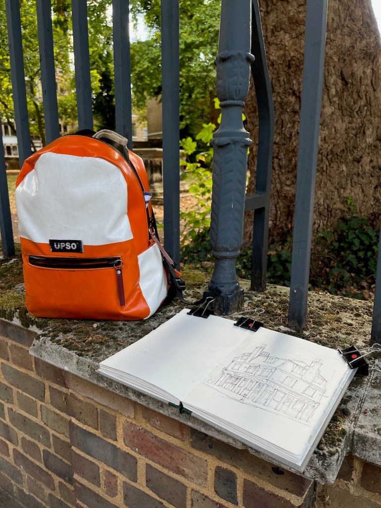
Here is work in progress:
This is a wonderful café-restaurant – recommended. It is east of Tower Bridge, about a 45 minute walk from the City.

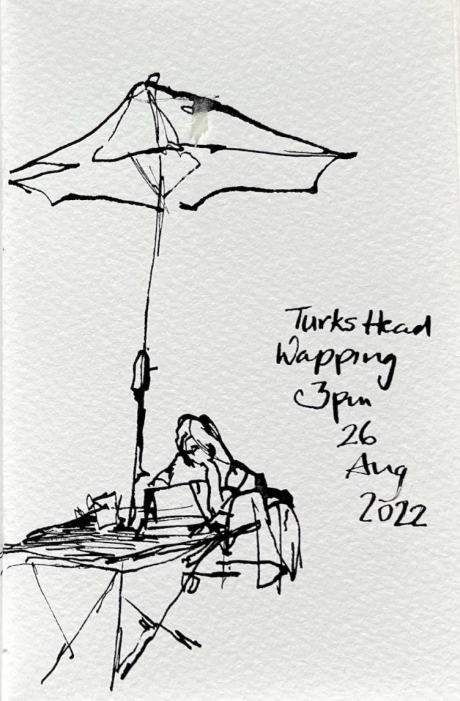
I’ve drawn the Turk’s Head before:

Turks Head Café Wapping
Here is the marvellous Turks Head Café, Wapping, rescued from demolition by local residents in the 1980s. Inside, I found warmth, quiet tables, and the gentle murmur of conversations: people actually talking to each other.…
Read more…
Turk’s Head Wapping E1, from the park
On Monday I cycled out East to the Turk’s Head for breakfast. With a coffee and croissant, in front of me, I sketched the view. The Turk’s Head is the building on the right. The…
Read more…
Hello penwithlit! Many thanks for the reblog. Yes, these days “Ultramarine Blue + Burnt Umber” is my go-to black/grey. It’s not quite as dark as a mix I used to use: “Phthalo Green(BS) + Perylene Maroon” which produced a really dark carbon black, like ink. But I re-organised my paintbox and Phthalo Green was evicted. I thought it was too “artificial” a green. It may come back in the future. But the “”Ultramarine Blue + Burnt Umber” mix is dark enough for my urban scenes, I think. I only have exactly 12 colours in the palette, so if one comes in, one goes out. The one that came in was a pink: Rose Madder Permanent.
I’m so glad you commented on the dip pen sketch. This is a totally new medium for me. The ink is very black, proper shellac-based drawing ink. I shall do more of these sketches and post an article about them. The dip-pen prompts its own drawing style, and makes both thin and thick strokes.
LikeLike
Reblogged this on penwithlit and commented:
Some unusual colours and thanks for advice on mixing greys. Love the dipped pen sketch too!
LikeLiked by 1 person
It’s lovely to see your sketches, over time, from different views. Are the adjacent buildings still there? Perhaps you just chose not to sketch them this time, or is it just that they are not visible from your chosen vantage point this time?
LikeLiked by 1 person
Hello Hashi and thank you for your encouraging comment! Yes, the adjacent buildings are all still there, as drawn in previous sketches, just not visible from where I was standing yesterday. I was looking North East, and from that viewpoint the Turks Head is surrounded by trees. St Johns Court and the other buildings are outside the frame of the drawing, to the right.
LikeLike